The network for creativity
Join 1.25M professional creatives like you
Connect with clients, get discovered, and run your business 100% commission-free
Creatives on Contra have earned over $150M and we are just getting started
Back to feedPost

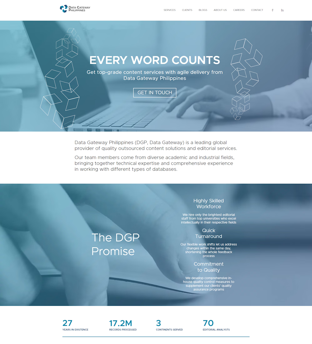
I executed a website overhaul and UI cleanup for Data Gateway Philippines, fixing site-wide layout issues, restoring broken responsive structures, and redesigning brand visual assets to present a cohesive corporate image.
Layout Repair & Fixes: Identified and corrected broken multi-page layouts across desktop and mobile views, fixing misaligned containers, overlapping text sections, and broken grid structures.
Custom Iconography & Visual Assets: Recreated and vectorized custom icons and graphical elements to ensure crisp display across retina/high-DPI screens and match modern design standards.
UI Polish & Alignment: Standardized typography spacing, visual hierarchies, and background overlay consistency across core sections like "The DGP Promise" and company metrics counter.
Performance & Cross-Browser Stability: Ensured layout fixes translated cleanly across major web browsers and viewports without breaking existing backend functionality.


The network for creativity
Join 1.25M professional creatives like you
Connect with clients, get discovered, and run your business 100% commission-free
Creatives on Contra have earned over $150M and we are just getting started







Related posts

Meriot personal portfolio Website Homepage showcase
A portfolio website designed to turn personal expertise into a strong digital presence.
The goal was to create a website that communicates experience, personality, expertise, and credibility within the first few seconds.
I focused on:
Clear positioning and personal branding
Strong visual hierarchy
Editorial-style typography
Project-focused storytelling
UX/Product Design service presentation
Testimonials and social proof
Clear CTA for potential clients
Responsive, conversion-focused layouts
The visual direction combines minimal typography, bold imagery, dark/light sections, and subtle interactions to give the portfolio a distinctive personality without making it difficult to navigate.


Top notch execution

Remove Liquidity component cards for a recent Web3 design project—what would be the best direction for readability and focus? Dark Mode or Light Mode? ⚡️
12 voted
40%
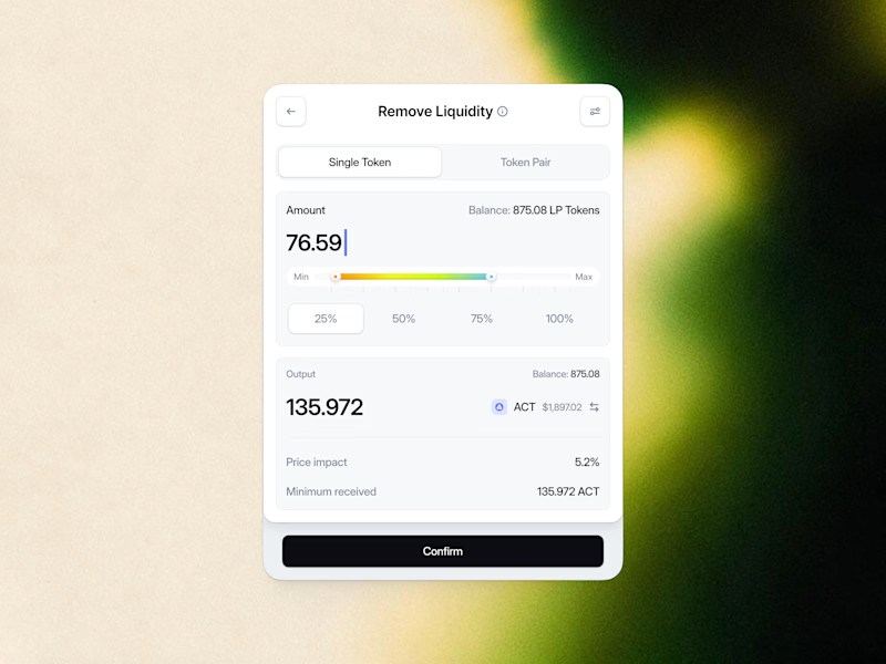
18 voted
60%
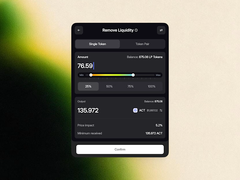
30 votes
Closed

White one need bit more darker bg on elements to make them visible like the dark more does.

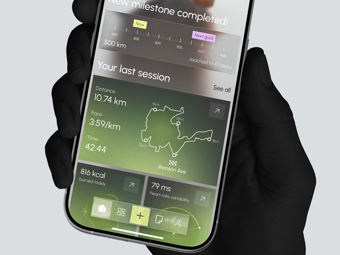
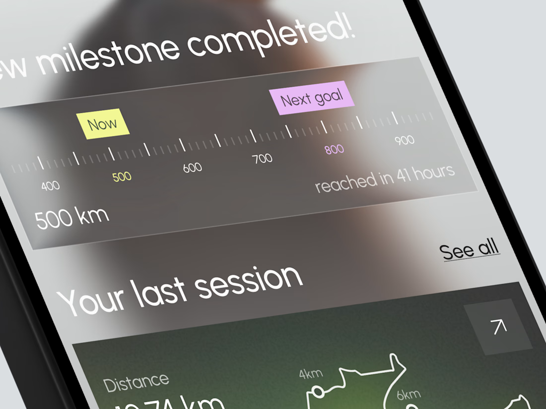
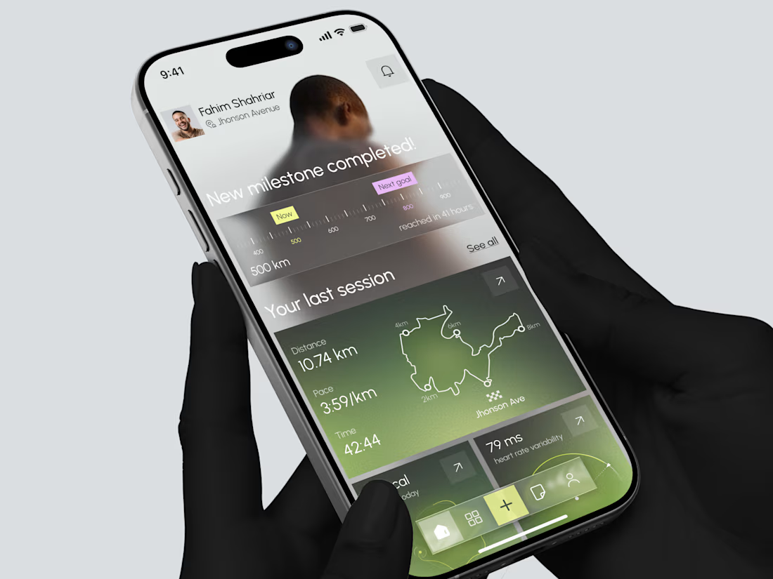
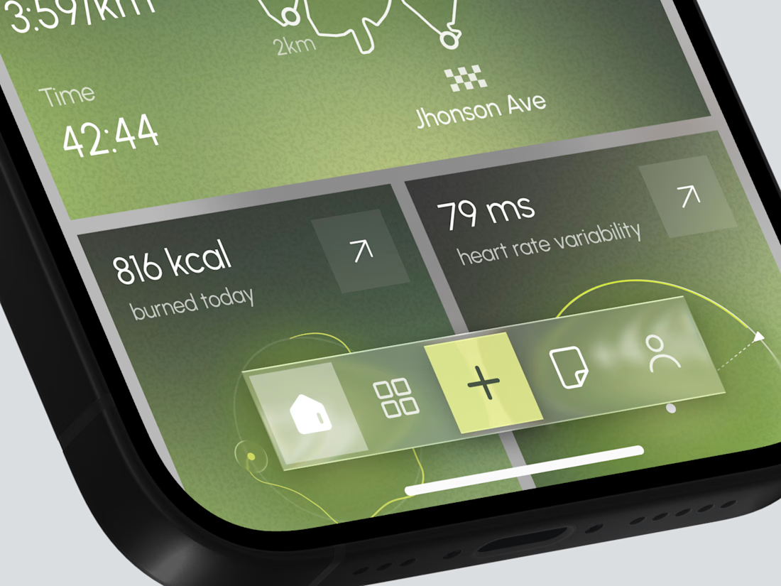
Designed a modern Fitness Tracking Mobile App.
Clean and motivational UI with milestone progress, last session map, distance, pace, calories, and heart rate insights for better running performance.

TOP!!