The network for creativity
Join 1.25M professional creatives like you
Connect with clients, get discovered, and run your business 100% commission-free
Creatives on Contra have earned over $150M and we are just getting started
Back to feedPost

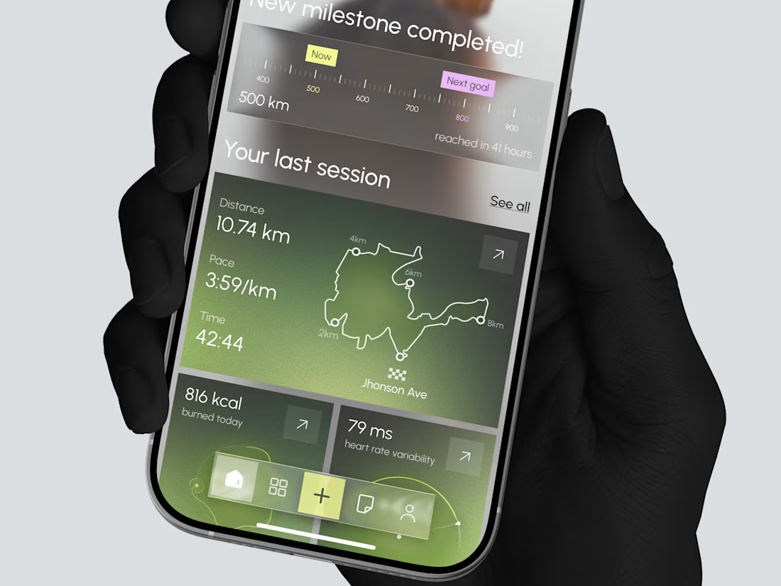
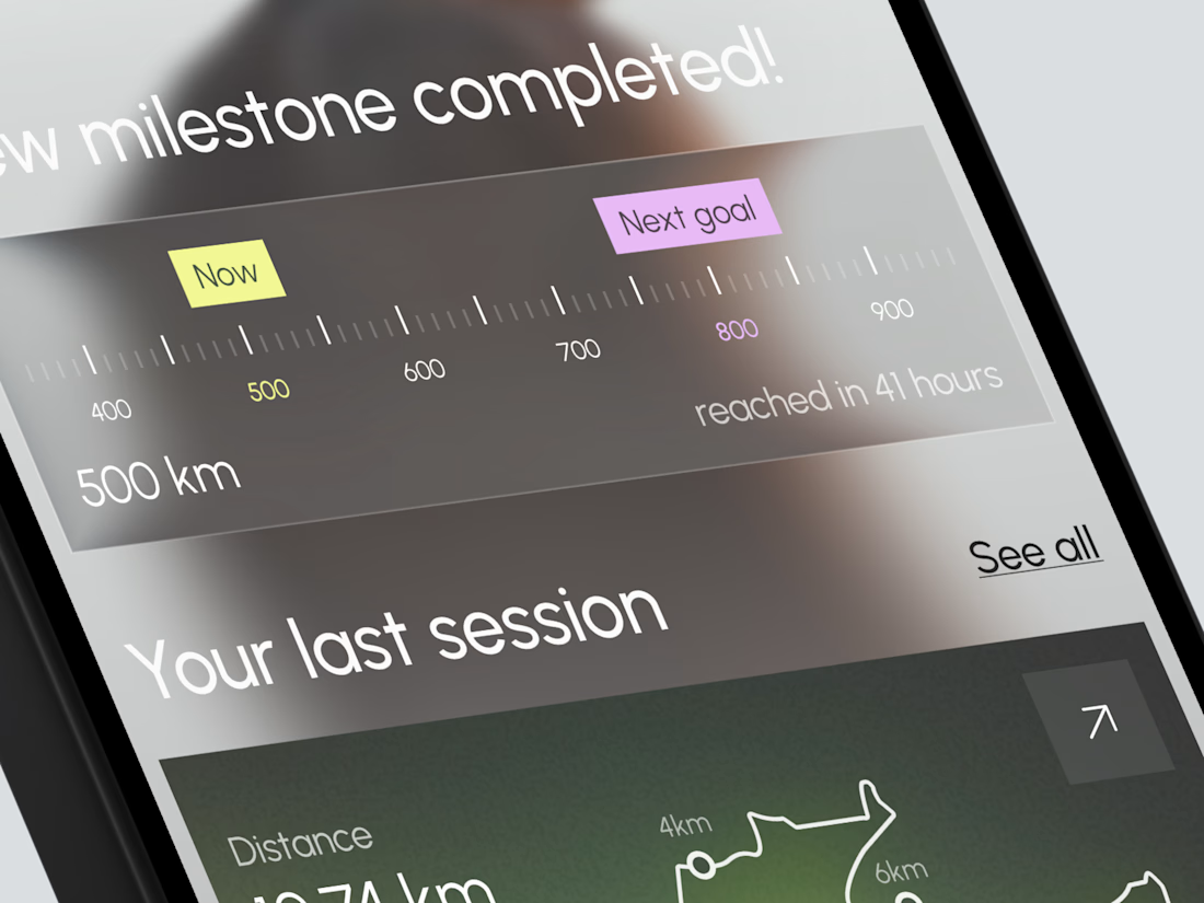
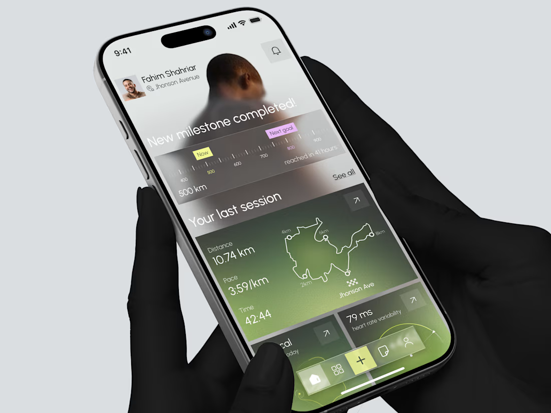
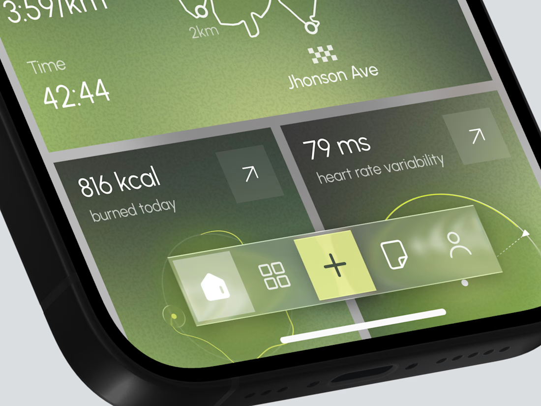
Designed a modern Fitness Tracking Mobile App.
Clean and motivational UI with milestone progress, last session map, distance, pace, calories, and heart rate insights for better running performance.



Thank you so much
The network for creativity
Join 1.25M professional creatives like you
Connect with clients, get discovered, and run your business 100% commission-free
Creatives on Contra have earned over $150M and we are just getting started




Related posts

Vowelle is now live on @framer Marketplace 🤍
As far as I could find, it’s the first dedicated bridal shop template there.
20 CMS dresses, dynamic filters, My Fitting favourites, and appointment booking.
Free for a limited time 👀
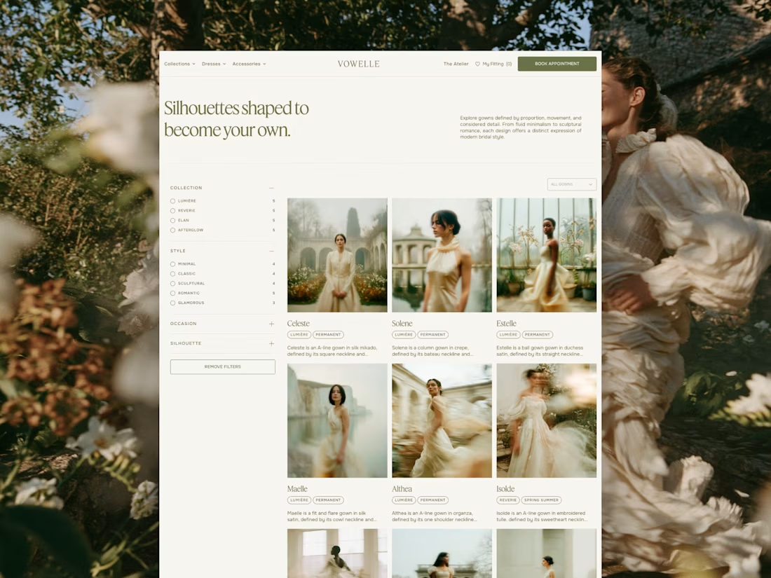
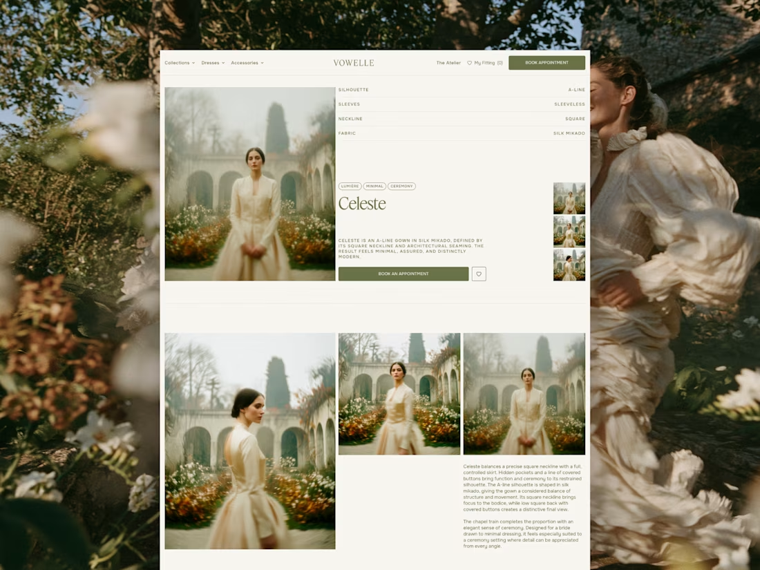

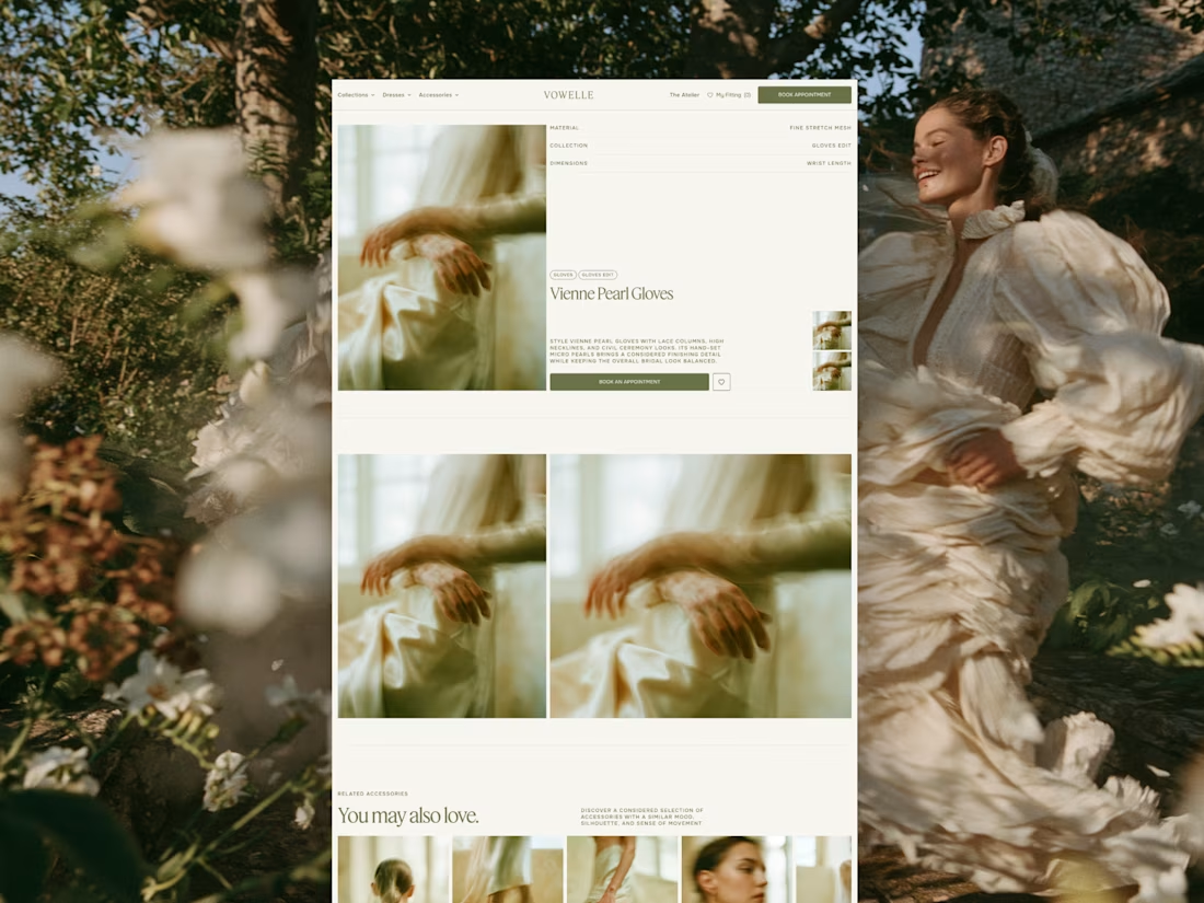

I liked the nav bar on this one, the dropdowns look Good. Plus the whole template is so clean and well thought. Great Work.

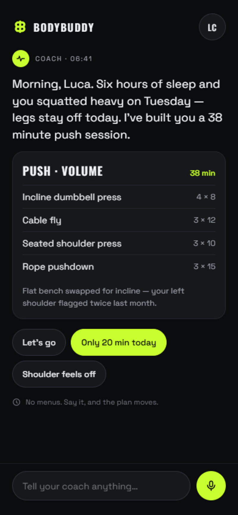
Two ways to build the same fitness app.
A: AI-first. No tabs, no dashboards. The app is one conversation with a coach that already knows you slept six hours and squatted heavy on Tuesday. You log sets by talking. The plan rewrites itself mid-workout.
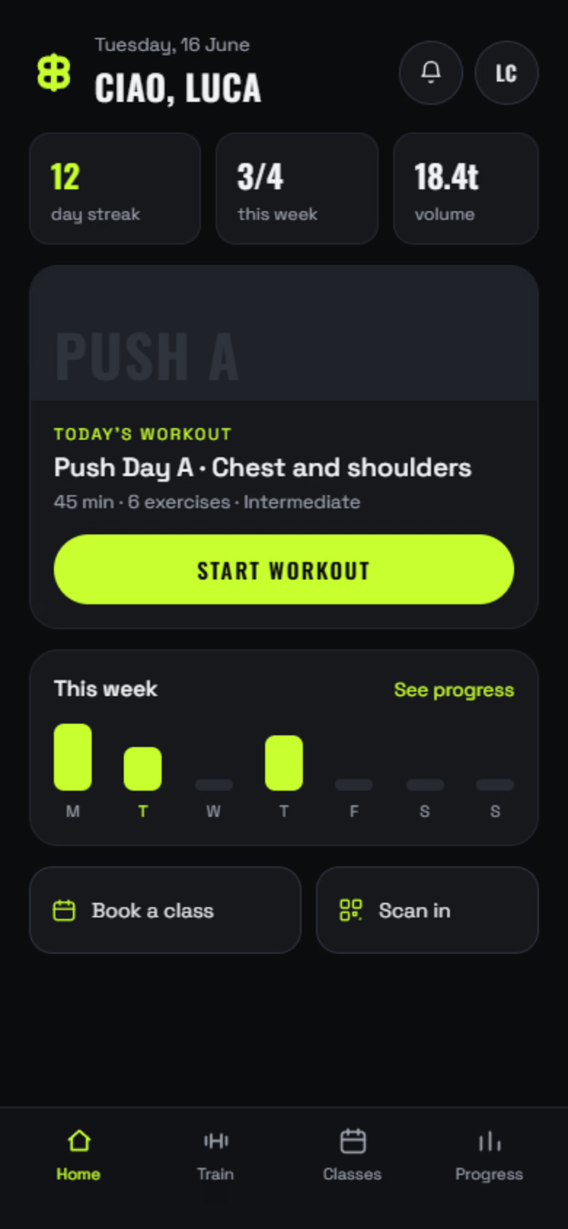
B: The modern standard. Home, today's workout, set-by-set logging, class booking, progress. Everything a member expects, done properly.
Same brand, same components, same build quality. The only real difference is how much you're asking the user to unlearn.
Most gyms should ship B. A few should bet on A.
Which one would you open tomorrow morning?
1 voted
25%
3 voted
75%
4 votes
Closed

Going with A here, the idea of the plan rewriting itself mid-workout instead of you scrolling a dashboard feels like where fitness apps eventually land. Would you actually ship the AI-first version to real users right now, or is it more of a thought experiment at this stage?

Which color direction feels right for this digital payment app?
While designing a full digital payment app experience, from bills overview to payment confirmation, I explored two different color systems for the entire flow. Same screens, same functionality, just a different accent palette and personality.
Option 1 - Neon Green. Bold, high-energy, and gives a sharp, fintech-forward feel throughout the journey.
Option 2 - Cyan/Blue. Cool, modern, and leans more premium and trustworthy across the whole app.
Would love your honest UX/UI take, which direction feels more trustworthy, engaging, and appropriate for a digital payment app, and why? 👇
3 voted
38%
5 voted
62%
8 votes
Closed

Cyan/Blue