The network for creativity
Join 1.25M professional creatives like you
Connect with clients, get discovered, and run your business 100% commission-free
Creatives on Contra have earned over $150M and we are just getting started
Back to feedPost
Taste Test

Two ways to build the same fitness app.
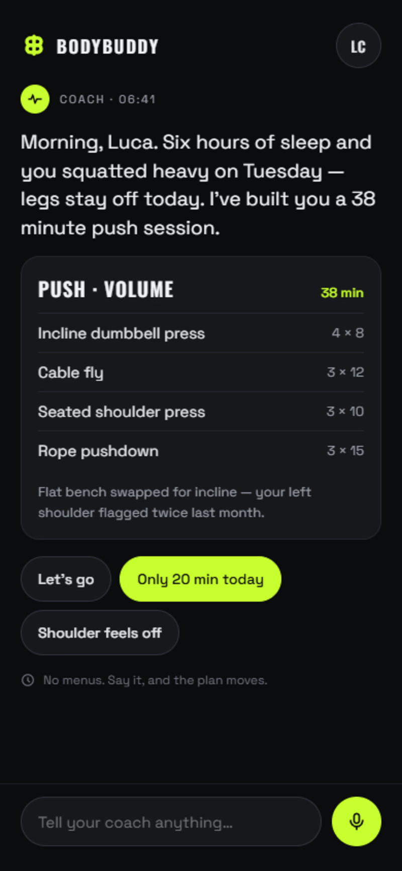
A: AI-first. No tabs, no dashboards. The app is one conversation with a coach that already knows you slept six hours and squatted heavy on Tuesday. You log sets by talking. The plan rewrites itself mid-workout.
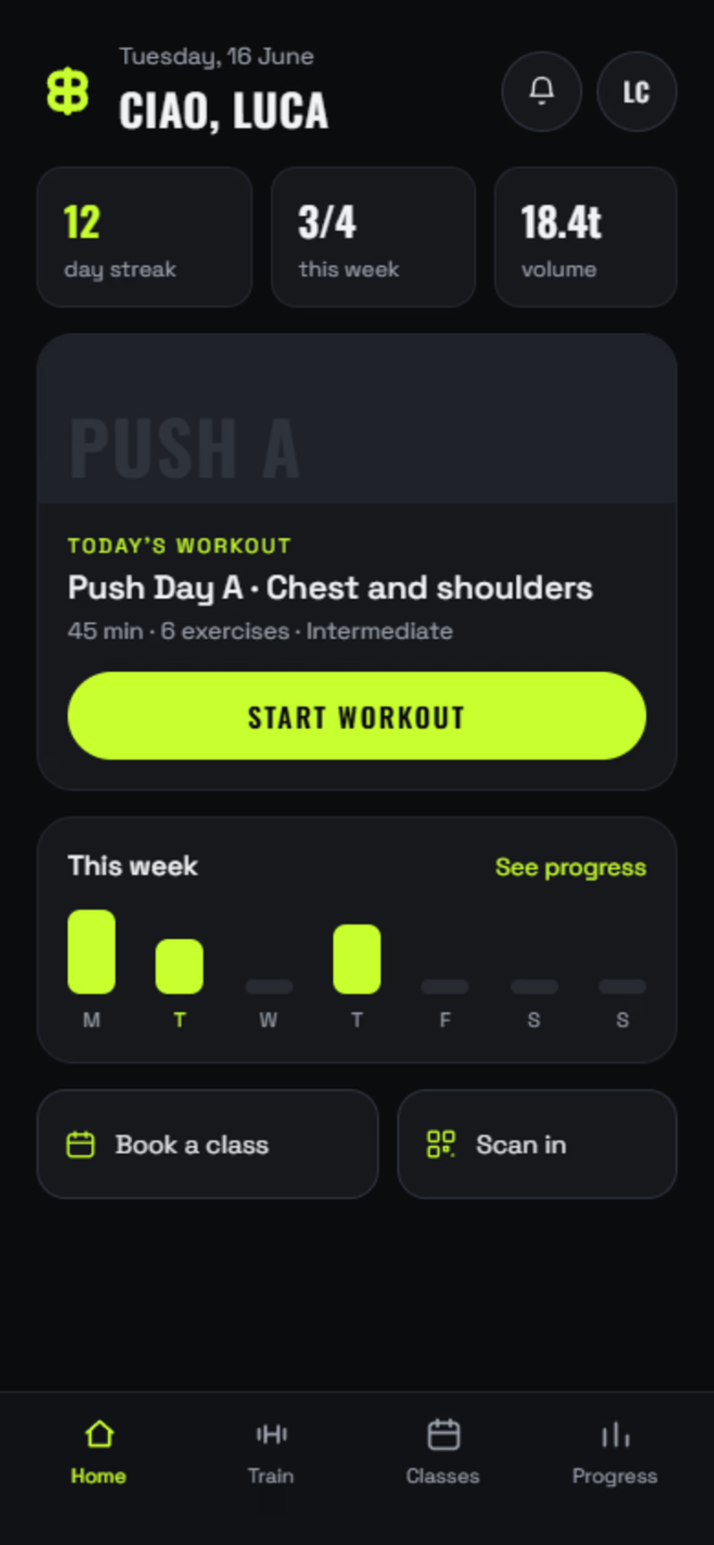
B: The modern standard. Home, today's workout, set-by-set logging, class booking, progress. Everything a member expects, done properly.
Same brand, same components, same build quality. The only real difference is how much you're asking the user to unlearn.
Most gyms should ship B. A few should bet on A.
Which one would you open tomorrow morning?
1 voted
25%
3 voted
75%
4 votes
Closed

Thanks mate I appreciate it. Yeah I feel it gives a nice vibe to the app.

A is the more interesting product, but B is what a member can learn in a minute. The conversation version only lands if the logging version already earned their trust.
That is very true, thanks for the feedback mate, much appreciated.

Going with A here, the idea of the plan rewriting itself mid-workout instead of you scrolling a dashboard feels like where fitness apps eventually land. Would you actually ship the AI-first version to real users right now, or is it more of a thought experiment at this stage?
It's something I am currently working on, I would like to ship it out in the near future, as I believe the fitness industry will eventually head in this direction.
Thank you to everyone that voted and commented, it much appreciated.
The network for creativity
Join 1.25M professional creatives like you
Connect with clients, get discovered, and run your business 100% commission-free
Creatives on Contra have earned over $150M and we are just getting started











Related posts


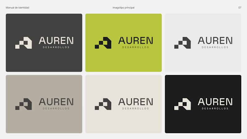
Same brand. Same palette. Two completely different proposals for a real estate developer.
A: An isotype built from blocks. Geometric, precise, the language of construction. It says we build.
B: Custom lettering with movement. Warmer, more editorial. It says we build places you’d want to live in.
36 voted
51%
35 voted
49%

71 votes
Closed

My vote is B, Milagros. Custom lettering with movement has real editorial warmth, which suits a developer selling places people actually want to live in.

Brand identity exploration
Which one do you think it fits better?
36 voted
77%

11 voted
23%

47 votes
Closed

Cobalt is great Gold is unique 🎉🎉🔥🔥

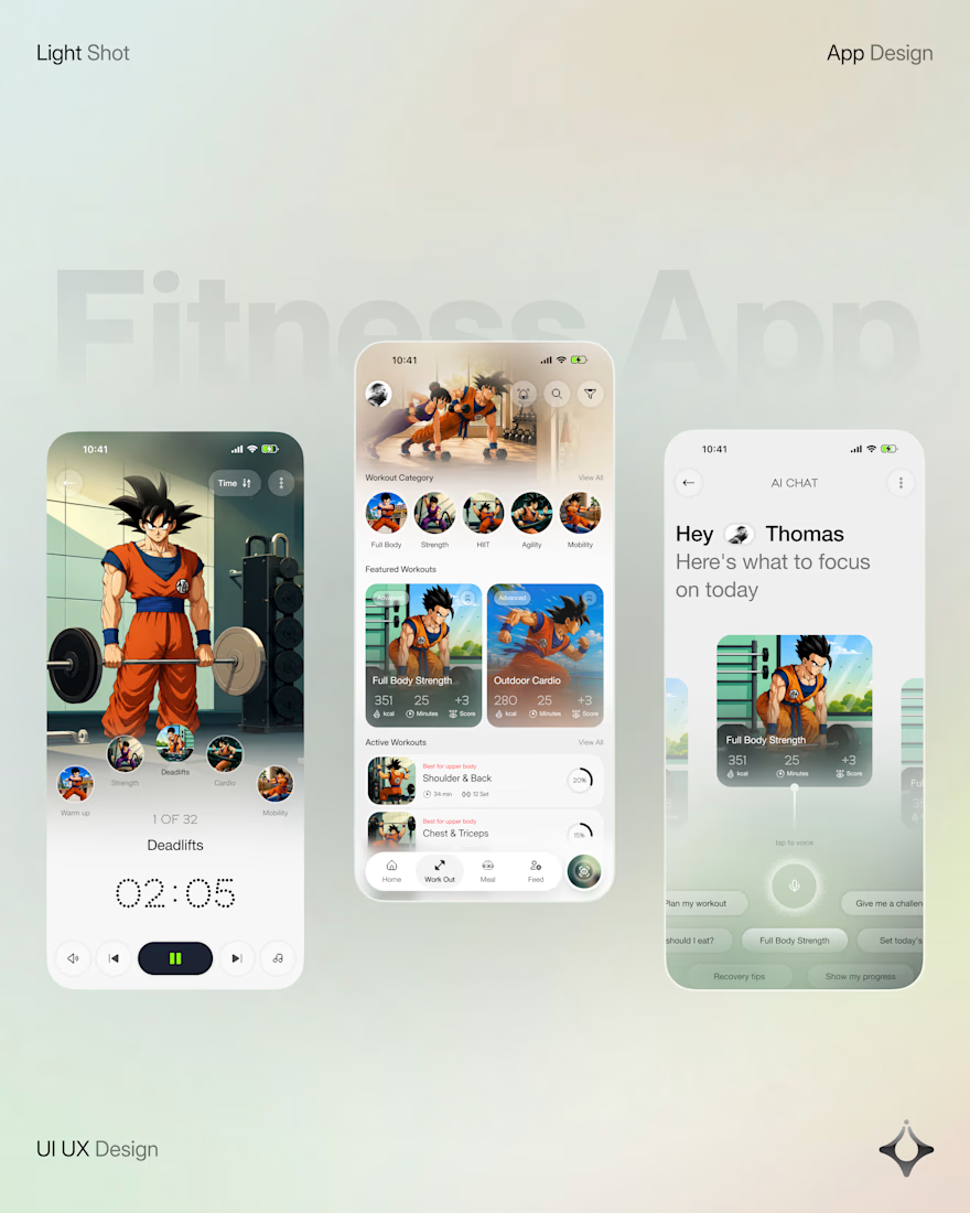
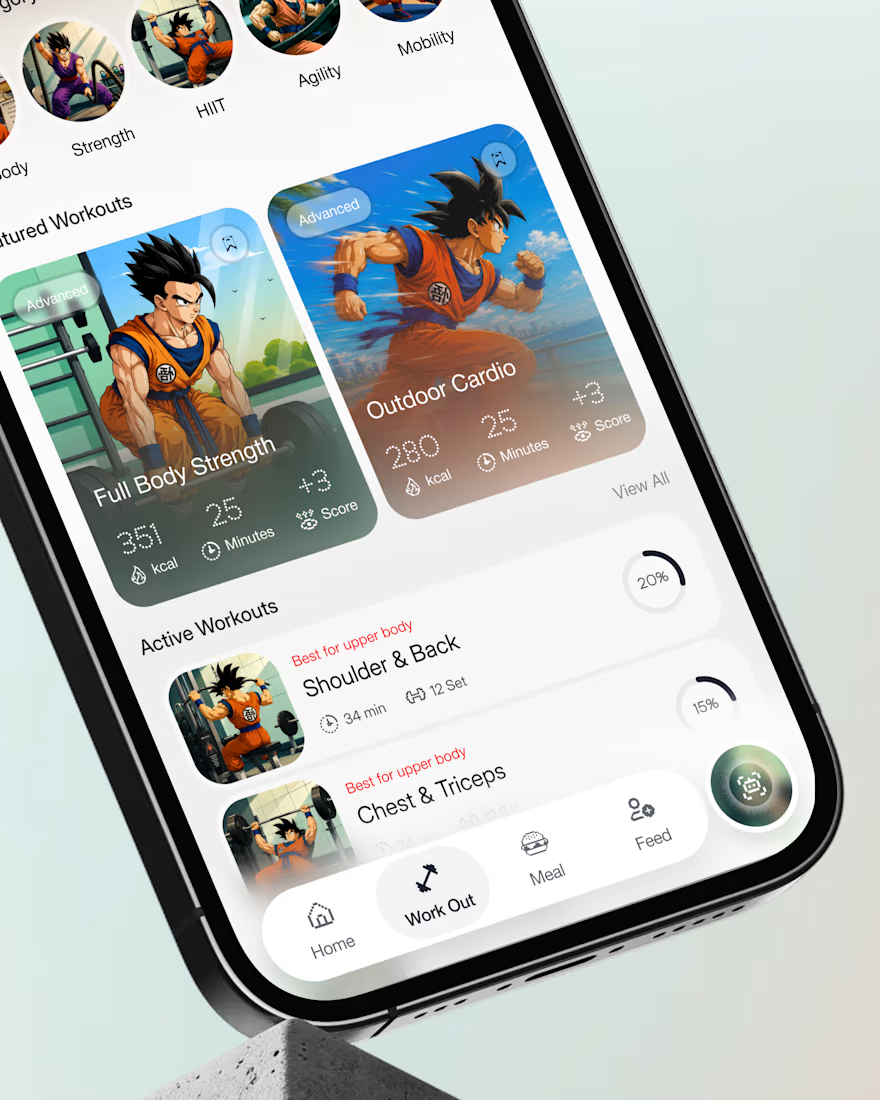
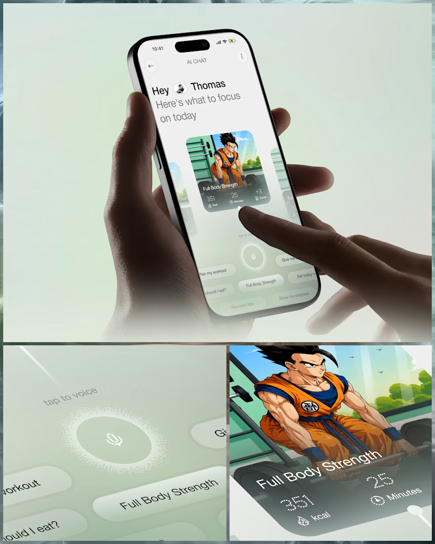
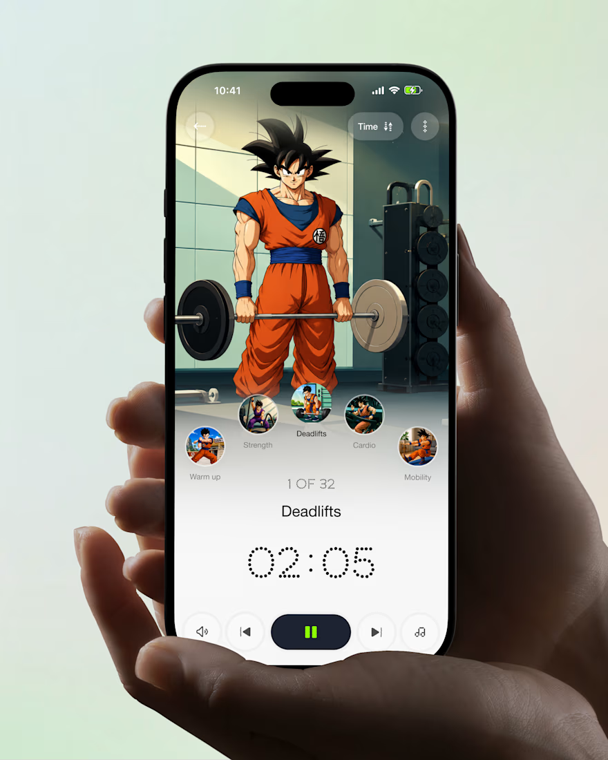
What if your fitness app felt like having a personal trainer in your pocket?
Meet your new workout companion. A bold fitness app concept combining personalized workouts, AI coaching, and a seamless mobile experience to make every session count.
Would you use this to level up your fitness journey?



Ye le Jani Juice Lab wali post ke liye copy-ready:
Love this concept Juice Lab! A fitness app that feels like a personal trainer in your pocket is exactly what's needed — combining personalized workouts with AI coaching and a seamless mobile experience is a great approach. The...