The network for creativity
Join 1.25M professional creatives like you
Connect with clients, get discovered, and run your business 100% commission-free
Creatives on Contra have earned over $150M and we are just getting started
Back to feedPost
Taste Test

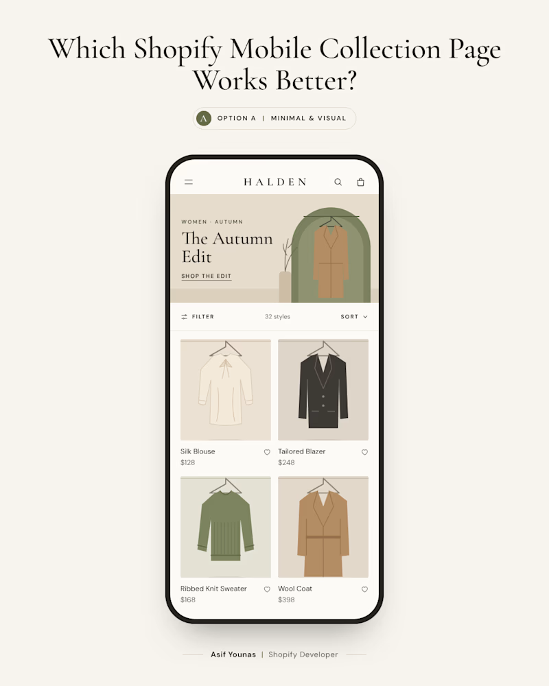
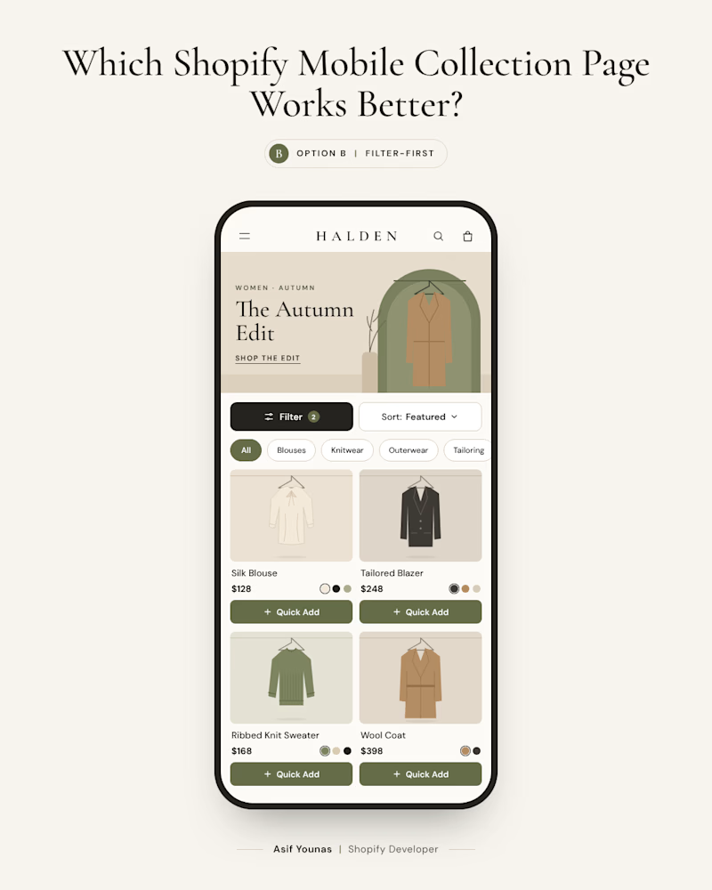
Two Shopify collection pages. Same products. Different shopping experiences.
Option A: A clean 2-column product grid with minimal filters and large product images.
Option B: A compact product grid with visible filters, sorting, and quick-add options.
A feels more spacious and premium.
B gives shoppers more control, especially when browsing a large catalog.
But here's the interesting part: more features don't always mean a better shopping experience.
On mobile, screen space is limited. Every extra control competes with the products themselves.
Which approach would you choose for a Shopify fashion store?
A: Minimal and visual
B: Filter-first and functional

2 votes
Ends in 1d

Minimal! Custom coding?
The network for creativity
Join 1.25M professional creatives like you
Connect with clients, get discovered, and run your business 100% commission-free
Creatives on Contra have earned over $150M and we are just getting started
Related posts

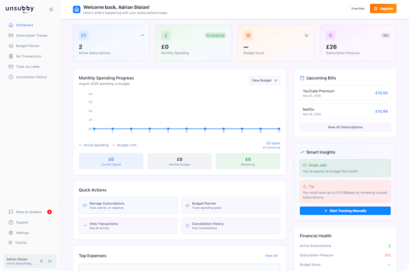
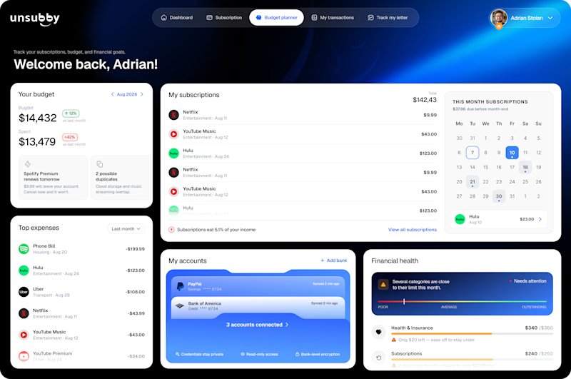
On the left is the original design. On the right is the redesign by Lunis Design Lab.
Which version would you prefer to use, and why? 👇🏻
1 voted
10%
9 voted
90%
10 votes
Closed


Two warm ups today, both might become full case studies:
Parlata: an audio-postcard service that records and archives local dialects. Every recording becomes a small printed card with a QR link.
MODULO: an Industrial IoT brand. Olive, navy, one wobbly blob.
One is warm and human. One is technical and playful. Which would you want to see go all the way?
31 voted
63%
18 voted
37%
49 votes
Closed

Love it

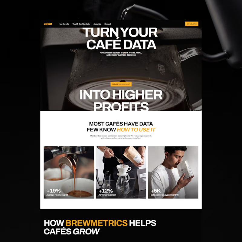
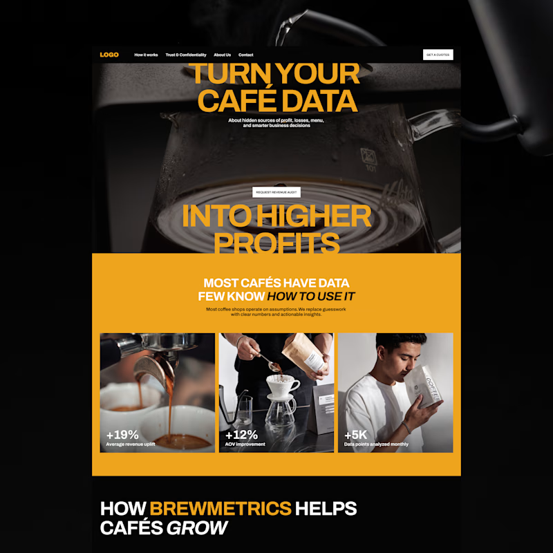
Exploring two color palette directions. Which one are you going for? 👀

13 voted
57%
10 voted
43%
23 votes
Closed

the bold gold of b is a winner by me!