The network for creativity
Join 1.25M professional creatives like you
Connect with clients, get discovered, and run your business 100% commission-free
Creatives on Contra have earned over $150M and we are just getting started
Back to feedPost

Looks like the crypto market's heating up again.
Kasta was a crypto app. Over 19 months we designed something I'm still proud of. This is the card experience.
Interactions are what separate a product that works from a product that feels premium. Same features, same screens. Completely different perception of value.
And when an app feels this considered, people trust it with more of their money. Deposits grew 25% on the release of the debit card feature.
#ProductDesign #Fintech #UXDesign #DesignStrategy


This is super amazing.

Great work

A 25% bump in deposits is huge. Was that mostly from new users trusting the app faster or existing users depositing more?

Completely agree with this philosophy. The micro-interactions and smooth card transitions are what make an interface feel responsive and alive rather than static. Beautifully executed, Novatur!

Clean work

amazing


25% from a card feature is wild

25% deposit growth tied directly to a card feature release is a great number to have in your back pocket for future pitches. Did you have that kind of measurable lift as a goal going in, or was it a pleasant surprise once it shipped?

love these color options, plus the floating effect is so fun!


Really Amazing work👏

The dot indicators under the card carry more weight than they look — swapping card color live instead of a static swatch picker is what makes a virtual card feel owned rather than just issued.

This deserves more than just liking, this deserves to be featured! 🏆 Micro-interactions on payment card UI elevate standard features to an elite level.

Looks amazing! Feels more live!

Nice and clean work

Super clean animation! I also think the crypto space is heating up once again. I have made a product launch video for a crypto exchange, happy if you check that out: https://youtu.be/JXWKuRlr-hw
The network for creativity
Join 1.25M professional creatives like you
Connect with clients, get discovered, and run your business 100% commission-free
Creatives on Contra have earned over $150M and we are just getting started





Related posts


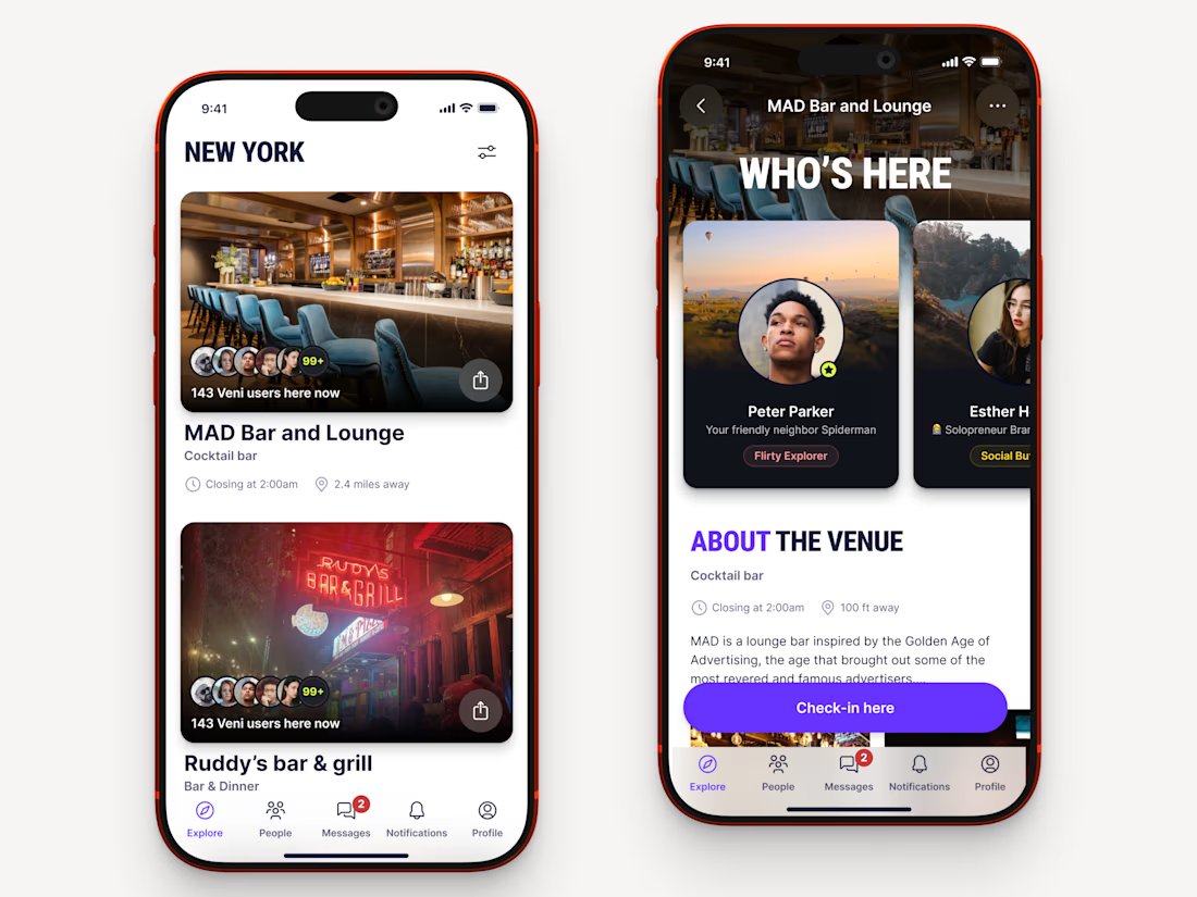
Recently worked on a mobile app for local networking.
Find venues (bars, clubs, conference halls, etc..) nearby, see who's there and connect.



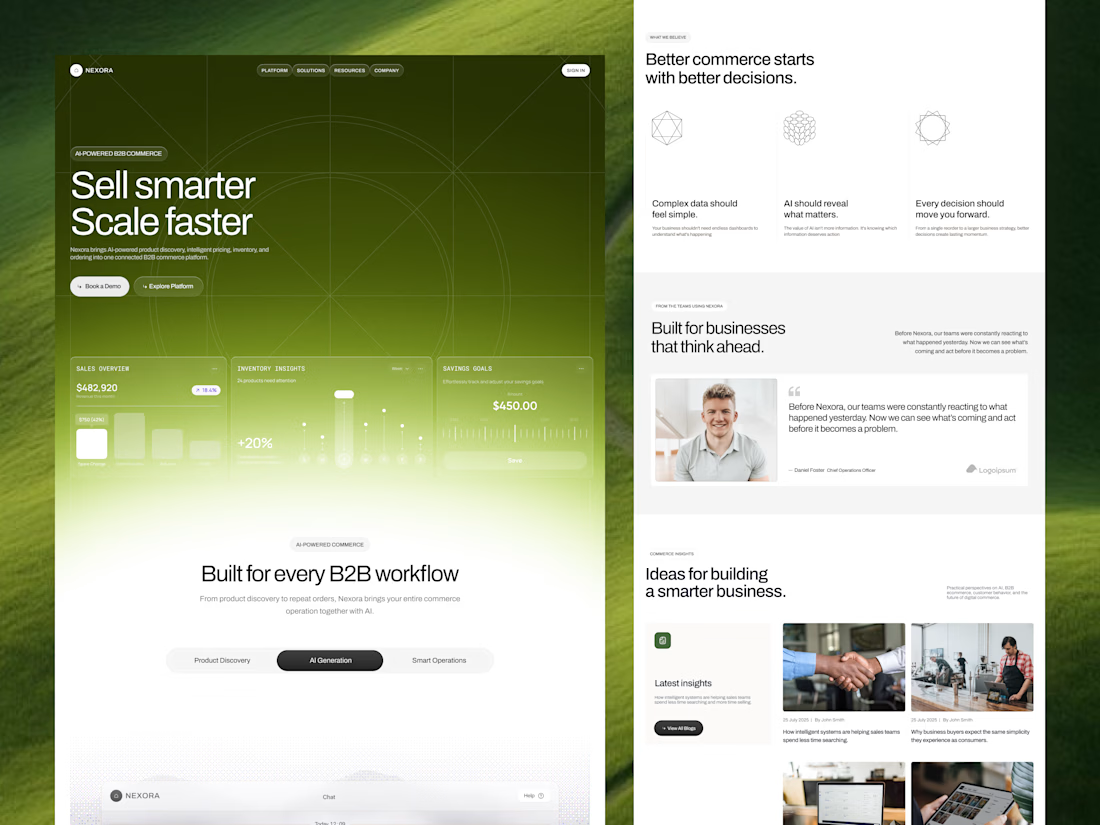
Our goal was to make pricing, inventory and ordering data feel simple and human for an AI-powered B2B commerce platform. We'd love to hear your thoughts!

Engaging background and nice gradient to not make the section look seprate 🔥

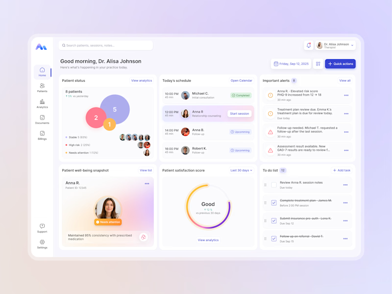
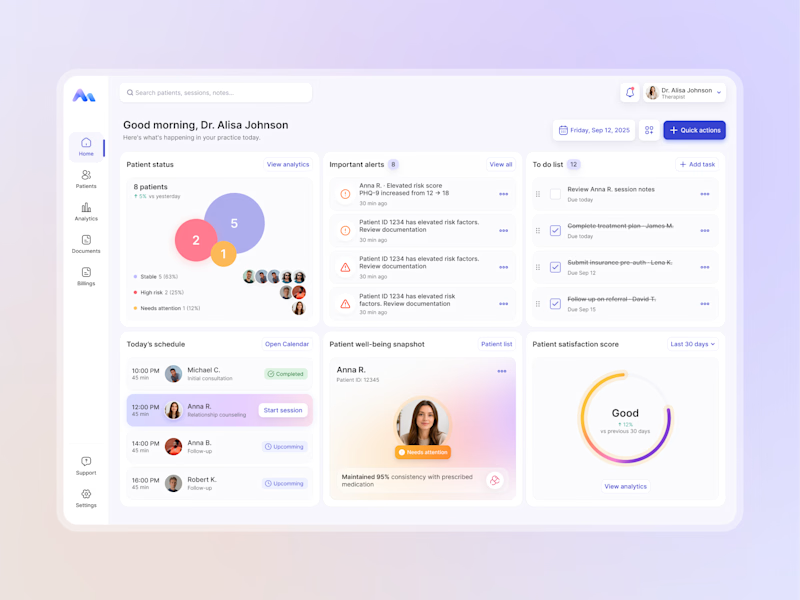
Designing for therapists means prioritizing what matters in the next few minutes, not just what looks good on a dashboard.
I explored two layout directions for a mental health practice management web app that helps psychologists manage sessions, patients, documentation, tasks, and follow-ups.
Both concepts use the same core widgets, but with different positioning and visual hierarchy. The goal was to make daily priorities easier to scan and act on.
Which option feels more intuitive - A or B? 🤔
17 voted
68%
8 voted
32%
25 votes
Closed