The network for creativity
Join 1.25M professional creatives like you
Connect with clients, get discovered, and run your business 100% commission-free
Creatives on Contra have earned over $150M and we are just getting started
Back to feedPost
Traditional loan apps often overwhelm users with chaotic designs and opaque terms, leading to high drop off rates. I saw an opportunity to rebuild the relationship between borrowers and lenders.
Introducing Loaner: a solution designed around clarity, simplicity, and unwavering transparency. By prioritizing the user's need for honest information, we created an interface that builds instant trust and facilitates faster decision making.
This design restructured the entire loaning framework. By analyzing competitor friction points and deep diving into user personas, I streamlined a scalable flow that turns a stressful process into an empowering experience, converting visitors into long-term loyal users.
Here's a link to the design in development - Project link
This is a really meaningful problem to solve! Loan apps are notorious for confusing UX — designing around clarity and simplicity could genuinely change how people feel about borrowing. Excited to see where Loaner goes!
Thanks my mentor.
Nice Work 😍
Thank you Nazma
Most welcome
The network for creativity
Join 1.25M professional creatives like you
Connect with clients, get discovered, and run your business 100% commission-free
Creatives on Contra have earned over $150M and we are just getting started
Related posts
The first one gives less cognitive overload 🔥
Small visual changes can completely change how a product feels.
Imagine you're the client.
You paid for this dashboard.
Which version would you approve?
🅰️ A
🅱️ B
I'm curious what catches your eye first.
#uidesign #dashboard #saas #figma #productdesign #webdesign #uxdesign #sports #designfeedback #contra
14 voted
58%
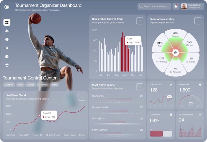
10 voted
42%
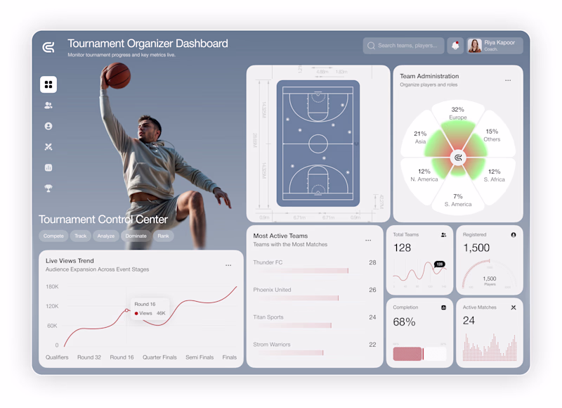
24 votes
Closed
I prefer A. The hero section grabs my attention immediately.
I designed a website and 3d animations for Ngen.
This is mesmerizin 🔥
Challenges
View allTrending
Claude
Claude has entered the design space. How are you using Claude Design?
Contra University
Learn from expert creatives how to earn more using next-gen AI tools.
fifaworldcup2026
The World Cup is here and the whole world's watching. How are you designing for the world stage?
creativeaiflow
Creative AI workflows are evolving. What tools do you use, and what are their strengths and weaknesses?
freelancerlife
Freelancer life is wins, pivots, and everything in between. What’s yours right now?