The network for creativity
Join 1.25M professional creatives like you
Connect with clients, get discovered, and run your business 100% commission-free
Creatives on Contra have earned over $150M and we are just getting started
Back to feedPost

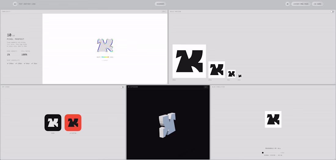
Every logo starts the same way, with a simple idea.
But getting it right? That’s where things get interesting.
This one came together through a mix of late-night exploration, testing fonts that almost worked, and refining the one that finally felt right. (Yes, staring at fonts for 20 minutes straight is part of the process.)
The goal was clear: create something clean, confident, and memorable, with a distinctive “D” insignia that could stand on its own.
Once the typography clicked, everything else started to align.
The color direction? Smooth process, the client already had a strong vision, which made execution even sharper.
From there, it was all about refining, adjusting, and pushing the details until it felt complete.
And this is the final result.
What do you think?
The network for creativity
Join 1.25M professional creatives like you
Connect with clients, get discovered, and run your business 100% commission-free
Creatives on Contra have earned over $150M and we are just getting started
Related posts

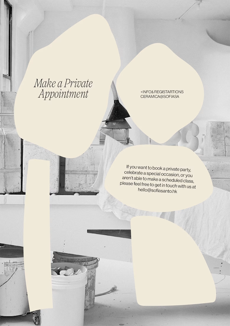
Brand identity for Ceramic studio
Graphic identity conveys authenticity, craftsmanship, and modernity. We suggested combining classic serif fonts with modernist minimal sans-serifs. This balances tradition with modern simplicity for a sophisticated composition.
We used an irregular texture inspired by clay, simulated through stamp-like illustrations. This evokes earth and manual work, suggesting a human touch. For colors, we used earth tones with a vibrant accent for highlights. The typography creates an elegant, contemporary visual dynamic.


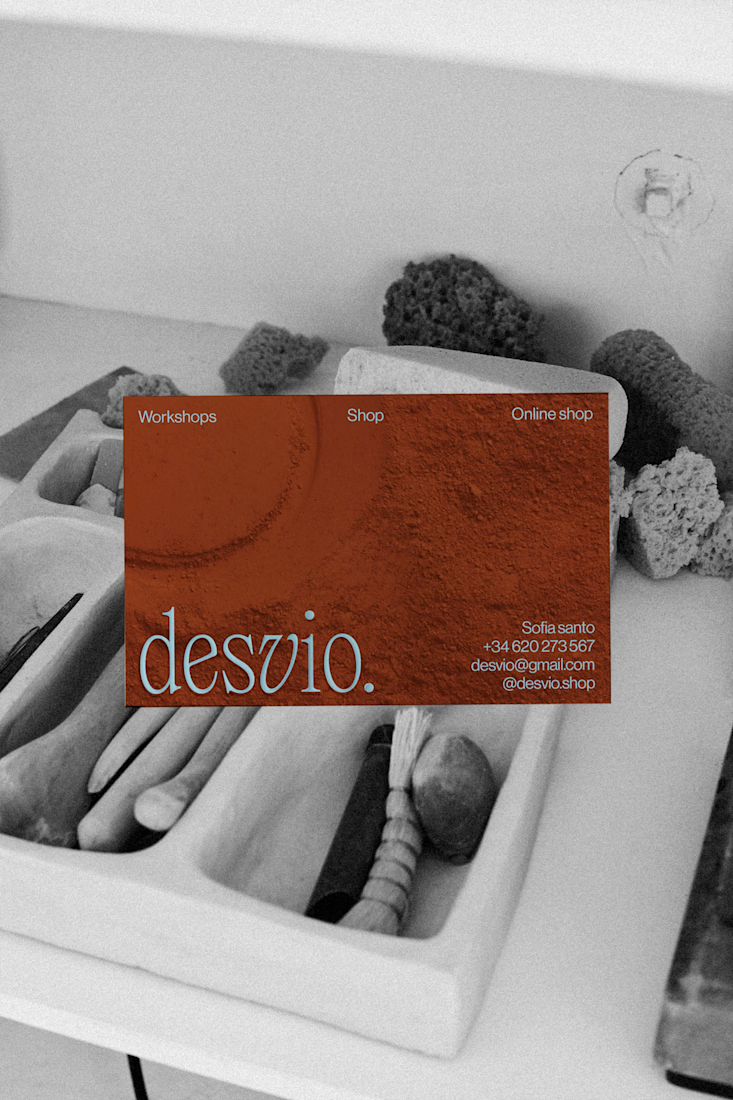
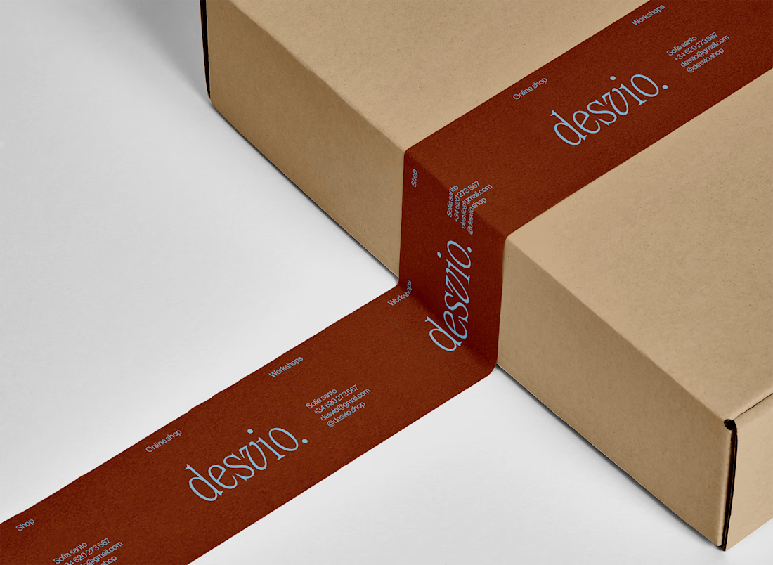
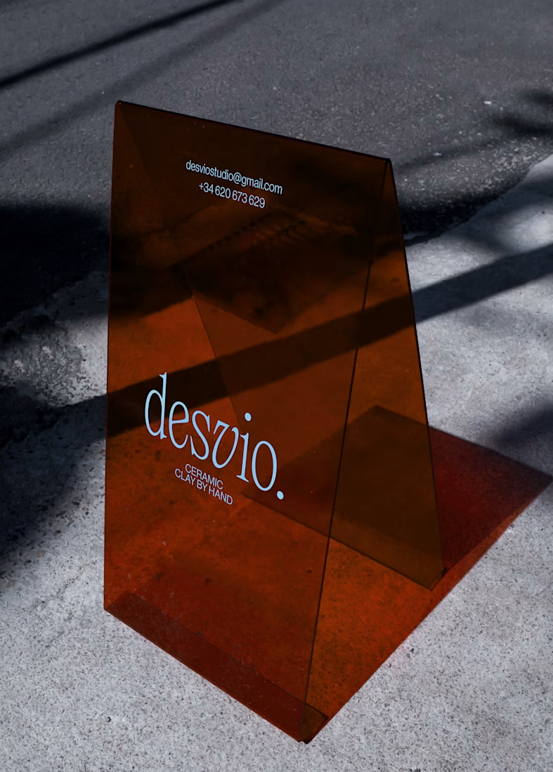

The clay texture detail with stamp-like illustration is such a thoughtful design choice — it literally makes you feel the material. desvio. has such a strong, tactile identity. The terracotta palette is perfect for a ceramic studio!


this is sick! I just stress-tested my logo with this tool symbl.space
10/10 rating 🏆

nice
my favourite part of this project?
The photograph of croissant came first. then matched every color to what I saw.
no mood boards. no references. just warm butter, cold marble, and a script logo that moves like a broad-nib pen at 45 degrees.
the brand is called Dorure, named after the egg wash that makes a croissant shine.
full case study below 👇


Trending


Figma Make
Go from idea to prototype in minutes. What are you designing?
aivideo
AI video tools are moving at warp speed. Which ones are you experimenting with?
illustration
Handcrafted illustration is bubbling up across the web. What are you drawing lately?
aidesignflow
AI tools are redefining design work. What's your current workflow?
freelancerlife
Freelancer life is wins, pivots, and everything in between. What’s yours right now?
