
Anastasia Kochetkova
Crafting soulful brand identities based on psychology.
New to Contra
Anastasia is ready for their next project!
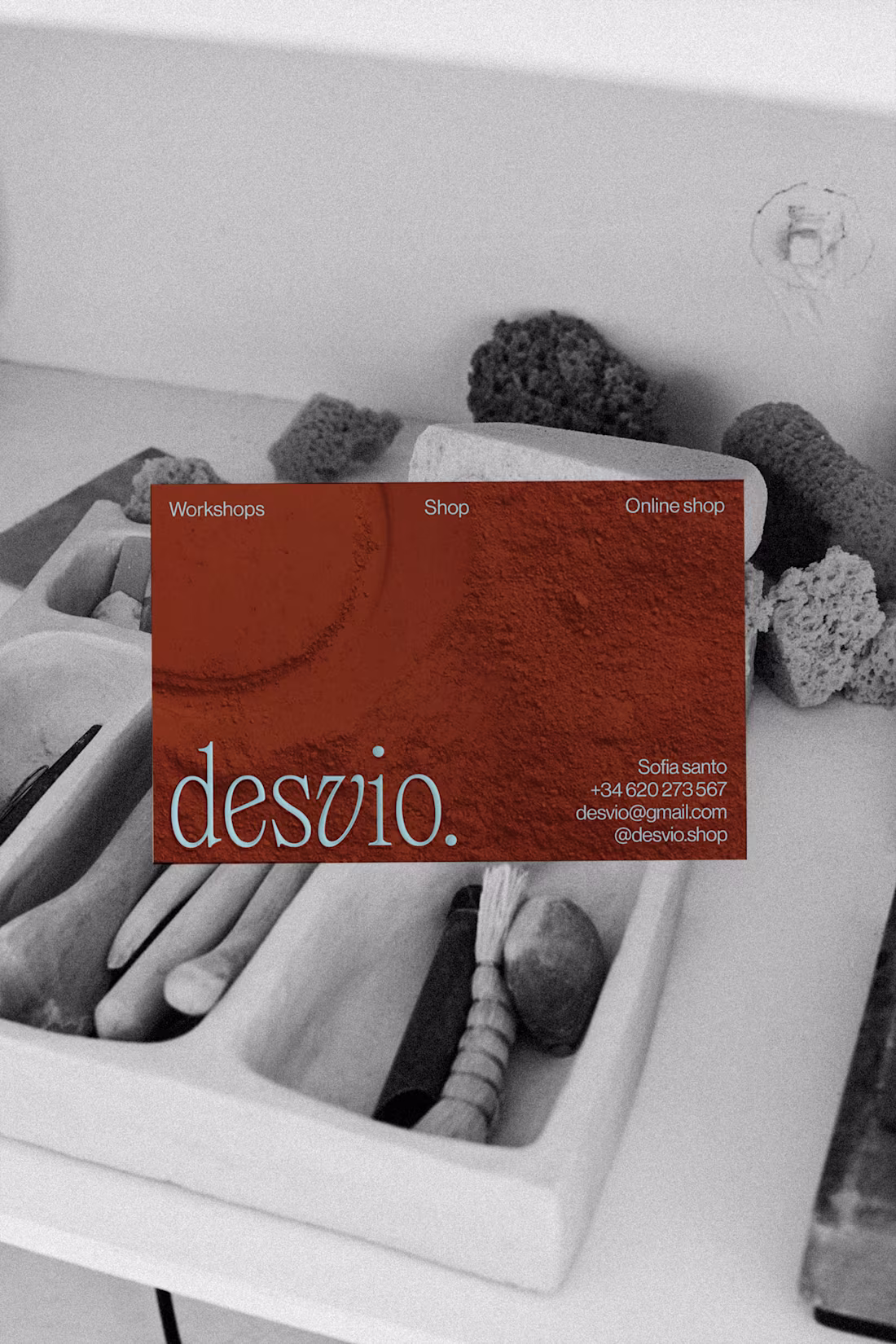
Brand identity for Ceramic studio
Graphic identity conveys authenticity, craftsmanship, and modernity. We suggested combining classic serif fonts with modernist minimal sans-serifs. This balances tradition with modern simplicity for a sophisticated composition.
We used an irregular texture inspired by clay, simulated through stamp-like illustrations. This evokes earth and manual work, suggesting a human touch. For colors, we used earth tones with a vibrant accent for highlights. The typography creates an elegant, contemporary visual dynamic.
24
98
1.6K
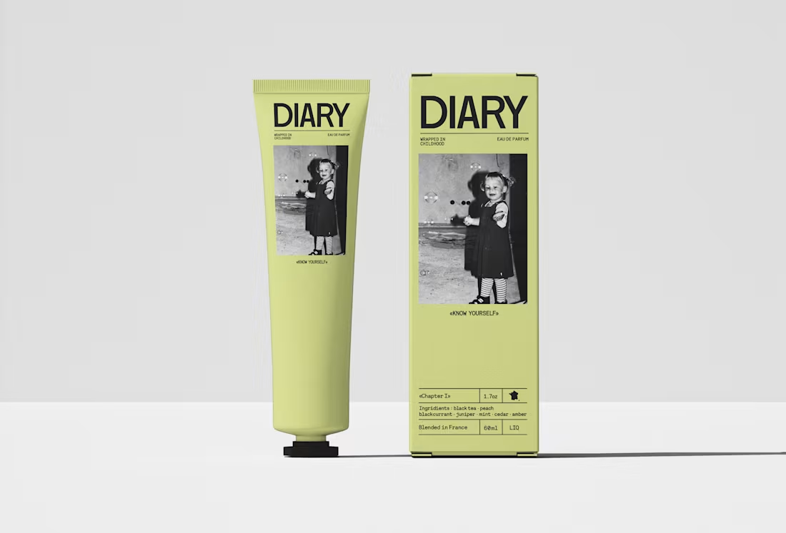
«DIARY»
Brand Identity application for fragrance brand (Case Study)
This brand of perfume is based on the memories of youth and childhood, this feeling that you can find support inside yourself just by turning to your warm memories, and the diary is exactly the place where we keep our most sincere experiences and feelings.
The challenge was to visually represent this delicate balance between nostalgia and present-day strength. I chose a sans-serif typeface to convey confidence and boldness, while soft, light yellow accents evoke the warmth and faded memories of childhood. The result is a visual identity that is both nostalgic and empowering.
1
240
Brand Identity application (Case Study)
This project involved designing and developing a vibrant and interactive website for a local cocktail festival. Recognizing that many similar festivals cater primarily to an older demographic, we aimed to create a more accessible and youthful experience for a target audience aged 20-30.
To achieve this, we incorporated a vibrant color palette and simplified the user experience, emphasizing a dynamic layout, playful animations, and engaging user interactions. The goal was to embody the festival's energetic and experimental spirit, creating an online experience that is as exciting and immersive as the festival itself.
1
233
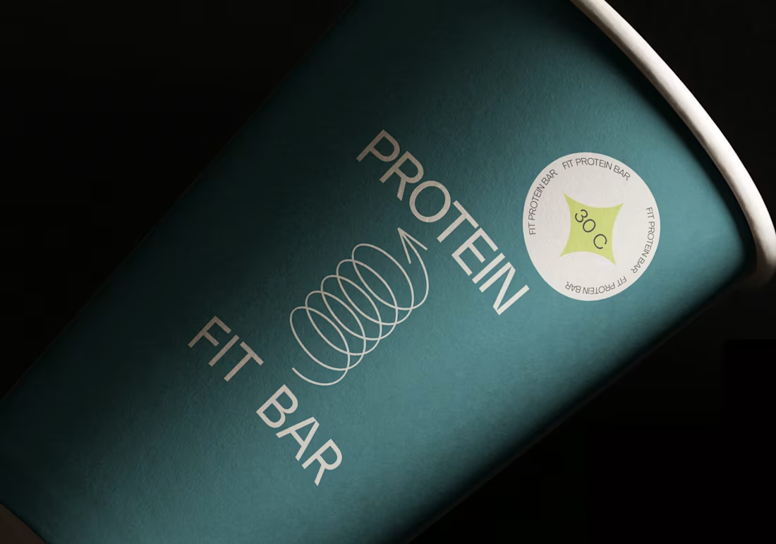
Brand Identity application (Atelier Maldonado)
Protein Fit Bar wanted to grow beyond their popular Hygge Cafe and reach more health-conscious people. They saw that many people, especially those who work out, were looking for healthy and easy-to-eat foods.
The challenge was to create a brand that appealed to both men and women, unlike most sports nutrition brands that focus mainly on men.
Atelier Maldonado wanted to make a brand that was both exciting and welcoming to everyone. Instead of using the tough, masculine look common in the industry, they aimed for a fresh and modern style that would attract a wider audience. The design balanced athleticism with a more sophisticated look, creating a brand that was both energetic and refined.
1
1
230