The network for creativity
Join 1.25M professional creatives like you
Connect with clients, get discovered, and run your business 100% commission-free
Creatives on Contra have earned over $150M and we are just getting started
Back to feedPost

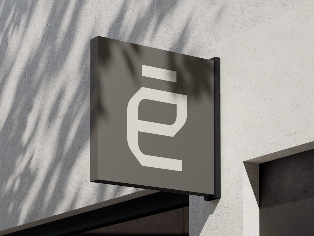
What if construction felt as clear as the space it creates?
For Arqētia, we built a visual identity around one of the industry's most important client needs: transparency. A direct response to the uncertainty often associated with construction, from unclear processes and budgets to timelines and decision-making.
The concept makes transparency tangible, translating it into a visual system that feels open, structured and precise.
check it out
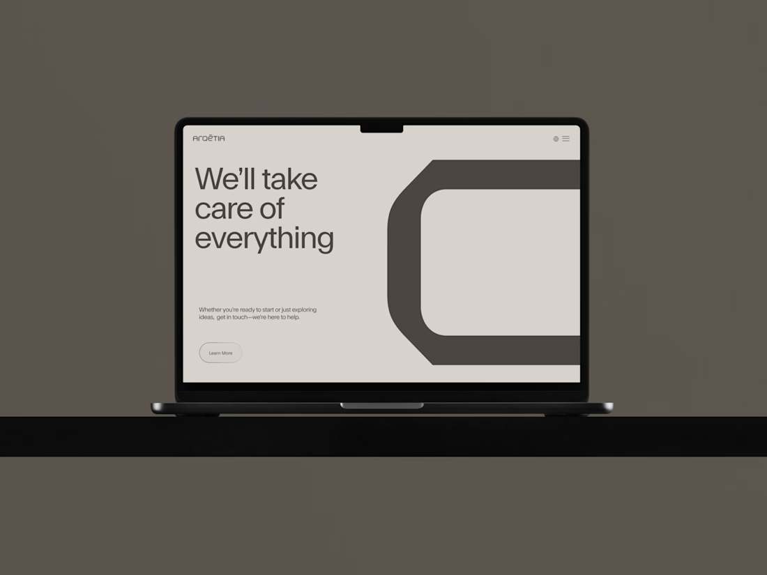
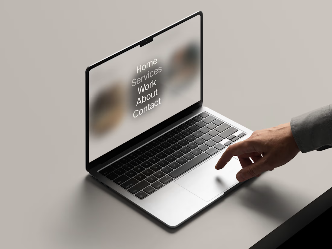
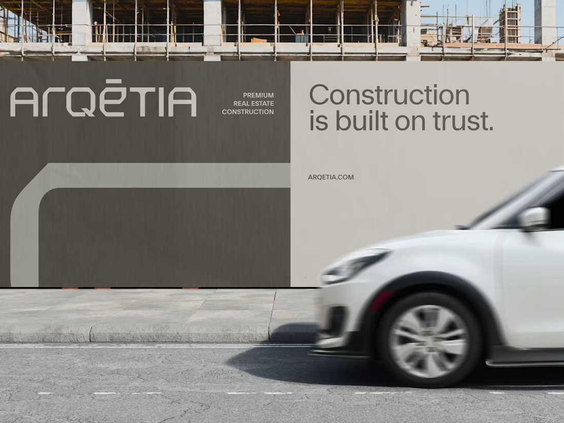

Those social posts, and the layouts in general are so so structured and really show how good the brand is!! Well done once again.

Building the identity around transparency is a smart move for construction. It feels clear and honest.


This feels really refined. Love how the typography and muted palette make the brand feel trustworthy and premium.


clean, fits construction well

love this design

Incredible web design congrats 🔥🔥🔥

amazing , clean

Great 👍

Nice work keep sharing

Using transparency as the central brand value for a construction identity is a strong, defensible position — most brands in that industry lean on strength and permanence. If the system extends into the website, I'd watch how the transparency metaphor survives in navigation and...

Very clean identity work


diablo que brutal!! it feels like structurally sound like a cinder block.

Love it! clean grid structures, generous whitespace, and zero clutter

very cohesive and professional loved it

Awesome work.
The network for creativity
Join 1.25M professional creatives like you
Connect with clients, get discovered, and run your business 100% commission-free
Creatives on Contra have earned over $150M and we are just getting started





Related posts

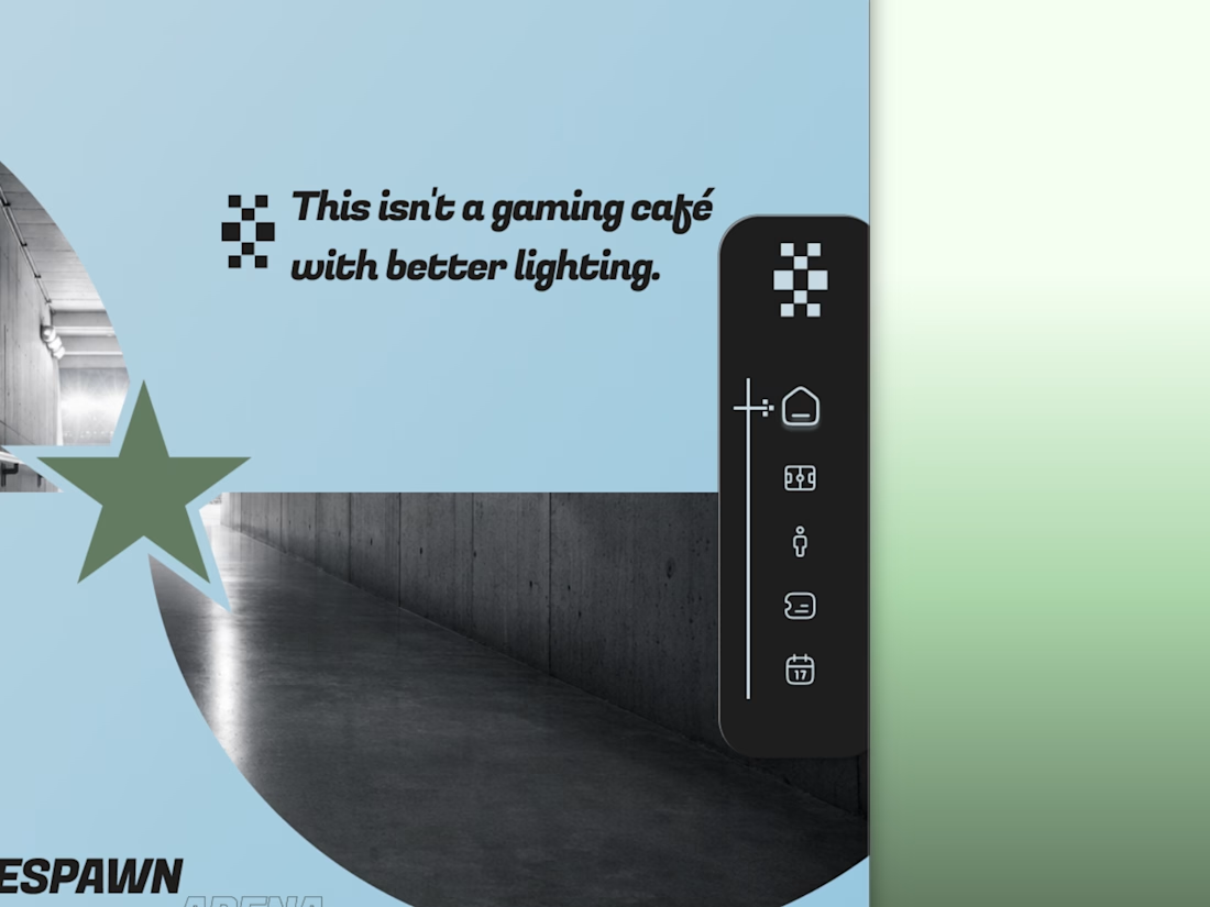
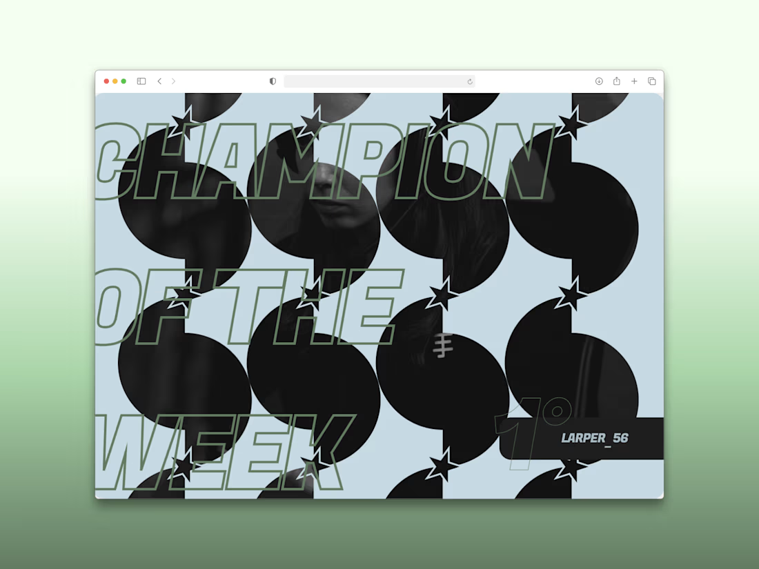
Every esports brand reaches for neon and a mascot.
RESPAWN ARENA reaches for a scoreboard.
Case study on the stadium-grade identity — typography, system, the whole build — dropping soon.

I think this could be my favorite Framer code component I’ve created. Meet Page Transition Studio, you can add animated transitions between pages across 10 styles. My favorites are vertical strips and centre split. What’s yours? Check the live preview here


Good work, like the interaction

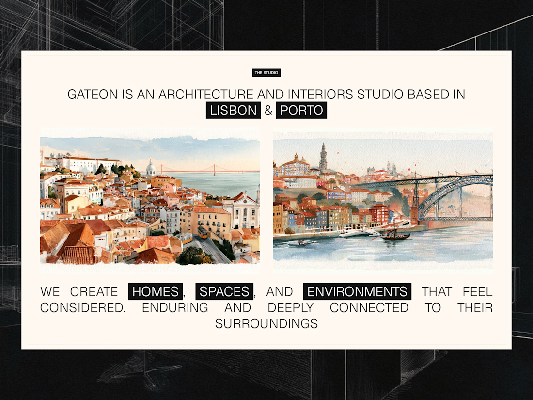
Studio section for Gateon, a interior design and architecture studio with bases in Lisbon and Porto