The network for creativity
Join 1.25M professional creatives like you
Connect with clients, get discovered, and run your business 100% commission-free
Creatives on Contra have earned over $150M and we are just getting started
Back to feedPost
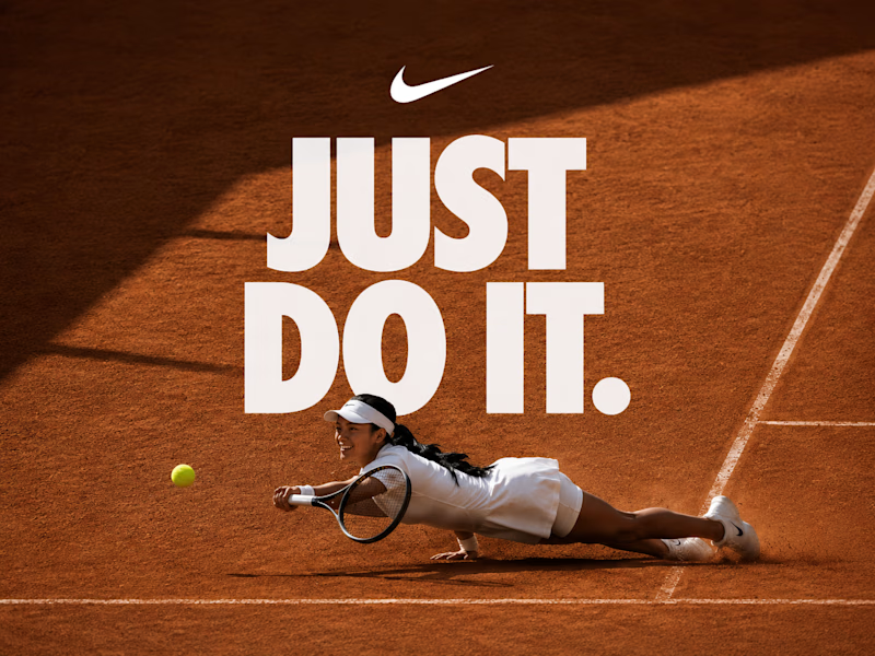
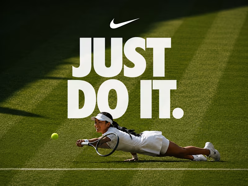
Taste Test
This Wimbledon moment already looked like a Nike ad. I just finished the idea.
Grass or clay?
72 voted
37%
122 voted
63%
194 votes
Closed

Grass

I feel the terracotta color visualize the effort of the player, wdyt?

I can definitely see that. The terracotta version feels more intense and dramatic, while the grass version stays closer to the original Wimbledon moment. That contrast is exactly why I wanted to compare both. Thanks for sharing your perspective🙌

I like the tagline going behind the athlete to add dimension.
From a creative direction point of view, is worth noticing that Wimbledon features 18 different courts where the matches take place, all of them are grass courts. I think is the only Grand Slam competition in the...
Thanks for the thoughtful feedback! That's a great observation. The clay version was just a creative exploration, but I agree the grass court better captures the original Wimbledon story. I appreciate you pointing that out

Very sharp observation, i can't more agree
Grass
Thanks, I'm curious what made you choose the grass version. Was it because it's the original Wimbledon surface?
Yes exactly, it made it feel natural.


It depends on the message the creator is trying to convey, but personally I'd go with the calmer one, so the version with the grass. Great work! 🙌
I can definitely see that. The terracotta version feels more intense, while the grass one gives the design more room to breathe.

Voted grass, it's Wimbledon so the court should match the actual tournament. The dive and the white kit against green reads more premium too, clay flattens the contrast a bit.
You're absolutely right about Wimbledon. 😊 Since this was imagined as a Nike concept rather than official tournament artwork, I treated the surface as a creative choice, that's why I included both grass and clay versions

Clay

Grass 👍

Outstanding design !

They both look great, but I am going for grass

You should use the surface they were playing on at Wimbledon because its widely known that all the athletes HAVE TO wear all white. So, if a fan saw this and saw her outfit and then the surface was changed that would be odd.
Sorry, didn't realize someone essentially said this lol.
You're absolutely right. I know Wimbledon is all about grass and white outfits. I was just exploring an alternative visual direction, but the grass version is definitely the more authentic one
Sorry, I didnt see someone already said that lol.

The Grass is better. It makes it easiler to see the tennis player
Thanks for sharing your perspective🙌

Grass always
Fair enough😊


I choose grass



The clay looks more like a tennis court. That would be my pick

Grass
You don't play tennis on clay so grass it is
Haha, I actually play on clay 😄 That's exactly why I wanted to include both versions

Grass


I go for #grass

It's a good point, thanks🙌

#grass for sure!

i will go with the grass all day
the feeling it create alone makes sense

both looks nice, but I'd choose grass, it gives fresh feel, and contrst between player and the environment.

Grass has the vibes

The original was in grass :)
Yep, but I go with clay😇
Both looked great!
Perhaps changing the expression? She looks too relax :D Other than that... it is brilliant :)

Minimal edits, maximum impact. That's the kind of design thinking I appreciate. 👌

Wimbledon in grass @Olena Andreieva
You're right 💯 This was more about experimenting with different visual interpretations of the same moment than matching reality exactly
The network for creativity
Join 1.25M professional creatives like you
Connect with clients, get discovered, and run your business 100% commission-free
Creatives on Contra have earned over $150M and we are just getting started
Related posts

FIRST TIME ON GROUND — a fashion film shot across Egypt, except nobody went to Egypt.
The reference: a real brand film that took 7 days of shooting across the country. I reverse-engineered its edit down to the frame — one 4.5-second opening hold, cuts accelerating from 1s to 0.5s, a one-second strobe burst on the drop, then two seconds of stillness to close. That rhythm is why those films feel expensive.
Then I rebuilt the whole thing from zero:
• 14 scenes, directed from a full shotlist before generating a single frame
• Keyframes in Nano Banana Pro — one locked style system (crimson-amber silhouettes + high-contrast B/W for negative flashes)
• Motion in Seedance 2.0 — one decisive camera move per shot, the cutting rhythm lives in the timeline, not the prompt
• Title cards generated too, projector flicker included, in a single multishot pass
• Graded and cut in Premiere
Solo. Zero flights. The edit does 60% of the work — the footage does 40%.
This is the production model I bring to launch films and brand films: a real location shoot's craft, without the location. If you're launching something and want a film like this, Lets Talk!
AI Content CreationAI Video ProductionVideo EditingAdobe Premiere ProHiggsfield AIClaudeaivideoaigold






Super user-friendly

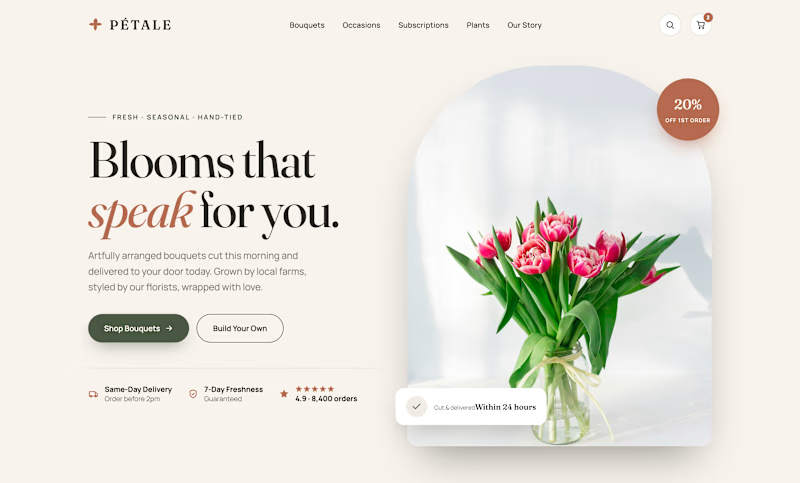
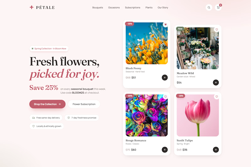
Two heroes. Same florist. Opposite strategy.
Editorial sells the feeling. Big serif line, one bouquet, trust badges below.
Bouquets sells the deal. No hero image. Straight into product grid, prices, promo code up top.
One asks you to fall in love. One asks you to buy now.
Flowers are impulse buys with emotional weight. Which wins more carts?
🌸 Editorial
🛒 Bouquets
Vote below.

24 voted
62%
15 voted
38%
39 votes
Closed
Editorial looks premium








Trending

Claude
Claude has entered the design space. How are you using Claude Design?

Contra University
Learn from expert creatives how to earn more using next-gen AI tools.
fifaworldcup2026
The World Cup is here and the whole world's watching. How are you designing for the world stage?
creativeaiflow
Creative AI workflows are evolving. What tools do you use, and what are their strengths and weaknesses?
freelancerlife
Freelancer life is wins, pivots, and everything in between. What’s yours right now?