The network for creativity
Join 1.25M professional creatives like you
Connect with clients, get discovered, and run your business 100% commission-free
Creatives on Contra have earned over $150M and we are just getting started
Back to feedPost
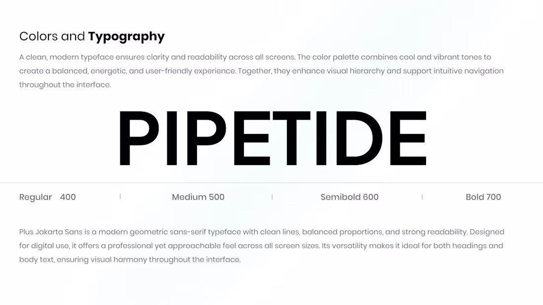
Pipetide — Colors & Typography that do the quiet work
For Pipetide, the goal was simple:
make the interface feel clear, confident, and easy to scan.
I chose Plus Jakarta Sans for its clean geometry and strong readability across screens.
Paired with a balanced color palette, it helps create a calm visual hierarchy — so users know where to look and what to do without thinking too hard.
Good typography shouldn’t shout.
It should guide, support, and stay out of the way.
That’s the idea behind Pipetide’s visual system.
The network for creativity
Join 1.25M professional creatives like you
Connect with clients, get discovered, and run your business 100% commission-free
Creatives on Contra have earned over $150M and we are just getting started
Trending
Claude
Claude has entered the design space. How are you using Claude Design?
Contra University
Learn from expert creatives how to earn more using next-gen AI tools.
creativeaiflow
Creative AI workflows are evolving. What tools do you use, and what are their strengths and weaknesses?
freelancerlife
Freelancer life is wins, pivots, and everything in between. What’s yours right now?
Related posts
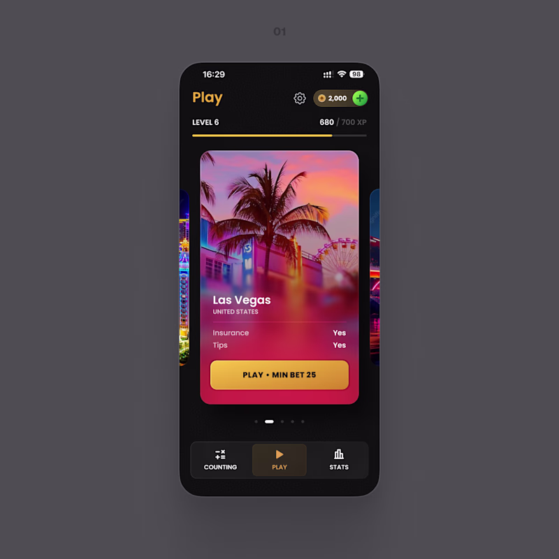
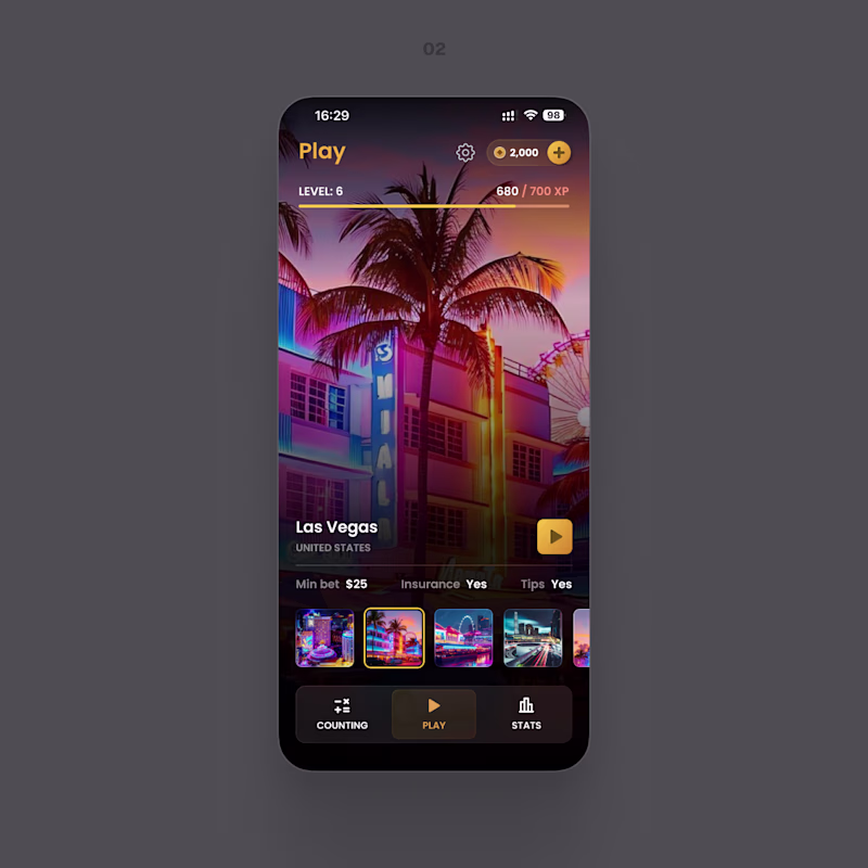
Sharing something I'm working on right now.
Two directions for the same screen. One keeps everything in a focused card – the button and the conditions right where you look. The other turns the whole screen into the place: more atmosphere, less interface.
Which one feels easier to use? And if the prettier one isn't the easier one for you, tell me in the comments – that's the part I'm stuck on.
8 voted
42%
11 voted
58%
19 votes
Closed
Both of looks clean and well thought out. How long did it take you to bring everything together?
Nice work! - I like the combination of MCP to canvas to code
Built an entire fintech UI in one session - 16 screens, zero Figma files.
Connected @flowstep_ai MCP to Claude Code > generated every screen directly on the canvas via prompts. No manual pixel-pushing.
Used design skills (hallmark, impeccable, prompt-master) to refine each...
A visual concept focused on clear structure, intuitive navigation, and an engaging user journey. Key principles:
💯 Simple and intuitive layout
🔥 Strong visual hierarchy
🚀 Responsive experience across devices
🧠 Clear calls to action