The network for creativity
Join 1.25M professional creatives like you
Connect with clients, get discovered, and run your business 100% commission-free
Creatives on Contra have earned over $150M and we are just getting started
Back to feedPost
Taste Test

One of my favorite interactions I’ve designed for a client.
The idea was to turn a fairly complex system into something simple and visual, using animated isometric layers to show how each part connects.
I also designed it to adapt seamlessly between light and dark modes while keeping the same visual language.
Still one of my favorite pieces from the project.
Which one would you choose — light or dark?

8 votes
Ends in 22h

Dark theme always looks premium, but you made light look awesome too, would go with light on this one
Thanks! The site was originally designed in dark mode, so adapting everything to light took a bit of extra work. Glad to hear it turned out well.
great work man


Dark for me. The isometric layers work really well with it.
Thank you for choosing!

good job
Thank you!
The network for creativity
Join 1.25M professional creatives like you
Connect with clients, get discovered, and run your business 100% commission-free
Creatives on Contra have earned over $150M and we are just getting started
Trending
retrofuturism
Share your favorite designs from the past exploring the distant future. Or your own take on the aesthetic 🚀
halftone
Dots. Texture. Grain. Let's see your designs using the halftone technique.

Midjourney
Creatives are showing off what they're making with Midjourney.
colorgrade
Video editors sound off: How do you enhance the mood of your video in color grading?





Related posts


Which button do you actually want people to press?
Same hero, same two actions. The only thing I changed is their weight, and that alone decides where the eye lands.
1 – Two primaries. Both buttons solid amber. Looks confident, reads as a tie - and the visitor has to break it.
2 – One primary, one quiet. "Book your stay" stays solid; "Explore cabins" drops to a ghost. Now there's a clear first move and a calm backup.
Hierarchy isn't about adding emphasis - it's about turning one thing down so the other can lead.
Do you give the main CTA a clear winner, or keep the options equal?

6 voted
10%
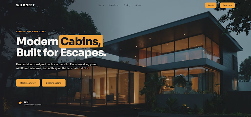
57 voted
90%
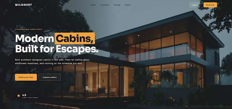
63 votes
Closed


one solid one ghost, every time

Which option will you choose and why?
Lucra: How it works Section Exploration
35 voted
76%
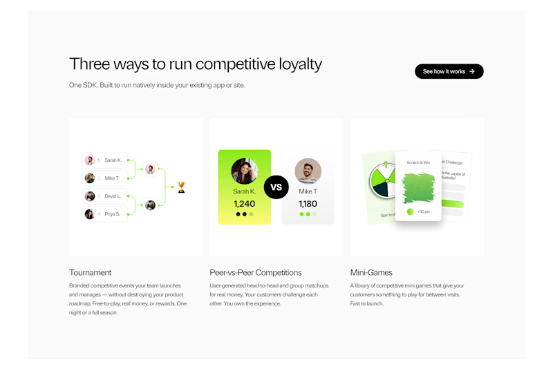
11 voted
24%
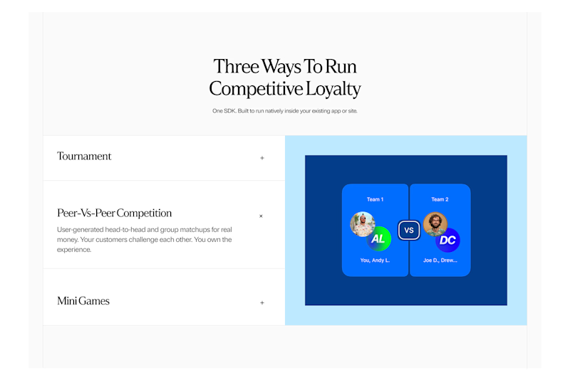
46 votes
Closed

A looks Good


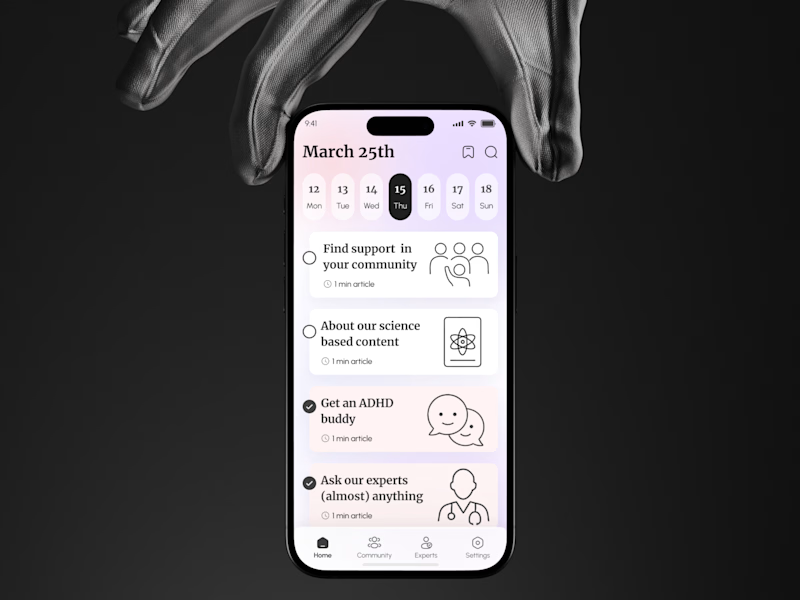
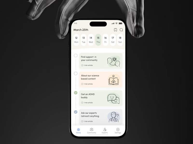
For an ADHD brain, which is better UX:
“Let me choose”
or
“Tell me what’s next”?
A gives users more freedom to scan, explore, choose.
B creates a clearer path, makes progress visible, and reduces decisions.
Neither is automatically better
But for users dealing with attention, overwhelm, & decision fatigue, structure can directly affect whether they continue or drop off
Which one creates less friction and a stronger reason to keep going?
🟣 A Let me choose
🟢 B Tell me what’s next
👉 BOOK A MOBILE APP STRATEGY SESSION
https://calendly.com/asol_design/book-diagnostic-call-linkedin-clone
If users aren’t activating, converting, or coming back, I’ll help identify where the UX is losing them.


6 voted
20%
24 voted
80%
30 votes
Closed
