The network for creativity
Join 1.25M professional creatives like you
Connect with clients, get discovered, and run your business 100% commission-free
Creatives on Contra have earned over $150M and we are just getting started
Back to feedPost
Taste Test
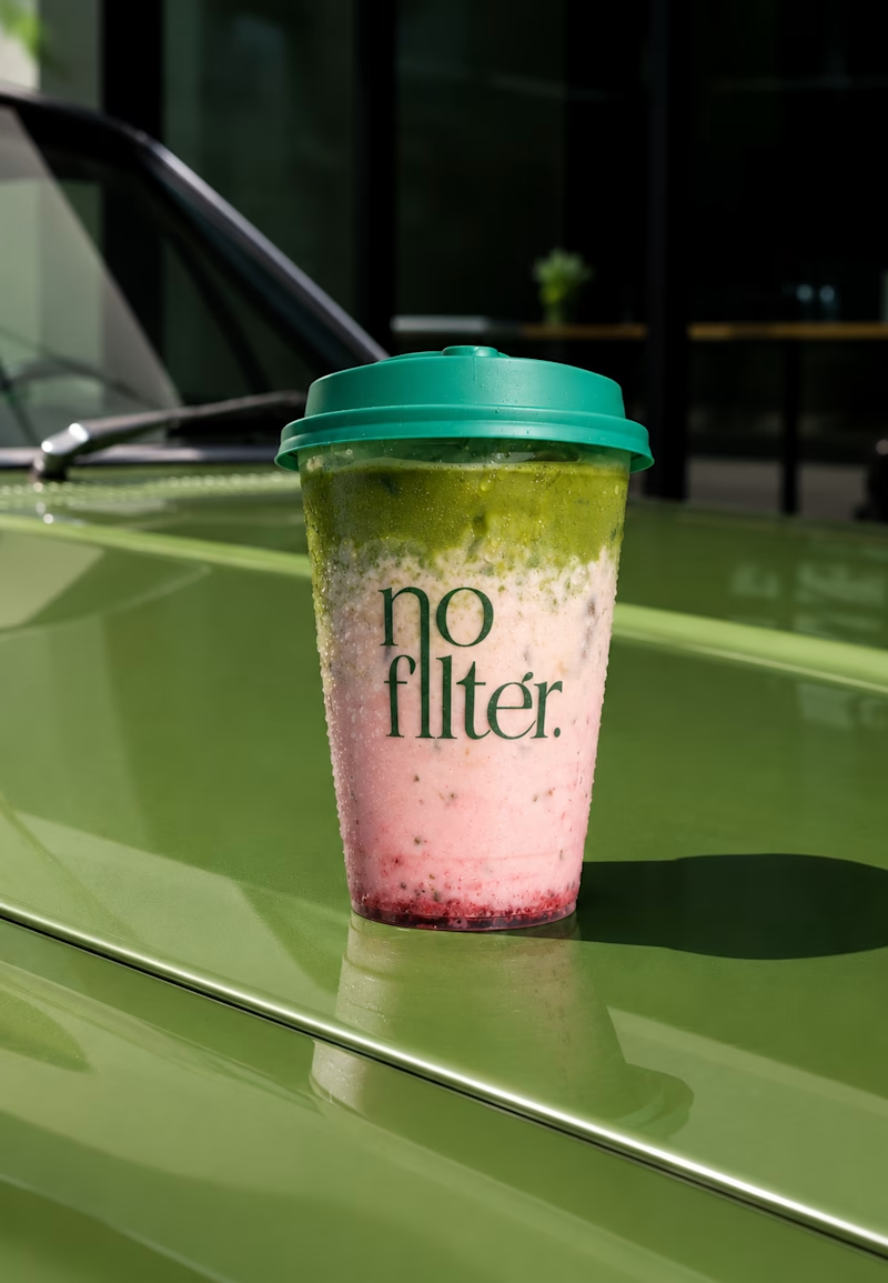
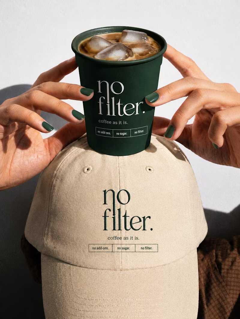
Which one looks more Friendly and attractive?
15 voted
36%
27 voted
64%
42 votes
Closed

The one on the right for sure!

Thanks dear 🙌


Friendly & Stylish for sure
Thanks for the vote dear :)

Playful and fresh
Thanks afnan

Absolutely amazing work
Thank you. ♥️ Really appreciate 😊

Friendly & stylish
thanks dear 😊

i feel more energy in the first one
Thank you 😊

friendly and stylish gets my vote
Thank you. ♥️

Friendly & Stylish 😊
Thanks koonj

second one
Thanks Hassan for vote ☺️ ☺️
welcome!😃

friendly & stylish

Lowkey both look great and feel like they are in the same visual family. The friendly stylish one feels more like a nice social post and playful fresh one fells like an ad for a new seasonal drink.
both feel friendly and attractive for different purposes
Good work! Its the...
The network for creativity
Join 1.25M professional creatives like you
Connect with clients, get discovered, and run your business 100% commission-free
Creatives on Contra have earned over $150M and we are just getting started

Challenges
View all


Related posts


I like 2 more

I’m testing two different creative directions and would love your honest opinion.
Version A focuses on a bright, minimal gallery experience with circular visual experiments.
Version B explores a darker, more cinematic product direction for Montairé with hardware-focused visuals.
Which one feels cooler, more premium, and more memorable — A or B?
I’d also love feedback on the typography, layout, animation, and overall art direction.
10 voted
53%
9 voted
47%
19 votes
Closed

I’d lean toward Version B. The darker direction gives the hardware more presence and makes the whole experience feel more intentional and engineered. Version A is visually interesting, but B gives Montairé a much clearer identity at first glance.


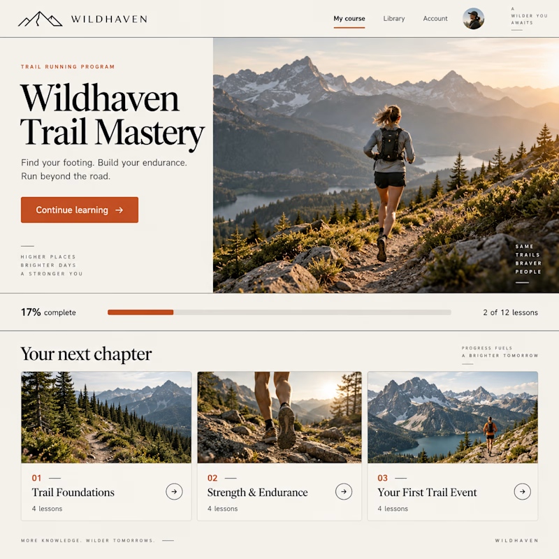
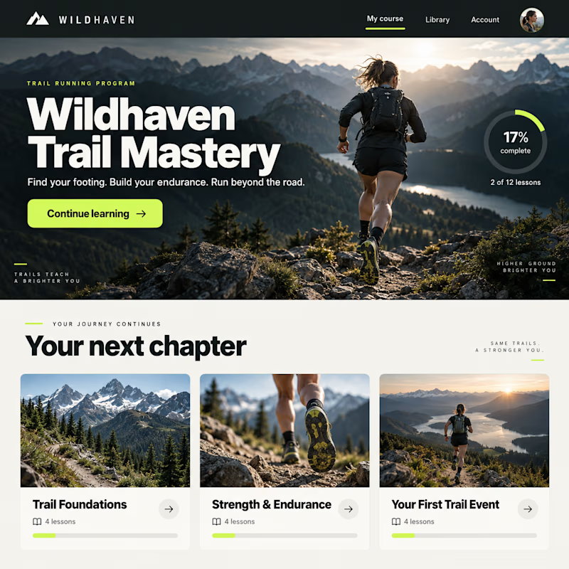
Same course. Two completely different vibes.
Exploring two design concepts for a Kajabi course experience: warm and editorial, or bold and cinematic.
Same curriculum. Different typography, layout, and visual direction.
Which one would you rather learn inside—1 or 2?

10 voted
19%
44 voted
81%
54 votes
Closed
