The network for creativity
Join 1.25M professional creatives like you
Connect with clients, get discovered, and run your business 100% commission-free
Creatives on Contra have earned over $150M and we are just getting started
Back to feedPost

Urban Groves - Sustainable Urban Landscaping Branding
Urban Groves is a modern sustainable landscaping brand built around the idea of bringing meaningful greenery into urban environments. The visual identity balances the structured character of city architecture with the organic qualities of nature, creating a brand that feels fresh, approachable, and environmentally conscious. The combination of bright blue, fresh green, warm yellow, and neutral tones gives Urban Groves an energetic yet trustworthy personality.
The logo combines urban buildings, trees, and a rising sun within a compact shield-like form. The buildings represent modern city living, while the trees introduce the idea of greenery, sustainability, and healthier urban spaces. The small sun element adds a sense of growth, optimism, and forward movement. Its bold outlined construction keeps the symbol recognizable across both large environmental projects and smaller brand applications.
The Urban Groves identity extends across urban landscaping, rooftop gardens, vertical gardens, sustainable development projects, service vehicles, signage, digital platforms, advertising, and corporate communications. The flexible visual system creates a consistent presence across physical and digital touchpoints while reinforcing the brand's core message of connecting modern cities with nature. Overall, Urban Groves presents a distinctive identity for a company focused on greener spaces, sustainable living, and better urban environments.


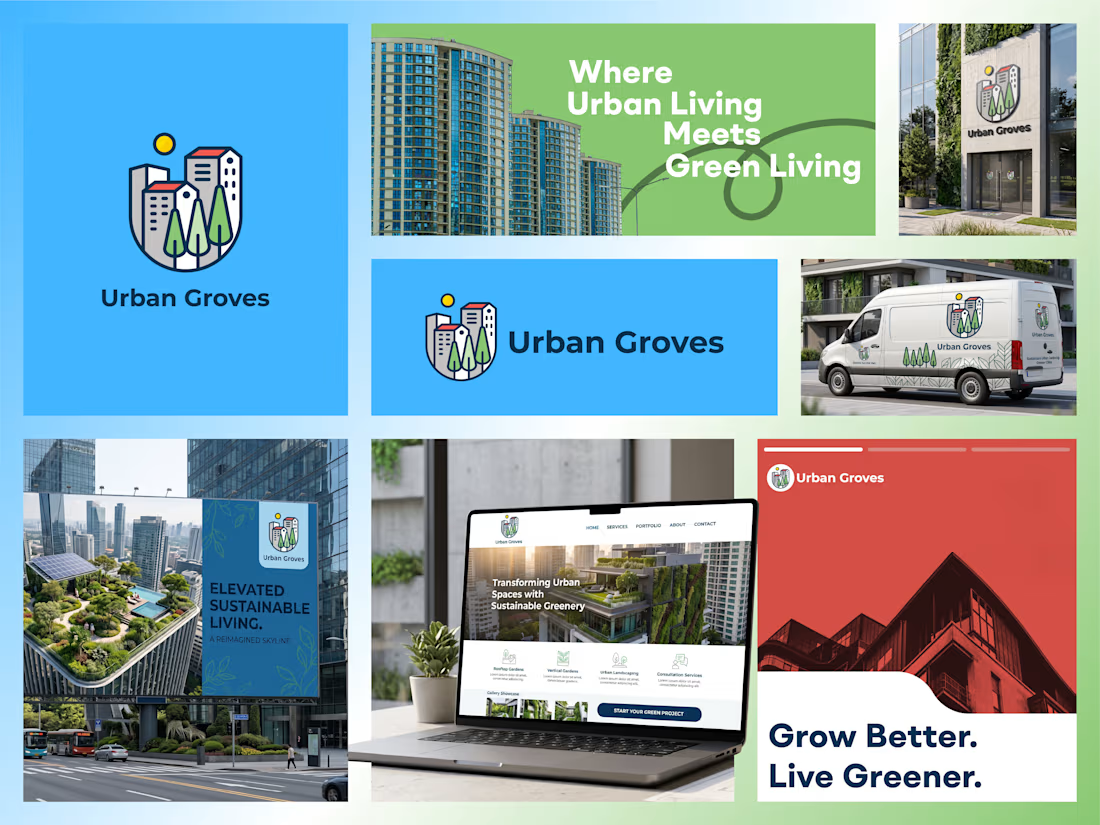

The shield enclosure is doing the heavy lifting here — it's what lets a buildings-trees-sun combination survive on a van door and still read as one mark. Was the containment there from the first sketches, or did it come in once you started testing the small applications?
The network for creativity
Join 1.25M professional creatives like you
Connect with clients, get discovered, and run your business 100% commission-free
Creatives on Contra have earned over $150M and we are just getting started











Related posts

Have you ever designed packaging for a brand that never launched? 👀
Surprisingly, it’s happened to me more times than I expected.
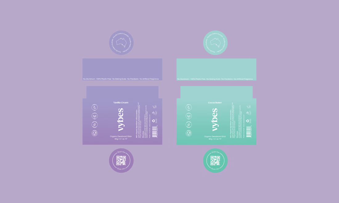
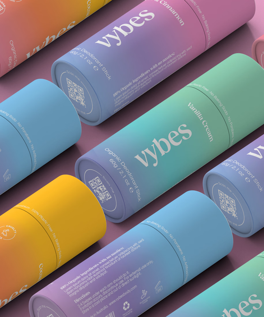
Vybes was an organic deodorant brand from Australia I worked on, designing packaging for a product that, in the end, never made it to market.
It’s a weird feeling putting so much thought into packaging for a product that people will never see on a shelf.
How many unreleased projects are hiding in your folders? 😂


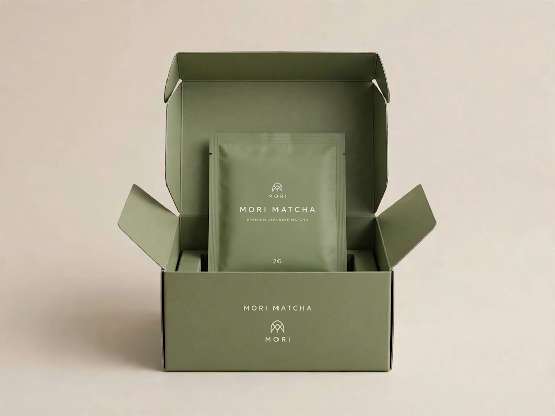
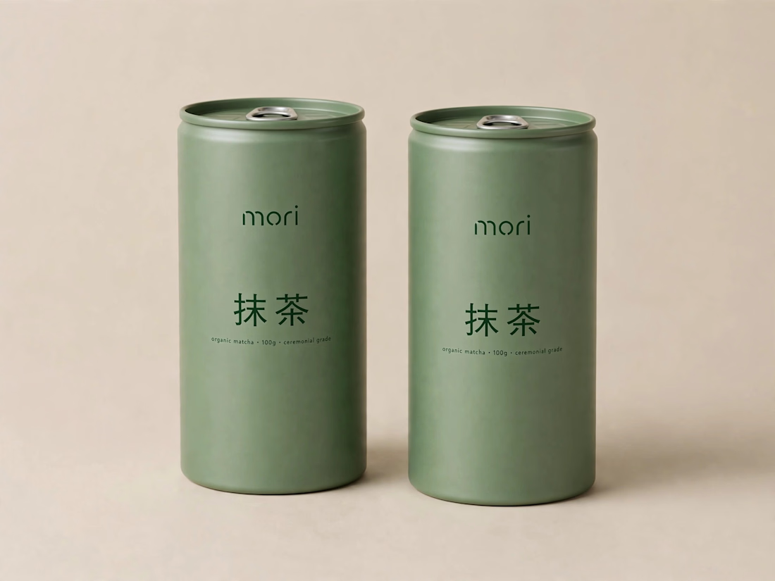
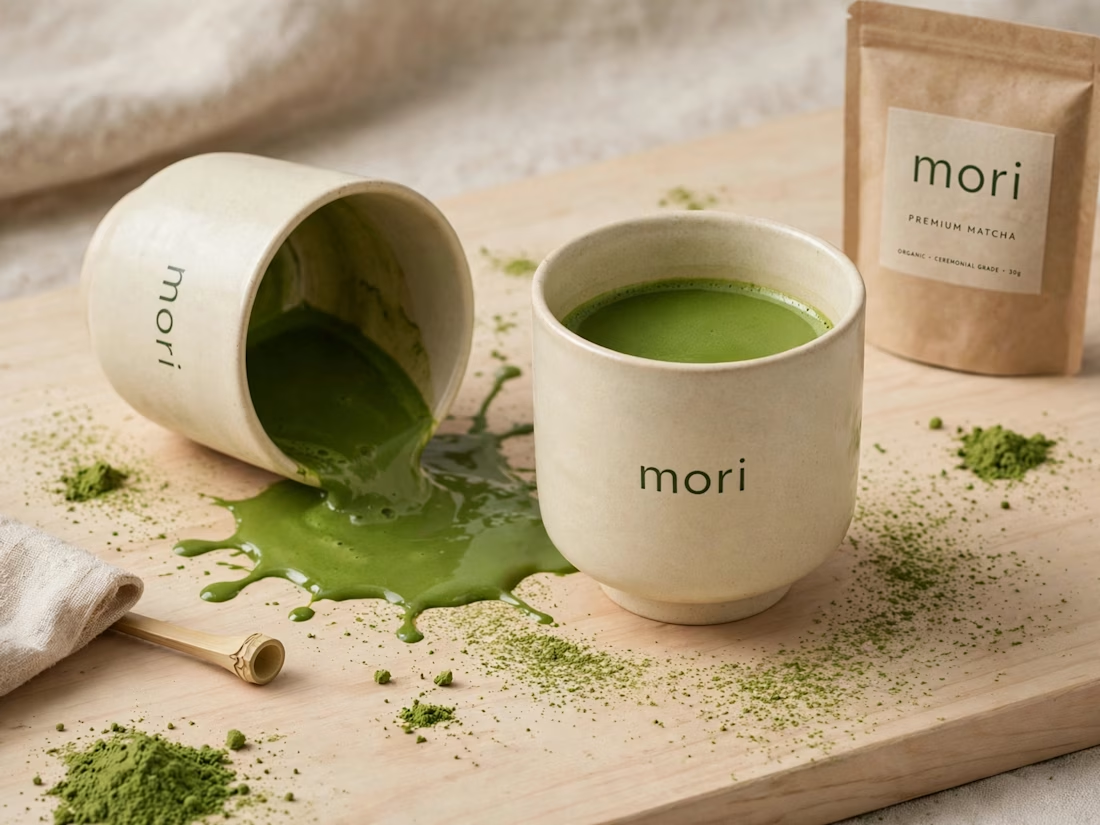
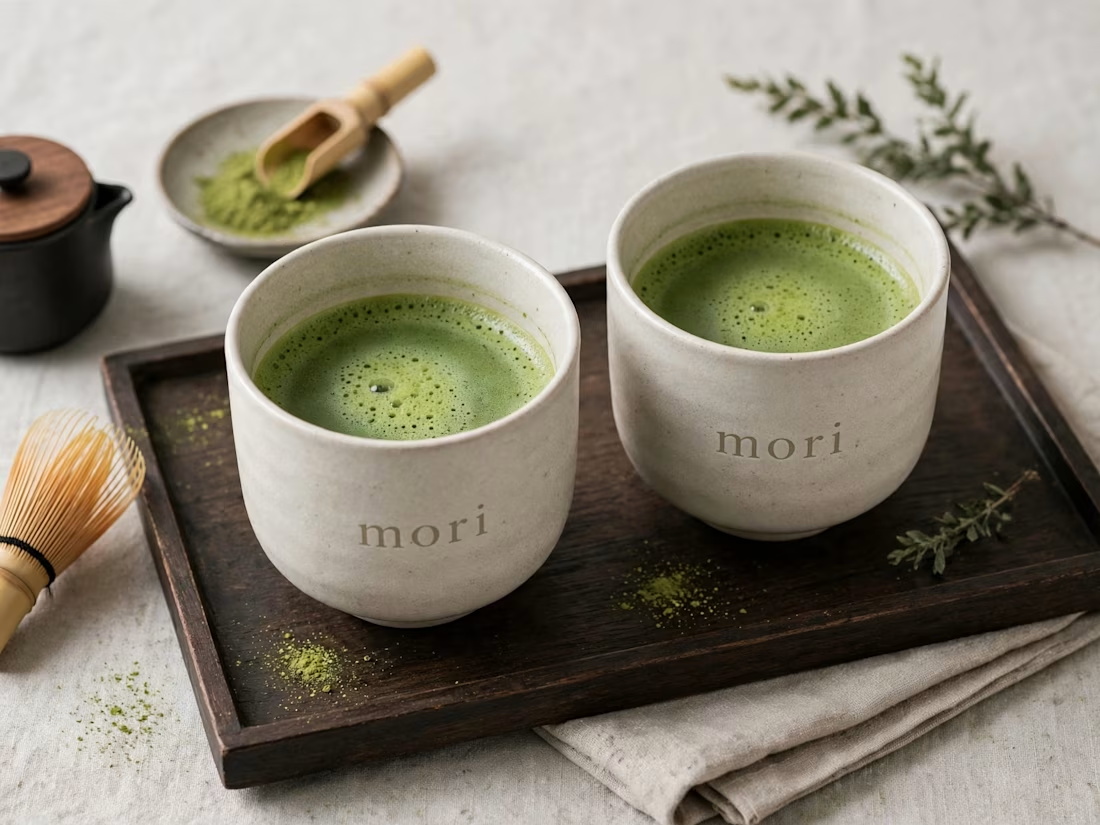
more visuals from my latest project — mori matcha 🍵
explored minimal Japanese packaging with earthy greens and calm typography.
focusing on premium ceramic cups and clean can design.
#branddesign #packagingdesign #visualidentity #brandstrategy #matcha #minimaldesign #japanesedesign #figma #mockup #branding



An existing brand identity showcased across a new campaign. This was one of my favourite projects ever!
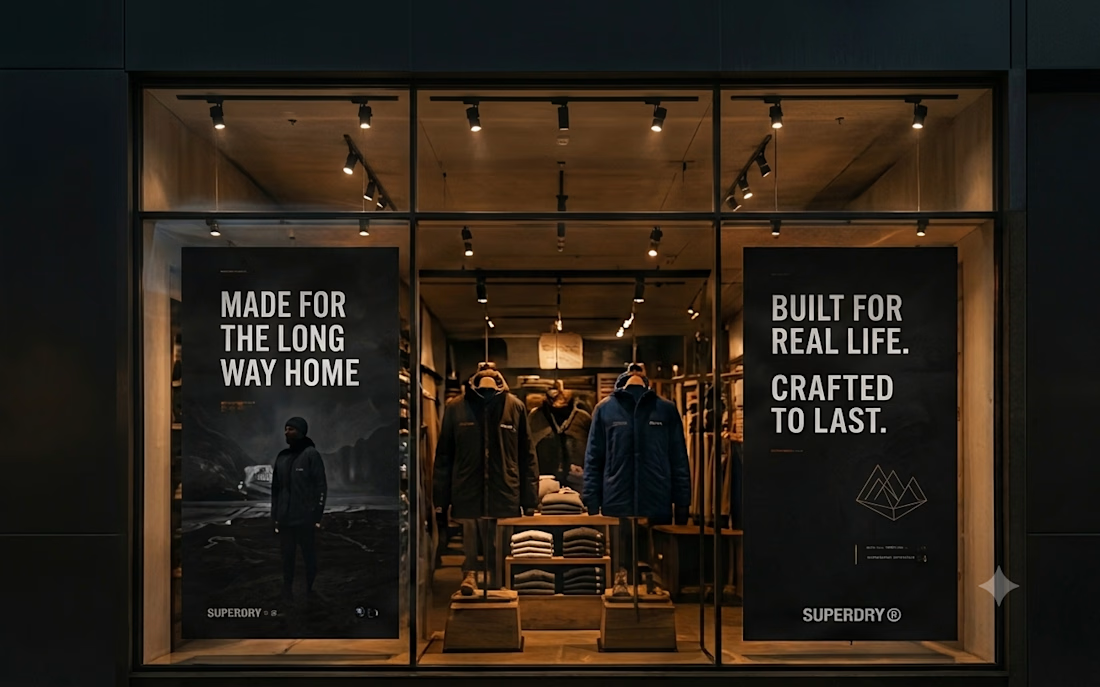
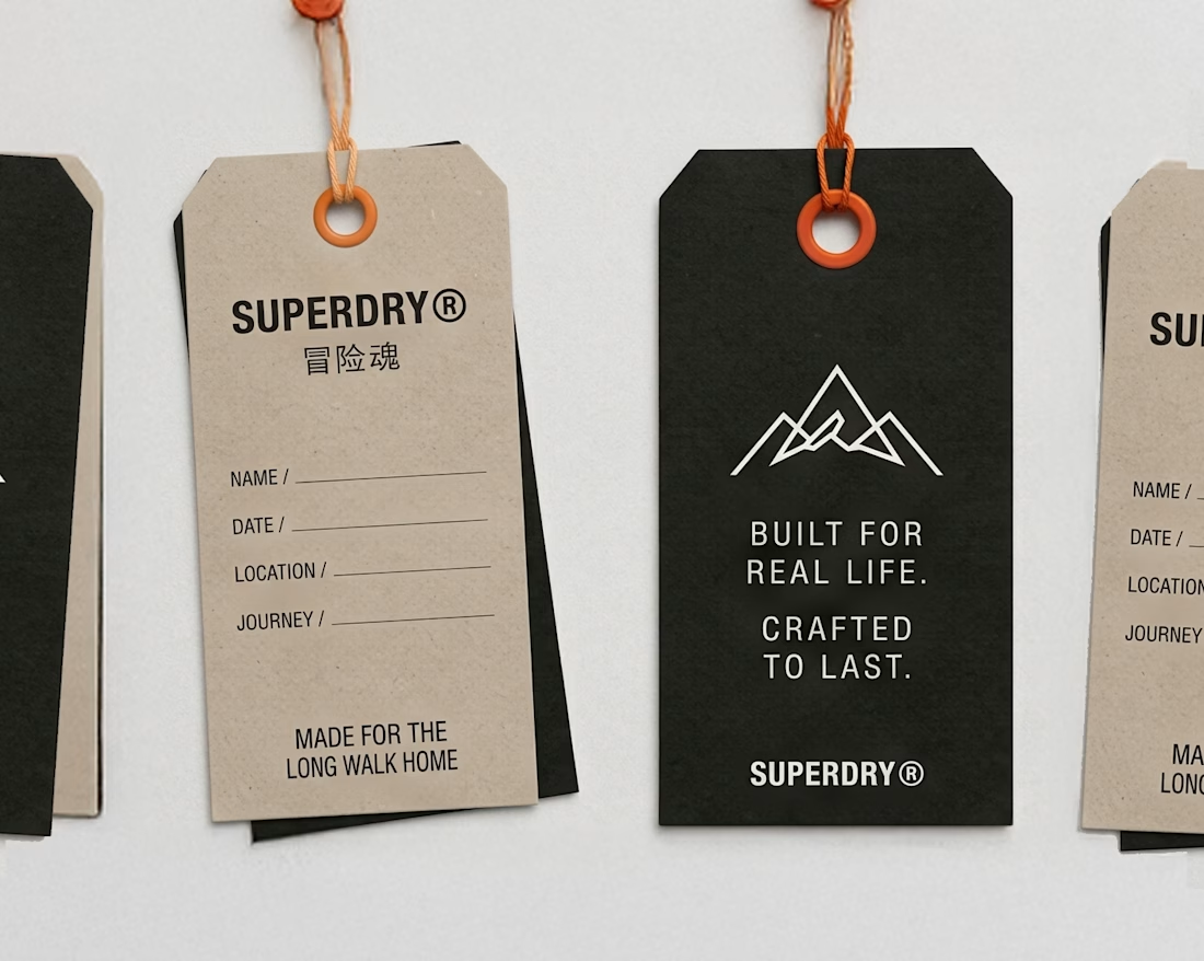
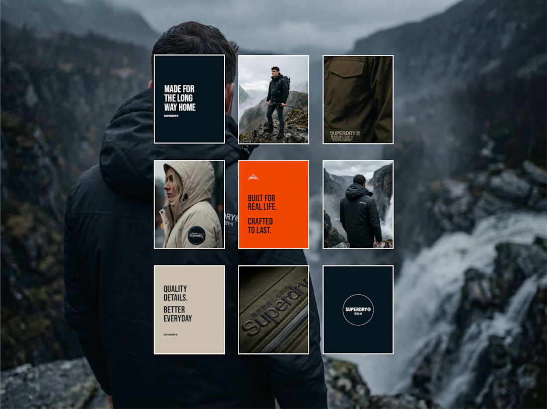
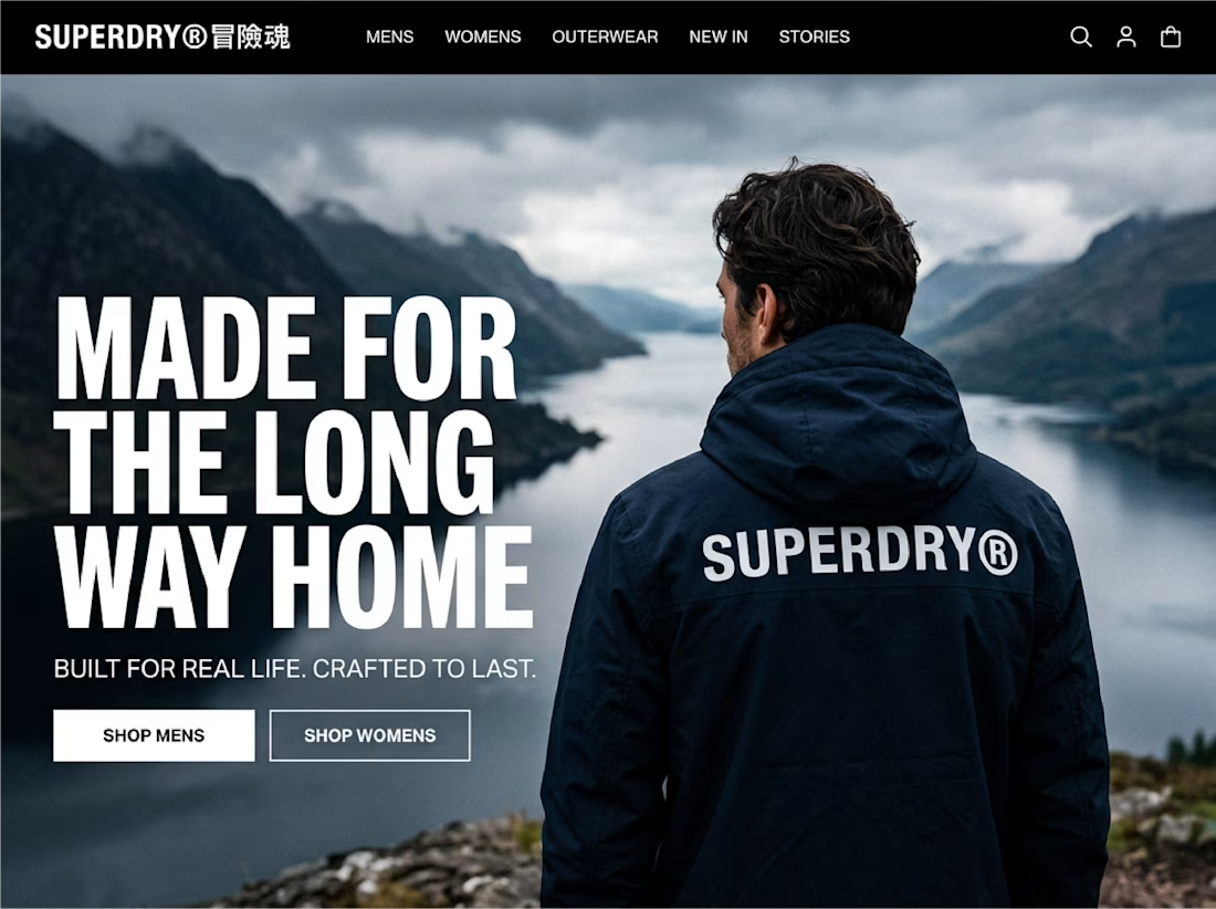


made for the long way home across the back of that jacket is so good