
pro
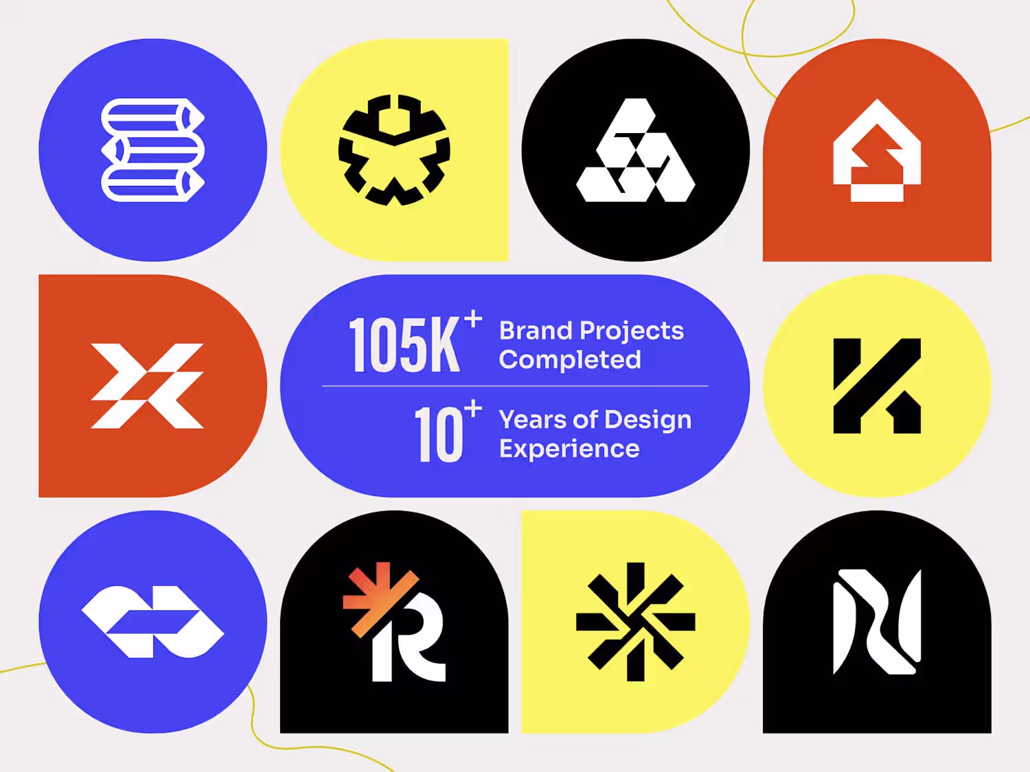
Logoflow (@logoflow_mayur) • Instagram photos and videos
1
2
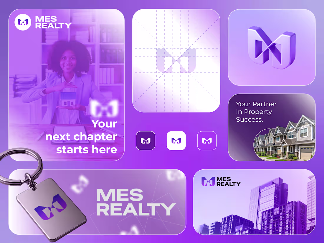
MES Realty
I got a brief for a real estate brand.
The brief?
Create a brand that feels trustworthy, modern, and professional while helping buyers, sellers, and investors feel confident about one of the most important decisions of their lives.
Here's how I brought MES Realty to life:
• I explored what clients value most when choosing a real estate partner: trust, guidance, transparency, and long-term confidence.
• We crafted a mission: Help people navigate property decisions with expertise, integrity, and personalized support.
• Shaped a vision: To become a trusted real estate brand known for turning property goals into successful outcomes.
• Designed a distinctive geometric symbol that combines structure, balance, and connection, reflecting both property foundations and strong client relationships.
• Developed a sophisticated purple color system that communicates reliability, professionalism, ambition, and a premium service experience.
The result?
A brand that doesn't just represent real estate. It represents opportunity, security, and the excitement of starting a new chapter with confidence.
The client's reaction?
"The brand instantly feels credible and established. It gives our clients the confidence we want them to feel from the very first interaction."
4
192
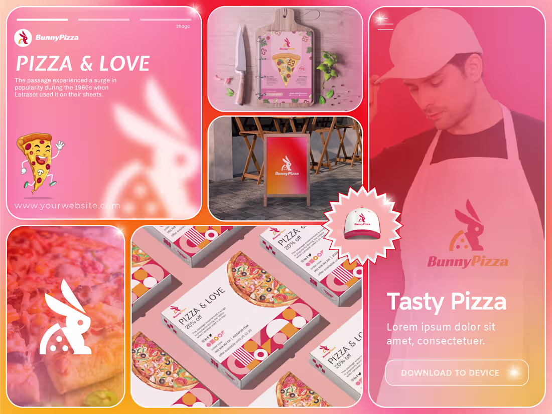
BunnyPizza
I got a brief for a pizza brand.
The brief?
Create a fun, memorable, and family-friendly brand that stands out in a crowded food market while making every pizza experience feel joyful and approachable.
Here's how I brought BunnyPizza to life:
• I explored what makes food brands instantly lovable, focusing on playfulness, personality, and visual memorability.
• We crafted a mission: Deliver delicious pizza experiences that bring people together through flavor, fun, and happiness.
• Shaped a vision: To become a recognizable pizza brand that families, friends, and food lovers instantly connect with and remember.
• Designed a distinctive rabbit mascot integrated with a pizza slice, creating a unique symbol that communicates speed, freshness, and fun at first glance.
• Developed a vibrant pink, orange, and warm coral color palette that reflects energy, appetite, friendliness, and a modern dining experience.
The result?
A brand that doesn't just sell pizza. It creates a cheerful personality customers can recognize, trust, and enjoy long before they take their first bite.
The client's reaction?
"This isn't just a pizza logo. It's a character people will remember and associate with great food and good times."
0
177
AISporty
I got a brief for a sports technology platform.
The brief?
Create a brand that feels intelligent, energetic, and future-ready while helping athletes and users track performance, improve results, and stay connected through technology.
Here's how I brought AISporty to life:
• I explored how modern athletes rely on data, insights, and smart technology to reach their goals more efficiently.
• We crafted a mission: Empower people to achieve peak performance through intelligent digital tools and actionable insights.
• Shaped a vision: To become a trusted platform where sports, technology, and personal growth seamlessly come together.
• Designed a bold geometric symbol inspired by achievement, progress, and upward momentum, reflecting the journey toward better performance.
• Developed a vibrant gradient color system that blends innovation, energy, and accessibility, creating a modern experience that feels both powerful and approachable.
The result?
A brand that doesn't just represent a sports app. It represents ambition, progress, and the confidence that comes from having the right tools to perform at your best.
The client's reaction?
"This isn't just a logo. It perfectly captures the energy, intelligence, and forward-thinking vision behind our platform."
0
168
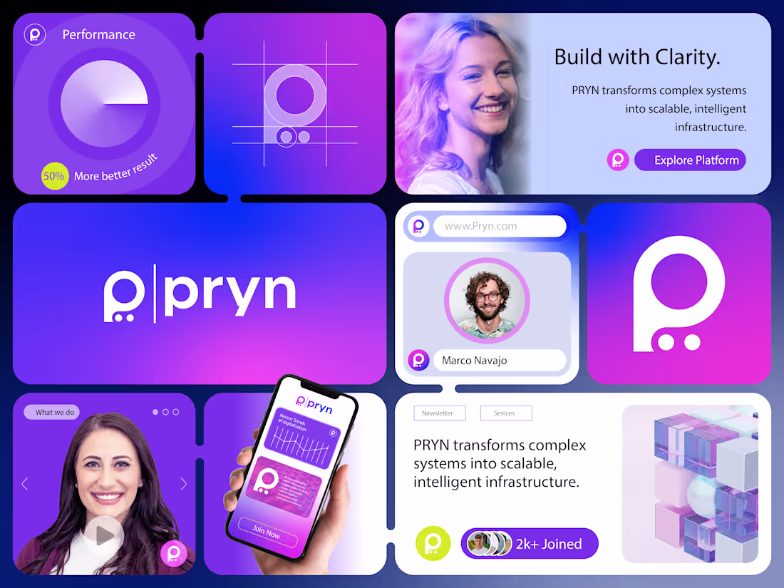
PRYN
I got a brief for a technology and infrastructure platform.
The brief?
Create a brand that makes complex systems feel simple, intelligent, and accessible while positioning the company as a trusted partner for scalable digital growth.
Here's how I brought PRYN to life:
• I explored how modern businesses struggle with complexity when managing data, systems, and digital infrastructure.
• We crafted a mission: Transform complex systems into scalable, intelligent solutions that empower growth.
• Shaped a vision: To become a trusted platform that helps organizations build with clarity, confidence, and efficiency.
• Designed a visual identity around a minimalist "P" symbol, representing precision, connectivity, and streamlined problem-solving.
• Developed a vibrant purple-to-blue gradient system that communicates innovation, reliability, intelligence, and forward-thinking technology.
The result?
A brand that doesn't just represent technology. It represents clarity in complexity. It gives businesses confidence that powerful solutions can also be intuitive and approachable.
The client's reaction?
"This isn't just a logo. It perfectly captures our goal of making complex infrastructure feel simple and accessible."
0
164
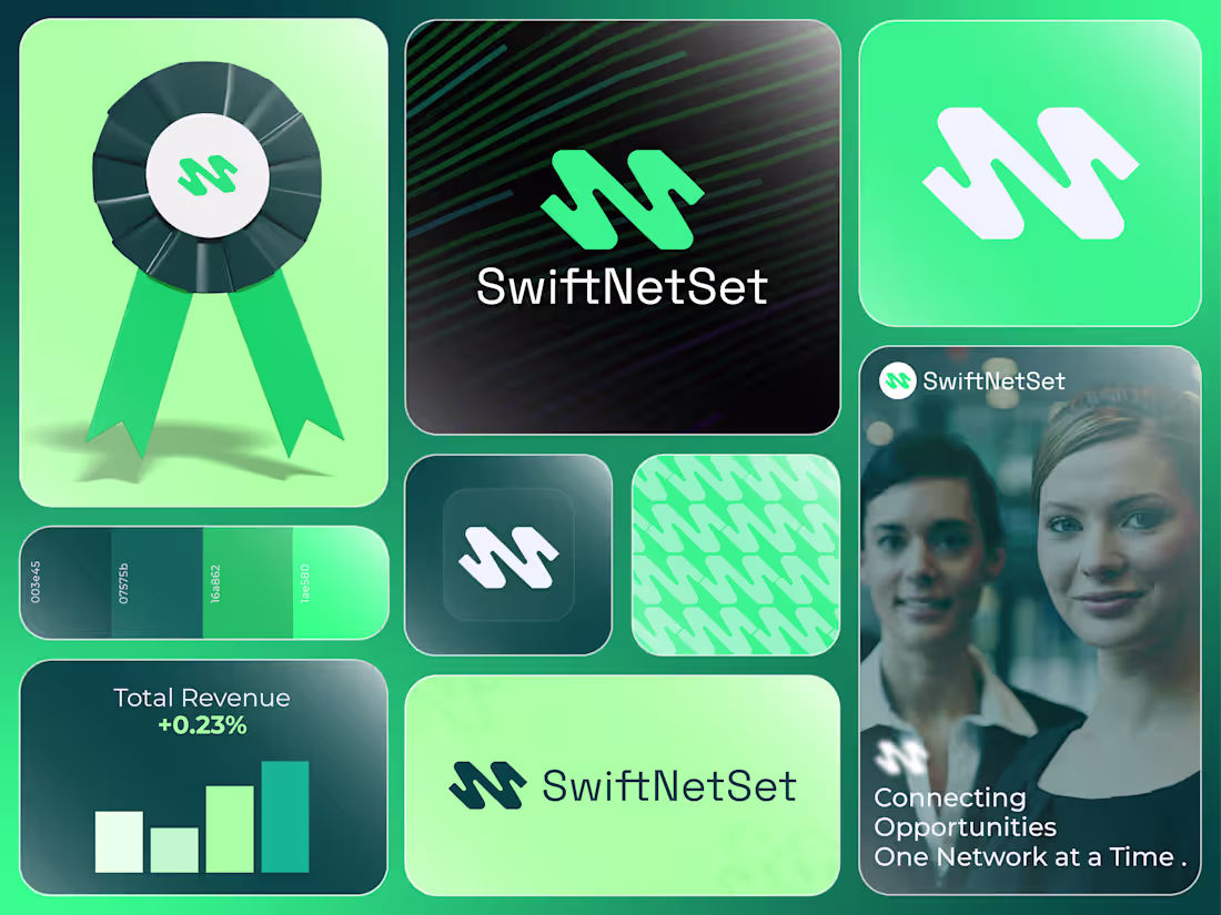
SwiftNetSet
I got a brief for a networking and business growth platform.
The brief?
Create a brand that feels fast, reliable, and professional while helping businesses build meaningful connections and unlock new opportunities.
Here's how I brought SwiftNetSet to life:
• Researched the challenges professionals face when building strong networks in an increasingly digital world.
• Defined a brand mission focused on simplifying connections and helping businesses grow through smarter networking.
• Created a dynamic visual identity inspired by speed, connectivity, and seamless communication.
• Designed a modern symbol that combines movement and structure, representing the flow of ideas, opportunities, and professional relationships.
• Built a fresh green and teal color system that communicates growth, trust, innovation, and forward momentum.
The result?
A brand that feels modern, efficient, and dependable. One that helps professionals connect with confidence and positions networking as a catalyst for growth.
The client's reaction?
"This feels exactly like the future of professional networking. Clean, memorable, and built around connection."
0
148
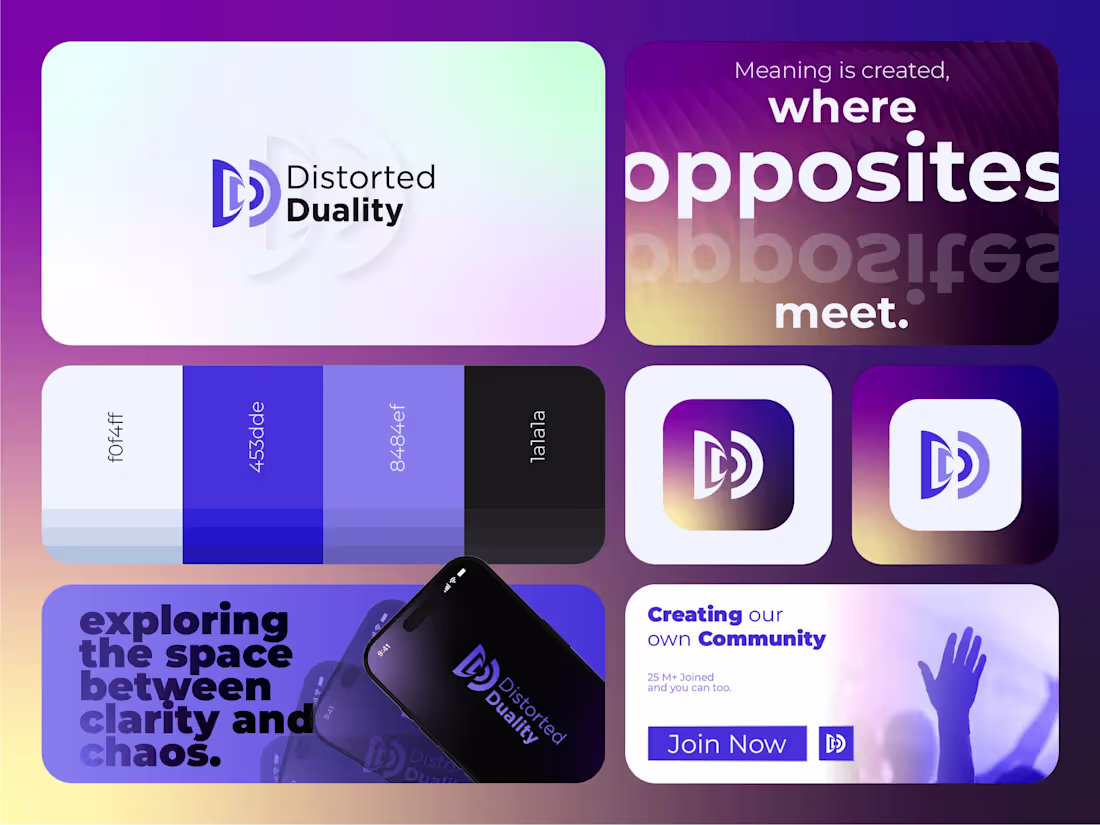
Distorted Duality
I got a brief for a music and audio production brand.
The brief?
Create a brand that captures the relationship between sound and reflection, originality and influence, while feeling modern, immersive, and unforgettable.
Here's how I brought Distorted Duality to life:
• I explored the idea that every sound creates a response, an echo, a reflection of itself.
• We crafted a mission: Create immersive audio experiences that transform sound into emotion.
• Shaped a vision: To build a recognizable creative identity where music, production, and storytelling intersect.
• Designed a visual identity centered around two interconnected "D" forms, representing sound and echo, creation and reflection.
• Developed a vibrant purple-to-gold color palette that evokes energy, creativity, depth, and movement.
The result?
A brand that doesn't just represent music production. It represents the relationship between sound and perception. It turns a simple concept into a memorable visual experience.
The client's reaction?
"This isn't just a logo. It's a visual expression of how our music moves and resonates."
0
138
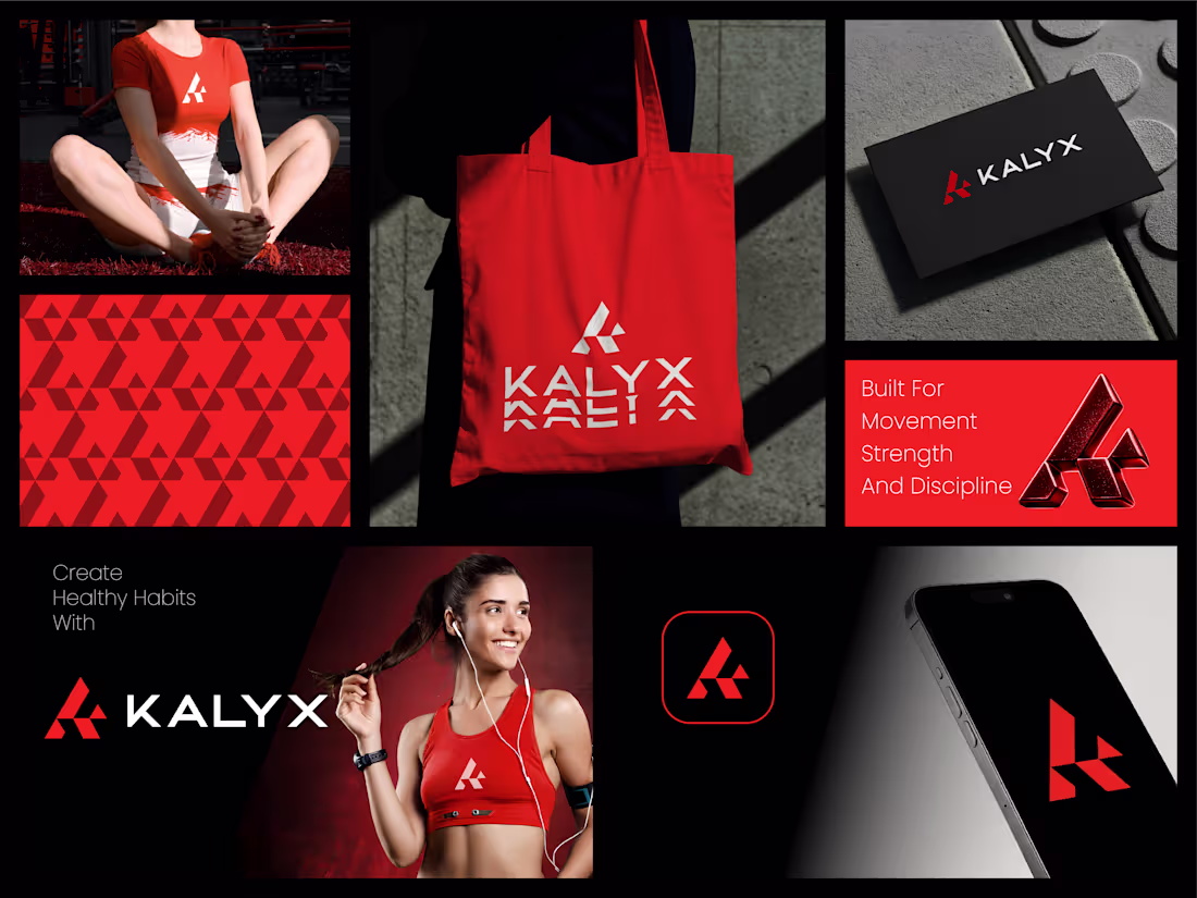
Kalyx
I got a brief for a fitness and performance brand.
The brief?
Create a bold identity that inspires discipline, strength, and progress while appealing to people committed to pushing their limits.
Here's how I brought Kalyx to life:
• Explored the mindset of athletes and fitness enthusiasts who see training as more than exercise. It's a commitment to growth, resilience, and self-improvement.
• Developed a brand strategy centered around movement, determination, and the pursuit of peak performance.
• Designed a dynamic geometric symbol that reflects strength, momentum, and forward progression while creating a memorable visual signature.
• Built a high-energy visual identity using bold red, black, and white tones to communicate power, confidence, and intensity.
• Created a versatile brand system designed to perform across activewear, digital platforms, mobile applications, packaging, and promotional campaigns.
The result?
A brand identity that feels strong, modern, and motivating. One that empowers individuals to stay focused on their goals and embrace the discipline required to achieve them.
The client's reaction?
"This captures exactly what our brand stands for. Powerful, energetic, and built for people who never stop improving."
4
4
259
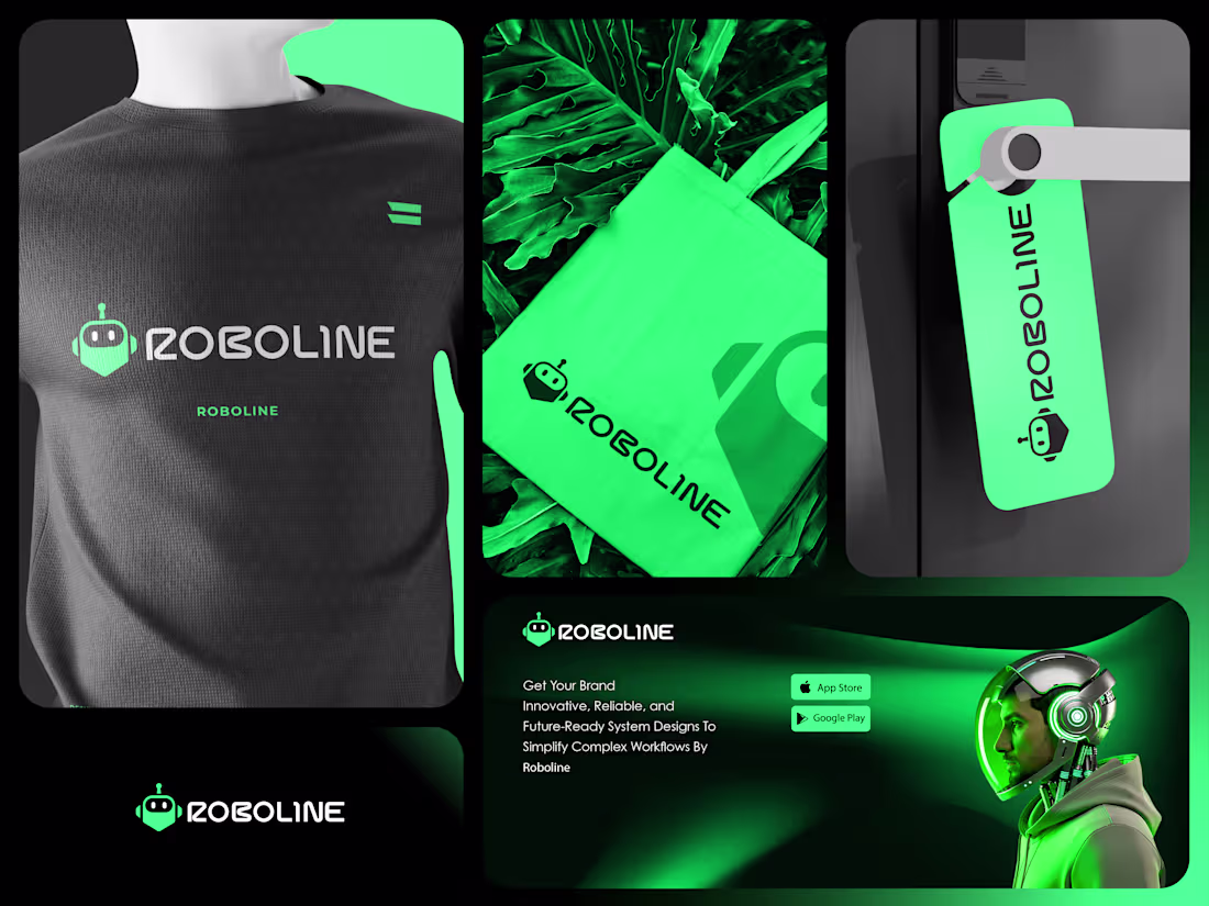
Roboline
I got a brief for a technology and automation company.
The brief?
Create a futuristic brand identity that communicates innovation, intelligence, and reliability while remaining approachable to modern businesses adopting automation.
Here's how I brought Roboline to life:
• Explored how businesses perceive automation today. They want technology that is powerful and advanced, but also intuitive and dependable.
• Developed a brand strategy centered around simplifying complexity through intelligent systems and forward-thinking solutions.
• Designed a custom robot-inspired symbol that instantly communicates technology, automation, and digital transformation.
• Built a bold visual identity using vibrant neon green and deep black tones to create a modern, high-tech presence that stands out in a competitive market.
• Created a scalable branding system designed to perform across software platforms, mobile applications, digital products, merchandise, and marketing campaigns.
The result?
A brand identity that feels innovative, energetic, and future-ready. One that positions Roboline as a trusted technology partner helping businesses streamline operations and embrace the future with confidence.
The client's reaction?
"This perfectly reflects the direction of our company. It feels modern, intelligent, and instantly recognizable."
5
3
223
Ironwing Logistics
I got a brief for a logistics and transportation company.
The brief?
Create a bold, modern identity that communicates speed, reliability, and operational excellence while standing out in a highly competitive industry.
Here's how I brought Ironwing Logistics to life:
• Explored the qualities businesses look for in a logistics partner: trust, efficiency, precision, and dependable delivery.
• Developed a brand strategy centered around strength in motion, combining the power of transportation with the agility required in modern supply chains.
• Designed a custom symbol inspired by a wing in flight, representing speed, forward momentum, and seamless movement across routes and networks.
• Built a high-impact visual identity using bold violet tones and clean geometric forms to create a modern, technology-driven presence.
• Created a scalable brand system that works across vehicles, uniforms, digital platforms, mobile applications, and marketing materials.
The result?
A brand identity that feels powerful, professional, and future-ready. One that reinforces Ironwing's commitment to delivering with precision while building trust at every stage of the journey.
The client's reaction?
"This captures exactly who we are. Strong, dependable, and always moving forward."
2
124
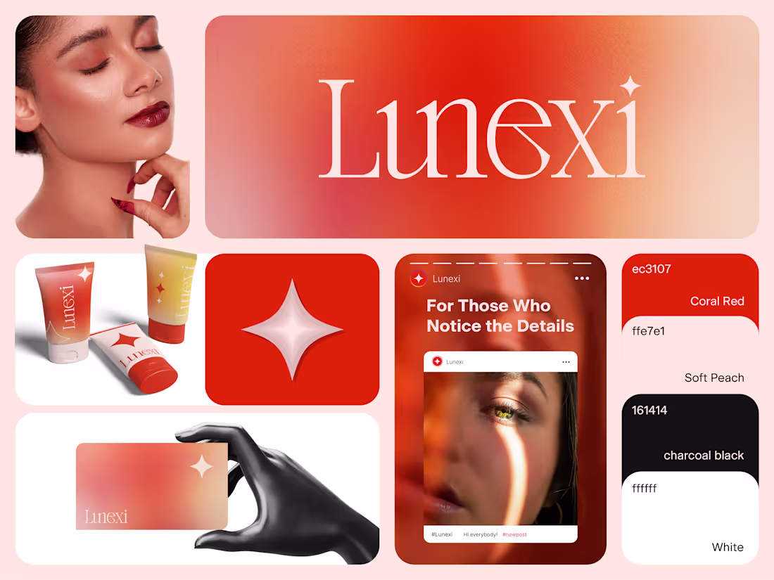
Lunexi
I got a brief for a beauty and skincare brand.
The brief?
Create a modern beauty brand that feels radiant, sophisticated, and effortlessly memorable while appealing to consumers who value both aesthetics and self-care.
Here's how I brought Lunexi to life:
• Explored what today's beauty consumers seek beyond products: confidence, self-expression, and elevated everyday rituals.
• Developed a brand strategy centered around the idea that beauty is found in the details, the moments, and the confidence that comes from feeling your best.
• Designed a refined wordmark paired with a luminous star-inspired symbol to represent radiance, transformation, and inner confidence.
• Built a vibrant visual identity using warm coral tones, soft neutrals, and elegant typography to create a premium yet approachable presence.
• Created a flexible brand system that extends seamlessly across product packaging, digital campaigns, social media, and customer touchpoints.
The result?
A brand identity that feels fresh, modern, and aspirational. One that captures attention instantly while creating an emotional connection with consumers who appreciate beauty, quality, and thoughtful design.
The client's reaction?
"This feels exactly like the brand we imagined. Modern, elegant, and full of personality without losing its premium appeal."
3
151
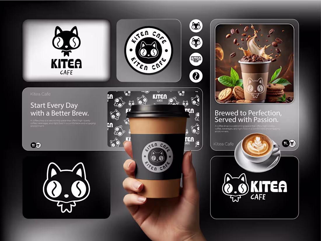
Kitea Cafe
I got a brief for a café brand.
The brief?
Create a memorable identity that feels warm, approachable, and playful while helping the café stand out in a crowded coffee market.
Here's how I brought Kitea Cafe to life:
• Explored what makes people fall in love with their favorite café. Great coffee, welcoming spaces, and a personality that keeps them coming back.
• Developed a brand strategy centered around comfort, community, and creating moments people look forward to every day.
• Designed a charming mascot-inspired logo that combines the playful appeal of a cat with coffee-inspired elements, creating an identity that's both distinctive and easy to remember.
• Built a bold black-and-white visual system that feels modern, versatile, and highly recognizable across every touchpoint.
• Created a flexible brand experience that works seamlessly across cups, packaging, signage, social media, and in-store environments.
The result?
A brand identity that feels fun, friendly, and full of character. One that turns a simple coffee stop into an experience customers remember and share.
The client's reaction?
"This captures exactly what we wanted. It's playful, unique, and gives our café a personality people can instantly connect with."
1
139
Archoza
I got a brief for an interior design and architectural brand.
The brief?
Create a refined identity that communicates sophistication, craftsmanship, and timeless design while appealing to clients who value beautifully curated spaces.
Here's how I brought Archoza to life:
• Explored what clients seek when investing in interior design: trust, elegance, attention to detail, and a sense of lasting quality.
• Developed a brand strategy centered around creating spaces that feel both functional and emotionally engaging.
• Designed a minimalist monogram that combines architectural structure with modern simplicity, giving the brand a distinctive and memorable signature.
• Built a warm, neutral visual identity inspired by natural materials, soft textures, and contemporary interiors.
• Created a cohesive brand system that works seamlessly across digital platforms, client presentations, marketing materials, and luxury touchpoints.
The result?
A brand identity that feels calm, sophisticated, and enduring. One that reflects the studio's commitment to thoughtful design and creating spaces that leave a lasting impression.
The client's reaction?
"This perfectly reflects our vision. It feels elegant, timeless, and aligned with the type of clients we want to attract."
1
159
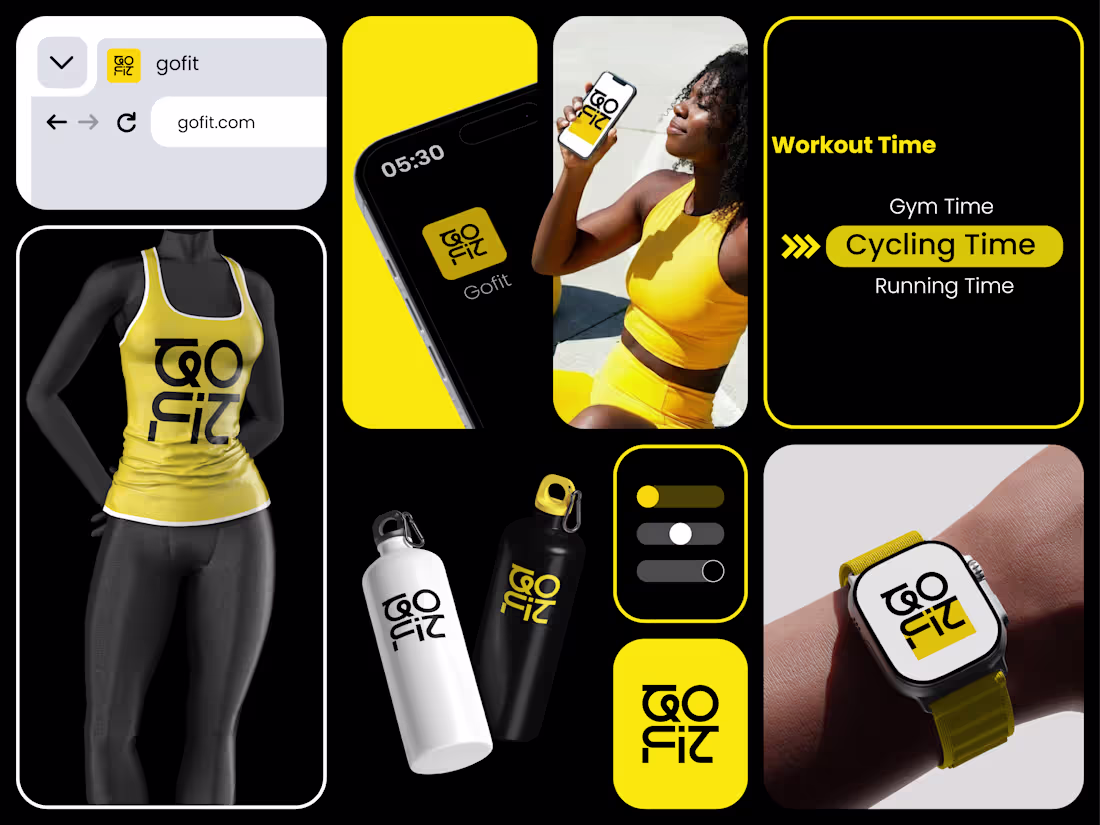
GoFit
I got a brief for a fitness and wellness brand.
The brief?
Create a bold, energetic identity that motivates people to stay active while feeling modern, memorable, and digitally driven.
Here's how I brought GoFit to life:
• Explored the mindset of fitness enthusiasts who are constantly striving to improve, stay consistent, and achieve their personal goals.
• Developed a brand strategy centered around movement, progress, and making fitness an accessible part of everyday life.
• Designed a custom logo that combines strong geometric forms with a compact, recognizable structure that performs well across digital and physical touchpoints.
• Built a high-contrast visual identity using black, white, and vibrant yellow to communicate energy, confidence, and motivation.
• Created a flexible brand system that works seamlessly across mobile apps, wearable devices, fitness apparel, merchandise, and marketing campaigns.
The result?
A brand identity that feels dynamic, modern, and instantly recognizable. One that inspires action and helps users stay connected to their fitness journey every step of the way.
The client's reaction?
"This perfectly captures the energy and ambition behind our brand. It feels bold, modern, and ready to grow with us."
3
2
198
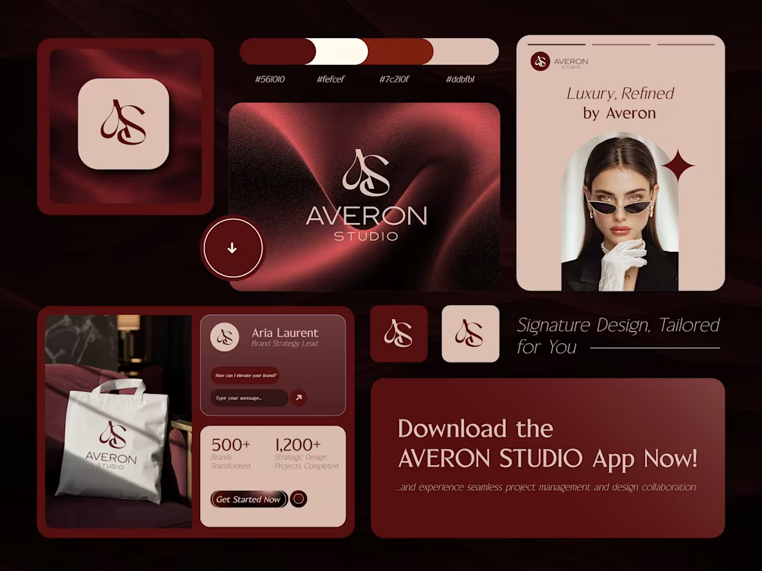
Averon Studio
I got a brief for a premium design and branding agency.
The brief?
Create a sophisticated identity that reflects creativity, strategy, and high-end design while building trust with ambitious brands seeking exceptional results.
Here's how I brought Averon Studio to life:
• Explored what premium clients value most: expertise, exclusivity, attention to detail, and a seamless creative experience.
• Developed a brand strategy centered around transforming ideas into elegant, impactful visual identities.
• Crafted a refined monogram that serves as a timeless signature, reinforcing the studio's commitment to bespoke design solutions.
• Built a luxurious visual identity using rich burgundy tones, soft neutrals, and elegant typography to communicate confidence and sophistication.
• Created a cohesive brand system that extends across digital platforms, client touchpoints, marketing assets, and premium brand experiences.
The result?
A brand identity that feels polished, trustworthy, and premium. The goal was to position Averon Studio as a strategic creative partner for businesses looking to elevate their presence and create meaningful connections with their audience.
The client's reaction?
"This perfectly captures the level of sophistication and professionalism we want clients to experience from the moment they discover our brand."
1
144
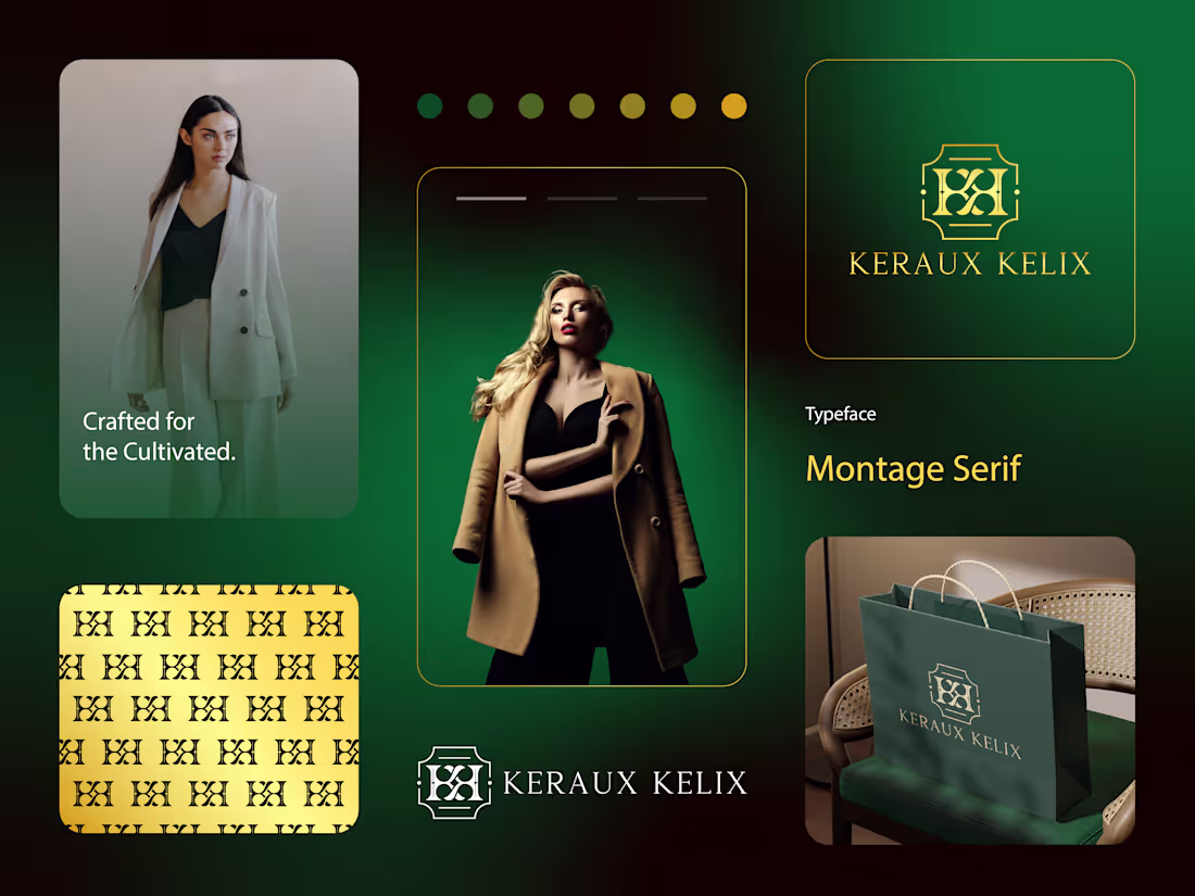
Keraux Kelix
I got a brief for a luxury fashion brand.
The brief?
Create a sophisticated identity that embodies exclusivity, craftsmanship, and timeless elegance while appealing to discerning, style-conscious consumers.
Here's how I brought Keraux Kelix to life:
Explored the values luxury customers seek most prestige, quality, refinement, and individuality.
Developed a brand strategy centered around understated elegance, where every detail reflects confidence and sophistication.
Crafted a custom monogram that serves as a distinctive brand signature, balancing heritage-inspired design with a modern aesthetic.
Built a premium visual identity using deep emerald green and gold tones to convey luxury, status, and timeless appeal.
Created a cohesive branding system designed to elevate every touchpoint, from packaging and shopping bags to digital experiences and marketing materials.
The result?
A brand identity that feels exclusive, polished, and enduring. One that positions Keraux Kelix as more than a fashion label, it becomes a symbol of refined taste and elevated living.
The client's reaction?
"This feels like a luxury house with history and prestige. It's elegant, distinctive, and exactly the image we wanted to project."
1
145
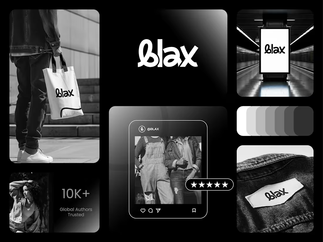
Blax
I got a brief for a contemporary fashion brand.
The brief?
Create a bold and recognizable identity that reflects confidence, individuality, and modern street culture without relying on trends that quickly fade.
Here's how I brought Blax to life:
Explored the mindset of style-conscious consumers who value authenticity, self-expression, and timeless design.
Built a brand strategy around simplicity, confidence, and creating a strong visual presence with minimal elements.
Crafted a custom wordmark with unique letterforms that gives the brand a distinctive and memorable identity.
Developed a monochromatic visual system that reinforces sophistication, versatility, and effortless style.
Designed the identity to perform seamlessly across apparel labels, packaging, advertising, social media, and retail environments.
The result?
A brand identity that feels bold, premium, and unmistakably modern. One that stands out through clarity and confidence rather than complexity.
The client's reaction?
"This is exactly what we wanted - clean, distinctive, and powerful. It feels like a brand people can instantly recognize and trust."
2
136
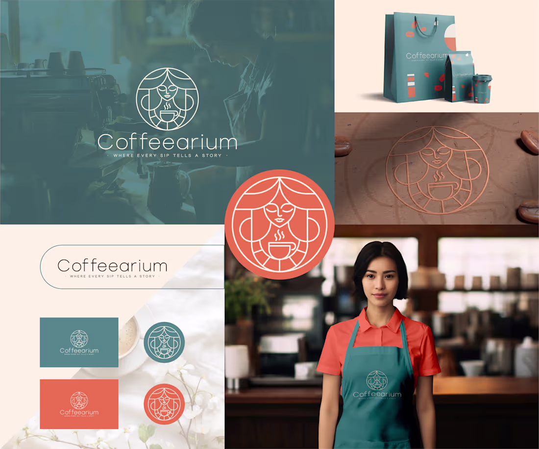
A coffee brand is more than the beans it serves; it's the stories shared around every cup.
For Coffeearium, I created a warm and inviting brand identity inspired by connection, comfort, and the ritual of coffee. The custom emblem blends a serene character with a steaming cup, creating a memorable symbol that feels both modern and timeless.
Coffeearium, Where Every Sip Tells A Story. ☕✨
1
159
Kitty Boss
I got a brief for a pet brand.
The brief?
Create a fun, memorable identity that pet owners would instantly love while giving the brand a playful personality that stands out in the pet care market.
Here's how I brought Kitty Boss to life:
Explored what pet owners value most; the joy, companionship, and unique personalities their pets bring into their lives.
Built a brand concept around the idea that every cat secretly runs the house, making them the true "boss" of the family.
Designed a charming mascot featuring a well-dressed cat character to create an immediate emotional connection with customers.
Developed a warm, friendly color palette inspired by comfort, playfulness, and the affection people have for their pets.
Created a versatile identity system that works across pet accessories, packaging, tags, merchandise, and promotional materials.
The result?
A brand identity that's playful, approachable, and instantly recognizable. One that captures the confidence, charm, and quirky personality that cat lovers know so well.
The client's reaction?
"This is exactly what Kitty Boss should be - cute, memorable, and full of character. We couldn't stop smiling when we saw it."
1
119
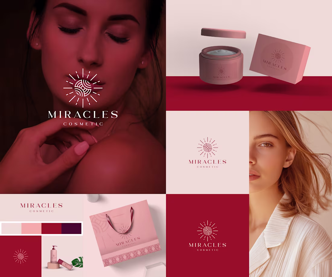
Miracles Cosmetic
I got a brief for a beauty and skincare brand.
The brief?
Create a premium cosmetic brand that makes customers feel radiant, confident, and beautiful while standing out in a crowded beauty market.
Here's how I brought Miracles Cosmetic to life:
Explored what consumers truly seek from beauty products, not just results, but confidence, self-care, and transformation.
Built a brand story around the idea that beauty isn't about perfection; it's about revealing the best version of yourself.
Designed a custom emblem inspired by light, renewal, and positive transformation, creating a symbol that feels both elegant and memorable.
Developed a sophisticated visual identity using warm blush, rose, and rich crimson tones to evoke luxury, femininity, and trust.
Created a cohesive branding system that extends seamlessly across packaging, shopping bags, product labels, and marketing materials.
The result?
A brand identity that feels premium, aspirational, and emotionally engaging. One that transforms everyday beauty routines into moments of confidence and self-expression.
The client's reaction?
"This feels like the perfect balance of luxury and warmth. It's exactly how we want customers to feel when they experience our brand."
1
156
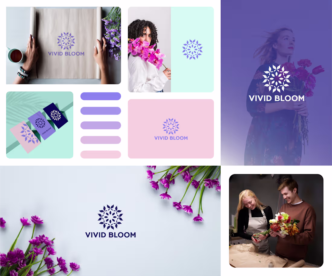
Vivid Bloom
I got a brief for a floral and gifting brand.
The brief?
Create a brand that celebrates life's meaningful moments through the beauty of flowers, while feeling modern, uplifting, and memorable.
Here's how I brought Vivid Bloom to life:
Explored the emotions behind gifting flowers - love, gratitude, celebration, and connection.
Developed a brand story centered around helping people express feelings that words alone can't always capture.
Designed a custom floral-inspired symbol that represents growth, beauty, joy, and the many ways people connect through meaningful gestures.
Built a fresh visual identity using soft lavender, blush, and mint tones to create a feeling of warmth, elegance, and positivity.
Created a versatile branding system that works seamlessly across packaging, stationery, social media, and retail experiences.
The result?
A brand identity that feels vibrant, welcoming, and full of life. One that transforms a simple bouquet into a memorable experience and helps customers celebrate the moments that matter most.
The client's reaction?
"This perfectly captures the emotion behind our brand. It feels fresh, beautiful, and instantly recognizable."
2
3
222
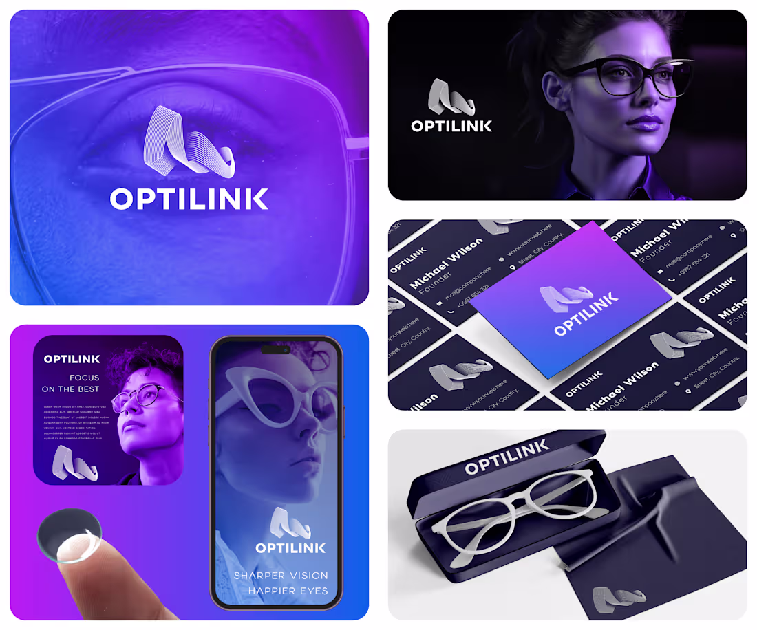
Optilink
I got a brief for an eyewear and vision-care brand.
The brief?
Create a modern, innovative brand that communicates clarity, precision, and confidence while standing out in a highly competitive optical market.
Here's how I brought Optilink to life:
Explored the relationship between vision, technology, and human connection to uncover what truly matters to modern eyewear consumers.
Developed a brand strategy centered around helping people see the world with greater clarity and confidence.
Designed a distinctive abstract symbol inspired by fluid sightlines, optical precision, and seamless connectivity.
Crafted a bold visual identity using vibrant blue and violet tones to represent innovation, trust, and forward-thinking design.
Built a scalable brand system that works effortlessly across packaging, retail experiences, digital platforms, and marketing materials.
The result?
A brand identity that feels modern, intelligent, and premium. One that positions Optilink as more than an eyewear company it becomes a trusted partner in helping people see and experience life more clearly.
The client's reaction?
"This perfectly captures the innovation and confidence we wanted our brand to represent. It feels fresh, memorable, and future-ready."
2
4
252
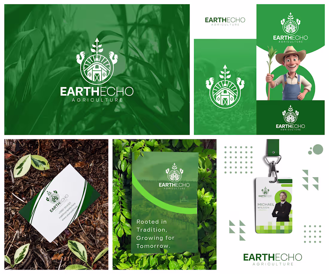
EarthEcho Agriculture
I got a brief for an agriculture brand.
The brief?
Create a brand that honors farming traditions while positioning the business as a forward-thinking leader in sustainable agriculture.
Here's how I brought EarthEcho Agriculture to life:
Explored the values that matter most to modern farmers and agricultural communities trust, stewardship, growth, and resilience.
Developed a brand story centered around the connection between generations of agricultural knowledge and future innovation.
Designed a custom emblem that combines a farmhouse, cultivated fields, thriving crops, and livestock to reflect the complete farming ecosystem.
Built a fresh, nature-inspired visual identity using shades of green to symbolize sustainability, prosperity, and environmental responsibility.
Created a versatile branding system that works seamlessly across signage, stationery, marketing materials, uniforms, and digital platforms.
The result?
A brand identity that celebrates the roots of agriculture while embracing the opportunities of tomorrow. One that communicates reliability, expertise, and a deep commitment to the land.
The client's reaction?
"This feels like more than a logo, it tells the story of who we are, where we come from, and where we're headed."
1
159
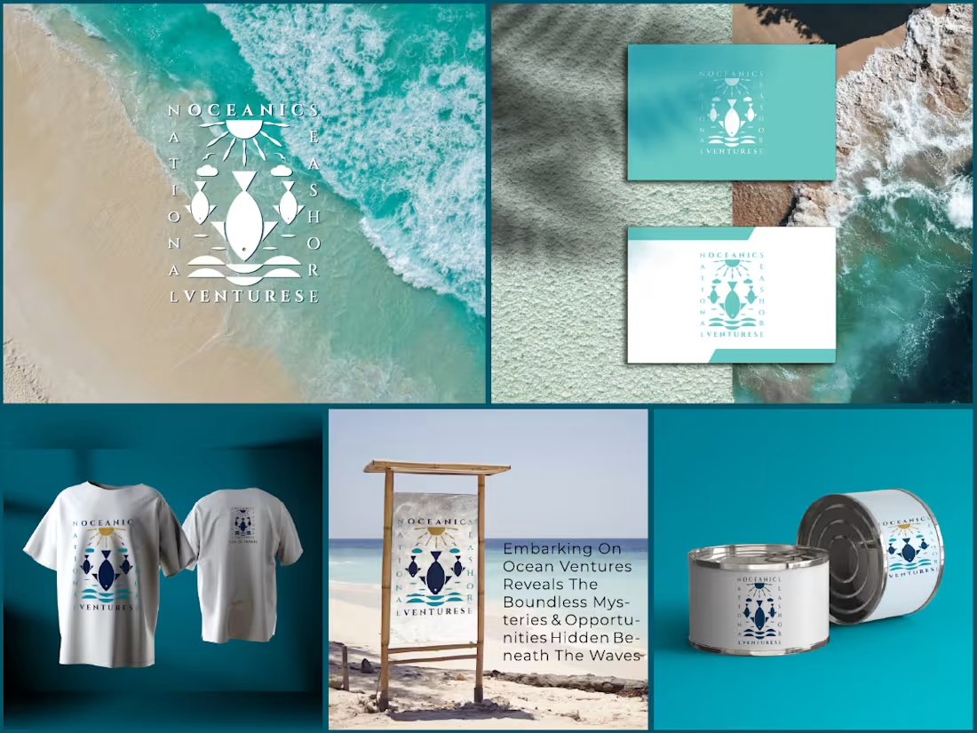
Oceanic Ventures
I got a brief for an ocean exploration and adventure brand.
The brief?
Create a brand that captures the excitement of discovering the unknown while reflecting the beauty, power, and serenity of the ocean.
Here's how I brought Oceanic Ventures to life:
Explored the mindset of modern adventurers who seek meaningful experiences beyond traditional travel.
Built a brand narrative centered around exploration, connection with nature, and endless possibilities beyond the horizon.
Designed a custom emblem that combines oceanic elements, waves, marine life, and celestial motifs to symbolize discovery and navigation.
Developed a vibrant coastal color palette inspired by crystal-clear waters, sandy shores, and the ever-changing sea.
Created a versatile visual identity system that translates seamlessly across apparel, signage, promotional materials, and branded merchandise.
Final result?
A brand identity that goes beyond showcasing ocean adventures. It inspires curiosity, fuels exploration, and invites people to experience the wonders hidden beneath and beyond the waves.
The client's reaction?
"This identity perfectly captures the sense of adventure and discovery that defines our brand."
2
186
Audio Script
I got a brief for an audio transcription and content solutions company.
The brief?
Create a professional brand identity that communicates clarity, accuracy, and seamless communication in a digital-first world.
Here's how I brought Audio Script to life:
Explored the relationship between spoken words and written content, which forms the foundation of the company's services.
Developed a concept that visually bridges audio and text through a single, memorable symbol.
Designed a custom mark where a flowing sound wave transforms into a document, representing the conversion of speech into structured information.
Chose a clean, modern typography style to reinforce professionalism, reliability, and ease of use.
Built a bold yet approachable color palette that helps the brand stand out while maintaining a strong corporate presence.
The result?
A simple, intelligent identity that instantly communicates what the business does while positioning it as a trusted partner for transcription, documentation, and content services.
The client's reaction?
"The logo explains our entire service in a single glance. It's simple, memorable, and exactly what we needed."
2
188
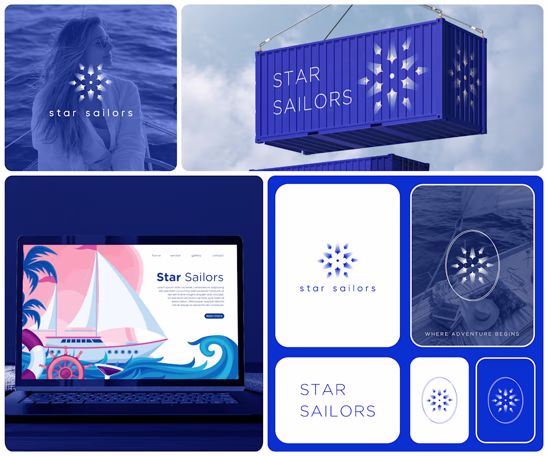
I got a brief for a luxury sailing and travel brand.
The brief?
Create a brand that captures the freedom of the open sea while appealing to travelers seeking unforgettable, premium experiences.
Here's how I brought Star Sailors to life:
Explored the emotions that drive adventure seekers freedom, discovery, and a desire to escape the ordinary.
Defined a brand personality centered around elegance, trust, and exploration.
Developed a visual concept inspired by celestial navigation, where sailors once relied on the stars to guide their journeys.
Designed a distinctive symbol that blends the beauty of a star with the spirit of maritime travel.
Paired it with modern, minimalist typography and a deep ocean-inspired color palette to evoke sophistication and serenity.
The result?
A brand identity that feels both aspirational and approachable. One that inspires confidence, sparks curiosity, and reflects the magic of discovering new horizons.
The client's reaction?
"You didn't just create a logo, you captured the feeling of setting sail toward something extraordinary."
1
191
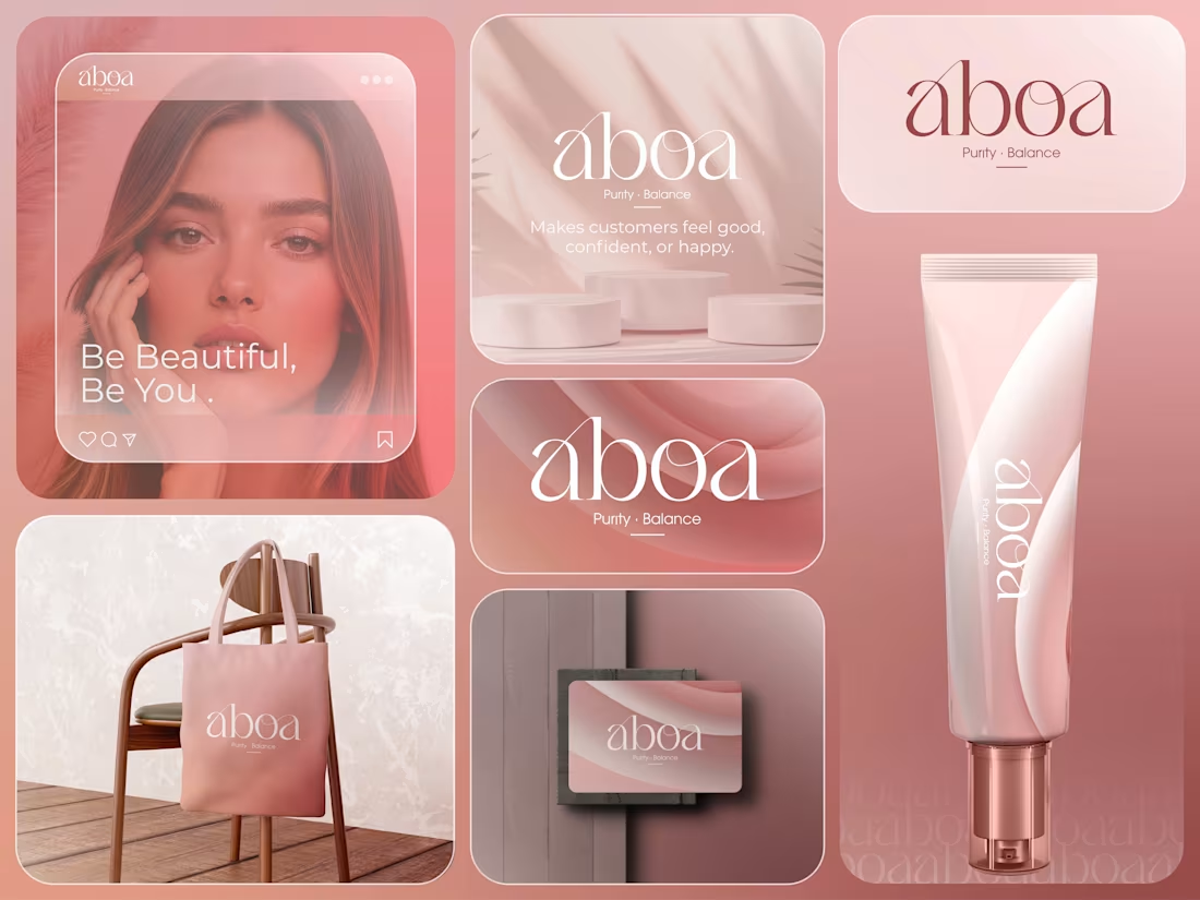
Aboa — Premium Skincare Brand Identity & Packaging Design
Aboa is a modern skincare brand identity designed to embody purity, confidence, and everyday luxury. The branding combines a custom typographic logo, a soft blush-toned color palette, and elegant visual elements to create a clean, approachable, and premium aesthetic. The identity was developed to resonate with beauty-conscious consumers seeking high-quality skincare products while maintaining a refined and contemporary market presence. The project included logo design, visual identity development, packaging design, color direction, typography, and branded marketing applications, resulting in a cohesive brand experience across digital and physical touchpoints.
1
246
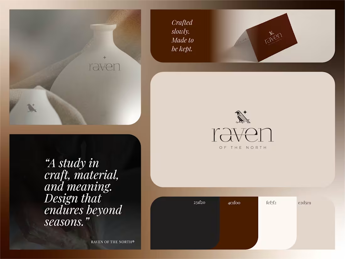
Raven of the North is a luxury lifestyle brand identity inspired by craftsmanship, heritage, and timeless design. The visual system combines an elegant serif wordmark, a refined raven symbol, and a warm, earthy color palette to create a sophisticated and memorable brand presence. Every element was carefully crafted to reflect quality, authenticity, and enduring value while maintaining a modern, minimalist aesthetic. The project included logo design, brand identity development, typography selection, color direction, and branded applications, resulting in a cohesive visual experience that elevates the brand and strengthens its connection with its audience.
1
239
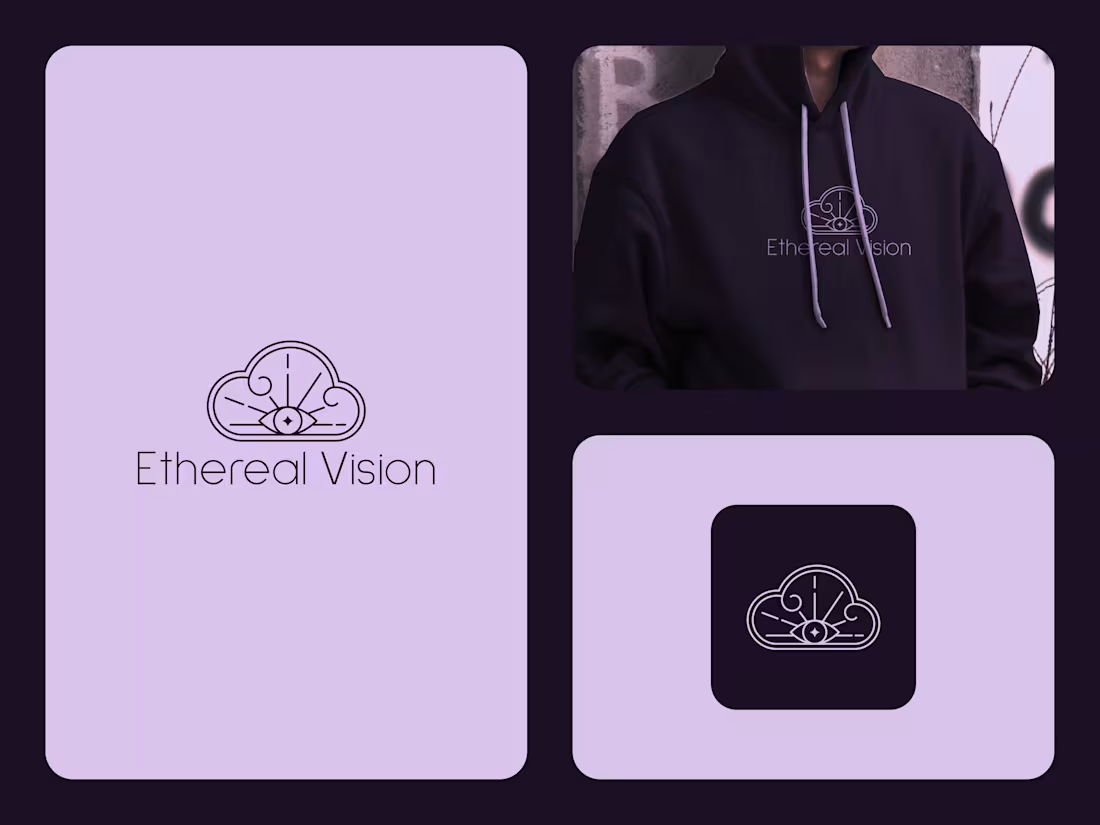
Ethereal Vision
I got a brief for a spiritual lifestyle and metaphysical brand.
The brief?
Create an identity that reflects inner wisdom, mindfulness, and spiritual awakening while feeling elegant, calming, and memorable across products, services, and digital experiences.
Here's how I brought Ethereal Vision to life:
• I explored the symbolism of intuition, higher consciousness, and personal transformation, creating a brand that resonates with people seeking clarity, balance, and deeper meaning.
• We defined a mission: Inspire spiritual growth through thoughtfully curated products, guidance, and experiences that encourage self-discovery and mindful living.
• Established a vision: To become a trusted destination where spirituality, creativity, and personal enlightenment come together in a modern and approachable way.
• Designed a custom emblem featuring a celestial cloud surrounding an all-seeing eye, symbolizing divine insight, protection, intuition, and the connection between the physical and spiritual worlds.
• Enhanced the identity with radiant lines, flowing curves, and minimalist celestial details that evoke serenity while maintaining a refined and contemporary aesthetic.
• Developed a sophisticated visual identity using soft lavender tones with deep plum backgrounds, creating a peaceful yet premium atmosphere that reflects wisdom, harmony, and mystical elegance.
The result?
A brand identity that inspires trust, curiosity, and self-reflection, inviting people to embrace a journey of mindfulness, intuition, and spiritual discovery.
The client's reaction?
"The identity feels calm, meaningful, and beautifully balanced. It communicates spirituality in a modern way while giving our brand a distinctive presence that our audience will immediately connect with."
1
21
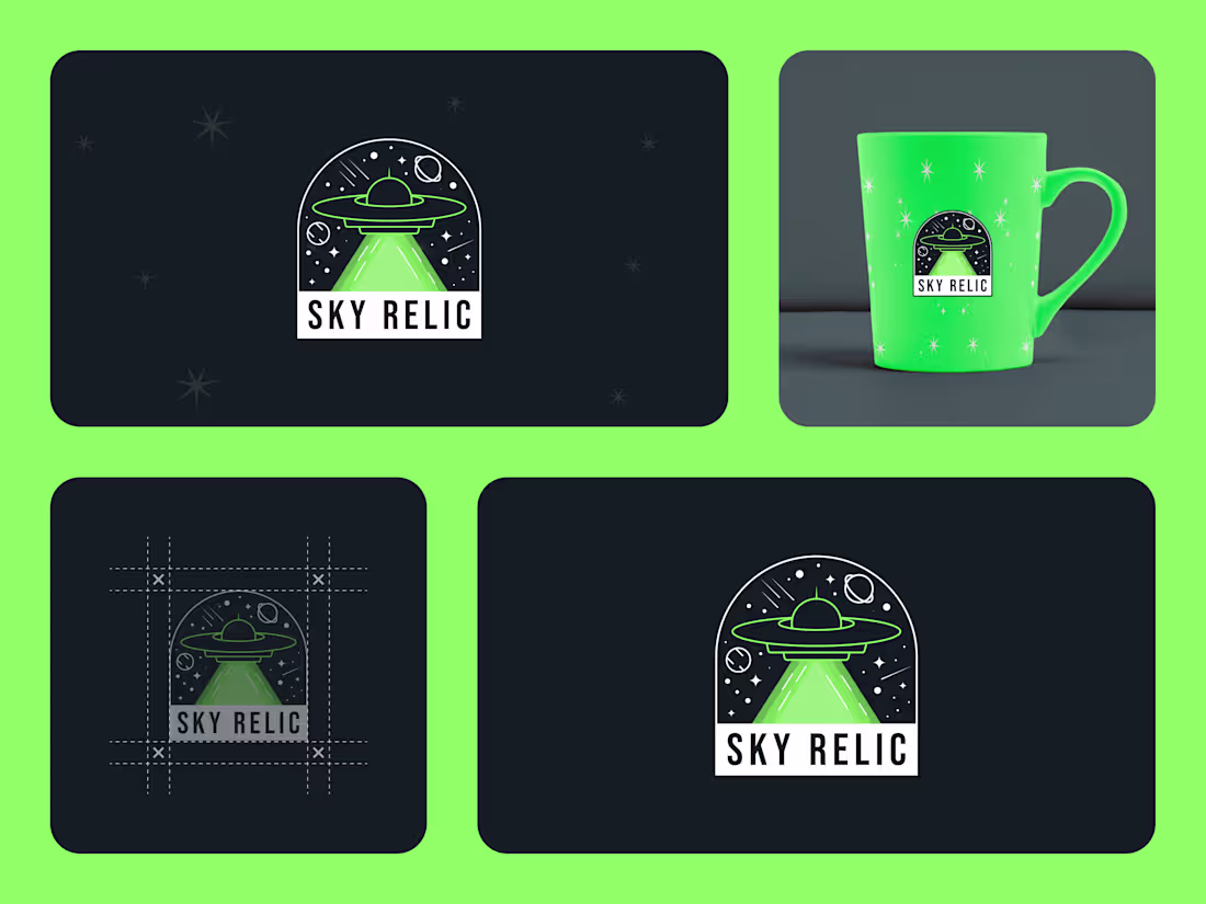
Sky Relic
I got a brief for a collectibles and memorabilia brand.
The brief?
Create a memorable identity for a brand centered around UFO culture, cosmic discoveries, and the fascination of exploring worlds beyond our own.
Here's how I brought Sky Relic to life:
• I explored the emotions that drive collectors and enthusiasts who are captivated by unexplained phenomena, space exploration, and the thrill of uncovering rare treasures.
• We defined a mission: Celebrate curiosity and discovery through collectibles that inspire wonder and keep the spirit of exploration alive.
• Established a vision: To become a recognizable destination for people who appreciate cosmic stories, mysterious artifacts, and imaginative adventures.
• Designed a custom UFO-inspired emblem that instantly communicates exploration, mystery, and the excitement of encountering the unknown.
• Incorporated celestial details such as planets, stars, and a focused beam of light to reinforce the brand's connection to space and extraterrestrial themes.
• Developed a bold visual system using deep cosmic tones paired with vibrant green accents, creating a distinctive identity that feels futuristic, memorable, and highly recognizable.
The result?
A brand identity that transforms a simple collectibles business into an experience filled with imagination, adventure, and endless possibilities waiting to be discovered.
The client's reaction?
"This feels exactly like the world we wanted to create. The logo instantly tells a story, and the space-inspired details make the brand feel exciting, unique, and unforgettable."
1
50
Symbolic Eye
I got a brief for a tattoo studio and symbolic art brand.
The brief?
Create a bold identity that reflects the deeper meaning behind body art, blending sacred geometry, spiritual symbolism, and modern tattoo culture into a memorable visual experience.
Here's how I brought Symbolic Eye to life:
• I explored the connection between tattoos and personal transformation, creating a brand that represents stories, beliefs, and individuality rather than just ink on skin.
• We defined a mission: Transform meaningful ideas into timeless body art through symbolism, craftsmanship, and artistic expression.
• Established a vision: To become a destination for clients seeking tattoos that carry purpose, emotion, and lasting significance.
• Designed a custom emblem featuring an all-seeing eye enclosed within a geometric triangle, representing intuition, protection, balance, and inner awareness.
• Enhanced the identity with celestial details, radiant lines, and minimalist ornamental elements that evoke mystery while maintaining a refined and contemporary aesthetic.
• Developed a monochromatic visual system that pairs crisp white linework with deep black backgrounds, creating a striking identity that stands out across signage, merchandise, social media, and studio branding.
The result?
A brand identity that feels powerful, artistic, and deeply symbolic, inviting clients to wear meaningful stories with confidence and individuality.
The client's reaction?
"The logo feels like a modern talisman. It captures the spiritual energy and artistic precision of our studio while giving the brand a distinctive identity that people instantly remember."
1
25
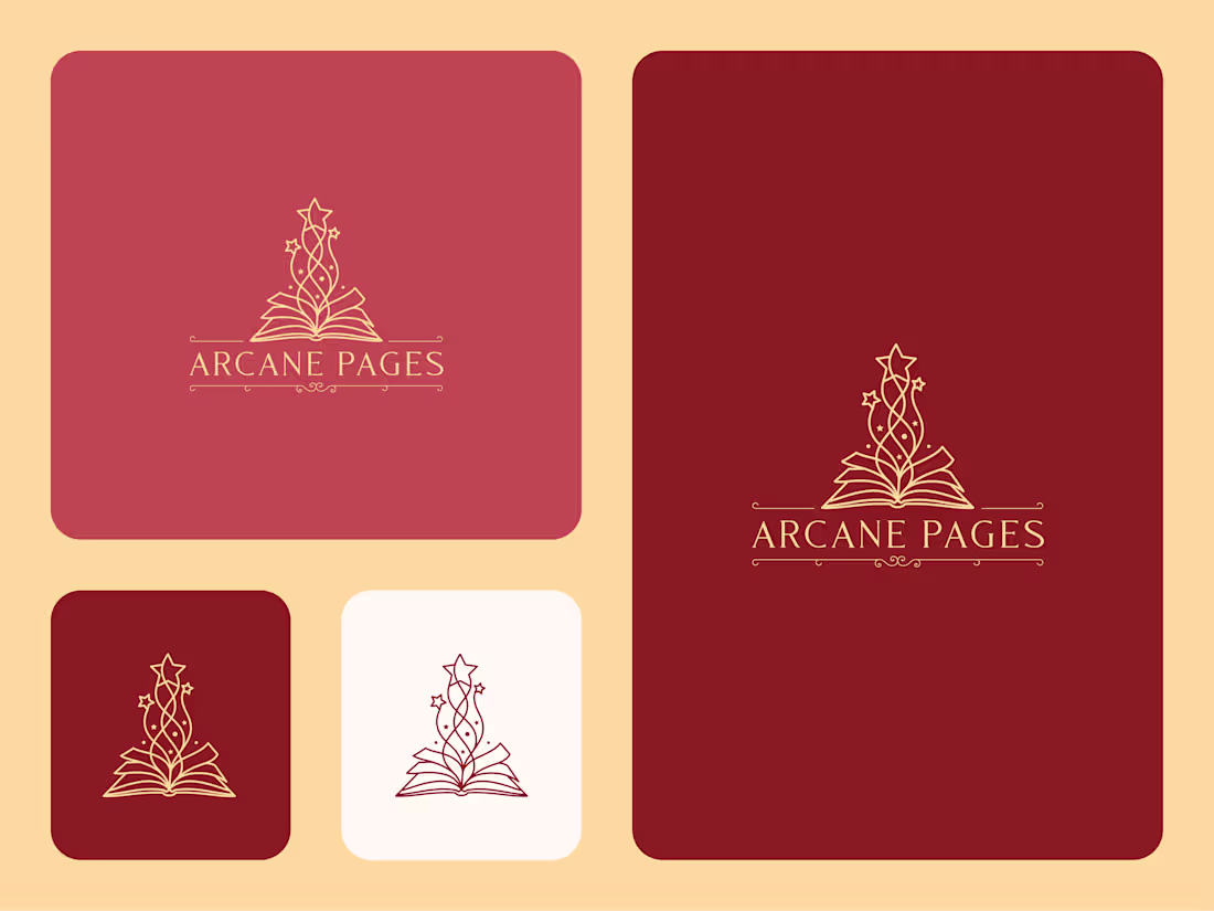
Every great story begins with a single page. Arcane Pages was envisioned as a brand for magical journals, fantasy-inspired stationery, and imaginative publishing projects that celebrate creativity, wonder, and the timeless art of storytelling. Designed for readers, writers, and dreamers alike, the brand captures the feeling of opening a book and stepping into an entirely new world.
The logo features an open book transformed into a source of enchantment, with flowing mystical elements rising from its pages and culminating in a radiant star. This symbolism reflects the power of knowledge, imagination, and discovery. The elegant linework and classic typography create a refined identity that feels both literary and magical, while the warm crimson and gold palette evokes the charm of treasured manuscripts and legendary tales.
Whether applied to journals, notebooks, book covers, publishing materials, bookmarks, packaging, or digital reading platforms, the identity remains distinctive and memorable. Arcane Pages is more than a visual mark - it is an invitation to explore stories, preserve ideas, and celebrate the magic hidden within every page.
1
33
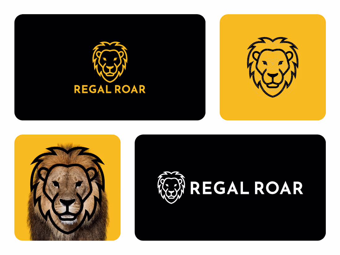
Regal Roar
I got a brief for a luxury men's grooming and lifestyle brand.
The brief?
Create a bold identity that embodies confidence, leadership, and timeless sophistication while making the brand instantly recognizable across premium products and digital platforms.
Here's how I brought Regal Roar to life:
• I explored the qualities associated with a lion, strength, courage, authority, and resilience, shaping a brand that inspires confidence and commands attention.
• We defined a mission: Empower individuals to embrace their confidence through premium products and a bold, refined brand experience.
• Established a vision: To become a trusted lifestyle brand recognized for quality, excellence, and a distinctive identity that represents leadership.
• Designed a custom lion emblem using clean geometric linework, creating a modern interpretation of royalty while maintaining a timeless and versatile appearance.
• Balanced sharp contours with symmetrical proportions to communicate stability, confidence, and precision, making the mark memorable across both digital and print applications.
• Developed a premium visual identity using black, white, and rich golden accents, delivering a sophisticated aesthetic that reflects power, prestige, and enduring elegance.
The result?
A brand identity that projects confidence at first glance, giving Regal Roar a commanding presence that feels premium, trustworthy, and instantly memorable.
The client's reaction?
"This identity perfectly reflects the confidence and strength we wanted our brand to represent. The lion feels modern, premium, and powerful without being overly complicated, making it exactly the statement we were looking for."
0
4
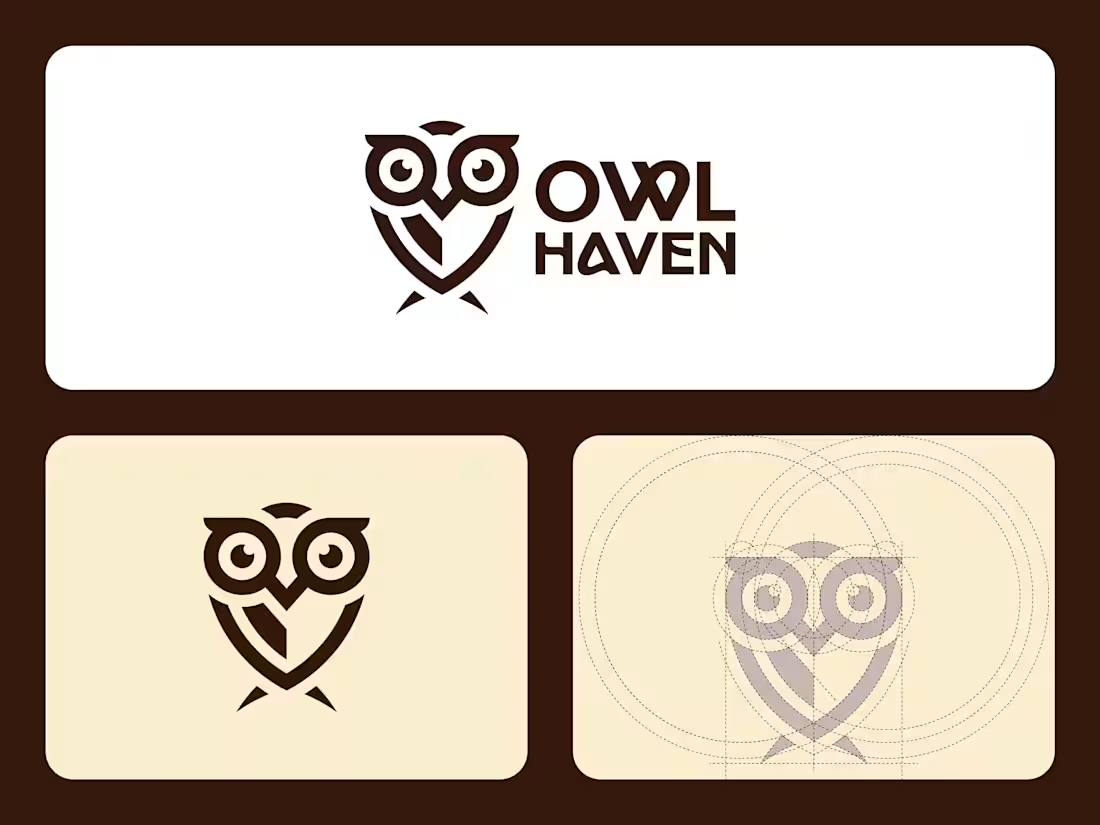
Owl Haven
I got a brief for an educational supplies and stationery brand.
The brief?
Create a friendly yet professional identity that represents knowledge, creativity, and learning while appealing to students, educators, and parents through a memorable and approachable brand.
Here's how I brought Owl Haven to life:
• I explored the symbolism of the owl as a timeless representation of wisdom, curiosity, and lifelong learning, building a brand that instantly communicates trust and education.
• We established a mission: Make quality educational supplies accessible while inspiring creativity, confidence, and academic growth for learners of all ages.
• Defined a vision: To become a trusted destination for school essentials and learning tools that encourage exploration, organization, and success.
• Designed a clean geometric owl emblem that combines simplicity with personality, creating an instantly recognizable mark that remains versatile across packaging, digital platforms, and promotional materials.
• Crafted a warm visual identity using earthy brown tones and soft cream backgrounds, reflecting reliability, comfort, and the welcoming atmosphere of a modern educational brand.
• Paired the icon with bold custom typography to create a balanced identity that feels contemporary, approachable, and highly memorable in both large and small applications.
The result?
A brand identity that transforms everyday school supplies into a trusted learning companion, helping Owl Haven stand out as a friendly, dependable, and inspiring educational brand.
The client's reaction?
"The owl perfectly represents the values we wanted our brand to communicate. It feels smart, welcoming, and memorable, giving us an identity that parents, teachers, and students can instantly connect with."
1
7
Ethereal Vision
I got a brief for a spiritual lifestyle and metaphysical brand.
The brief?
Create an identity that reflects inner wisdom, mindfulness, and spiritual awakening while feeling elegant, calming, and memorable across products, services, and digital experiences.
Here's how I brought Ethereal Vision to life:
• I explored the symbolism of intuition, higher consciousness, and personal transformation, creating a brand that resonates with people seeking clarity, balance, and deeper meaning.
• We defined a mission: Inspire spiritual growth through thoughtfully curated products, guidance, and experiences that encourage self-discovery and mindful living.
• Established a vision: To become a trusted destination where spirituality, creativity, and personal enlightenment come together in a modern and approachable way.
• Designed a custom emblem featuring a celestial cloud surrounding an all-seeing eye, symbolizing divine insight, protection, intuition, and the connection between the physical and spiritual worlds.
• Enhanced the identity with radiant lines, flowing curves, and minimalist celestial details that evoke serenity while maintaining a refined and contemporary aesthetic.
• Developed a sophisticated visual identity using soft lavender tones with deep plum backgrounds, creating a peaceful yet premium atmosphere that reflects wisdom, harmony, and mystical elegance.
The result?
A brand identity that inspires trust, curiosity, and self-reflection, inviting people to embrace a journey of mindfulness, intuition, and spiritual discovery.
The client's reaction?
"The identity feels calm, meaningful, and beautifully balanced. It communicates spirituality in a modern way while giving our brand a distinctive presence that our audience will immediately connect with."
1
21
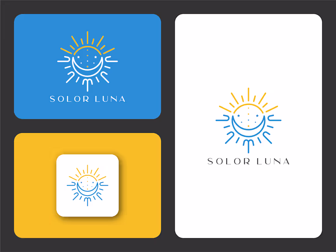
Solor Luna
I got a brief for a spiritual wellness and lifestyle brand.
The brief?
Create a calming identity that celebrates the harmony between the sun and the moon, reflecting balance, positivity, and mindful living through a timeless visual language.
Here's how I brought Solor Luna to life:
• I explored the symbolism of day and night, creating a brand that represents harmony, renewal, and the natural rhythm that connects people with the universe.
• We defined a mission: Inspire moments of peace and self-discovery through thoughtfully designed products that encourage mindfulness and inner balance.
• Established a vision: To become a trusted lifestyle brand recognized for blending celestial symbolism with modern, elegant design.
• Designed a custom emblem combining the sun and crescent moon into a single harmonious symbol, representing the balance between light and darkness, energy and tranquility.
• Enhanced the identity with radiant sun rays and subtle celestial stars, creating a clean, memorable mark that communicates warmth, optimism, and spiritual connection.
• Developed a fresh visual identity using vibrant golden yellow, calming blue, and crisp white, giving the brand a cheerful yet sophisticated personality that works beautifully across packaging, digital platforms, and lifestyle products.
The result?
A brand identity that radiates warmth, balance, and positivity while inviting people to embrace a lifestyle inspired by the beauty of the sun, moon, and the harmony they represent.
The client's reaction?
"This identity feels uplifting from the very first glance. The combination of the sun and moon perfectly reflects our vision, and the branding has a peaceful, memorable character that truly stands out."
2
26