
pro
Logo Flow
Crafting Your Brand's Logo and Identity Guidelines



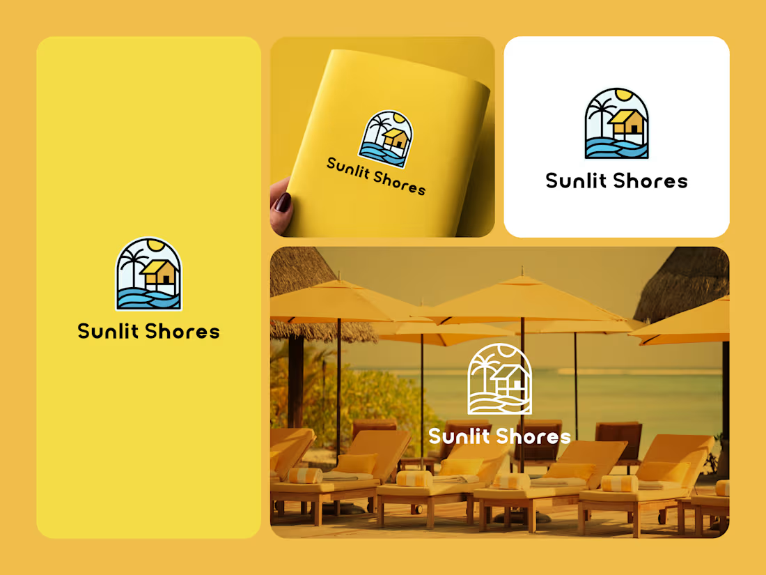
Sunlit Shores - Coastal Resort & Hospitality Branding
Sunlit Shores is a bright, welcoming coastal hospitality brand inspired by relaxed seaside living, warm sunlight, and the comfort of a tropical getaway. The identity combines a cheerful vacation atmosphere with a clean, approachable visual style, creating a brand that feels optimistic, refreshing, and easy to remember. The sunny yellow palette, complemented by ocean blue and warm neutral tones, reflects the energy of the shore while maintaining a polished hospitality feel.
The logo features a coastal retreat scene with a sun, palm tree, seaside waves, and a small shoreline home enclosed within an arched frame. The sun represents warmth and optimism, the palm tree reinforces the tropical setting, and the waves establish the connection to the coast. The house adds a sense of comfort and destination, communicating the idea of a welcoming place to relax. The compact illustrated emblem gives the identity strong recognition and makes it adaptable across different sizes and applications.
The Sunlit Shores identity extends naturally across resort signage, hospitality spaces, vacation rentals, apparel, stationery, promotional materials, social media, merchandise, guest amenities, and outdoor branding. The logo works effectively in both full-color and simplified applications, while the vibrant palette gives the brand a distinctive presence in coastal environments. Overall, Sunlit Shores creates a visual identity centered around sunshine, relaxation, coastal comfort, and memorable seaside experiences.
0
27
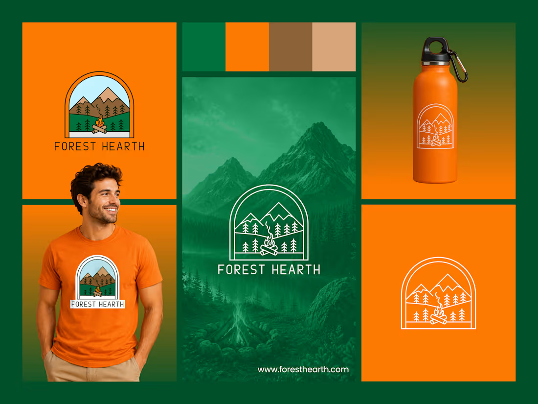
Forest Hearth - Outdoor Retreat & Nature Lifestyle Branding
Forest Hearth is a nature-inspired brand built around the warmth of the outdoors, peaceful mountain landscapes, and the simple comfort of gathering around a fire. The identity combines a rustic outdoor character with a clean, contemporary presentation, creating a brand that feels welcoming, adventurous, and grounded in nature. Deep forest green, warm earth tones, soft sky blue, and bright fire orange create a balanced palette inspired directly by the landscape.
The logo features a mountain landscape, evergreen trees, and a campfire enclosed within a rounded arch. The mountains represent exploration and the surrounding wilderness, while the evergreen trees reinforce the connection to the forest. At the center, the campfire becomes the heart of the mark, symbolizing warmth, gathering, comfort, and memorable moments outdoors. The arched frame gives the emblem a sense of shelter and creates a strong, recognizable shape that works across different brand applications.
The Forest Hearth identity can extend across outdoor retreats, cabins, camping experiences, adventure products, apparel, signage, merchandise, packaging, social media, and hospitality materials. The adaptable logo works effectively on both light and dark backgrounds, while the earthy color system reinforces the brand's natural character. Overall, Forest Hearth creates a distinctive visual identity centered around nature, adventure, warmth, and the feeling of coming together in the great outdoors.
2
53
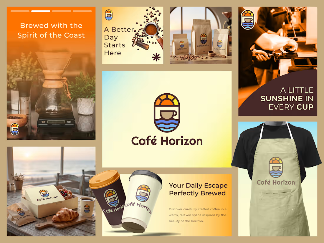
Café Horizon - Coastal Coffee Branding
Café Horizon is a warm, relaxed coffee brand inspired by the meeting point between great coffee and coastal living. The identity combines the comfort of a neighborhood café with the uplifting feeling of the sea and open horizons. A palette of warm orange, golden yellow, creamy neutrals, and deep brown creates an inviting visual character that feels energetic, welcoming, and easygoing.
The logo brings together a coffee cup, rising sun, and flowing ocean waves within a compact emblem. The cup communicates the brand's coffee focus, while the rising sun represents fresh beginnings and the optimism of a new day. The layered waves reinforce the coastal inspiration, creating a memorable symbol that works equally well in a café environment, on packaging, or as a small-scale brand mark.
The Café Horizon identity extends across coffee packaging, takeaway cups, bakery packaging, uniforms, aprons, café signage, menus, social media, promotional materials, and retail applications. The flexible emblem and warm color system allow the brand to maintain consistency across both physical and digital touchpoints. Overall, Café Horizon creates a distinctive visual identity built around good coffee, coastal warmth, everyday escapes, and the feeling of starting your day somewhere special.
0
36
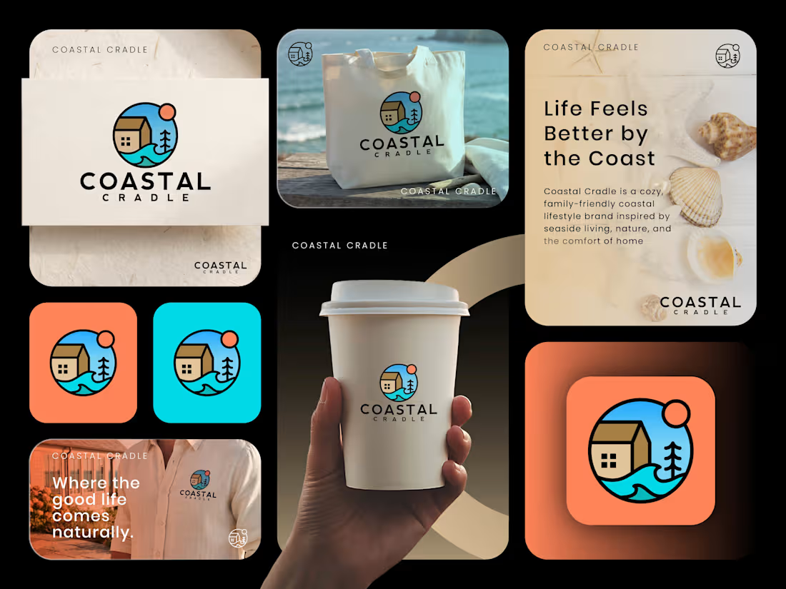
Coastal Cradle - Coastal Lifestyle Branding
Coastal Cradle is a warm and inviting coastal lifestyle brand inspired by the simple pleasures of seaside living, nature, and the comfort of home. The visual identity brings together a relaxed coastal character with a modern, family-friendly personality, creating a brand that feels approachable, cheerful, and timeless. A palette of ocean blue, warm coral, sandy beige, and natural neutrals reinforces the connection between the coast and everyday living.
The logo combines a coastal home, ocean waves, a tree, and the rising sun within a circular emblem. The home represents comfort and belonging, while the waves establish the connection to the sea and coastal lifestyle. The tree introduces nature and a sense of calm, while the warm sun adds optimism and energy. The bold, illustrated style gives the identity a friendly character while maintaining enough simplicity for strong recognition across different applications.
The Coastal Cradle identity extends across lifestyle products, apparel, tote bags, coffee cups, packaging, signage, social media, promotional materials, and retail applications. The flexible logo system and vibrant supporting palette allow the brand to move naturally between relaxed lifestyle imagery and bold graphic compositions. Overall, Coastal Cradle creates a distinctive visual identity centered around coastal comfort, family living, nature, and the feeling of home by the sea.
0
54