The network for creativity
Join 1.25M professional creatives like you
Connect with clients, get discovered, and run your business 100% commission-free
Creatives on Contra have earned over $150M and we are just getting started
Back to feedPost
Taste Test

Testing hero sections for a softball training Kajabi site- which one hits harder?
.
.
I’m on X too, mostly thinking out loud ideas, problems, and good people to follow https://x.com/rightnextstep?s=11


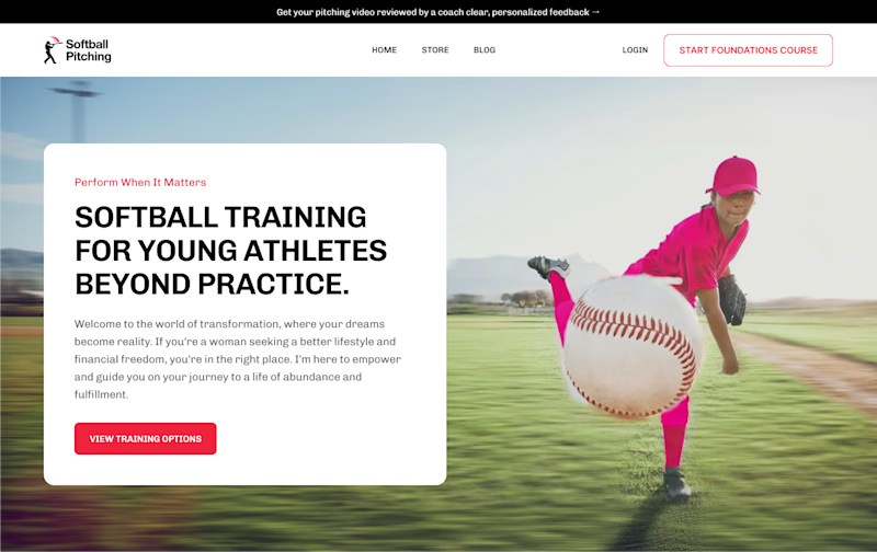
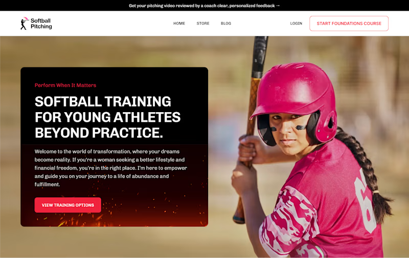
22 votes
Ends in 22h

Voted Hero 2, the dark overlay behind the text makes it way easier to read and the batting pose reads more determined than the pitching one. Feels more like a moment than a stock photo.

Hero two for me… it’s cleaner

very impressive design


Great typography and bold layout choices! For a high-energy sport like softball, the dynamic visuals and strong visual hierarchy in Option 1 grab attention immediately

Just like the look of the hero 2 section
The network for creativity
Join 1.25M professional creatives like you
Connect with clients, get discovered, and run your business 100% commission-free
Creatives on Contra have earned over $150M and we are just getting started
Trending

Claude
Claude has entered the design space. How are you using it?

Contra University
Learn from expert creatives how to earn more using next-gen AI tools.
Brand Design
The best brand designers are on Contra. Scroll to see what's trending in brand design. What are you building?
creativeaiflow
Creative AI workflows are evolving. What tools do you use, and what are their strengths and weaknesses?
freelancerlife
Freelancer life is wins, pivots, and everything in between. What’s yours right now?






Related posts

During the onboarding on Brainrot based on your online behavior you will be matched to one of six profiles! What would you be?

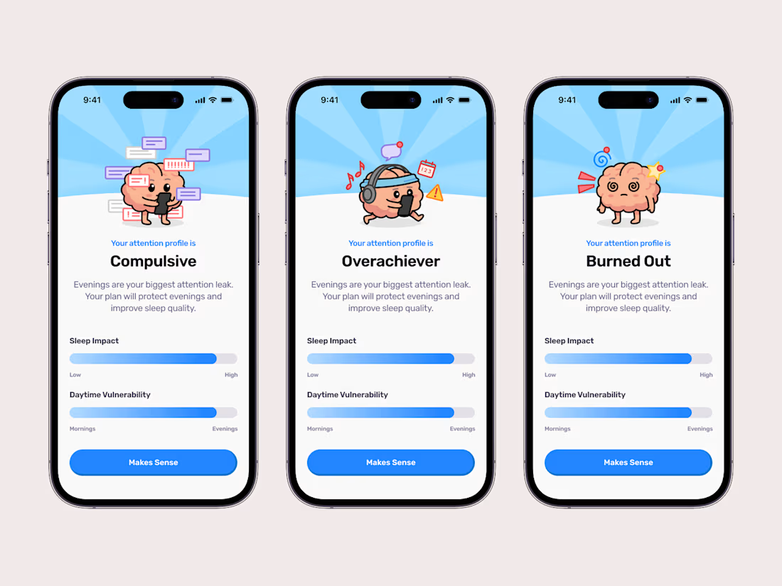

am i allowed to opt for all of the above? my attention profile is certainly colorful, at least i'd imagine. 😂

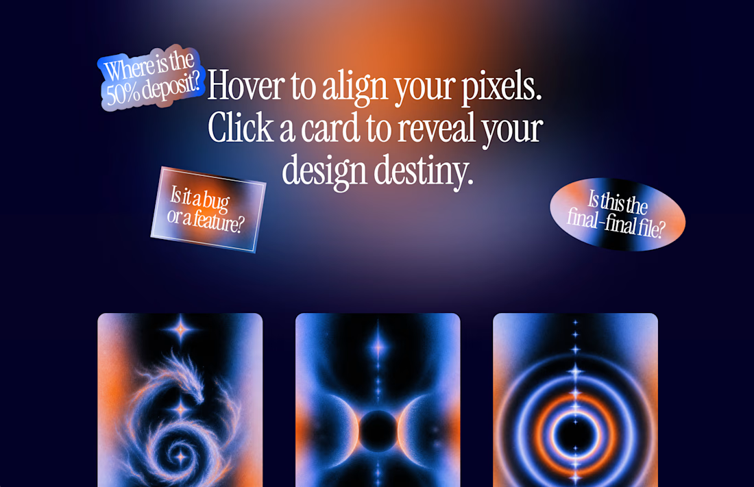
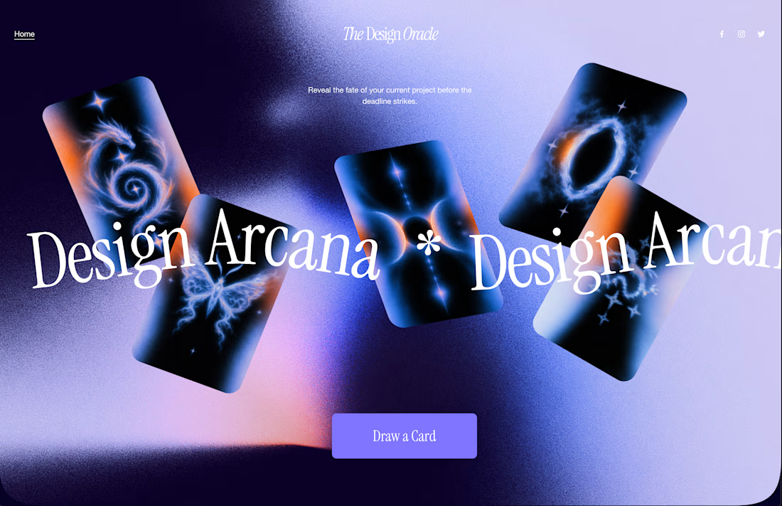
The Design Oracle is Live ✨ | Squarespace Make It Real Challenge
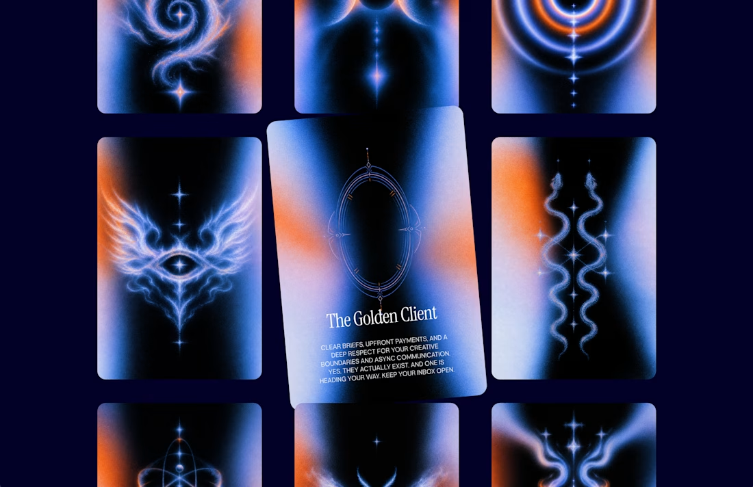
Ever wondered if that "final_FINAL_v4" file is actually the last one? Or if the client will ask to make the logo just a little bit bigger? Let the cards decide. 🔮
I’m thrilled to unveil The Design Oracle (or Design Arcana)—an interactive, mystical tarot experience created specifically for freelancers and designers to reveal the fate of their current projects.
This is my official submission for the Squarespace Make It Real Challenge. My goal was to completely break away from standard grid layouts and see how far I could push the creative boundaries using the new Finish Layer tools.
Here is how the magic works behind the scenes (without a single line of custom code):
Z-Axis & Overlapping: Used Fluid Engine to scatter the cards and floating stickers across the canvas, creating depth and a true "spread" feel.
Hover Reveals: Leveraged native image swap effects so users can organically "draw" a card just by exploring the screen.
Mobile Overrides: Rebuilt the entire chaotic desktop spread into a sleek, functional vertical stack for perfect mobile UX.
After over a decade in UI/UX and brand design, I still believe the best projects start with pure creativity before locking into rigid systems. This was incredibly fun to build.
Will you pull "The Golden Client" or "The Wheel of Feedback"?
Take a deep breath, align your pixels, and draw your card here:
https://round-herring-m73p.squarespace.
Password: contrathebest
I'd love to hear which destiny you got in the comments! 👇




Awesome work🔥👏👏

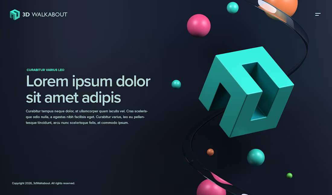

Impressive design. The branding feels strong and consistent.