The network for creativity
Join 1.25M professional creatives like you
Connect with clients, get discovered, and run your business 100% commission-free
Creatives on Contra have earned over $150M and we are just getting started
Back to feedPost

Chromatic Duel is a visual decision experience built in Wonder for the Contra x Wonder Challenge.
The project explores a simple idea:
Color palette selection should not only be about taste.
It should survive pressure.
Chromatic Duel turns two competing palette directions into a visible stress test. Ember enters as the bold, warm, dramatic direction. Tidal enters as the calm, precise, premium system direction.
Instead of presenting both palettes as moodboards, the Wonder canvas frames them as a duel.
The question is not:
“Which one looks better?”
The question is:
“Which one survives?”
Inside Wonder, I used the canvas to shape the full decision journey: the initial duel, the stress-test comparison, the iteration trail, the pivot in criteria, the workflow proof layer, and the final verdict.
The palettes are compared through four qualitative lenses:
Contrast
Harmony
Accessibility
System fit
As the system became clearer, Ember felt expressive but less stable. Tidal held together better across the interface direction, making it the stronger final choice.
Final Wonder verdict:
TIDAL SURVIVES.
Ember is archived.
I also created a Framer page as a bonus interactive wrapper. It lets visitors try challenger palettes and compare them visually against the fixed Tidal benchmark. The Framer page extends the experience, but the official build, workflow, and final decision remain in Wonder.
The core memory line:
The palette that survives the stress test wins.
Walkthrough video:
Uploaded directly with this submission.
Framer bonus page:
https://cyan-lettuce-159672.framer.app/


Wonder helped me generate competing directions, explore variants, reframe the criteria, and turn the final decision into a clear visual canvas.
The network for creativity
Join 1.25M professional creatives like you
Connect with clients, get discovered, and run your business 100% commission-free
Creatives on Contra have earned over $150M and we are just getting started






Related posts

Holographic is back, so I built the same concert ticket two ways in code. Which one would you keep after the show?
Foil: the rainbow shifts as it tilts. Silver: embossed type, one clean light sweep.
Vote, and tell me what you'd print on yours.
46 voted
82%
10 voted
18%
56 votes
Closed

Silver make it feel more real then Foil,,, good design in both

Lime Cream or Peach Fuzz? 🍋🟩🍑
Two animated isometric sets — same system, different mood. Cast your vote 👇
68 voted
78%
19 voted
22%
87 votes
Closed

Lime Cream. The dark linework pops more on it.

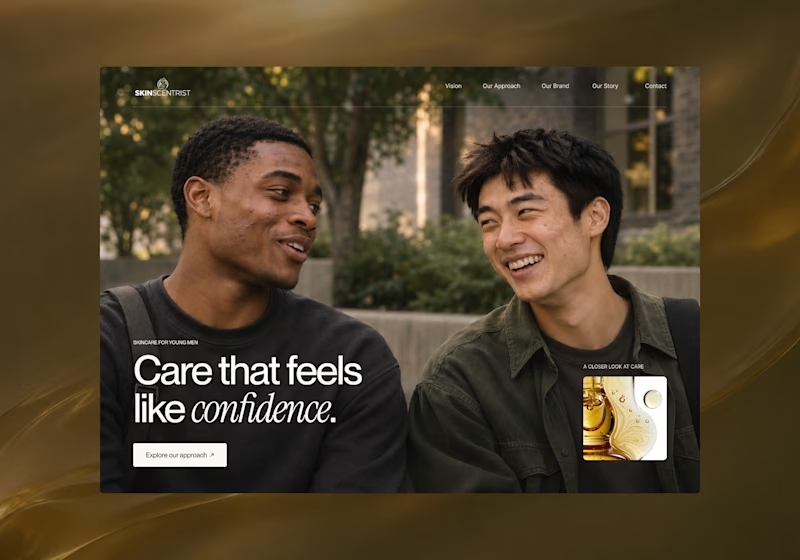
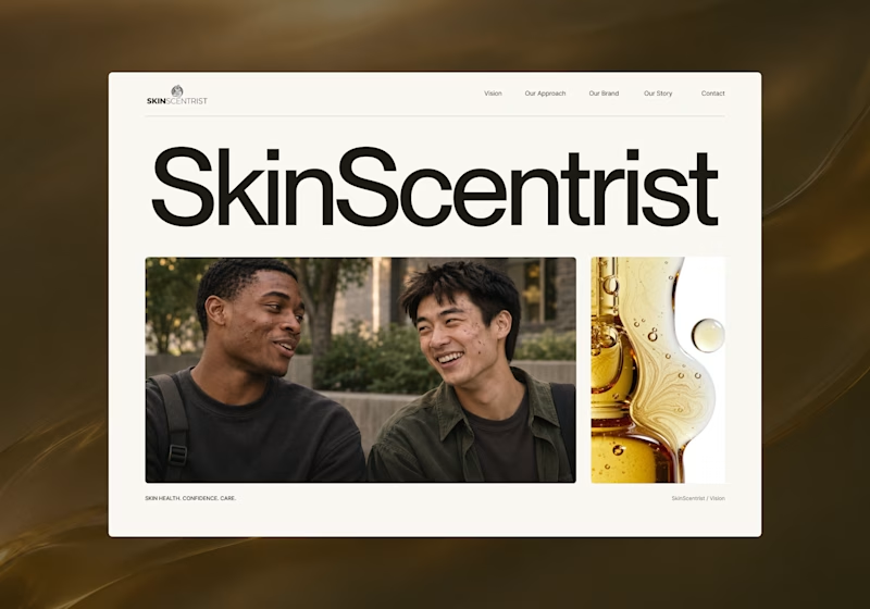
I’m exploring two homepage hero directions for SkinScentrist, a skincare brand focused on helping young men feel more confident in their skin.
Both concepts use the same imagery but take very different approaches to storytelling and visual hierarchy.
Direction 1 feels more emotional, immersive, and lifestyle-driven. The full-screen photography and bold messaging create a stronger connection to confidence and self-care.
Direction 2 feels more minimal, editorial, and brand-focused. The oversized typography, clean layout, and product imagery give it a more refined, contemporary skincare feel.
Direction 1: immersive, personal, emotional
Direction 2: minimal, editorial, premium
Which direction feels stronger for a modern skincare brand?

14 voted
93%
1 voted
7%
15 votes
Closed

Direction one — the full-screen photo feels warmer.