The network for creativity
Join 1.25M professional creatives like you
Connect with clients, get discovered, and run your business 100% commission-free
Creatives on Contra have earned over $150M and we are just getting started
Back to feedPost

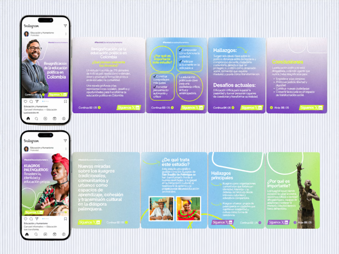
😍 This project involved four consulting sessions where, together with a team, we restructured the visual content strategy to better align with the brand’s identity.
The work focused on redefining how content is presented across digital platforms, including social media prototypes, typography systems, visual textures, photography direction, CTAs and overall content style.
We developed a cohesive approach that ensured consistency between visual design and messaging, improving clarity and engagement.
The magazine is part of the research division of Universidad Simón Bolívar in Barranquilla, Colombia.


The network for creativity
Join 1.25M professional creatives like you
Connect with clients, get discovered, and run your business 100% commission-free
Creatives on Contra have earned over $150M and we are just getting started



Related posts

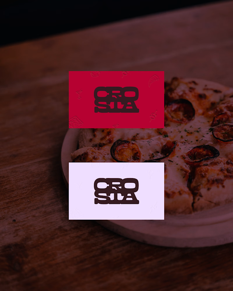
Do you prefer the main logo or the mark? Choose your pick.
The full project is coming soon, or check it out here on Instagram if you don't wanna wait.
11 voted
69%
5 voted
31%
16 votes
Closed

The mark, but for a reason that has nothing to do with which one looks better here: this brand lives on a pizza box, a napkin and a sticker on a takeaway bag, mostly around 20mm and often one ink on brown board. The full logo introduces the place once; the mark is what someone...

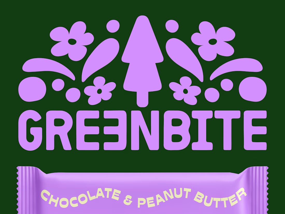
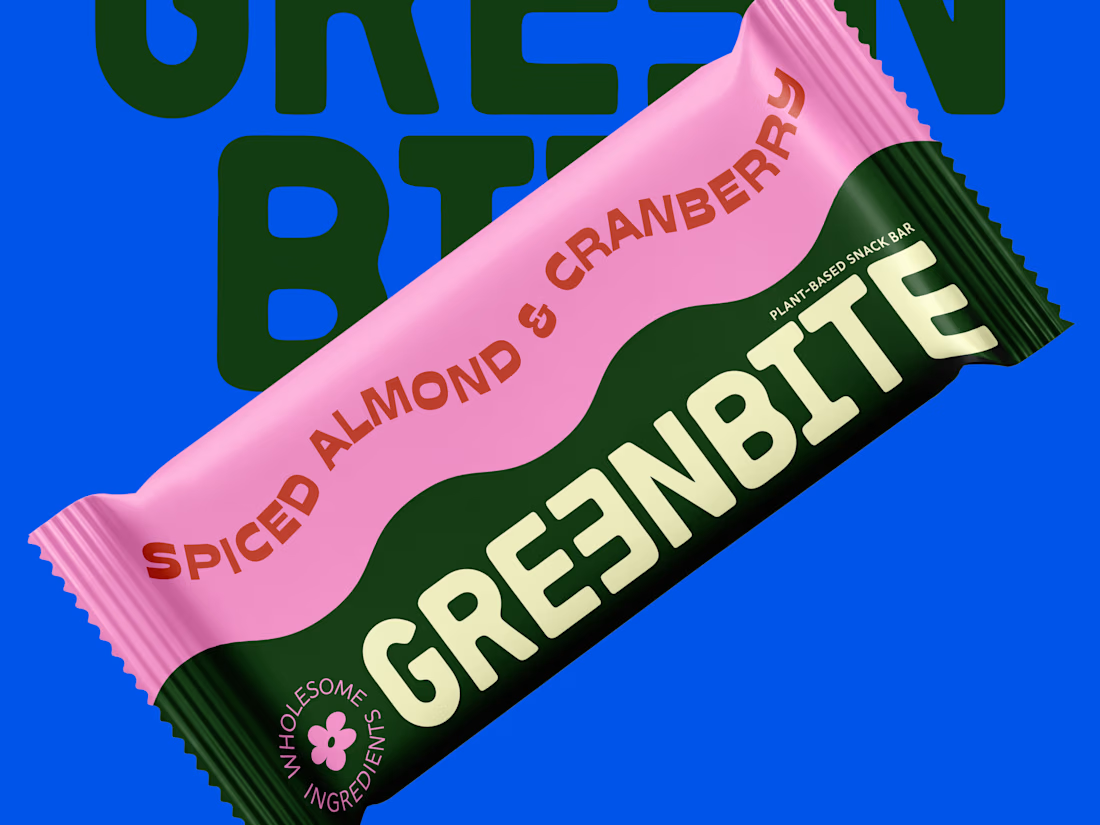
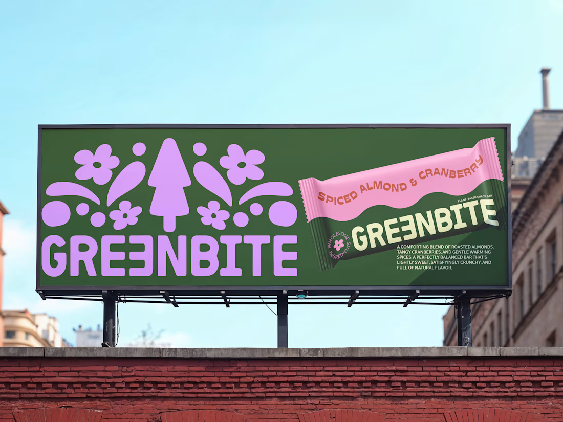
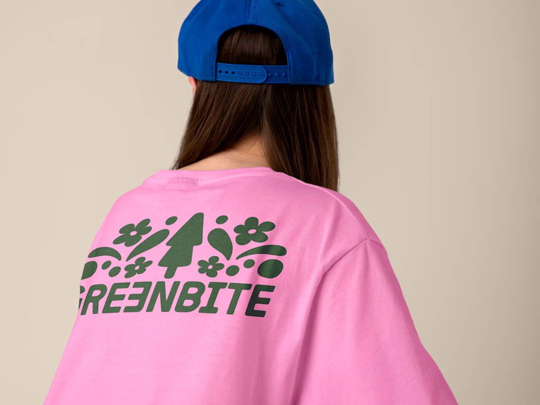
Brand identity and packaging design for Greenbite, a plant-based snack brand.
The goal was to blend organic typography with a vibrant, modern retro vibe to reflect "wholesome energy". Every element evokes natural flavors and feel good ingredients.

nice

Magazine-Cover-Design Braun-Series-5
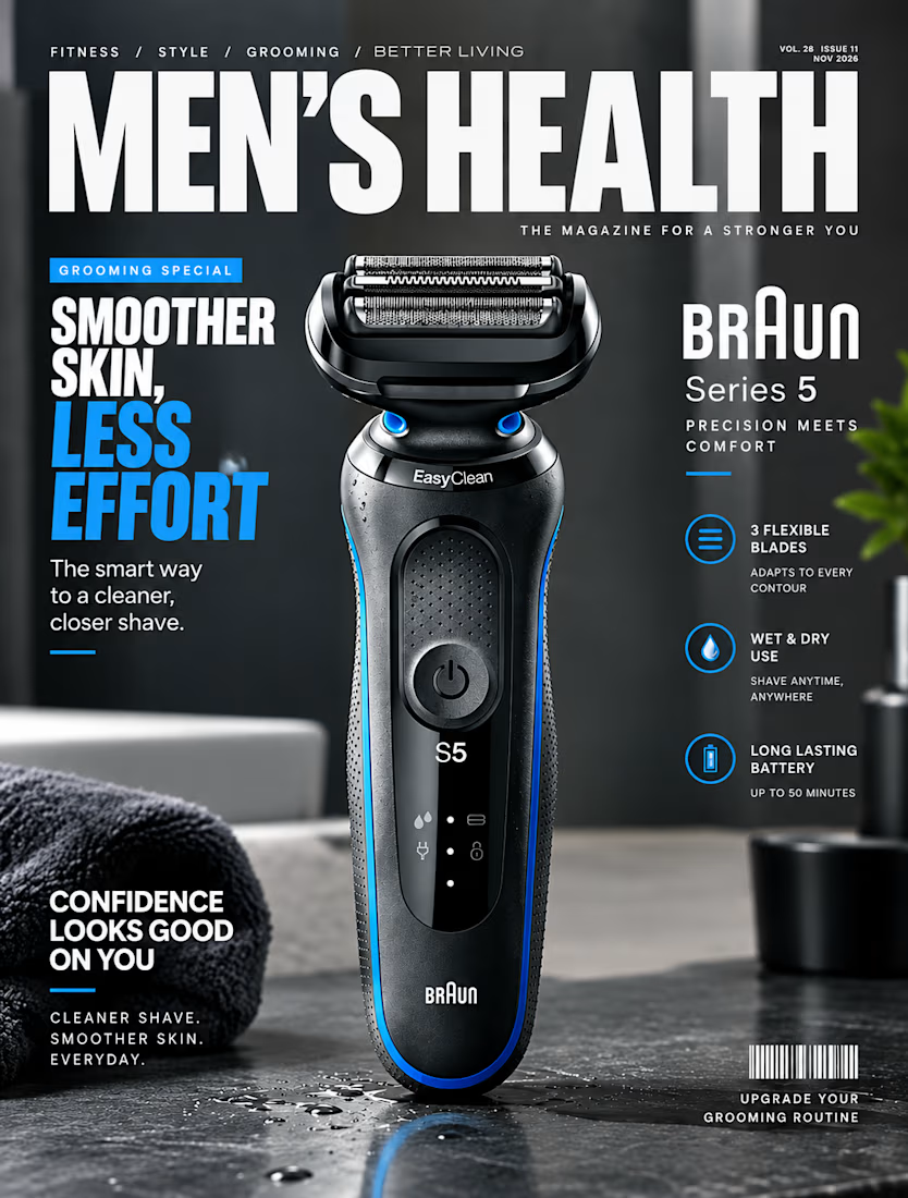

the water drops on the counter look so real. did you shoot the shaver or render it?