
José Manuel Torres
Web design & strategy for brands that want to scale
New to Contra
José Manuel is ready for their next project!
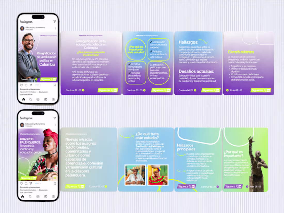
😍 This project involved four consulting sessions where, together with a team, we restructured the visual content strategy to better align with the brand’s identity.
The work focused on redefining how content is presented across digital platforms, including social media prototypes, typography systems, visual textures, photography direction, CTAs and overall content style.
We developed a cohesive approach that ensured consistency between visual design and messaging, improving clarity and engagement.
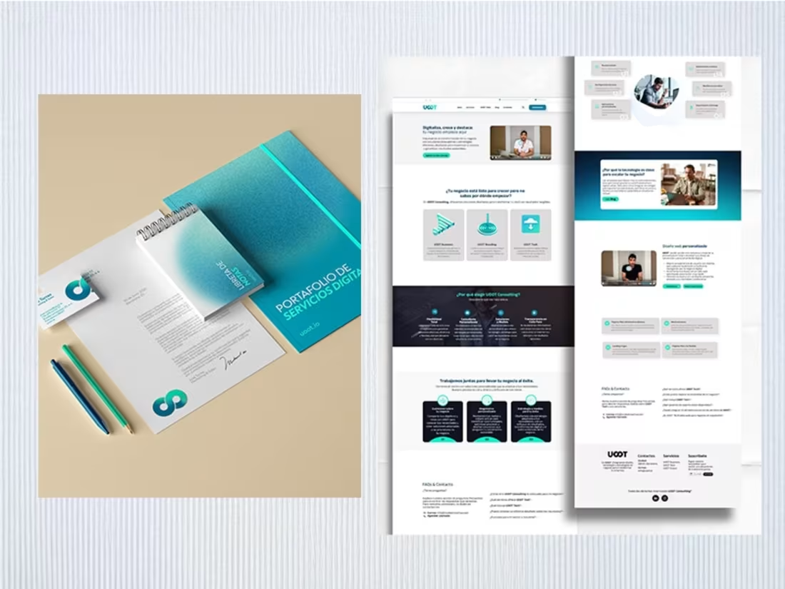
The magazine is part of the research division of Universidad Simón Bolívar in Barranquilla, Colombia.
1
15
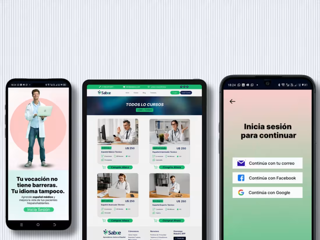
Hi everyone, this is a project I developed for an education platform. It’s a web app designed for native English speakers who want to learn Spanish.
The product was built across both mobile and desktop experiences, ensuring consistency and usability across devices. It also includes a technical layer with API integration and APK development, allowing the platform to be installed and used as a mobile app.
The goal was to create a seamless learning experience, combining intuitive navigation, clear structure and a user-friendly interface.
1
35
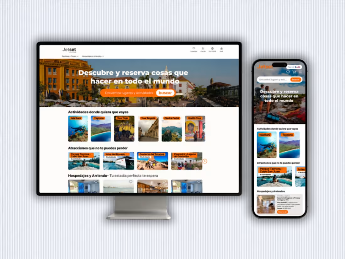
Building this website — a project that took over 9 weeks — meant stepping into a space full of possibilities, challenges and deep learning.
Creating jetsetcolombia.com (http://jetsetcolombia.com) was not just about designing an interface. It was about understanding a territory, mapping travel experiences, organizing complex information and transforming it into a smooth, human-centered navigation.
Every decision had intention. Every visual element served a purpose.
We analyzed, categorized and structured over 450 products, curating content so that each destination, experience and search would genuinely connect with the user. From selecting the right imagery to designing intuitive filters and building a coherent digital system, everything was part of one vision: creating a platform that feels alive.
This project reinforced that real innovation happens when design, strategy and technology move in sync — when we don’t just build pages, but craft meaningful experiences.
1
58
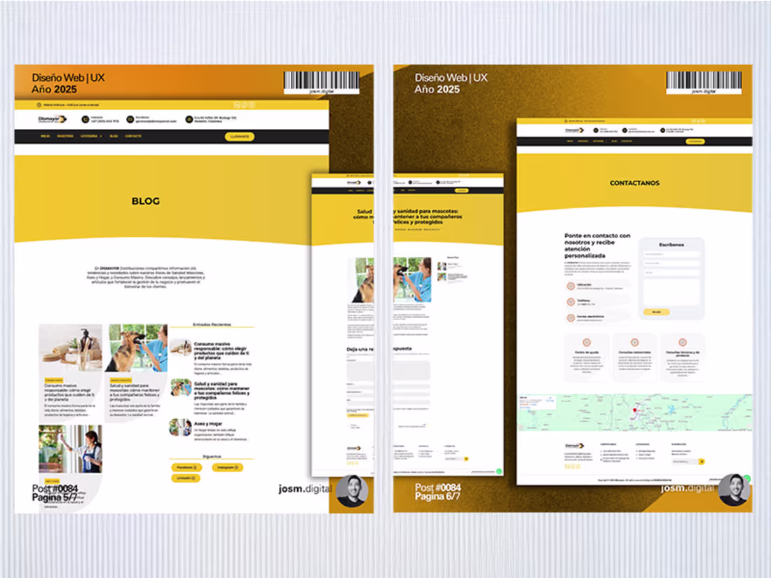
The #Dismayor website was redesigned with a visual approach inspired by the mass-consumption products the brand offers and distributes.
A modern and functional multi-site that reflects its brand architecture, product categories and delivers an intuitive, user-friendly navigation experience.
The project was developed in 48 hours of programming and 10 hours of UX design, ensuring both speed and efficiency without compromising usability or visual consistency.
Explore the website: https://www.dismayorcol.com/
2
68
In 2024, the visual identity of my second venture took shape with clarity, structure and direction.
This wasn’t just design — it was strategy.
Every line, space and interface was built to reflect a clear digital purpose, balancing aesthetics with functionality.
From social media to websites, from mobile interfaces to brand assets, I developed a cohesive visual system designed to communicate consistently across every touchpoint.
This project represents part of my work in branding and UX, where design is not only seen, but understood.
If you're building a company and want something that looks and feels intentional, start with strategy.
2
61
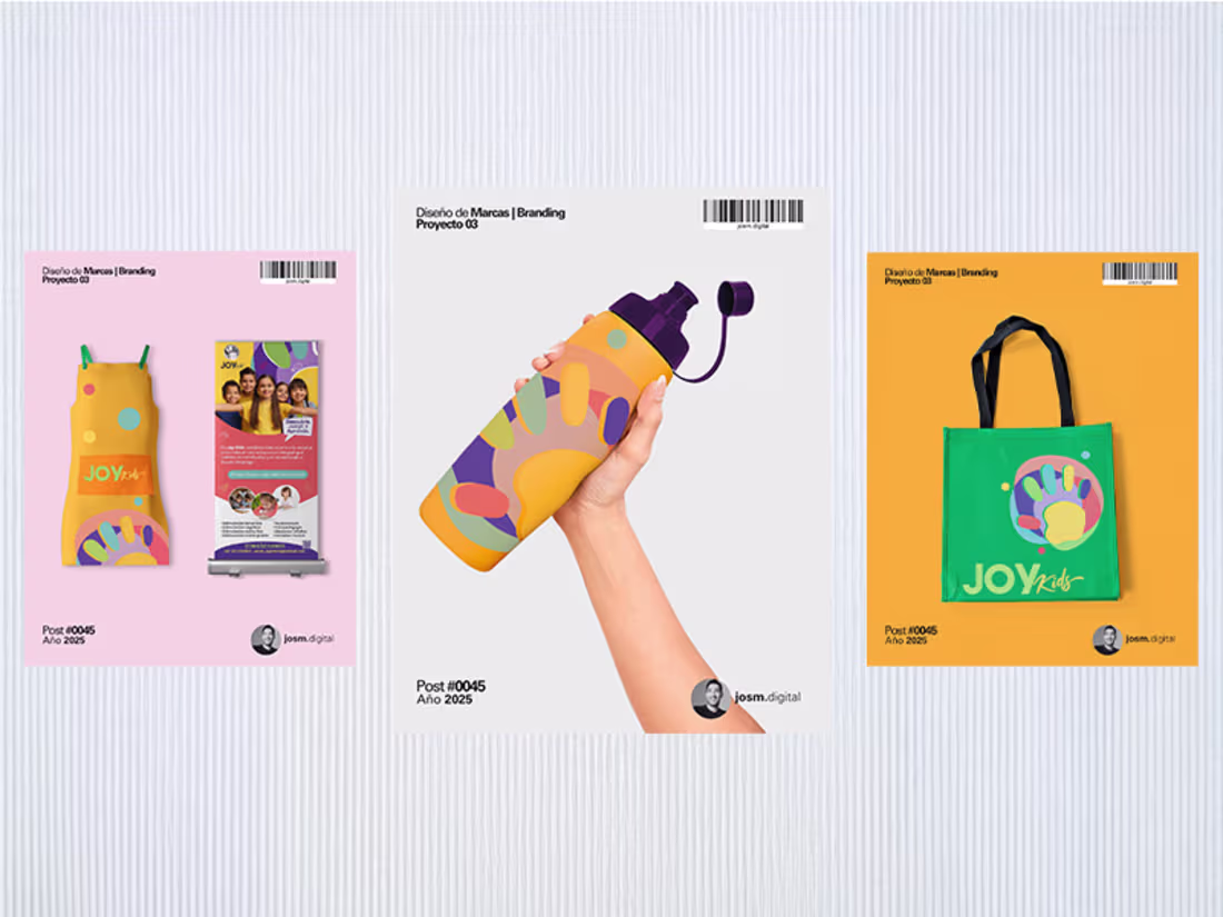
JoyKids is not just a name. It’s a universe created to explore, learn and grow through joy.
Here, color is not decoration — it’s a tool for expression. Imperfect shapes are not mistakes — they are open doors to imagination.
Every typeface, every stroke, every element is designed from the perspective of those who matter most: children.
This brand was created with a clear purpose: to support early cognitive development through creativity and play.
Because we believe education starts with emotion, connection and environments that invite curiosity.
JoyKids is a brand built with the eyes of a child — and the vision of someone who understands the importance of growing in an inspiring environment.
Want to build a brand that truly connects with your audience?
Let’s create something meaningful.
2
60
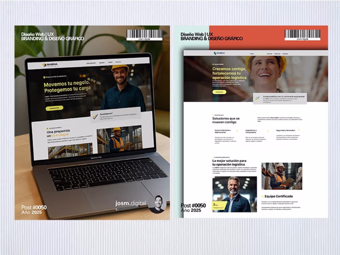
A project that pushed me beyond my comfort zone.
In 2025, I worked on the web development of a logistics company, where my role was to design the full visual concept and structure it in Figma for the engineering team to bring it to life.
This was my first time facing a project at this level, and it became a major learning experience. I focused on user experience, clarity and scalability, making sure every design decision was both functional and aligned with business goals.
A collaborative process that reinforced how strong ideas grow through teamwork.
1
59