The network for creativity
Join 1.25M professional creatives like you
Connect with clients, get discovered, and run your business 100% commission-free
Creatives on Contra have earned over $150M and we are just getting started
Back to feedPost




Thanks😊

So cool!

good!

So cool.

So cool.
Thank you very much!
The network for creativity
Join 1.25M professional creatives like you
Connect with clients, get discovered, and run your business 100% commission-free
Creatives on Contra have earned over $150M and we are just getting started





Related posts

Winder is a bold brand identity built around a geometric W-inspired symbol, combining sharp angles and forward movement to represent progress, speed, and direction.
The identity uses a striking red and deep burgundy palette, supported by clean typography and a consistent visual system across brand guidelines, digital applications, and product mockups.
Progress in Motion.




Great logo it feels it really has an identity 🎉🎉

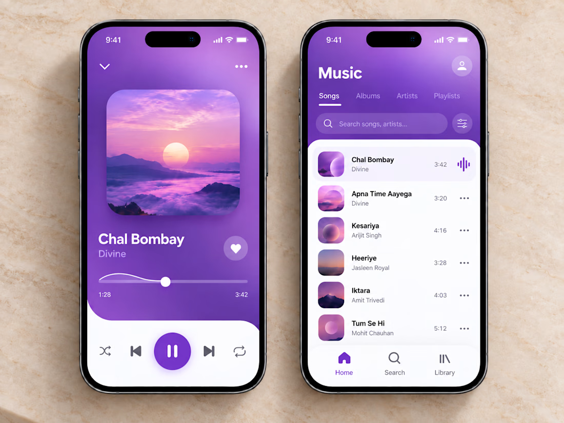
🎧💜 The clean and vibrant UI of this music app creates a calm, immersive listening experience, while smooth controls and simple navigation make finding and playing your favorite songs effortless.
🎶 Thoughtful organization, clear song lists, and a minimal player layout let you stay focused on the music without unnecessary clutter or extra clicks.


sick execution


I’m so excited to finally share this one and hear what you all think.
When Team Cook approached me to create their branding and logo, I knew I wanted to really push the concept and build something that felt bold, playful, and instantly recognisable.
What do you think?
P.s. their badges and tags have all my 🫶