The network for creativity
Join 1.25M professional creatives like you
Connect with clients, get discovered, and run your business 100% commission-free
Creatives on Contra have earned over $150M and we are just getting started
Back to feedPost
Jewel Babe: Brand Identity & Strategy for a Playful, Affordable Jewelry Brand https://contra.com/p/gUg2o3mN-jewel-babe
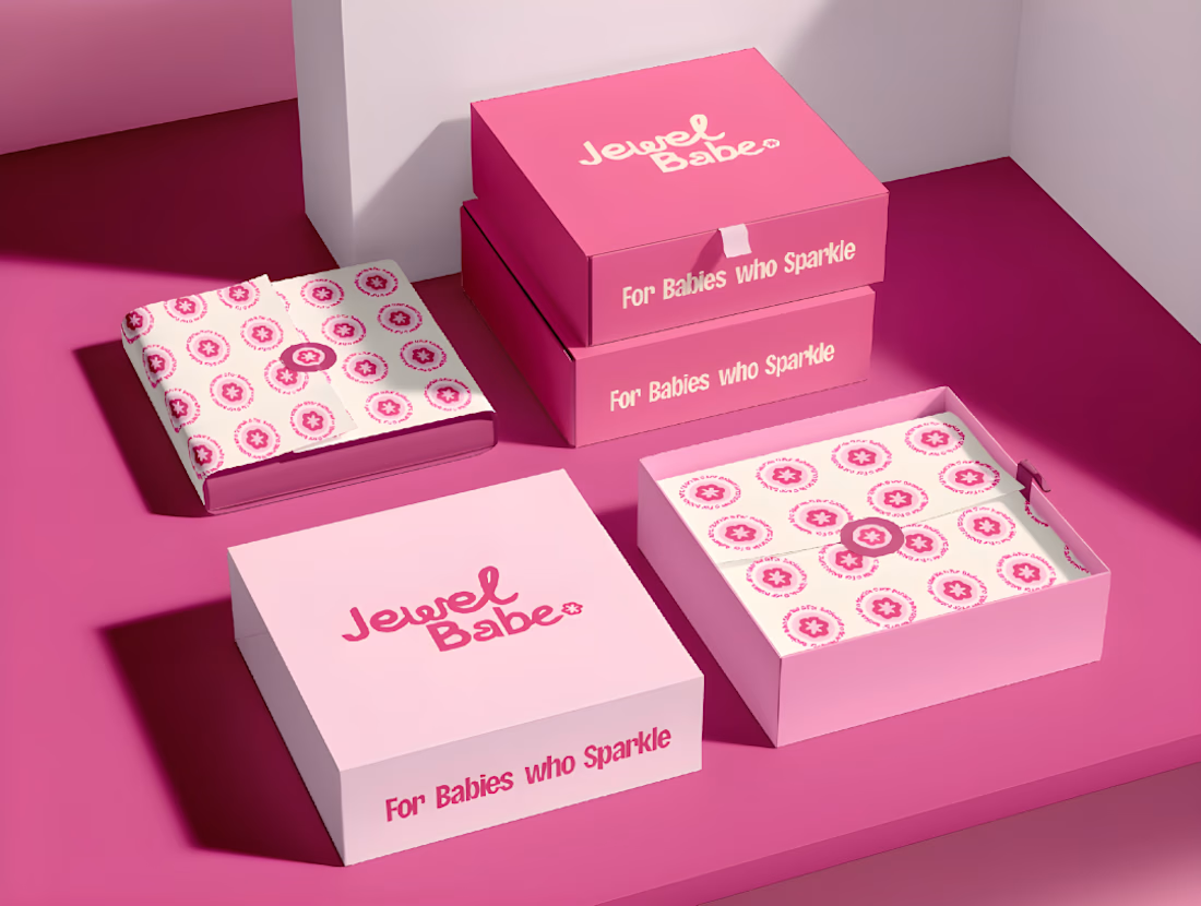
Jewel Babe had a product people liked and branding that looked like everyone else’s. The old wordmark and packaging felt generic, so nothing about the brand told a customer why to pick it over the next jewelry shop.
I rebuilt it from the strategy up.
The strategy
I started with research into who Jewel Babe is actually for: a trend-conscious, Pinterest-styled woman who uses jewelry for self-expression. From that I built the brand around three values: durability, feminine confidence, and affordability. Positioning, brand message, and tone of voice (casual, friendly, soft, trend-aware) were locked before any logo work started.
The design
A new wordmark and symbol, with colorways and variations for different uses
A bold pink palette paired with Clayful for personality and Deezer Product for clarity
A tagline that carries the whole brand: “For Babes Who Sparkle”
The brand in action
The identity runs across packaging (boxes, tape, stickers, shopping bags), print collateral, and social media templates, so every touchpoint feels like one brand.
Deliverables: Brand strategy, logo and identity system, packaging design, social media design
CLIENT FEEDBACK: [Hoorain rebuilt Jewel Babe from the strategy up. The new identity finally looks and sounds like our customer, and the packaging and social system made launching so much easier. Strategy-first, easy to work with, and she delivered exactly what she said she would. Highly recommend.]
Looking for a brand identity that’s built on strategy, not just good looks?
[ DM ME / BOOK A CALL]

For Babies who Sparkle is a great line, and the pink on pink boxes with the donut-flower pattern are instantly ownable. Contrarian take: the strategy-first framing in the caption is stronger than the pretty packaging, because every jewelry brand has pretty. Lead the next post...

heyy tyyy🙌
The network for creativity
Join 1.25M professional creatives like you
Connect with clients, get discovered, and run your business 100% commission-free
Creatives on Contra have earned over $150M and we are just getting started








Related posts

One brand, very different variety products. 👀
BASYX is one of my favorite projects because the packaging had to work across categories, from skincare to food, while still feeling like one cohesive brand.
That’s the fun challenge of multi-product brands: creating a visual system flexible enough to grow without losing its identity.

wow amazing

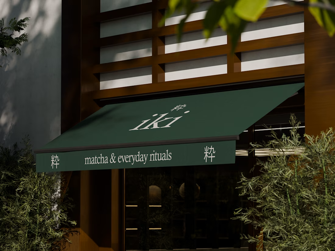
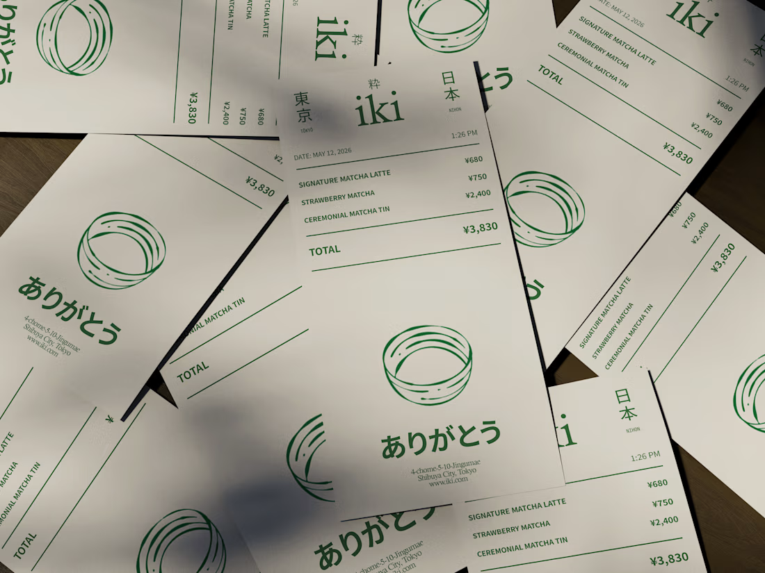
some visuals from iki, a matcha shop i’m currently working on 🍵
one of the most interesting parts of this project has been figuring out how to turn an abstract concept into something people can actually see and feel.
from the typography to the illustrations and overall visual language, every element is an opportunity to give the brand more personality and make it feel like its own world.
still exploring, but i’m really enjoying where this is going.
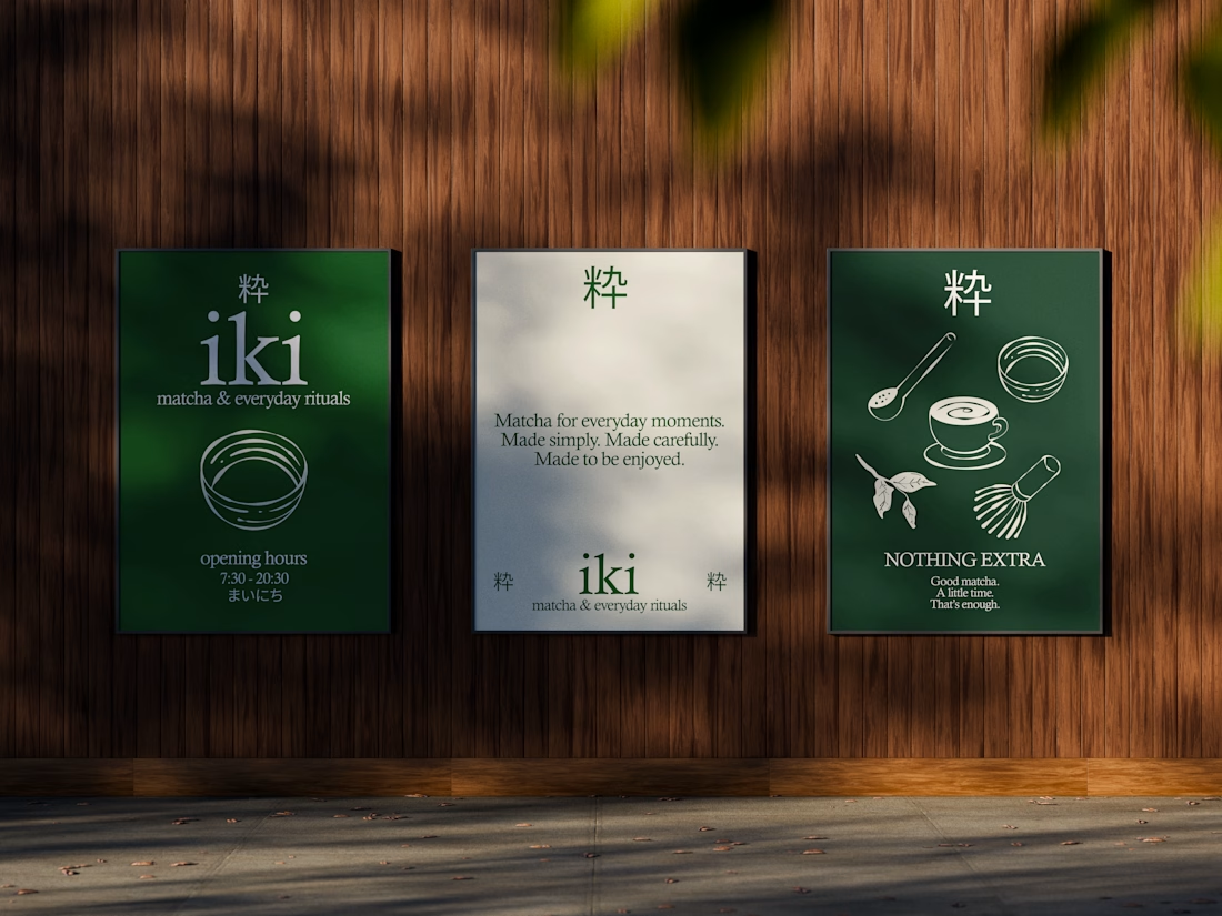
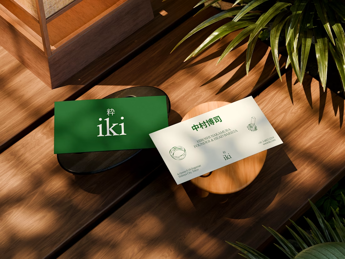


the illustration direction feels like it could take over the whole shop interior, not just the cups. thats usually where these projects fall apart

Recent brand showreel ✨
Identity and pitch deck for Infranova AI. Dark, bold, and a lot of purple.

Great 😍