The network for creativity
Join 1.25M professional creatives like you
Connect with clients, get discovered, and run your business 100% commission-free
Creatives on Contra have earned over $150M and we are just getting started
Back to feedPost

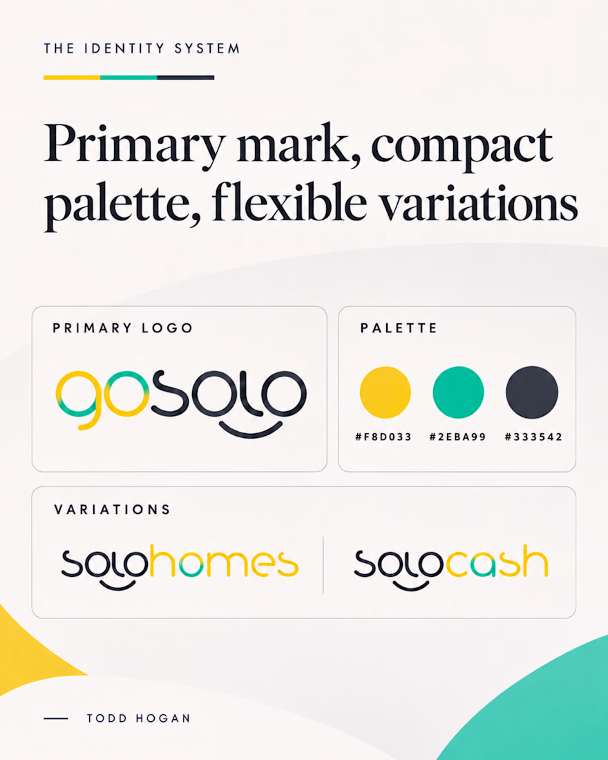
The biggest misconception about branding is thinking it's just a logo. What actually saves founders time and money later is a compact system a focused 2–3 color palette and clear sub brand rules so every new deck, social post, or product launch looks cohesive without starting from scratch.

The network for creativity
Join 1.25M professional creatives like you
Connect with clients, get discovered, and run your business 100% commission-free
Creatives on Contra have earned over $150M and we are just getting started





Related posts

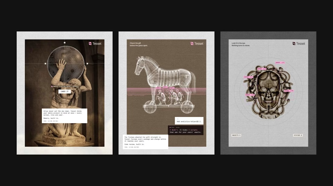
Branding an AI app builder with X-rayed Greek myths.
Tessel needed a brand that explains the product without a feature list, so every capability got a myth. Atlas holds your whole product in memory. Argus watches uptime. The Trojan Horse is code review. Apollo is voice. Medusa is visual QA.
Each poster pairs an archival image with a live-UI overlay, so it reads classical and engineered at the same time. Nine posters, one design system, one rule: the metaphor does the explaining.
Full project on my profile.


How far can you take a logo beyond the first draft?
I started with Recraft's Logo Maker and a fictional idea: Bibu's Paws, a cosy little dog rescue and adoption shelter.
I wanted the identity to feel warm, homely and full of character, so I explored a few logo directions before settling on the little dog tucked inside a house.
From there, I took the idea further, building out the visual identity with an earthy colour palette, typography, illustrations and a few real-world applications: the shelter space, dog merchandise and an adoption welcome kit.
I enjoyed seeing how a small starting point could grow into a brand with its own personality and world.
Now I'm curious: if you were building a brand around this logo, what would you create next?






It turned out so cozy, you did great

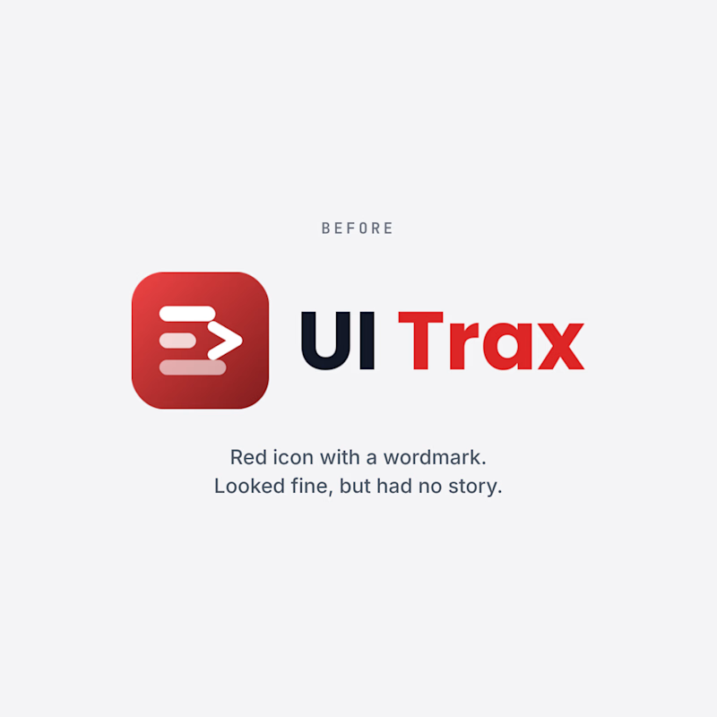
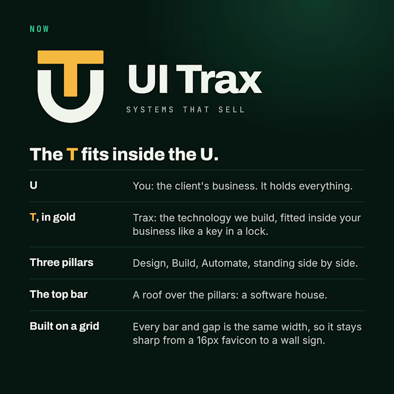
We redesigned the UI Trax logo, and this time every part has a meaning.
The U is you, the client's business. The gold T is Trax, the technology we fit inside it like a key in a lock. The three pillars are Design, Build and Automate. The top bar is a roof over them: a software house.
The old logo was a red icon with a wordmark. It looked fine, but it had no story.
Which one would you trust with your project? Vote, and tell me why in the comments.
#Branding #BeforeAndAfter #UITrax
0 voted
0%
3 voted
100%
3 votes
Closed

Now — the UT badge tells the story better.