The network for creativity
Join 1.25M professional creatives like you
Connect with clients, get discovered, and run your business 100% commission-free
Creatives on Contra have earned over $150M and we are just getting started
Back to feedPost
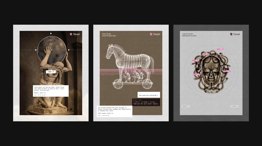
Branding an AI app builder with X-rayed Greek myths.
Tessel needed a brand that explains the product without a feature list, so every capability got a myth. Atlas holds your whole product in memory. Argus watches uptime. The Trojan Horse is code review. Apollo is voice. Medusa is visual QA.
Each poster pairs an archival image with a live-UI overlay, so it reads classical and engineered at the same time. Nine posters, one design system, one rule: the metaphor does the explaining.
Full project on my profile.


thanks
The network for creativity
Join 1.25M professional creatives like you
Connect with clients, get discovered, and run your business 100% commission-free
Creatives on Contra have earned over $150M and we are just getting started
Related posts

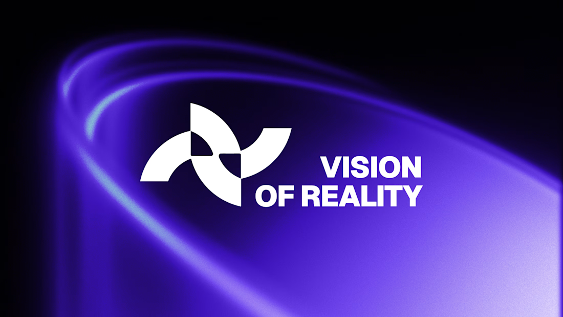
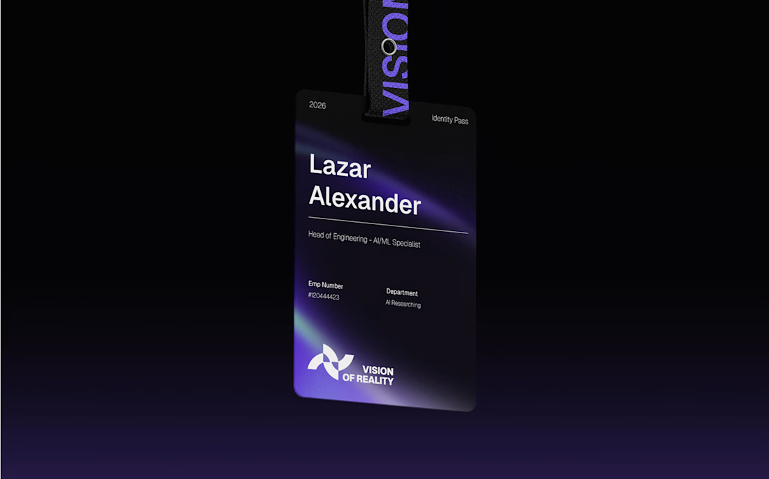
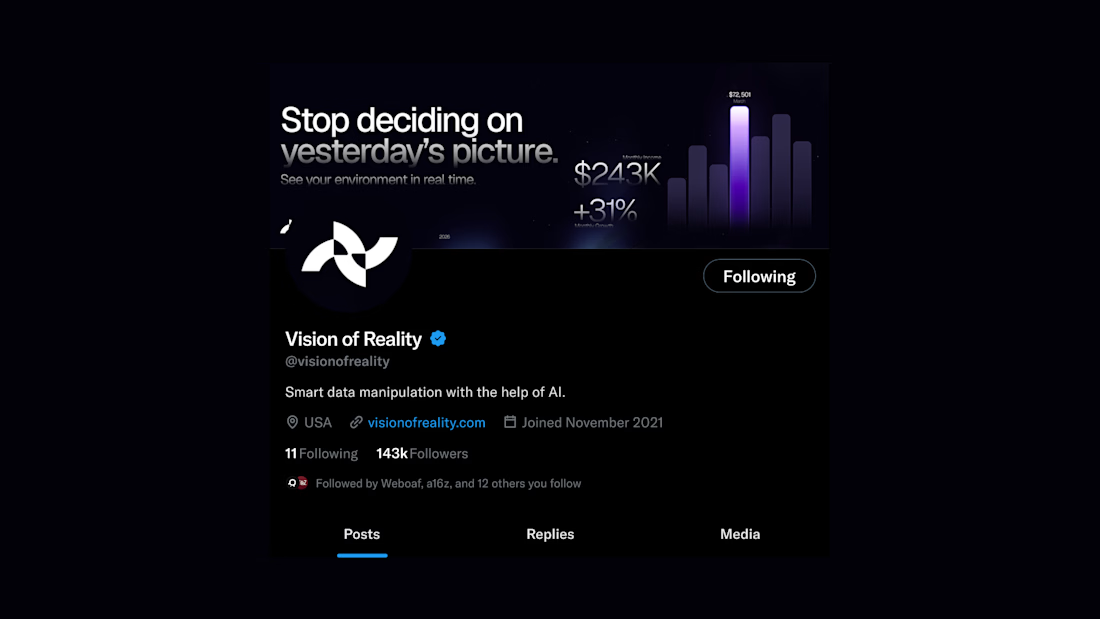
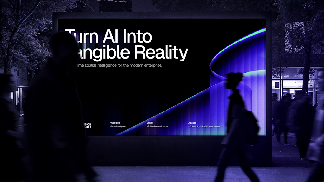

The conference badge sells it for me: a brand for an AI startup that already looks good on a lanyard is ready for its first event.

I’ve been building Halevra, a concept brand for a doctor-led longevity and skin clinic in Marylebone. This week was the homepage hero.
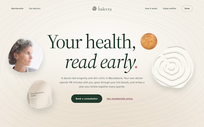
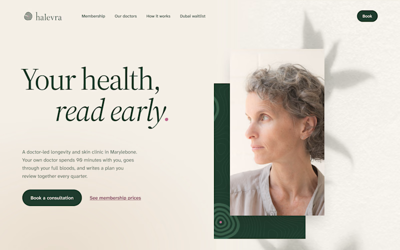
Same words, same brand kit, two different layouts.
A puts everything in the centre. The growth rings from the logo run across the whole page, with a few small pieces of the clinic around the headline.
B is quieter. The words sit on the left, one portrait on the right, and a leaf shadow on the wall behind her.
Which one would make you book the consultation?

3 voted
50%
3 voted
50%
6 votes
Closed

I would go with B, the editorial split. For a doctor-led clinic the portrait and the calm space around it do a lot of the trust work, and the headline reads clearly without competing with the rings. In A the rings are lovely but they pull the eye away from the message and the...

One pixel grid. A whole brand.
For Appy, a London product studio for impact-driven startups, the wordmark, icons, 3D smile and Appy Pixel, its custom typeface, all come from the same grid.
Appy Pixel won Typography at the Online Design Awards.
Type first or symbol first: where do you start a rebrand?


thats so nice, i loveee



