The network for creativity
Join 1.25M professional creatives like you
Connect with clients, get discovered, and run your business 100% commission-free
Creatives on Contra have earned over $150M and we are just getting started
Back to feedPost

🚀 I built a complete AI tools website with just ONE line using Claude AI.
No complex planning. No long prompts.
Just a simple instruction — and the full structure was generated instantly.
This is how fast things are changing.
But here’s the reality 👇
AI can generate structure… not real value.
An AI tools website that actually works needs:
✔ Clear categorization of tools (by use case)
✔ Smart search & filtering experience
✔ Trust signals (ratings, reviews, credibility)
✔ Clean UX that helps users discover fast
✔ A strategy behind what tools to feature and why
Most AI-generated sites look impressive at first glance…
But without UX thinking, they fail to retain users.
That’s where real skill matters.
I’m now using AI to speed up the process —
But combining it with UX strategy to build websites that people actually use.
Because:
👉 Anyone can generate a website
👉 Few can make it useful
If you're planning to build an AI tools platform or directory — let’s build it the right way.
#AI #AITools #WebDesign #UXDesign #ProductDesign #ClaudeAI #Freelance #Startup


The network for creativity
Join 1.25M professional creatives like you
Connect with clients, get discovered, and run your business 100% commission-free
Creatives on Contra have earned over $150M and we are just getting started




Related posts


The atmospheric orange-on-black treatment gives the hero real momentum, and the branching flow diagram makes the product story feel tangible. The compact controls are a nice touch for guiding attention without clutter.

Building Hanif's brand identity packaging, mobile, and apparel, unified by one flower and one flavor story.
.
.
.
More conversion tests, UI breakdowns, and real builds: x.com/rightnextstep
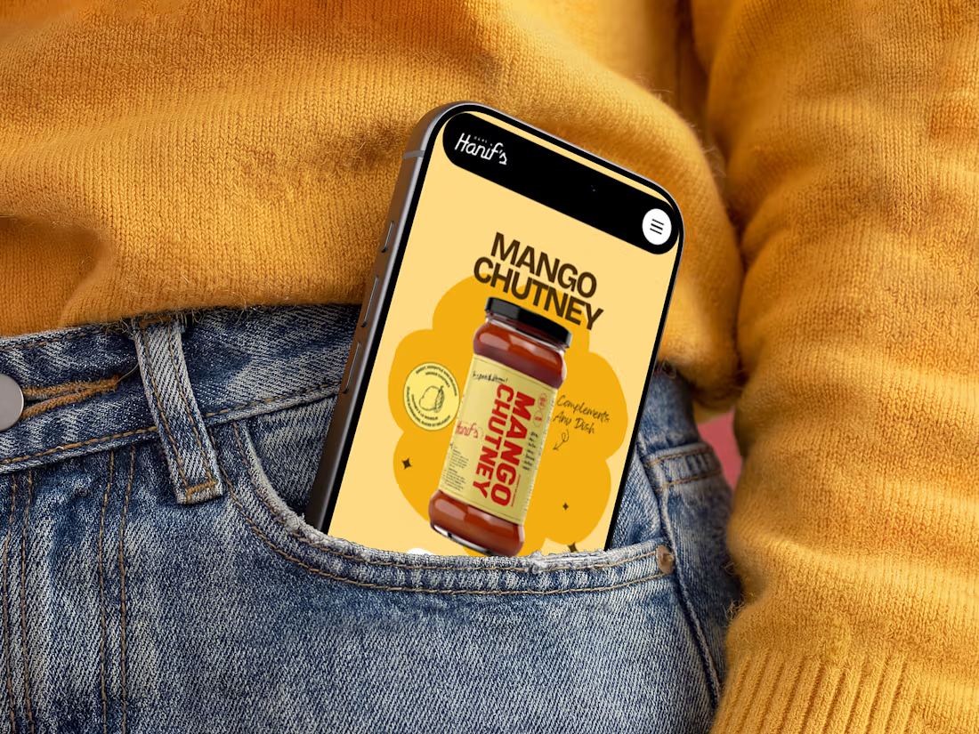
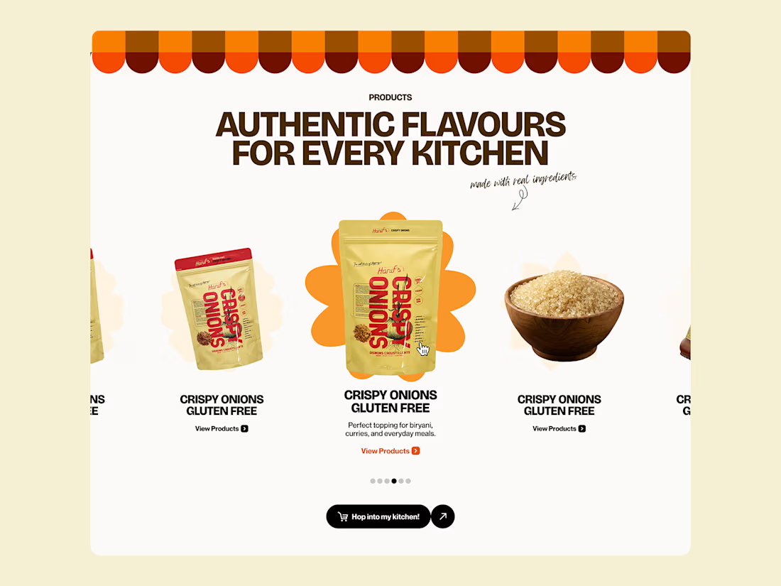
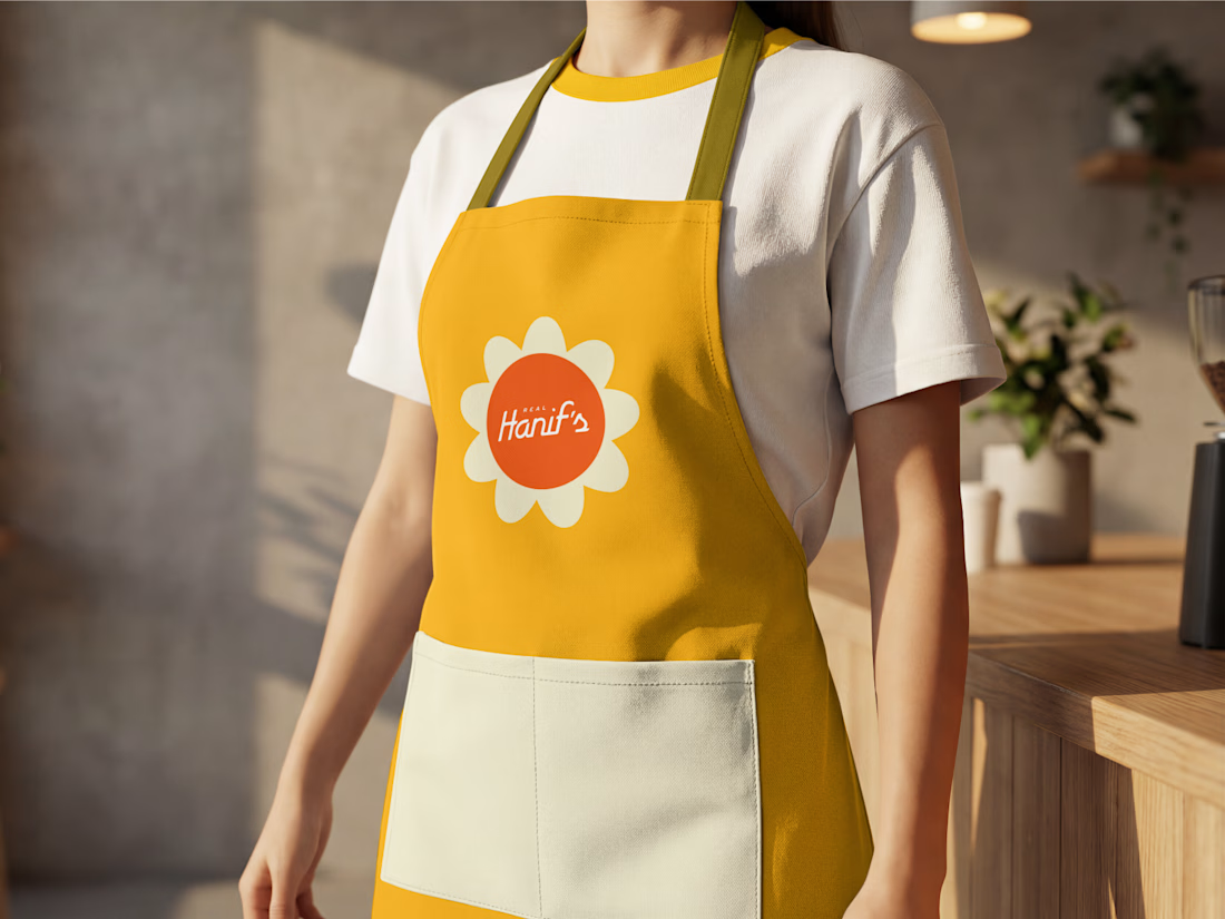
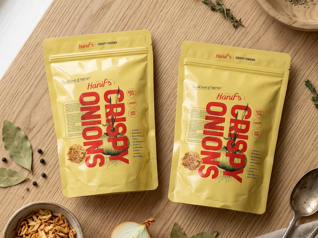

Great work, Anush! Loving the vibrant color palette and how smoothly the identity scales from packaging to apparel. The packaging designs look clean and high-end.

A brilliant SaaS tool needs a landing page that instantly builds trust and drives action.
I recently put together this visual upgrade for OpenTag to explore how tightening the layout could elevate their first impression.
Option A (The Original): Strong product copy, but the split layout and floating elements create competing focal points that divide the user's attention.
Option B (The Redesign): Centered messaging, a much clearer visual hierarchy, and a dynamic, breathable layout. The goal was to remove distractions and let the product interface take center stage.
Which direction do you think communicates the value better and creates a stronger first impression?
Let me know your pick!
8 voted
100%
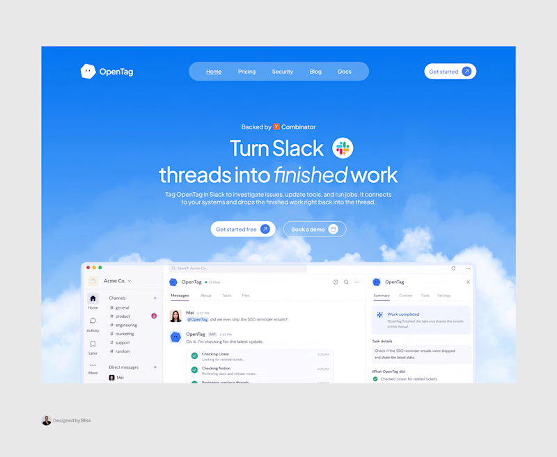
0 voted
0%
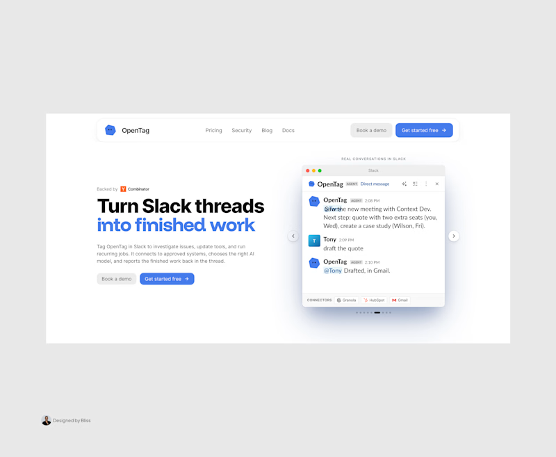
8 votes
Closed

Great work, Emmanuel!