The network for creativity
Join 1.25M professional creatives like you
Connect with clients, get discovered, and run your business 100% commission-free
Creatives on Contra have earned over $150M and we are just getting started
Back to feedPost
Taste Test
A brilliant SaaS tool needs a landing page that instantly builds trust and drives action.
I recently put together this visual upgrade for OpenTag to explore how tightening the layout could elevate their first impression.
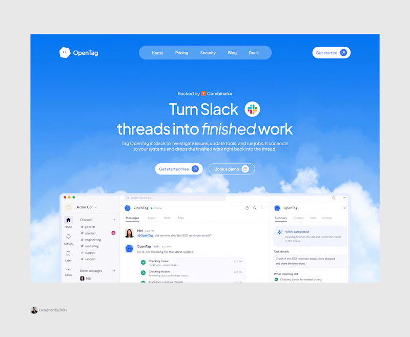
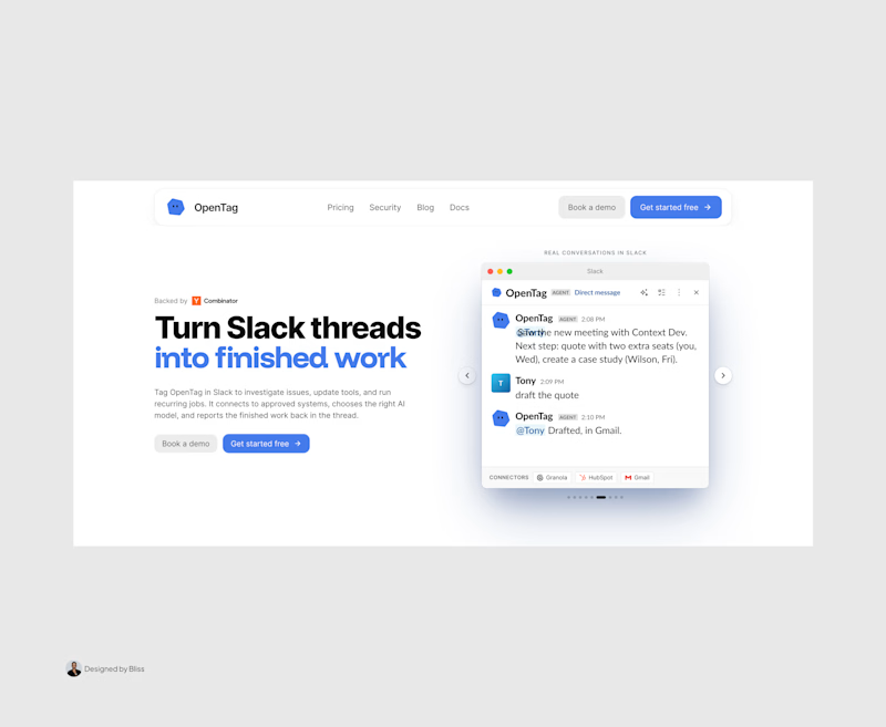
Option A (The Original): Strong product copy, but the split layout and floating elements create competing focal points that divide the user's attention.
Option B (The Redesign): Centered messaging, a much clearer visual hierarchy, and a dynamic, breathable layout. The goal was to remove distractions and let the product interface take center stage.
Which direction do you think communicates the value better and creates a stronger first impression?
Let me know your pick!

8 voted
100%
0 voted
0%
8 votes
Closed

PRO Design 😍

Thank you Umar🥂😊

Great work, Emmanuel!
Thank you Damilola 🥂

The trust-first framing is spot on—clear hierarchy and proof points can do a lot of heavy lifting before someone ever reaches the CTA. The direction feels very intentional.
Thank you Rohan

The redesign is a massive upgrade, Emmanuel. Centering the messaging and letting the UI take center stage instantly makes the value proposition clearer.
That's the ultimate goal, thanks for calling it out


Thank you
The network for creativity
Join 1.25M professional creatives like you
Connect with clients, get discovered, and run your business 100% commission-free
Creatives on Contra have earned over $150M and we are just getting started





Related posts

Just created a Framer website preloader with 2 options to choose from. The difference is the sequence of what appears first and the reveal animation. I made two options because I can’t choose which is best lol. What’s your favorite, Option 1 or 2?
BTW if you want this for free (normally $12), like it on the Framer Marketplace (on this link) and comment here so I know, and I’ll send it to your DM.

20 voted
48%
22 voted
52%
42 votes
Closed

Option 1 feels better than Option 2 for me

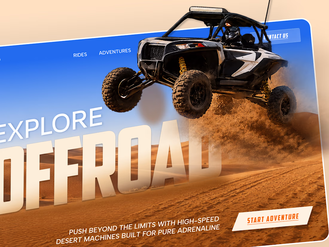
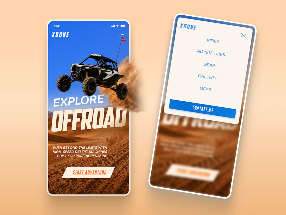
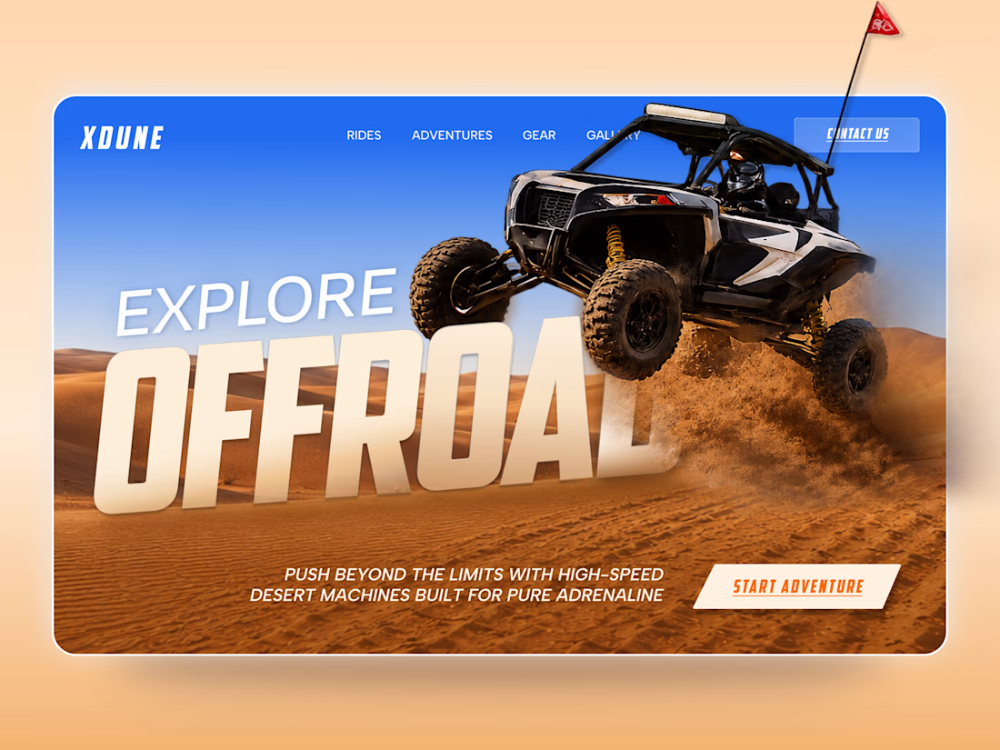
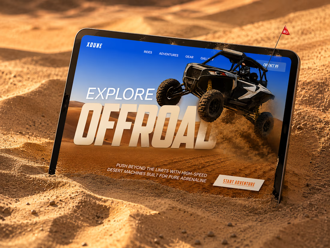
XDUNE — Off-Road Adventure Landing Page
A bold landing page concept built around speed, freedom, and off-road adventure 🔥
The visual direction combines desert landscapes, oversized typography, and a dynamic vehicle composition to make the experience feel energetic from the first screen
Special attention was given to:
• Strong action-focused hero composition
• Bold typography and clear hierarchy
• Desert-inspired visual atmosphere
• Adventure-focused CTA
• Responsive mobile experience
• Simple and clean navigation
The result is a high-energy landing page that feels fast, adventurous, and made for people who want to get off the road
Looking to create a bold website for an automotive, outdoor, or adventure brand? Let’s connect 🚀


love the vibe


Booking Calendar: Compact or Expanded?
I’m testing two calendar layouts for booking a spa hotel stay.
Version A - Compact. The calendar, selected dates, number of nights, and button remain inside one card.
Version B - Expanded. After the check-in date is selected, a separate booking summary card appears below the calendar.
The functionality is the same - only the presentation and visual hierarchy are different.
Which version feels clearer and easier to use?
17 voted
49%
18 voted
51%
35 votes
Closed

How do you create videos like these?