The network for creativity
Join 1.25M professional creatives like you
Connect with clients, get discovered, and run your business 100% commission-free
Creatives on Contra have earned over $150M and we are just getting started
Back to feedPost
Taste Test
Just created a Framer website preloader with 2 options to choose from. The difference is the sequence of what appears first and the reveal animation. I made two options because I can’t choose which is best lol. What’s your favorite, Option 1 or 2?
BTW if you want this for free (normally $12), like it on the Framer Marketplace (on this link) and comment here so I know, and I’ll send it to your DM.

20 voted
48%
22 voted
52%
42 votes
Closed


do you think wipe up is better than a split?
I think this is a good advice. Thank you for the feedback! i will revise the option 1 into wipe up!

option 2
a great choice! thank youu

Option 2 is sick 🔥
Thank you Celia! I also love option 2!

This is a pretty tough choice for me. 😂
Both options have their strengths.🤔
Thank youuu, this is why i made it as an option instead of just choosing one. Because both looks good 😭

Option 1 feels better than Option 2 for me
Thank you for the feedback! what do you think that makes option 1 better?
cinematic animation that feels familiar
Make sense. Thank you for the feedback!

Option 2
a good taste! thank you!

Awesome animation
Thank you so much Dominic!!

Option 2. Nice work🔥
Thank you Shubhang! may i know why you choose Option 2?
It feels much smoother to me. I love how the logo appears while the side animation is still happening, so there’s no pause between the two moments. By the time the side animation finishes, it naturally transitions into the reveal. The whole sequence feels continuous and really satisfying.
woww thank you so much for the detailed feedback! this helps me create a better product. lets connect Shubhang!

Option too is just soo smooth and clean🔥
Thank you for the feedback!

Tough call, both reveals are smooth. I'd go with whichever gets people to the content faster.
Thank you Tabish! but if you have to choose one, what would you choose?
option 1
Thank you for the feedback!

Option 1 for me
Thank you! May i know the reason?

I'll go with Option 1
Thank you! May i know why you choose option 1?

Option 1 got my vote
Thank you Afnan! May i know why you choose Option 1? Really appriciate the feedback!

Option 1 for me. The warm red image landing first gives the preloader more punch.
Thank you for the feedback Rafee! i also love the option 1 except when it divide the logo. so i revise it a little bit. the curtain open after the logo vanish
The network for creativity
Join 1.25M professional creatives like you
Connect with clients, get discovered, and run your business 100% commission-free
Creatives on Contra have earned over $150M and we are just getting started











Related posts
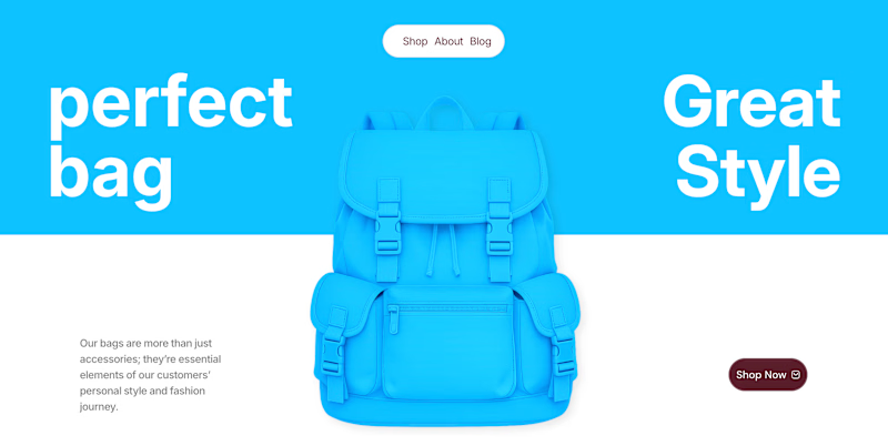
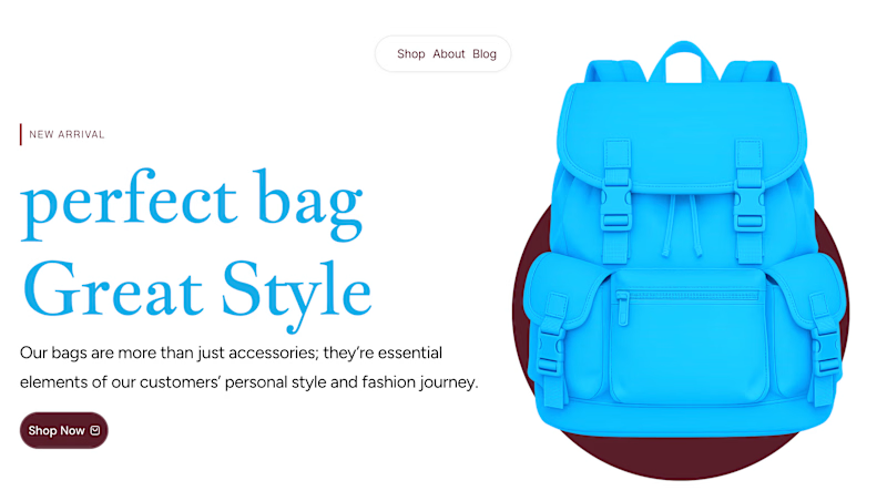
✨ Two Hero Concepts. One Bag Brand. Which One Wins? 👜
Exploring two different visual directions for Vellato, a fictional bag brand designed around everyday style, bold aesthetics, and modern fashion.
🔵 Option A: Bold Vibrant
🤍 Option B: Clean Editorial
If you were designing the digital experience for Vellato, which direction would you choose?
Option A or Option B?
Drop your vote in the comments! I'd love to hear which one catches your eye and why.

3 voted
60%
2 voted
40%
5 votes
Closed

Option A: Bold is great choice but you need make the blue tape darker to increase contrast ❤️❤️
Great job Orlerx🔥🔥

Two page transitions, one site. Which one feels better to you?

5 voted
83%
1 voted
17%
6 votes
Closed
Kinetic Reveal feels more natural ❤️❤️
great job Dayyan🎉🎉

My portfolio, reimagined in Framer
The goal was simple: bring everything together in one place, from client projects and case studies to Framer templates and project videos, while keeping the experience clean and easy to navigate.
The entire portfolio fits within a strict 100vh viewport, so you can explore everything without scrolling.
Would love to hear your thoughts and feedback!
Portfolio link in the comments.

