The network for creativity
Join 1.25M professional creatives like you
Connect with clients, get discovered, and run your business 100% commission-free
Creatives on Contra have earned over $150M and we are just getting started
Back to feedPost
Taste Test


Booking Calendar: Compact or Expanded?
I’m testing two calendar layouts for booking a spa hotel stay.
Version A - Compact. The calendar, selected dates, number of nights, and button remain inside one card.
Version B - Expanded. After the check-in date is selected, a separate booking summary card appears below the calendar.
The functionality is the same - only the presentation and visual hierarchy are different.
Which version feels clearer and easier to use?
17 voted
49%
18 voted
51%
35 votes
Closed

compact for me.

How do you create videos like these?

my guess is a screen record?
but yeah which screen recorder?

I choose Compact because it shows starts and end date with the number of nights. I did not choose Expanded because when another card appeared I thought it is for different thing.


These are great!
Expanded for me. Shows the selected dates clearly. Also I think a smooth slide-out transition would make this look even more sleek. What do you think? 🤔

I'd go compact. Keeping everything in one card makes it easier to see the dates and nights at a glance.

I go to compact

I think keeping the block from jumping is better for the overall UX because it keeps the layout stable and prevents unexpected shifts that can distract or confuse the user

Compact. Once check-in is chosen, the nights and the button should update in the same card. The second card in Expanded reads like a new task, not a summary of the same stay. A transition is nice, but it should happen inside the calendar card so the eye never leaves the dates.

I like the presentation; it's a creative one

Expanded for me. A separate summary card makes the dates and total easier to check before booking.

For a booking flow, I would test whether guests can quickly verify their dates, number of nights and total price before continuing. A compact layout may reduce scrolling on mobile, while a separate summary gives the confirmation step more emphasis. Have you tested both versions on small screens, especially with longer stays?
The network for creativity
Join 1.25M professional creatives like you
Connect with clients, get discovered, and run your business 100% commission-free
Creatives on Contra have earned over $150M and we are just getting started











Related posts

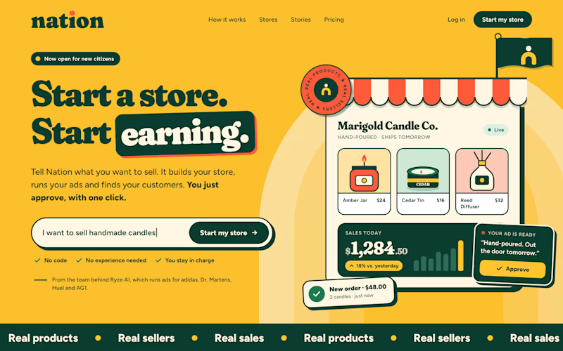
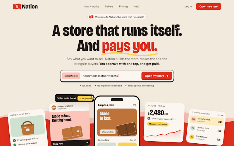
Two visual directions for the same brief. Which do you prefer?
2 voted
29%
5 voted
71%
7 votes
Closed

Direction A is more better to me it feels modern professional cartoony style that's impressive ❤️❤️
Great job Ayoub🔥🔥

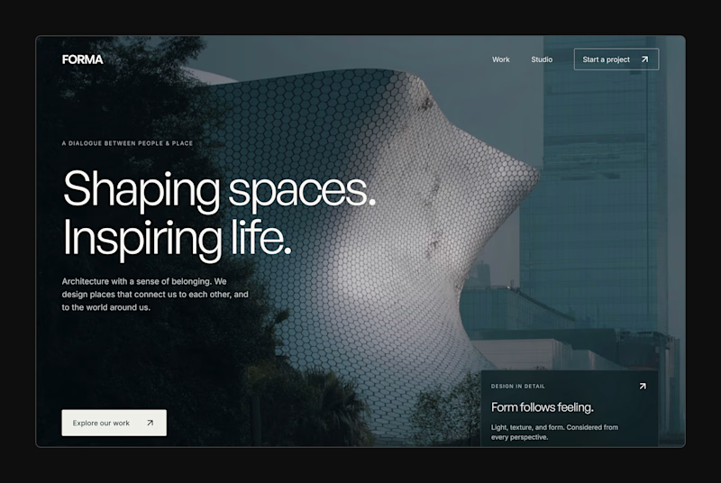
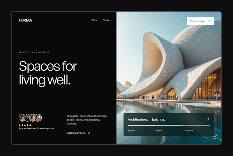
Design Exploration: Hero Section of Architecture Website. Which one do you think much better?


12 voted
43%
16 voted
57%
28 votes
Closed


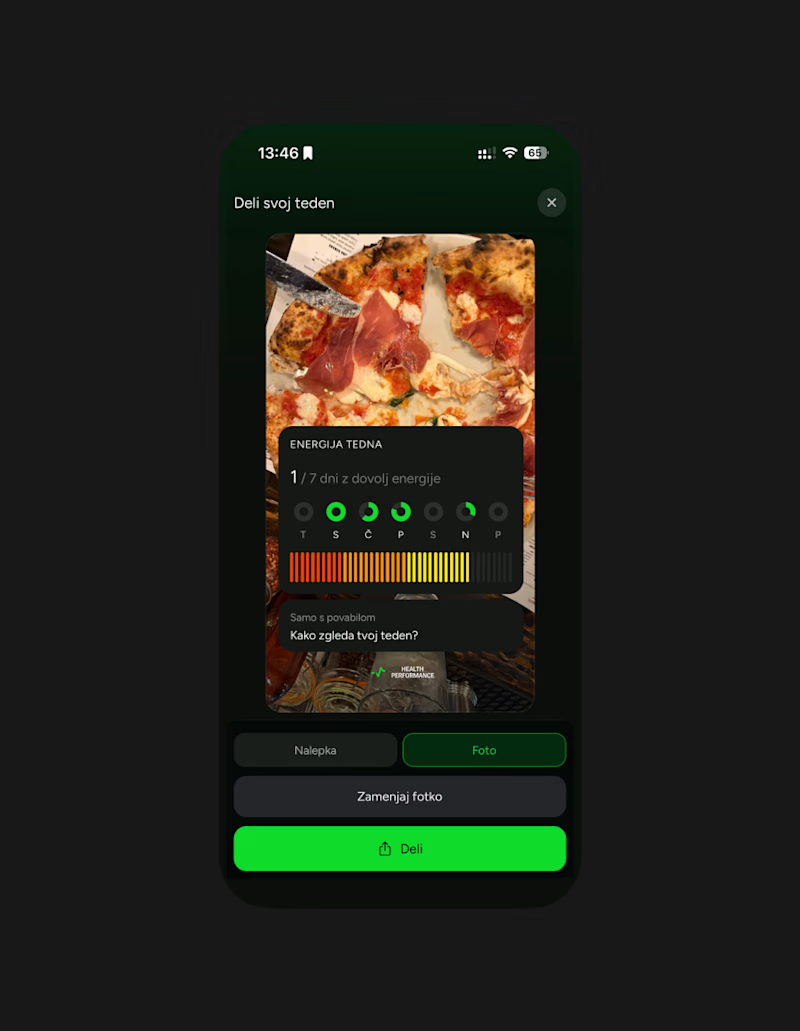
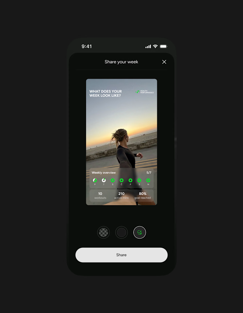
This week client came to me with a new idea for their app's share feature. They were trying something with Claude... But let's simplify this thingy:)
Let's remove all the buttons that confused me already - imagine what they'd do to a user...
Take our predefined bottom sheet and give our users 3 simple choices.
GOALS:
make it as simple as possible for our target persona (35-55 y/olds that aren't necessarily as modern and advanced in tech)
Create an aesthetically pleasing UI frame for stories, that makes people want the app & their lifestyle.
Which one would you go with?
SPOILER ALERT 🚨 we absolutely went with the after result😆
0 voted
0%
5 voted
100%
5 votes
Closed

Afterrrrr😊