The network for creativity
Join 1.25M professional creatives like you
Connect with clients, get discovered, and run your business 100% commission-free
Creatives on Contra have earned over $150M and we are just getting started
Back to feedPost
Minimalist Packaging for PUF Chips 🚀
I’m excited to share my latest work for PUF, a snack brand.
The Goal: Create a clean, "not overdone" packaging design that stands out through simplicity and modern aesthetics.
My Approach:
Intentional Simplicity: Focused on a bold, soft logo that pops against a clean background for instant recall.
Visual Hierarchy: Minimal typography ensures the flavor and brand remain the heroes.
Modern Feel: Used soft shadows and a refined palette for a premium retail look.
Tools: Figma & Canva.
This project proves that "less is more" creates a powerful impact on the shelf.


Thank you!!
The network for creativity
Join 1.25M professional creatives like you
Connect with clients, get discovered, and run your business 100% commission-free
Creatives on Contra have earned over $150M and we are just getting started



Related posts

Packaging and Ads Packages for Skincare and Cosmetic Brands
A visual storytelling case study, followed by packaging, labels, and ad packages for small ...


The dark teal band with the VEGAN, FRAGRANCE FREE and DERM TESTED pills makes the claims easy to read on the white jar. Did you check the label at the 30 ml size for legibility?


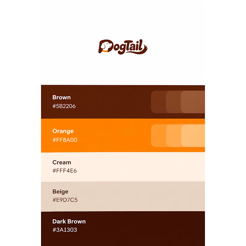
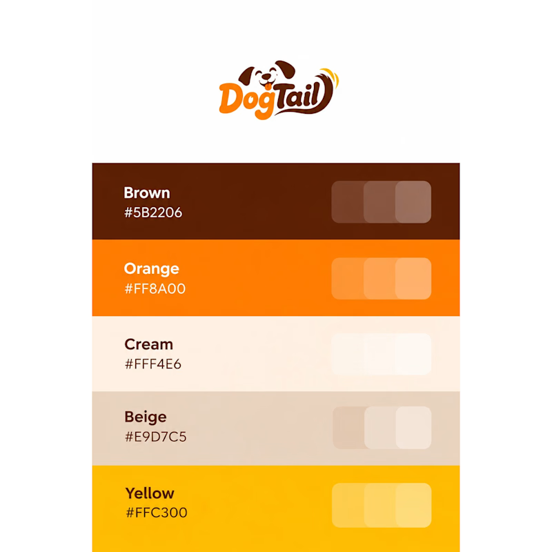
Two playful logo concepts for DogTail, a dog food and products brand.
Inspired by wagging tails and friendly typography. 🐶
Which one is your favorite?
A or B? 🐾
2 voted
25%
6 voted
75%
8 votes
Closed

B for me, hard to say no to that little face 🐶

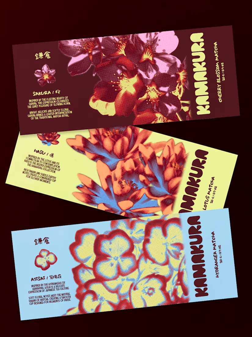
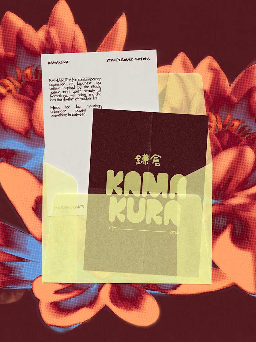
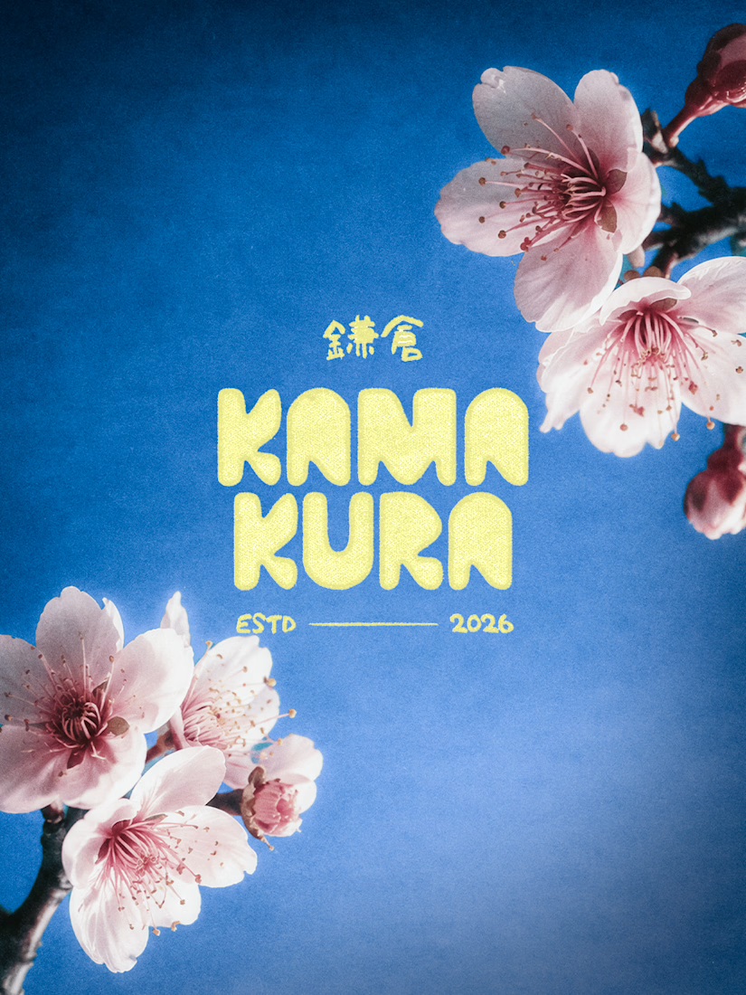
KAMAKURA is a Japanese matcha brand I designed to bring traditional matcha into everyday life. There are three flavours, each inspired by a flower: Ajisai (Hydrangea), Sakura (Cherry Blossom) and Hasu (Lotus).
I didn’t want the flowers to just sit there as decoration. So I started the whole identity from them. Their shapes and colours shaped the graphics and gave each flavour its own personality.
Then I added gradients. Petals are never one flat colour, so I wanted the design to shift the same way. It gave the brand some depth and made it feel a bit more artistic.
The final look is floral forms, soft gradients and bold type. Nothing like the green tins you usually see.
This was a collaborative project with my designer friend, Safna.
What do you guys think of the whole identity