The network for creativity
Join 1.25M professional creatives like you
Connect with clients, get discovered, and run your business 100% commission-free
Creatives on Contra have earned over $150M and we are just getting started
Back to feedPost
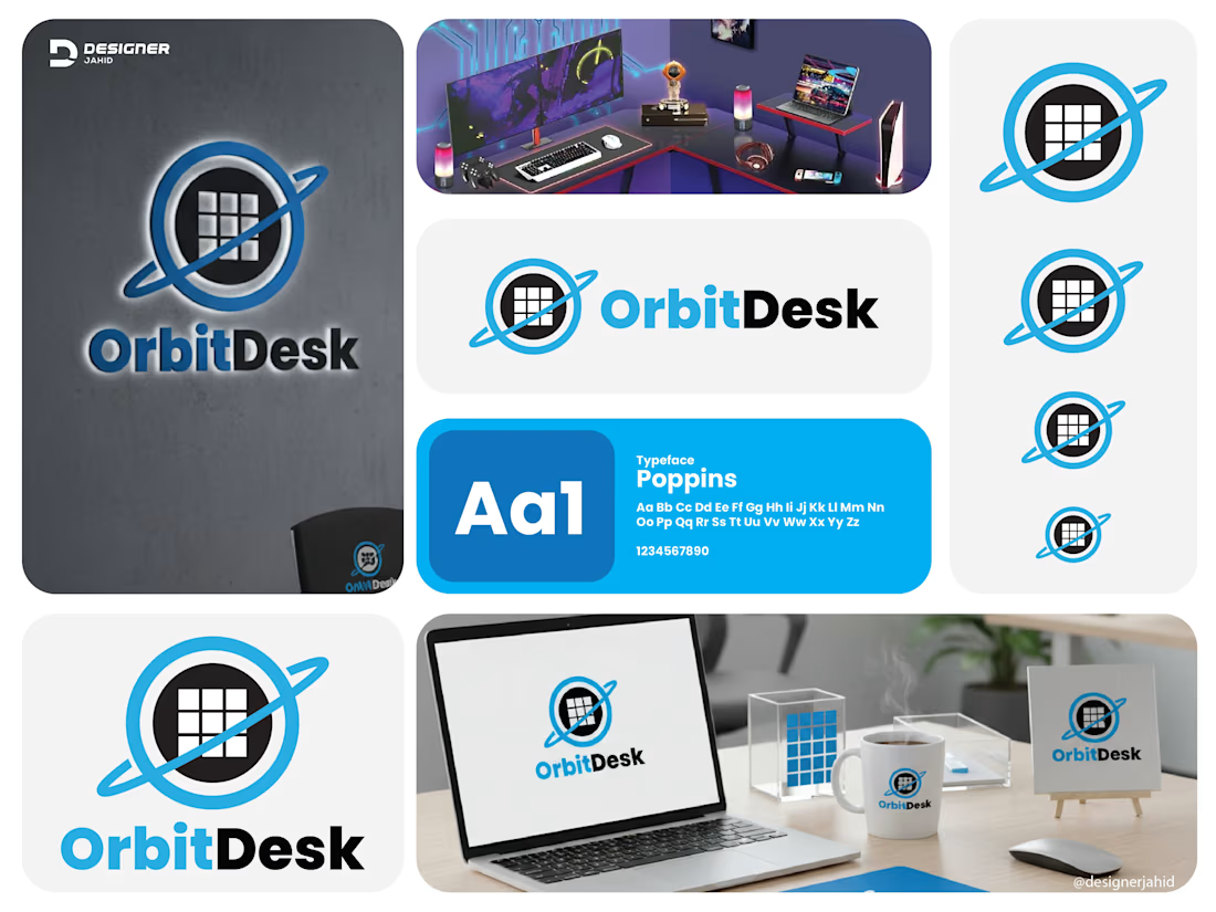
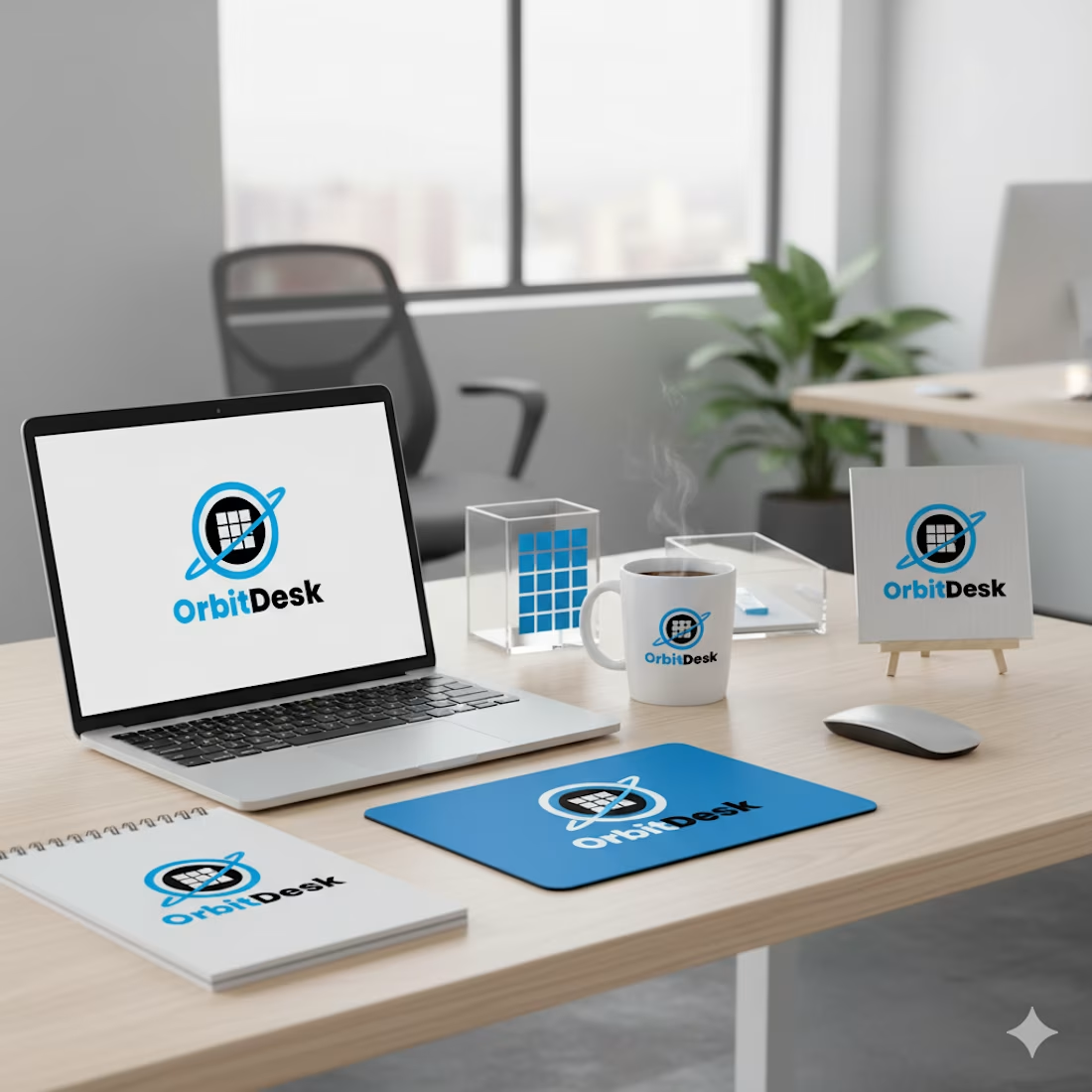
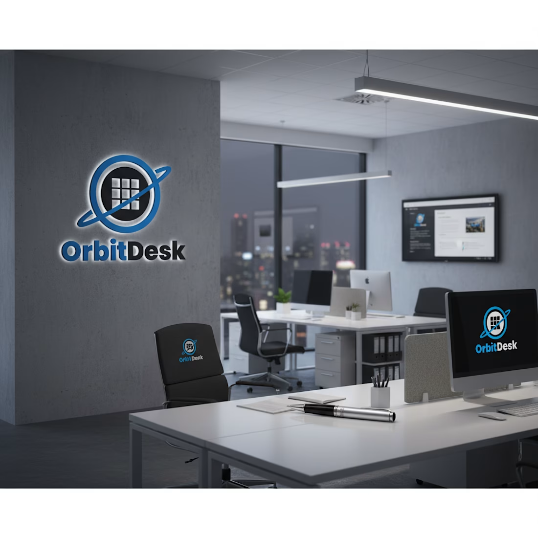
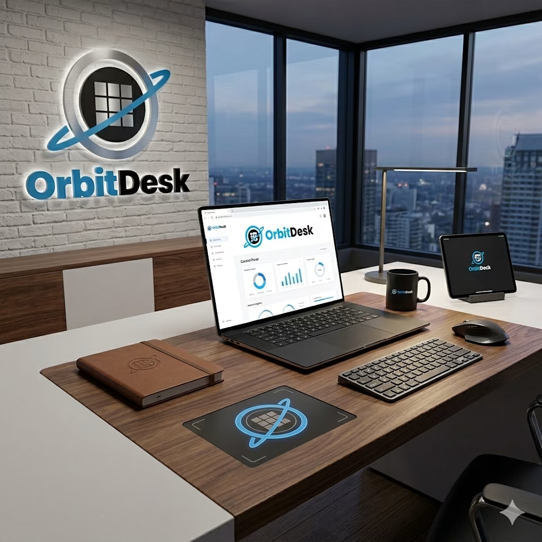
This logo combines technology, structure, and movement into one clean visual identity.
Symbol Meaning
Orbital ring — The blue ring circling the center represents motion, connectivity, and continuous workflow. It gives a sense of systems operating smoothly, like satellites in orbit. This supports the idea of efficiency and always-active digital infrastructure.
Central grid inside the circle — The square grid looks like a workspace layout, dashboard, or organized data blocks. This symbolizes structure, productivity, and digital work environments. It visually connects to the word " desk " as a place where tasks are managed.
Planet-like form — Together, the circle and orbit create a planet impression, reinforcing the name OrbitDesk and suggesting global reach, scalability, and smart systems working in sync.

This is solid, it feels both clean and engaging. If someone wanted to create something at this level, what would you say matters most in your process?

Thank you for your important comment. If someone wants to create such a quality design, then he/she should practice logo design a lot first. If he/she keeps designing logos regularly every day, then automatically one day he/she will be able to design a better quality logo.
The network for creativity
Join 1.25M professional creatives like you
Connect with clients, get discovered, and run your business 100% commission-free
Creatives on Contra have earned over $150M and we are just getting started
Related posts

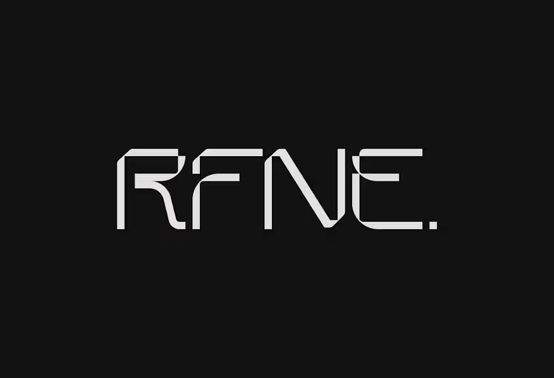
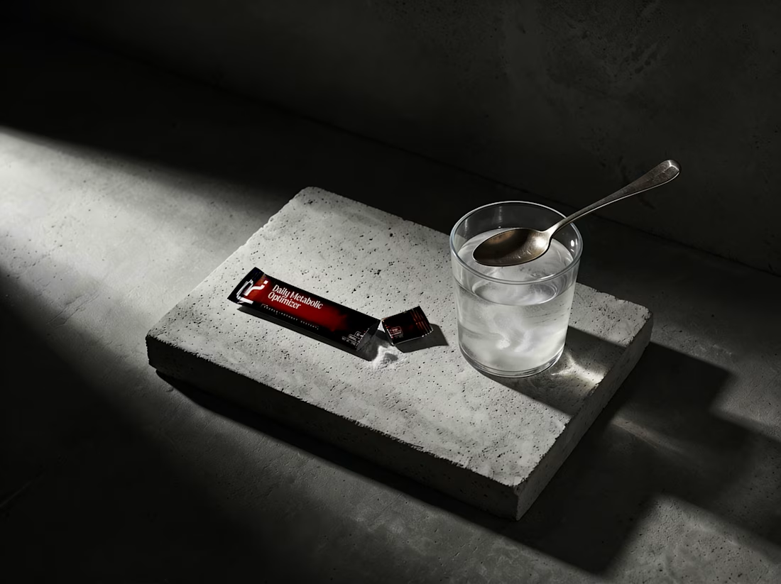
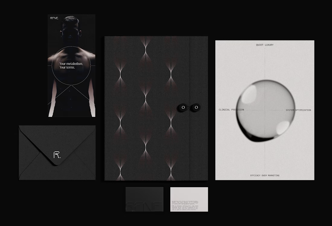
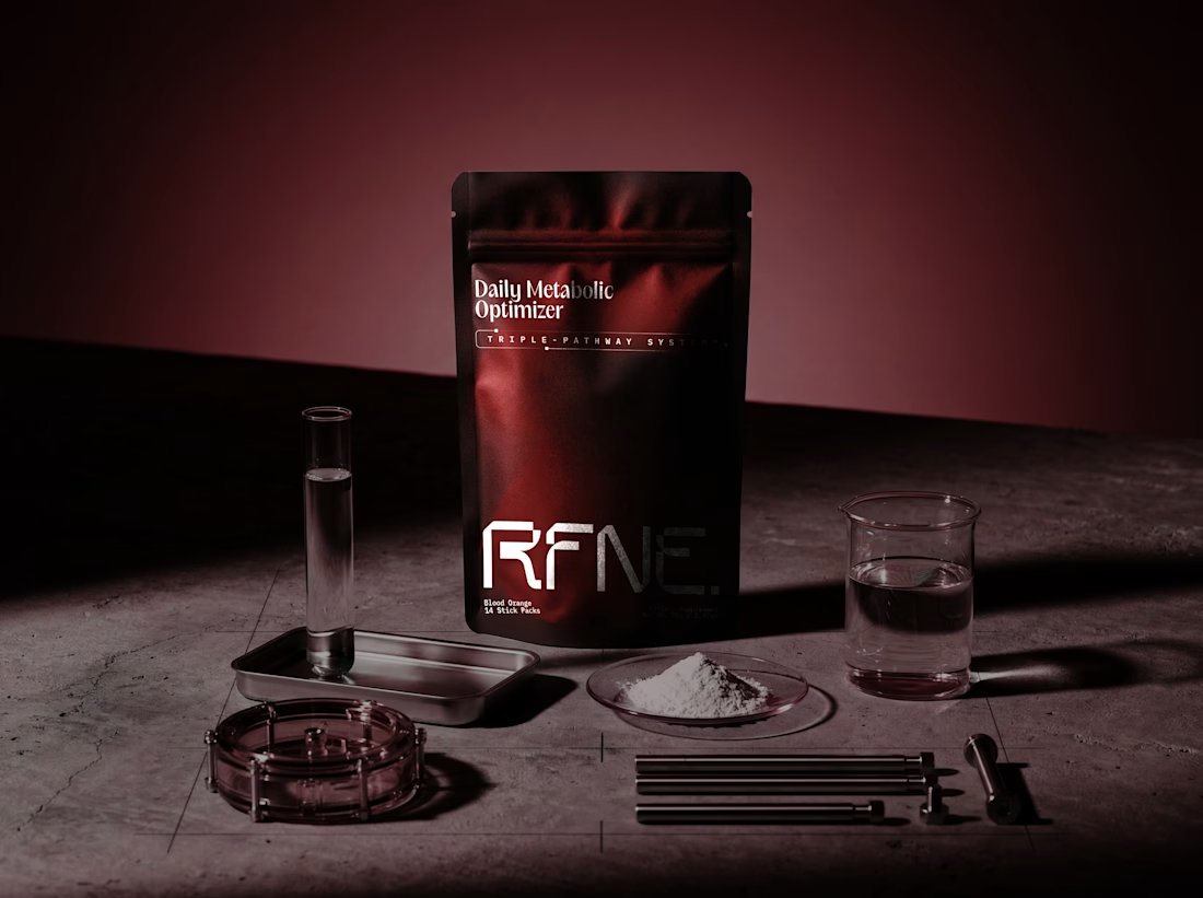
Branding & Packaging design for RFNE. 🧪
A precision metabolic support system engineered for high performers, a silent operating infrastructure designed to stabilize the body’s baseline and unlock elevated performance across training, focus, and recovery. Rooted in the concept of the bridge, the identity carefully balances scientific rigor with quiet luxury, creating a presence that feels both clinical and sophisticated.
You can see full project and narrative here
Feel free to like, comment and follow, kindly appreciated.
Brand DesignLogo DesignPackaging DesignUnicorn StudioAdobe IllustratorJitterbrandidentitysupplementpackaging



Love this!


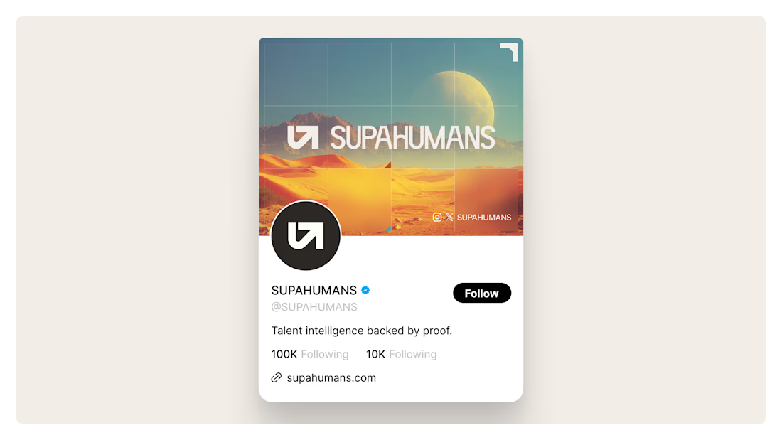
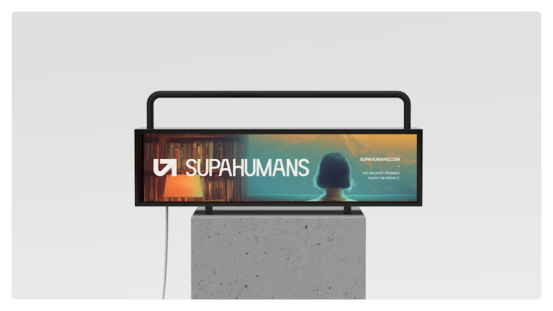
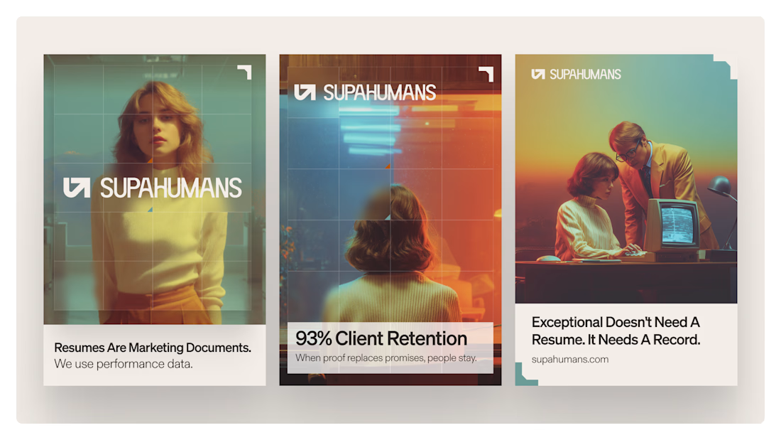
SUPAHUMANS was one of my favorite projects shipped this year.
one variable made it great and that's complete creative trust. the client briefed me, backed off, let the work breathe.
the goal for the rest of the year for me ifmore clients like this.
founders, it;s super simple, pick a designer, trust them and let them be creative.


Nice design
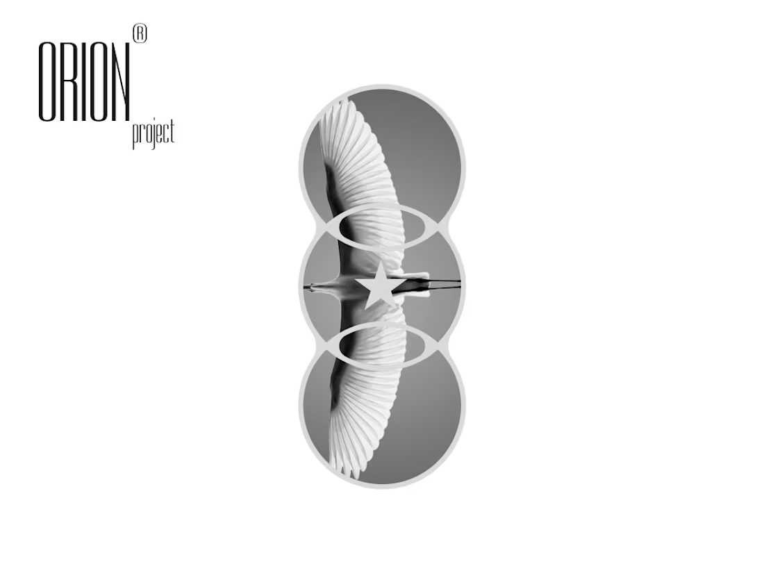
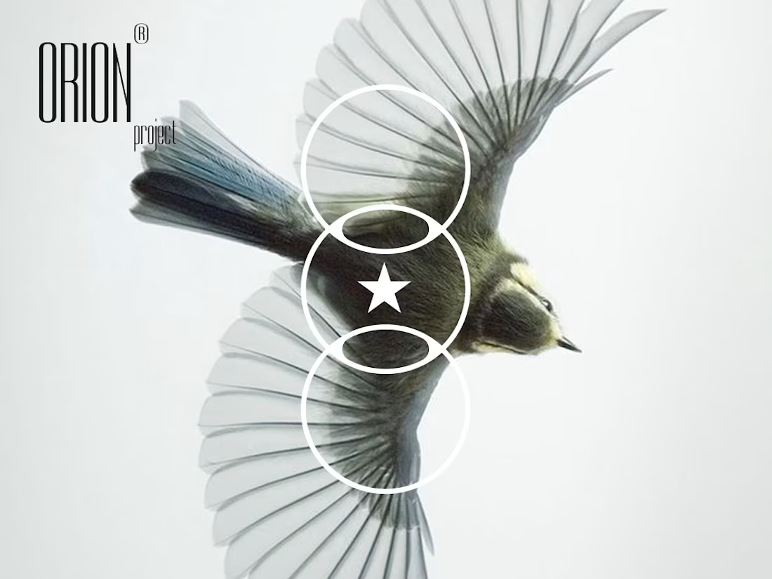
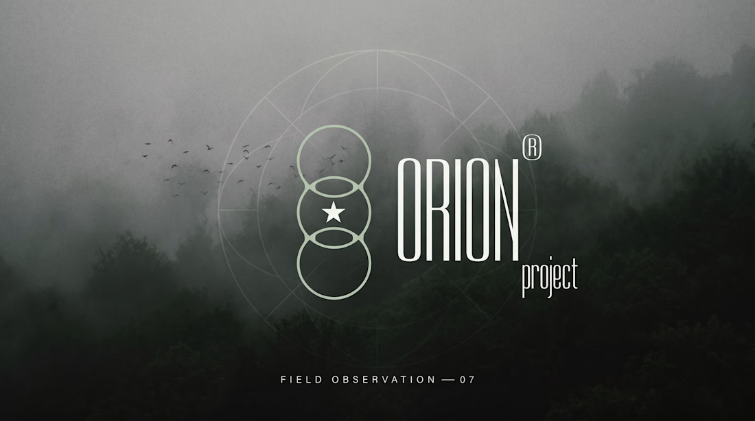
the mark is three circles and a star.
lens / threshold / archive.
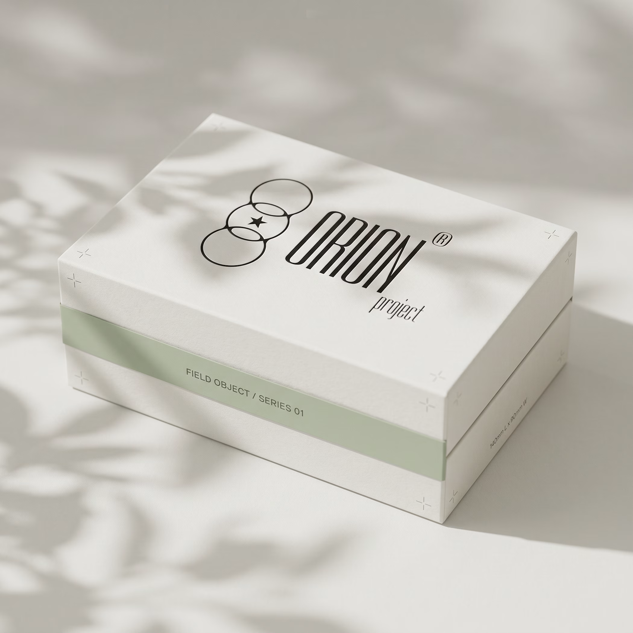
every mockup, every object, every type choice came from one question: what does a designer who thinks like a field researcher actually look like.
ORION project — case study out now.
Love it!


Trending

Claude
Claude has entered the design space. How are you using Claude Design?

Contra University
Learn from expert creatives how to earn more using next-gen AI tools.
creativeaiflow
Creative AI workflows are evolving. What tools do you use, and what are their strengths and weaknesses?
portfolioreview
The best portfolios tell a story, not just show a grid. Share yours for feedback.
freelancerlife
Freelancer life is wins, pivots, and everything in between. What’s yours right now?