The network for creativity
Join 1.25M professional creatives like you
Connect with clients, get discovered, and run your business 100% commission-free
Creatives on Contra have earned over $150M and we are just getting started
Back to feedPost
It’s all in the details.
A design isn’t finished when there’s nothing left to add, but when there’s nothing left to take away. I’ve been refining this landing page for a vintage photo studio, moving from a cluttered layout to a cleaner, more intentional UI.
By simplifying the logo and introducing a ghosted hero overlay, I’ve created a sense of depth without sacrificing that "premium" feel.
The Goal: Minimalist, sophisticated, and timeless. 🎞️✨

thank you
Good work. If you reduce the space between the headings, it will look betterAlso, if you center the paragraphs under the heading, it will look better from a UI perspective.
The network for creativity
Join 1.25M professional creatives like you
Connect with clients, get discovered, and run your business 100% commission-free
Creatives on Contra have earned over $150M and we are just getting started
Related posts
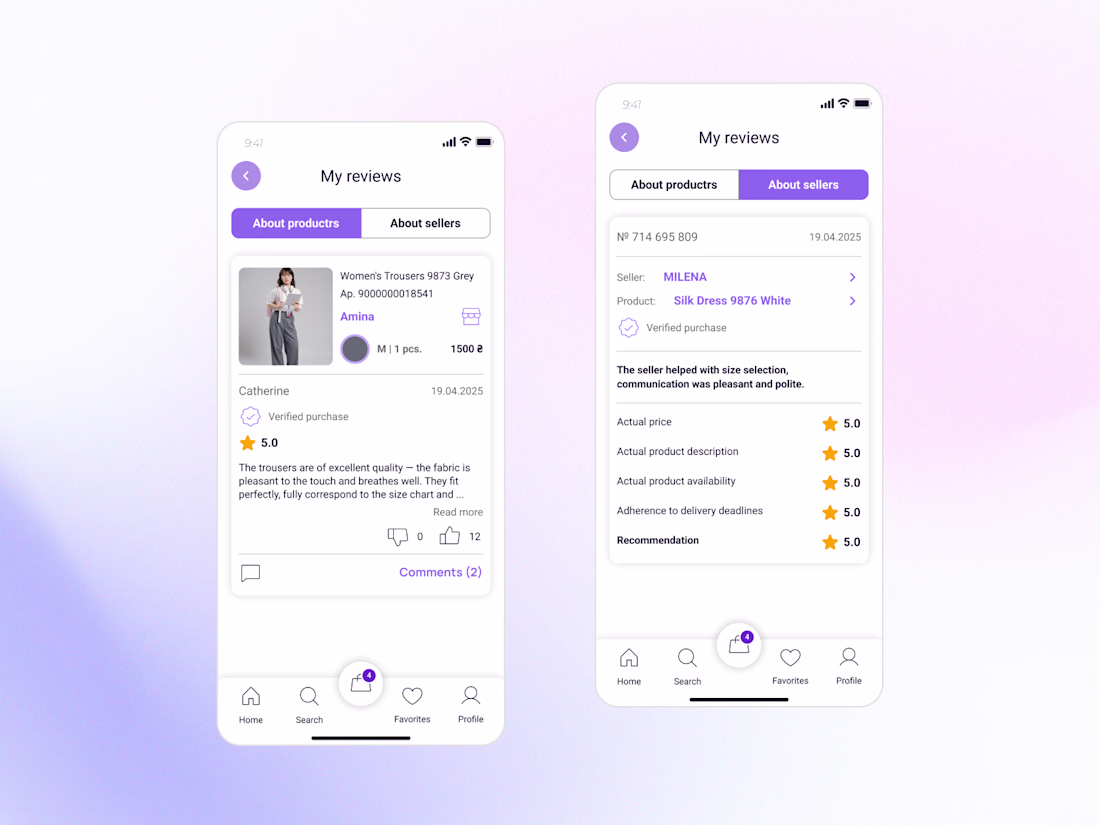
New design update: Reviews & Ratings for a Marketplace Buyer Profile🌟
Reviews are more than just stars - they help people decide who and what they can trust.
While designing this feature, I focused on making reviews clear, transparent, and useful for buyers.
Key improvements:
• Separate reviews about products and sellers for better context.
• Highlight verified purchases to increase credibility.
• Structure feedback so users can quickly find relevant information.
• Create a clean and intuitive experience that supports confident decision-making.
The goal was to turn reviews into a trust-building tool rather than just a collection of ratings.
Part of my ongoing Marketplace App concept. More screens coming soon 👀
Love this approach! Reviews play such a big role in decision-making, and I like how you've focused on making them more useful and transparent instead of just displaying ratings. Excited to see the next screens ✨
Meet ScribblePrompt.
It started with a moment at work. I was whiteboarding with one of our engineers, and the conversation felt faster, clearer, and more productive. That made me realize I wanted the same kind of experience with my coding agents, without sending screenshots, typing long explanations, and still not quite getting what I meant.
So me and @Carlneil Domkam built ScribblePrompt in Figma Make: a tool that lets you whiteboard with an agent, so ideas start as sketches, not walls of text.
If you like design tools that make ideation feel more natural, we’d love for you to check it out.
Features:
- Whiteboarding tools
- Sketch Context for Figma Make
- MCP for Claude and Cursor
- Sketch Assistant — generate sketches
- Responsive across desktop and iPad
Tools used:
- FigJam for ideation and brainstorming
- Figma Make for prototyping and implementation of the sketching tool, sketch context, and audio transcription
- Figma Design for UI design tweaks
- Figma Weave for logo generation and storyboard references
- Anthropic API for Sketch Context and MCP
- Gemini API for the sketching assistant:
It's been a fun 2 weeks participating in this hackathon! See you at Figma Config! 🚀
Hello everyone 🎉
I'm Viktoriia, a UX/UI Designer from Ukraine with 4+ years of experience creating websites and digital products.
My work spans SaaS, e-commerce, real estate, education, wellness, and nonprofit projects — from UX research and user flows to polished UI and design systems.
Lately, I've been actively exploring how AI can support the design process. I use AI tools to support research, explore ideas, challenge assumptions, and streamline workflows while keeping human-centred design at the core.
Excited to connect with fellow designers, founders, and creative professionals here on Contra. ✨
lovely stikers 😍😍😍 Welcome to Contra 🎉
Trending
Claude
Claude has entered the design space. How are you using Claude Design?
Contra University
Learn from expert creatives how to earn more using next-gen AI tools.
MagicPath
The canvas is infinite, and exploration is becoming the workflow. How are you using MagicPath?
creativeaiflow
Creative AI workflows are evolving. What tools do you use, and what are their strengths and weaknesses?
freelancerlife
Freelancer life is wins, pivots, and everything in between. What’s yours right now?