
kota Manoj Kumar
I build @framer templates ,websites and responsive sites
New to Contra
kota is ready for their next project!
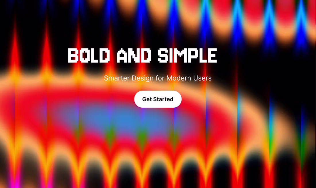
Bold visuals with a clean, modern feel.
Designed to capture attention instantly.
check out https://trail2.framer.website/page
2
113
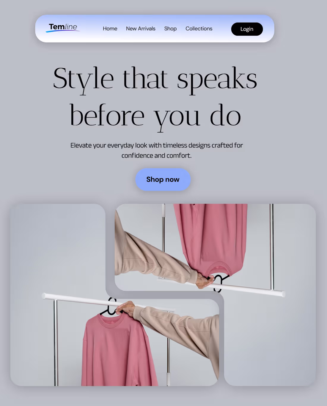
Temline brings timeless style and modern comfort together. Discover everyday essentials designed to elevate your look with effortless confidence and clean, refined aesthetics.
1
119
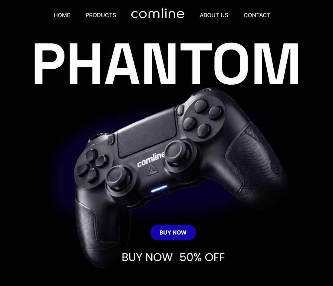
A dark, minimal hero section concept designed for a modern gaming brand. The layout focuses on bold typography, strong product presence, and a sleek black aesthetic to highlight the Comline Phantom controller.
1
134

It’s all in the details.
A design isn’t finished when there’s nothing left to add, but when there’s nothing left to take away. I’ve been refining this landing page for a vintage photo studio, moving from a cluttered layout to a cleaner, more intentional UI.
By simplifying the logo and introducing a ghosted hero overlay, I’ve created a sense of depth without sacrificing that "premium" feel.
The Goal: Minimalist, sophisticated, and timeless. 🎞️✨
2
3
219
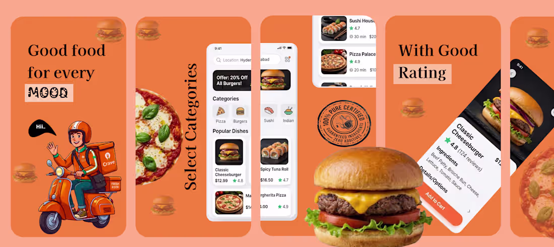
🍔 Food Delivery App UI Design Concept
Excited to share a recent UI/UX design concept for a modern food delivery mobile application. The goal of this project was to create a clean, engaging, and user-friendly experience that helps users quickly discover and order their favorite meals.
The design focuses on:
• Simple and intuitive navigation
• Clear food categories for easy browsing
• Visually appealing food cards with ratings and pricing
• A vibrant colour palette to create an energetic food ordering experience
This concept highlights how thoughtful UI design can make food ordering faster, easier, and more enjoyable for users.
Tools used: Figma
Focus: Mobile UI Design | Food Delivery Experience | User-Friendly Interface
1
167
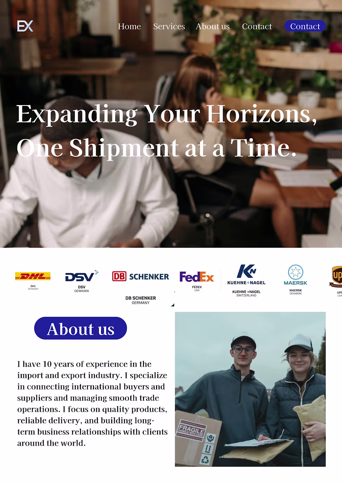
The work shown here is Global Trade Facilitation and Supply Chain Management. Rather than just moving boxes, this role acts as the critical link between manufacturers and global markets.
1
174
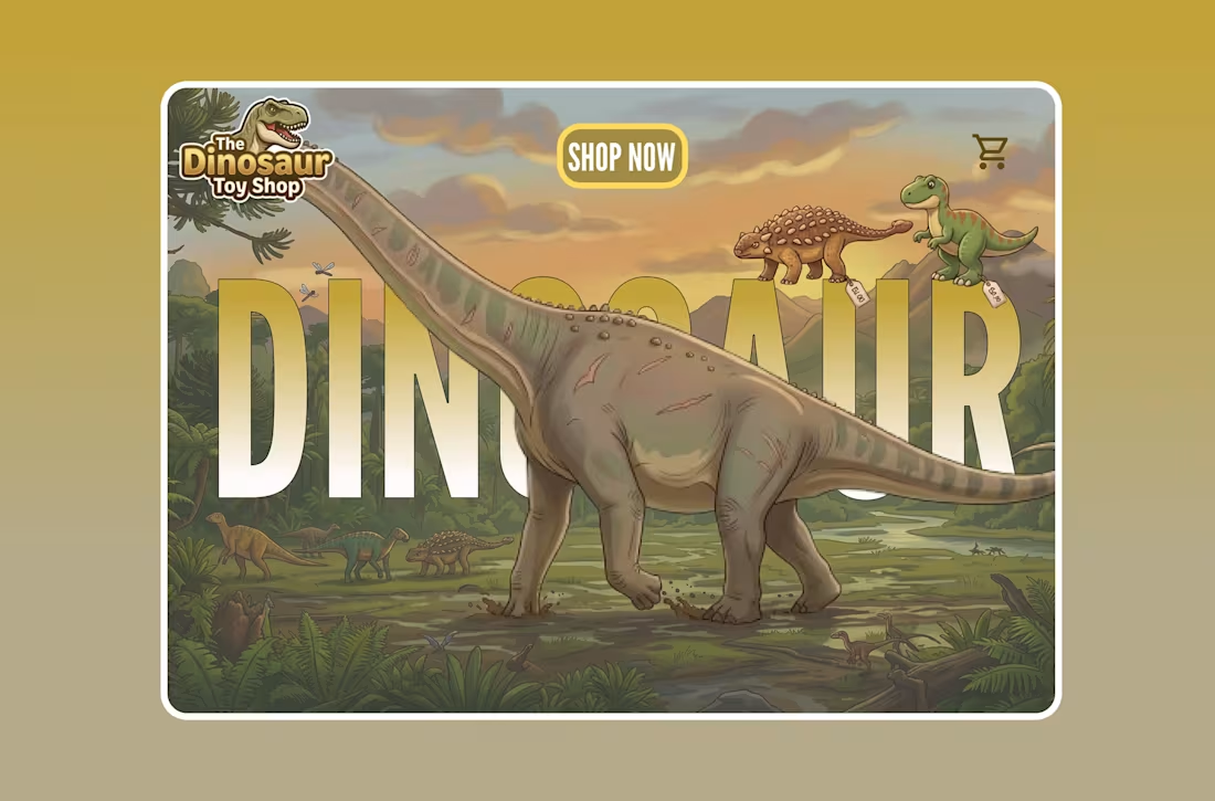
"Elevating e-commerce through immersive storytelling. 🦖
For The Dinosaur Toy Shop, we moved away from static product grids and created a living, breathing prehistoric ecosystem. By utilizing depth-masking and strategic typography, we’ve turned the 'Hero Section' into a narrative experience
1
176
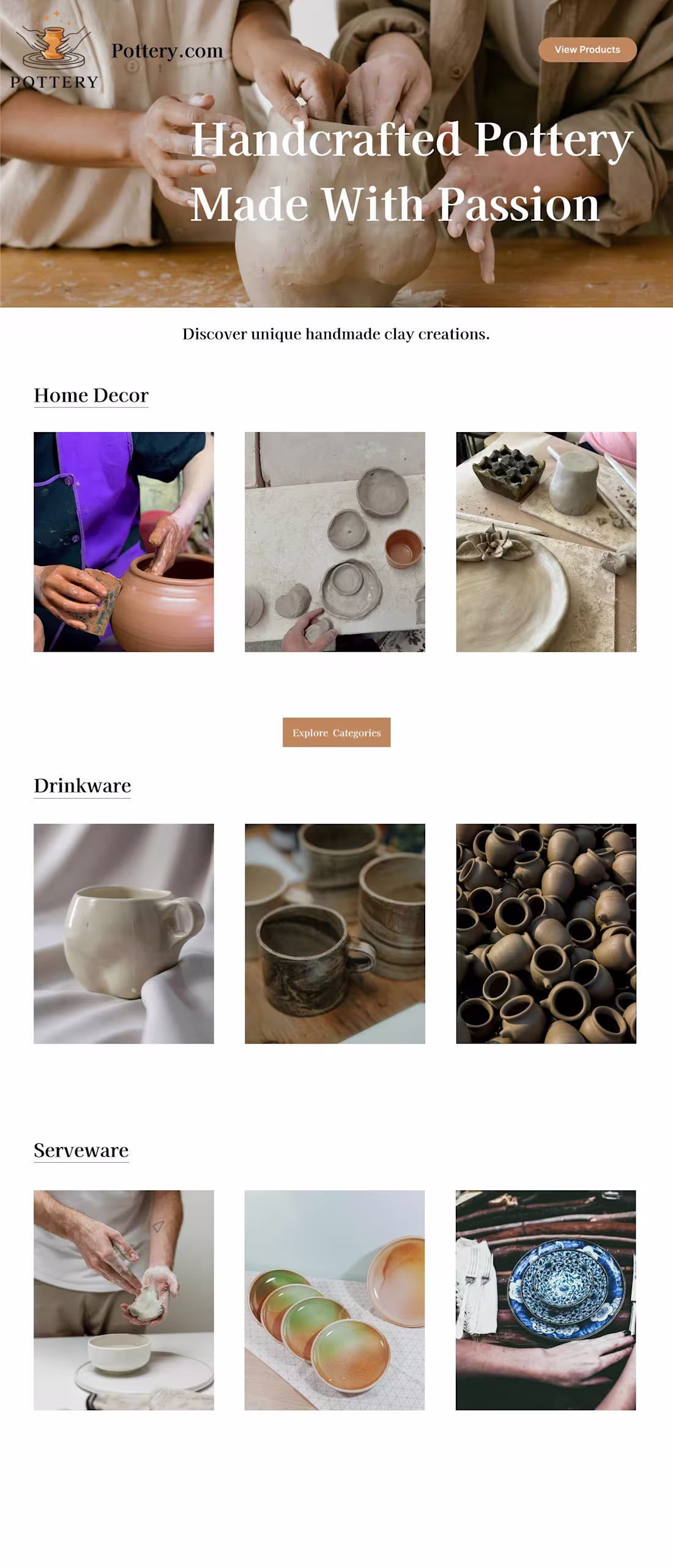
:Handcrafted Pottery E-commerce Website Design
This project is a modern e-commerce website design created for a handcrafted pottery brand. The goal of the design was to showcase handmade clay products in a clean, elegant, and visually engaging way.
The homepage highlights the brand’s craftsmanship through a warm hero section, product categories, and curated imagery. The layout focuses on simplicity, allowing the pottery products to stand out while guiding users smoothly through different collections such as Home Decor, Drinkware, and Serveware.
The design uses soft earthy colors, large product imagery, and minimal typography to reflect the natural and artisanal feel of pottery making. Clear call-to-action buttons help users easily explore categories and view products.
2
233