The network for creativity
Join 1.25M professional creatives like you
Connect with clients, get discovered, and run your business 100% commission-free
Creatives on Contra have earned over $150M and we are just getting started
Back to feedPost
It’s all in the details.
A design isn’t finished when there’s nothing left to add, but when there’s nothing left to take away. I’ve been refining this landing page for a vintage photo studio, moving from a cluttered layout to a cleaner, more intentional UI.
By simplifying the logo and introducing a ghosted hero overlay, I’ve created a sense of depth without sacrificing that "premium" feel.
The Goal: Minimalist, sophisticated, and timeless. 🎞️✨

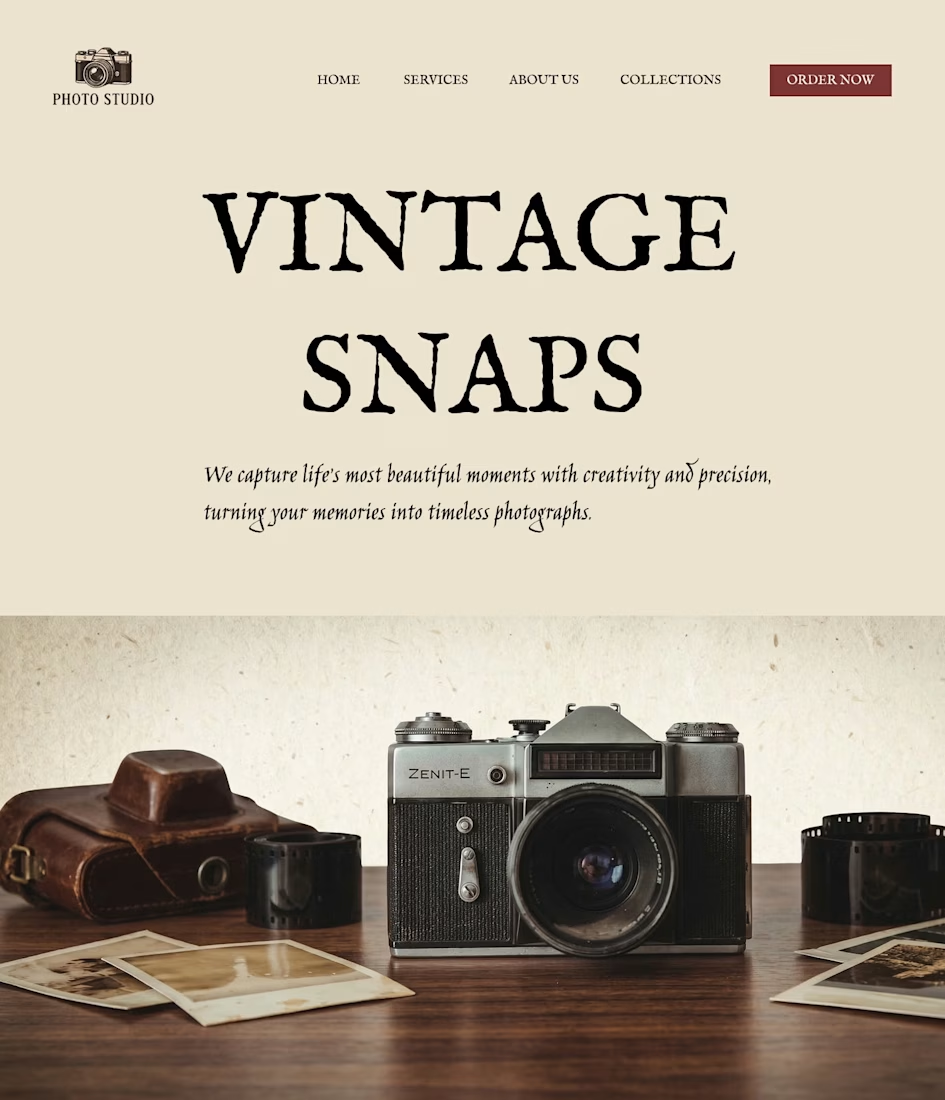

Good work. If you reduce the space between the headings, it will look betterAlso, if you center the paragraphs under the heading, it will look better from a UI perspective.

thank you
The network for creativity
Join 1.25M professional creatives like you
Connect with clients, get discovered, and run your business 100% commission-free
Creatives on Contra have earned over $150M and we are just getting started











Related posts


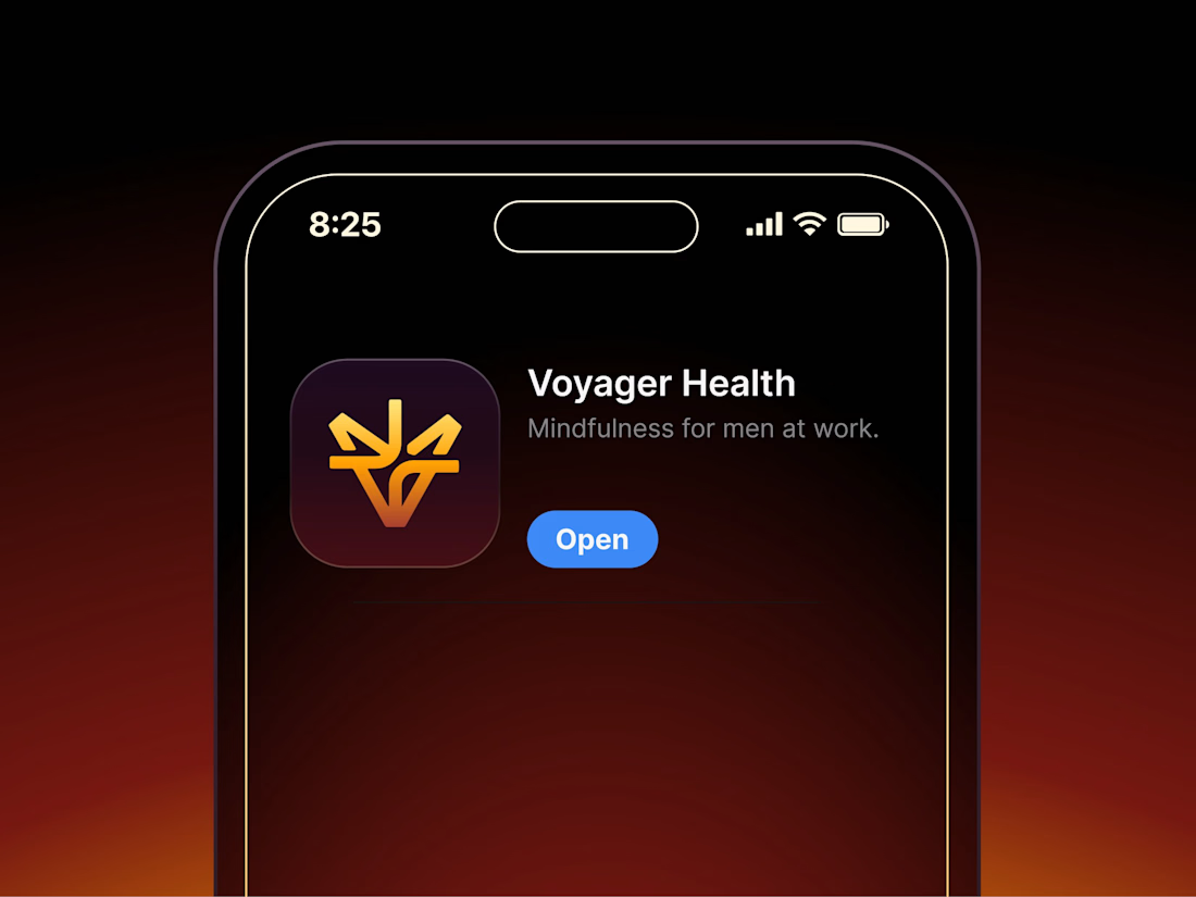

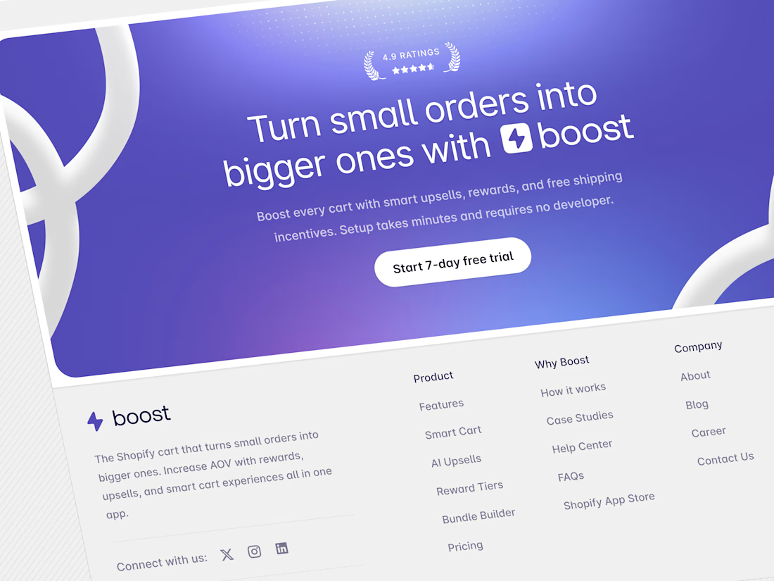
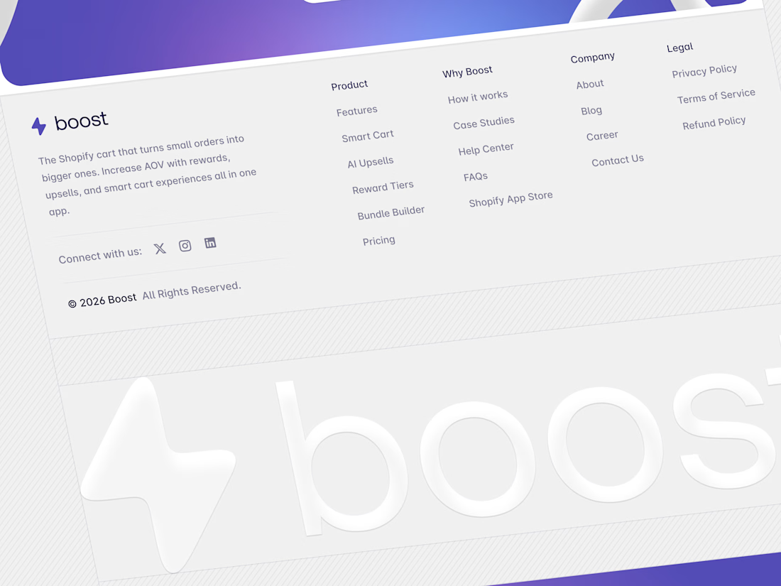
Aryna, that golden symbol pops so nicely against the plum background ✨

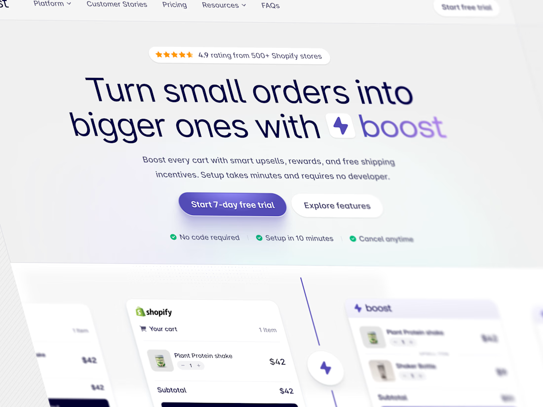
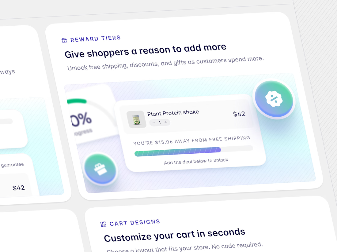

Brilliant work

Poster Club turns a simple event template into your own print. I built two working Flutter versions and recorded the same editing flow in each.
Print Room: calm, editorial, with a mounted canvas and bottom tools.
Cutout Playground: bold, playful, with loose prints and tools at the edge.
Which one would you rather use?
What made the difference?
Grab it for free:
https://contra.com/products/cUHBysMu-poster-club-free-flutter-ab-ui-kit


37 voted
60%
25 voted
40%
62 votes
Closed

Print Room looks great!!