The network for creativity
Join 1.25M professional creatives like you
Connect with clients, get discovered, and run your business 100% commission-free
Creatives on Contra have earned over $150M and we are just getting started
Back to feedPost
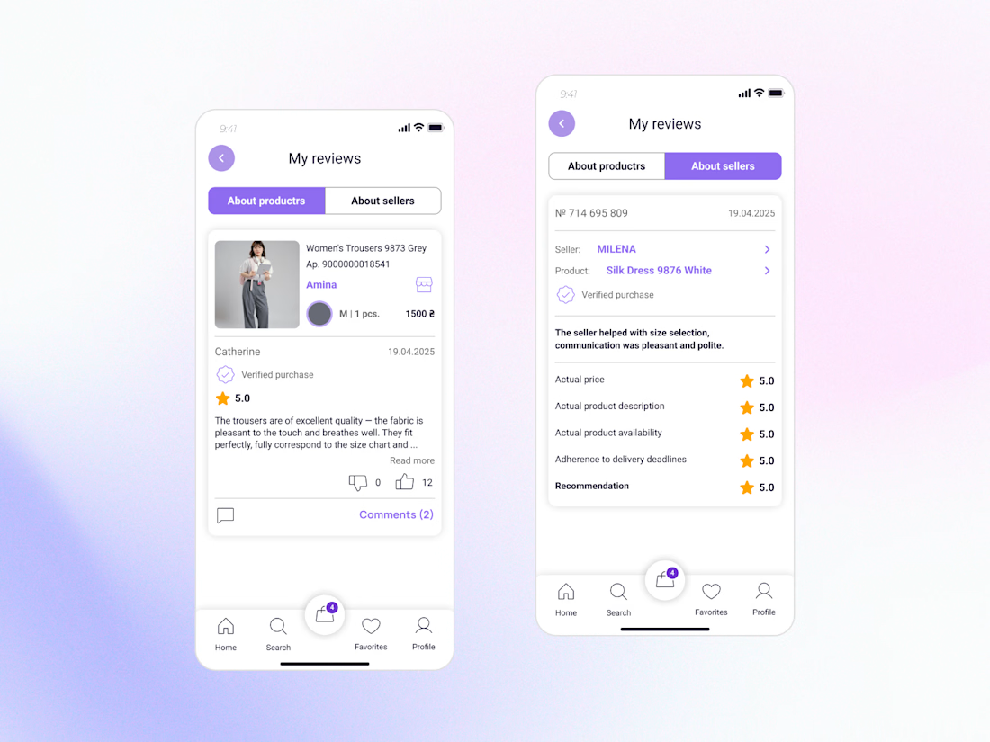
New design update: Reviews & Ratings for a Marketplace Buyer Profile🌟
Reviews are more than just stars - they help people decide who and what they can trust.
While designing this feature, I focused on making reviews clear, transparent, and useful for buyers.
Key improvements:
• Separate reviews about products and sellers for better context.
• Highlight verified purchases to increase credibility.
• Structure feedback so users can quickly find relevant information.
• Create a clean and intuitive experience that supports confident decision-making.
The goal was to turn reviews into a trust-building tool rather than just a collection of ratings.
Part of my ongoing Marketplace App concept. More screens coming soon 👀




Woow, I love your work Olha , welcome on Contra 😍

Thanks a lot! 🥰Thrilled to hear that from you!
This is just the beginning 🚀

Welcome on Contra 😍 ✨ I especially like the decision to separate product and seller reviews—it’s a small detail that adds a lot of clarity and helps users make more confident decisions.
So happy to hear that 😊 I wanted to make the decision-making process as smooth as possible for buyers. Thanks for the support! 🔥

Nice work! Love the idea with separating product and seller reviews.
Thank you! I noticed that mixing product and seller reviews often confuses buyers, so splitting them was a priority. Happy to hear it resonates with you! 😊

Great work😄😍

Wow, nice work!🔥

Ласкаво просимо на Contra 😊
Дякую! 😊


Welcome!! :😍 Incredible work
Thank you 😊

Welcome to Contra 🎉
Good work and I wish you to have more incredible offers 🚀
Thank you! 😊

Love this approach! Reviews play such a big role in decision-making, and I like how you've focused on making them more useful and transparent instead of just displaying ratings. Excited to see the next screens ✨
Thank you 😊 next screns are coming soon 🙃


Welcome to Contra

Welcome on Contra! 🙌 Great focus on building trust through structured data. Looking forward to the next updates! 👀
Thank you 😊 updates are on the way 🙃
The network for creativity
Join 1.25M professional creatives like you
Connect with clients, get discovered, and run your business 100% commission-free
Creatives on Contra have earned over $150M and we are just getting started
Challenges
View all


Related posts

Designed a dashboard concept for tracking net worth across every asset type — stocks, crypto, property, pensions, funds, cash, and liabilities — all in one place.
Instead of the usual pie chart or bar graph, the centerpiece is a dial: a single, glanceable gauge showing where your wealth actually sits. Behind it, a quiet grid of every asset category fades in and out of visibility, reinforcing that everything's accounted for even when it's not the focus.
Dark UI, a single confident green accent, and a lot of negative space — built to make a genuinely overwhelming task (seeing your entire financial picture at once) feel calm instead of cluttered.


wow the animation feels super smooth, what is this animation for?



wow the UI is insane and the presentation is mindblowing