The network for creativity
Join 1.25M professional creatives like you
Connect with clients, get discovered, and run your business 100% commission-free
Creatives on Contra have earned over $150M and we are just getting started
Back to feedPost

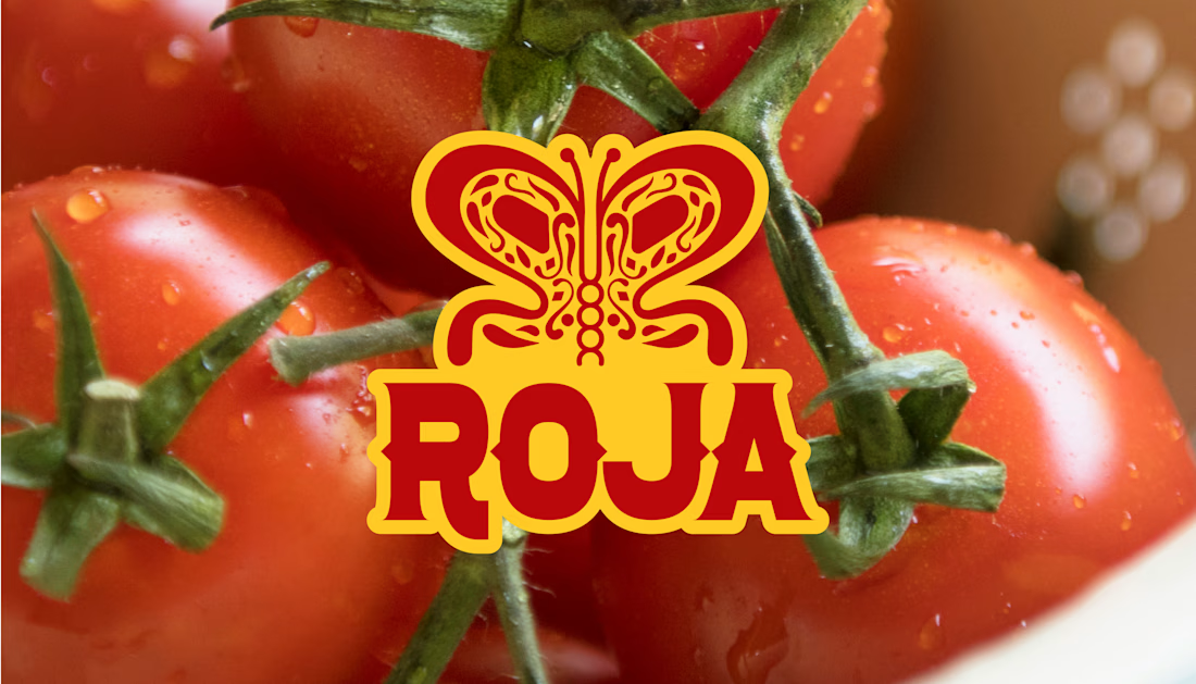
Two letters. One butterfly.
That's the whole icon for Roja.
A lot of brands use pretty obvious symbols when they want to show where they come from.
A chili pepper. A sombrero. Something literal.
I didn't want that for Roja.
The brand comes from a real story. Sofia's family grew tomatoes in Michoacán, and years later she brought that same flavor with her to London.
So I wanted the icon to say something about that journey too.
The mark is built from two mirrored R's.
Put them together and they create a butterfly.
And that's not just because it looks nice.
Butterflies migrate.
Sofia did too.
She moved from Mexico to London and brought that same recipe with her.
That's what I really like about this kind of logo.
The story doesn't always have to be sitting there as an illustration.
Sometimes you can hide it inside the actual logo itself.
Most people might never notice it.
But I still think it's worth doing.
Because the meaning is there, even if you have to look a little closer to find it.
The network for creativity
Join 1.25M professional creatives like you
Connect with clients, get discovered, and run your business 100% commission-free
Creatives on Contra have earned over $150M and we are just getting started





Related posts

Bring back mascot logo's 🙌
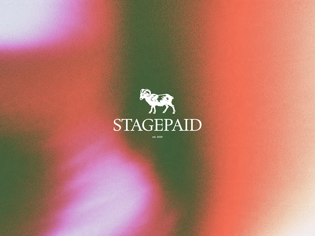
Ram logo 'Stagepaid'.




cool work! love mascot logos :D

Bringing MONETA to life through a series of brand applications that extend the identity across digital banking, business materials, and marketing touchpoints. A refined combination of typography, color, and structured layouts creates a modern and cohesive financial brand experience.
Have a project in mind?
Get in touch and let’s create something together.

Goatt!!

WOLLSEY - Jewelry for the Bold Ones
Wollsey is a jewelry brand built on one idea: bold jewelry should never blend in.
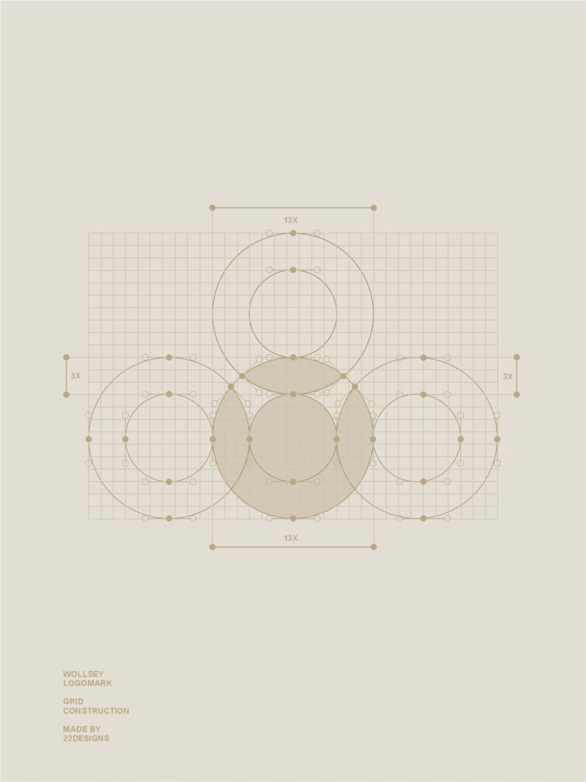
The identity centers on two interconnected principles; presence and permanence. The symbol takes the form of a solid, self-contained mark: a circular silhouette holding a crown-like negative space at its center, representing a piece of jewelry as an object of its own weight and status, not an accessory borrowed from someone else's trend cycle.
This concept carries through the entire visual system. The custom wordmark is built in a bold, condensed sans — compressed, confident letterforms that read as a stamp rather than a script, echoing the same solidity as the symbol itself.
The color palette pairs deep matte black with a controlled, high-impact red, balanced by warm cream and stone tones across packaging and supporting materials — a system built for contrast and attention rather than quiet luxury.
Full casestudy is coming soon
jewelrylogojewelrybrandidentityLogo DesignBrand DesignGraphic DesignAdobe IllustratorAdobe PhotoshopCorelDraw

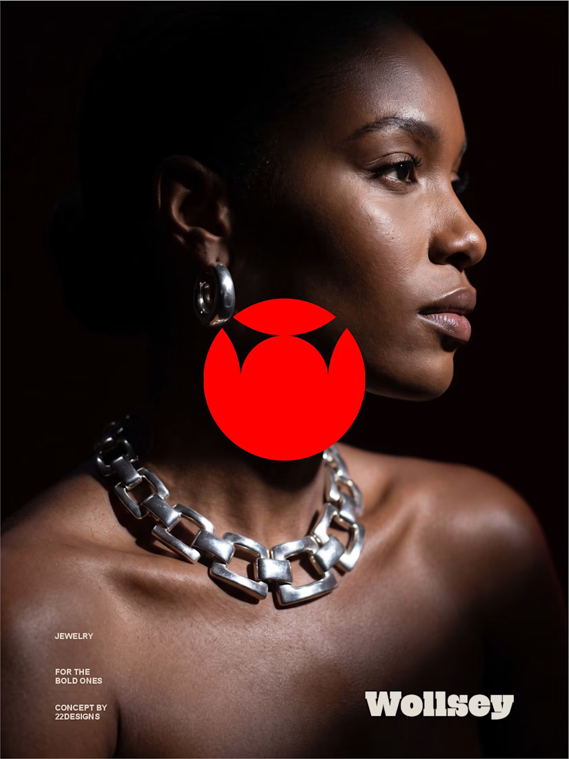
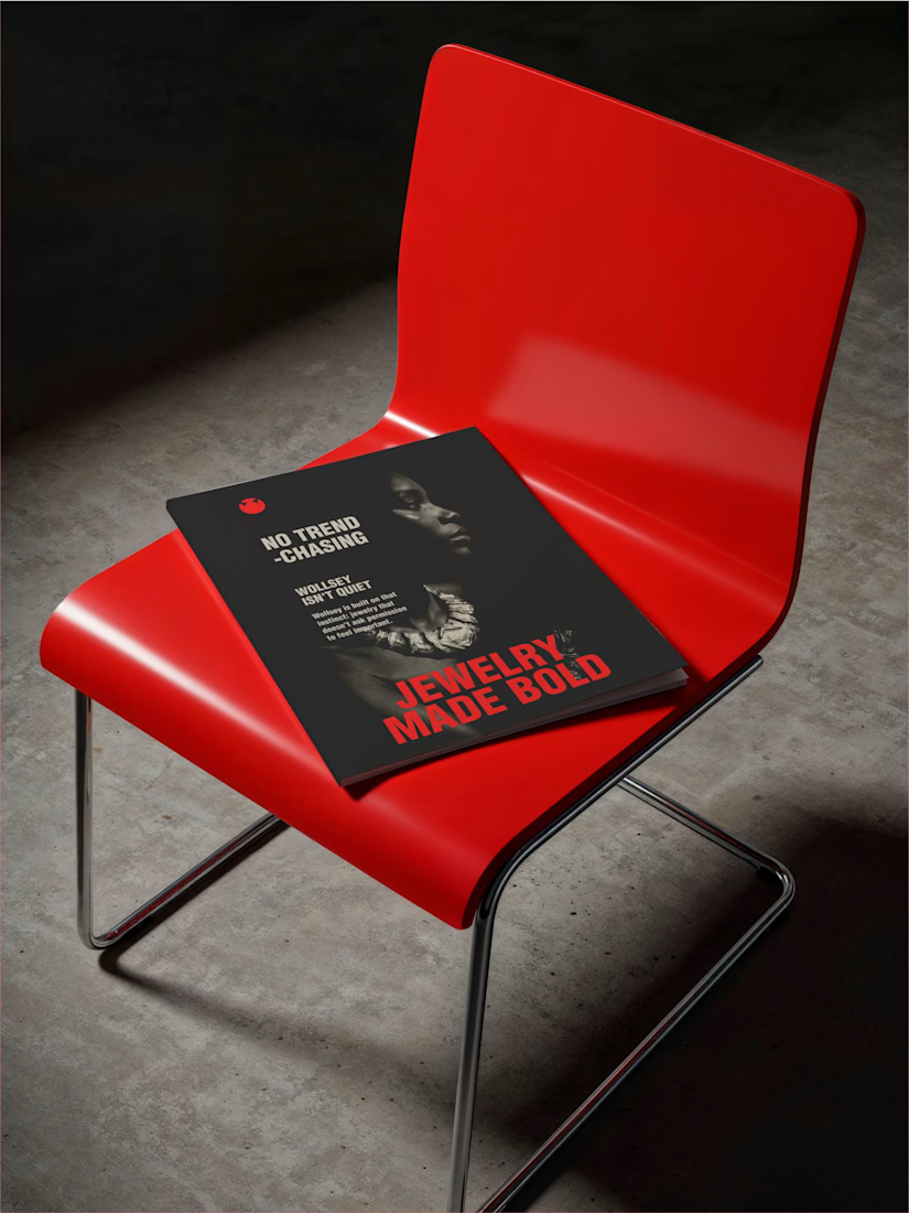
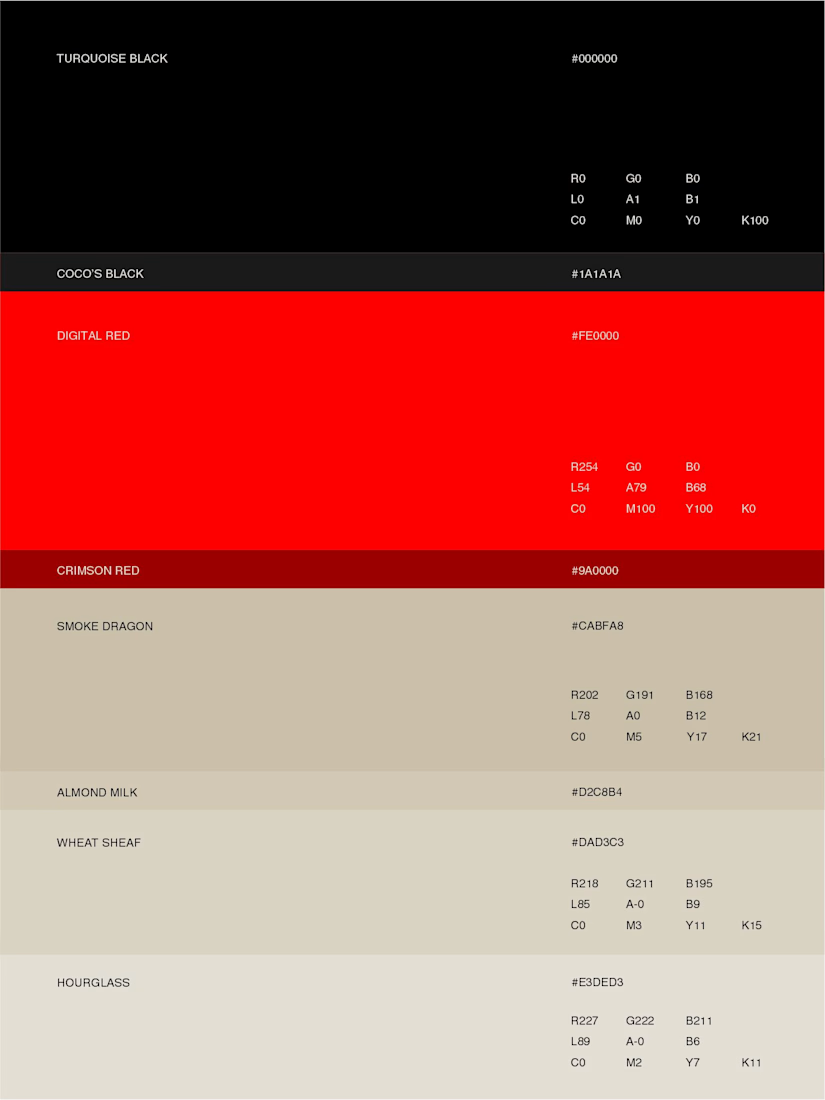

Bold jewelry should never blend in is the perfect one-line brief, and that solid red mark on the chained editorial shot backs it up completely. Jewelry Made Bold on the lookbook ties it all together. Presence and permanence really come through in the whole system.