The network for creativity
Join 1.25M professional creatives like you
Connect with clients, get discovered, and run your business 100% commission-free
Creatives on Contra have earned over $150M and we are just getting started
Back to feedPost
A magician spends more time deciding where you won't look than where you will. The trick isn't the sleight of hand itself, it's the joke right before it, timed so your eyes follow the punchline instead of the other hand.
It only works because attention is finite. Your eyes can really process one thing at a time. Everything else gets filled in from memory, after the fact.
Most case study pages waste that order badly. Big reveal shot first, then context nobody's warmed up enough to read, then "the client loved it" buried at the very bottom, right where attention already left. The order you show things in is the real trick. Most portfolios just don't have one.
If someone looked at your last project page for 8 seconds, what would they actually walk away remembering?

The joke-before-the-trick timing is such a good design parallel — users think they're reading filler copy while you're already moving their eyes where you need them.

That's it exactly, the filler copy is doing the heaviest lifting on the page.
The network for creativity
Join 1.25M professional creatives like you
Connect with clients, get discovered, and run your business 100% commission-free
Creatives on Contra have earned over $150M and we are just getting started





Related posts

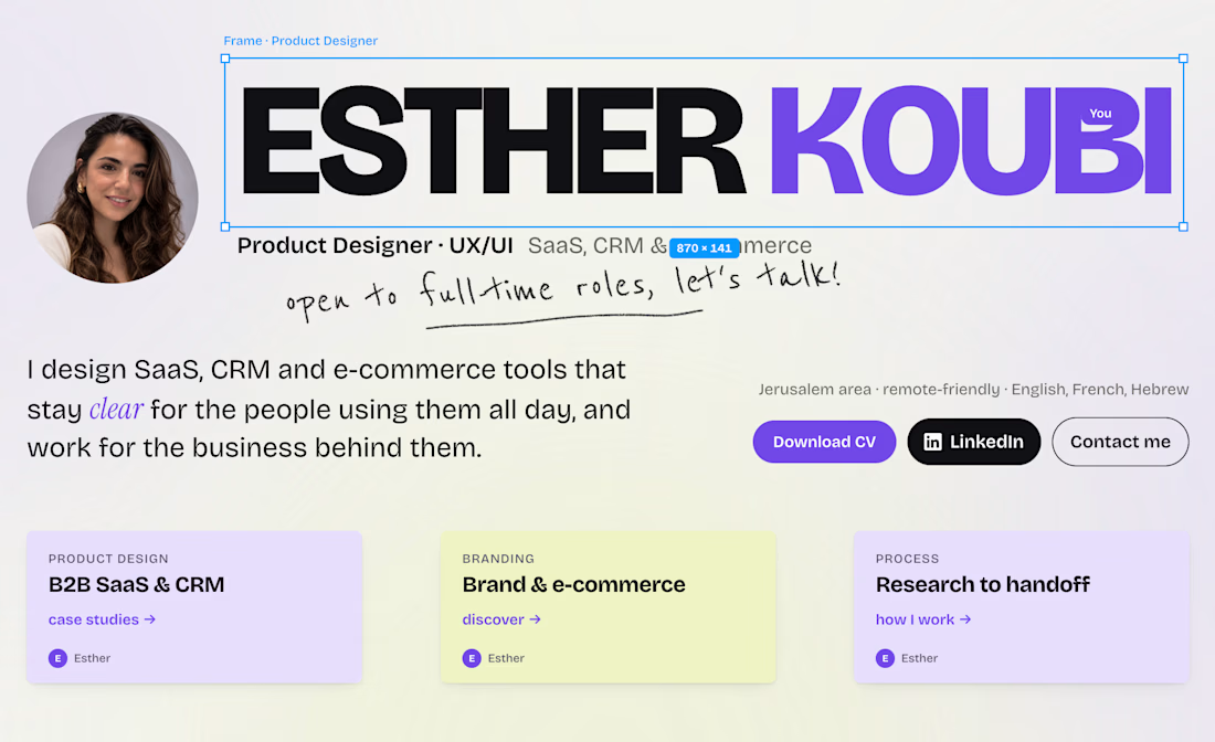
Sooooo… I decided to remake my portfolio.
And I did the exact opposite of my job.
A super nice website, animations everywhere, a little wink to @Figma's design… but barely any explanation of the process behind each project.
Lesson #1: Start with WHY.
(If you know, you know 😅)
So I'm taking it all back from scratch, and I'll share each case study in my next posts.
And to the recruiters passing by: what's the first thing you look at in a portfolio?
Link in the comments if you want to see the crime scene 👀

Looking goooooood 🔥

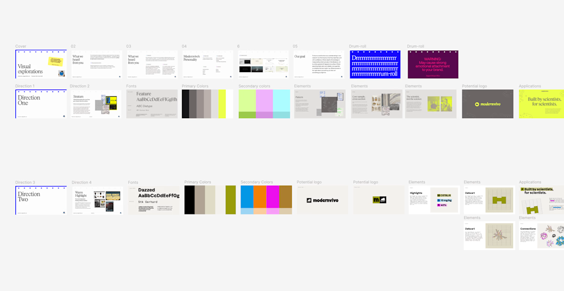
after presenting more brand directions than I can count, one thing I’ve learned: I never jump straight into showing the visuals.
first I want to establish what we're actually trying to solve.
what we heard from the client. what they want to be known for. where they sit in the market. what needs to feel different.
then the big idea, and how it translates into type, colour, imagery and graphic elements.
only then the designs.
context changes how you judge the work.

Your landing page doesn't need more sections. It needs a clearer next step.
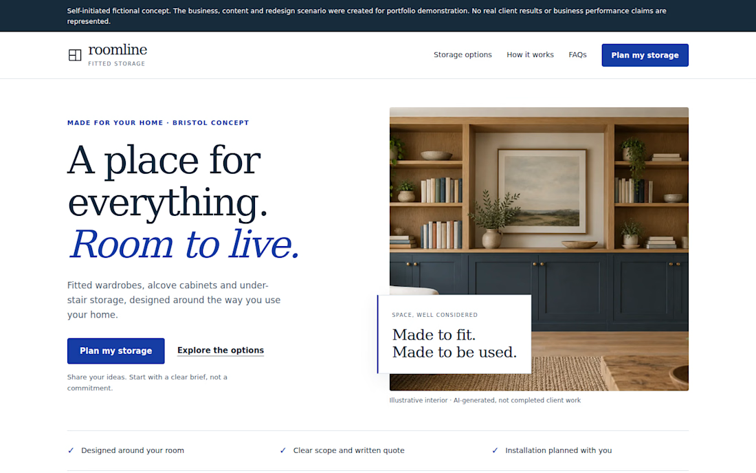
Self-initiated fictional concept. Roomline is a fictional fitted-storage business created for portfolio demonstration. No real client results or conversion data are represented.
I redesigned a fictional landing page around a simple question:
Can a visitor quickly understand the offer, see the relevant options, trust the next step, and know what to do?
The redesign focuses on:
• A clearer value proposition
• More focused service choices
• Stronger CTA hierarchy
• A simpler enquiry path
• Responsive mobile behavior
• FAQ content that addresses common questions
• A practical demonstration enquiry flow
I deliberately avoided claiming conversion improvements because this is a portfolio concept with no real traffic or A/B testing.
For landing pages, the useful work is often less about adding more sections and more about making the existing decision path easier to understand.