The network for creativity
Join 1.25M professional creatives like you
Connect with clients, get discovered, and run your business 100% commission-free
Creatives on Contra have earned over $150M and we are just getting started
Back to feedPost

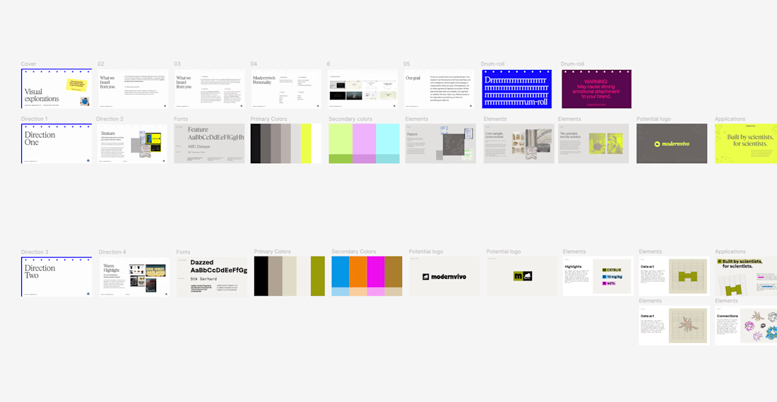
after presenting more brand directions than I can count, one thing I’ve learned: I never jump straight into showing the visuals.
first I want to establish what we're actually trying to solve.
what we heard from the client. what they want to be known for. where they sit in the market. what needs to feel different.
then the big idea, and how it translates into type, colour, imagery and graphic elements.
only then the designs.
context changes how you judge the work.

Love this approach. Do you usually present the brand directions as moodboards first, or jump straight to logo options after the strategy slide?

This is so true. When you explain the goals and the market first clients judge the designs on whether they actually work instead of just whether they like the color.


inspiring
The network for creativity
Join 1.25M professional creatives like you
Connect with clients, get discovered, and run your business 100% commission-free
Creatives on Contra have earned over $150M and we are just getting started
Related posts



've reviewed 50+ startup websites, and I noticed a pattern.
Their hero sections are often simple. They tell you who the product is for and what it does.
While working on this redesign concept for
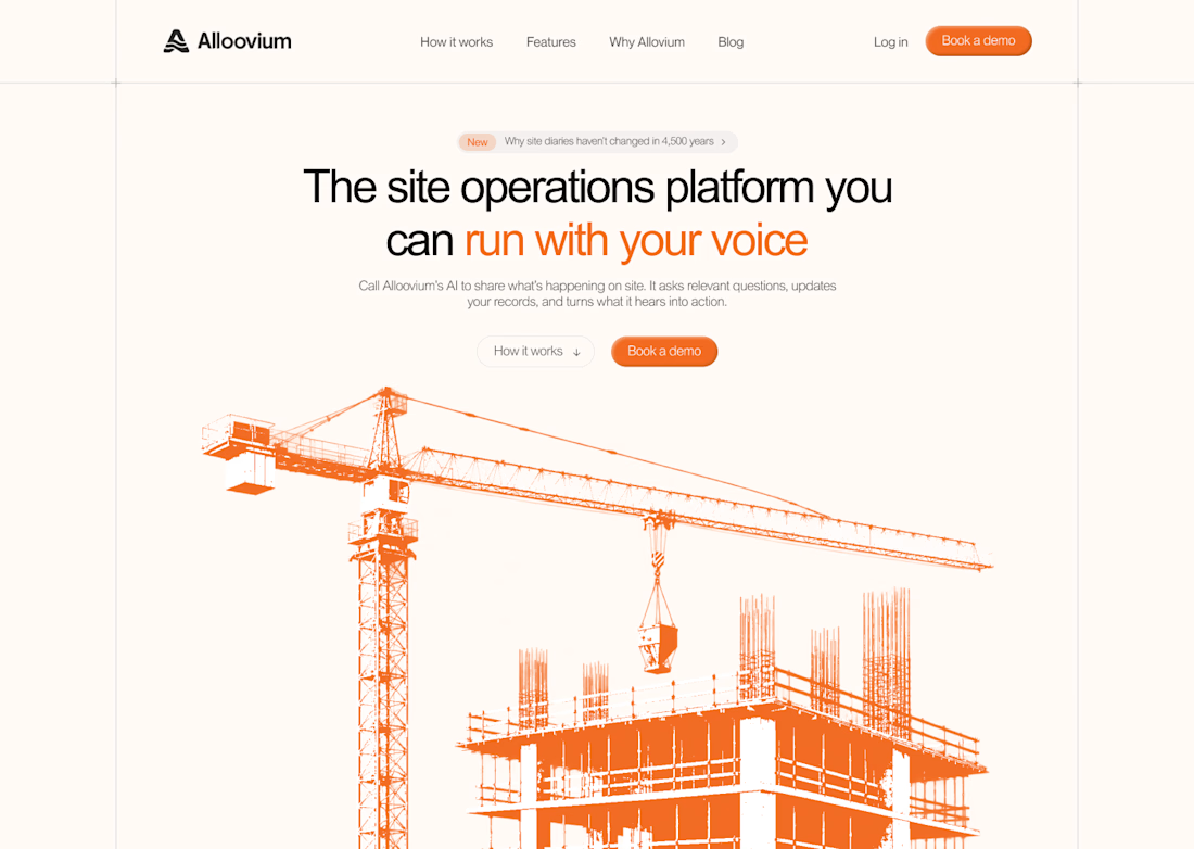
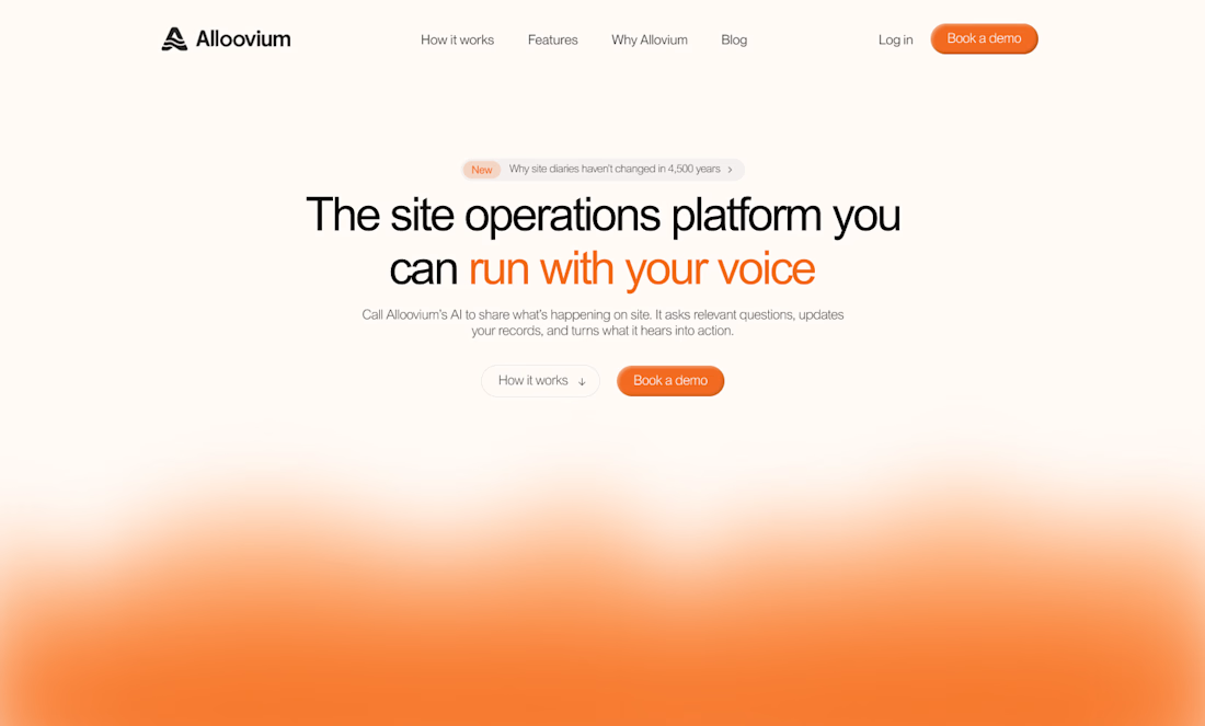
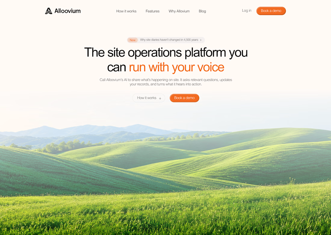
@Alloovium, I wanted to explore a different direction.
Their original website already explained the product and its audience.
But what if the hero also used visuals that reflected the world their customers work in?
People often scan websites before deciding what to pay attention to.
Relevant visuals can catch their attention and create a connection with the audience before they start reading.
So I explored a few visual directions inspired by the construction industry.
Building a startup? I'd love to help you explore a new direction for your website.


The construction visuals work well.


awesome work