The network for creativity
Join 1.25M professional creatives like you
Connect with clients, get discovered, and run your business 100% commission-free
Creatives on Contra have earned over $150M and we are just getting started
Back to feedPost

Your landing page doesn't need more sections. It needs a clearer next step.
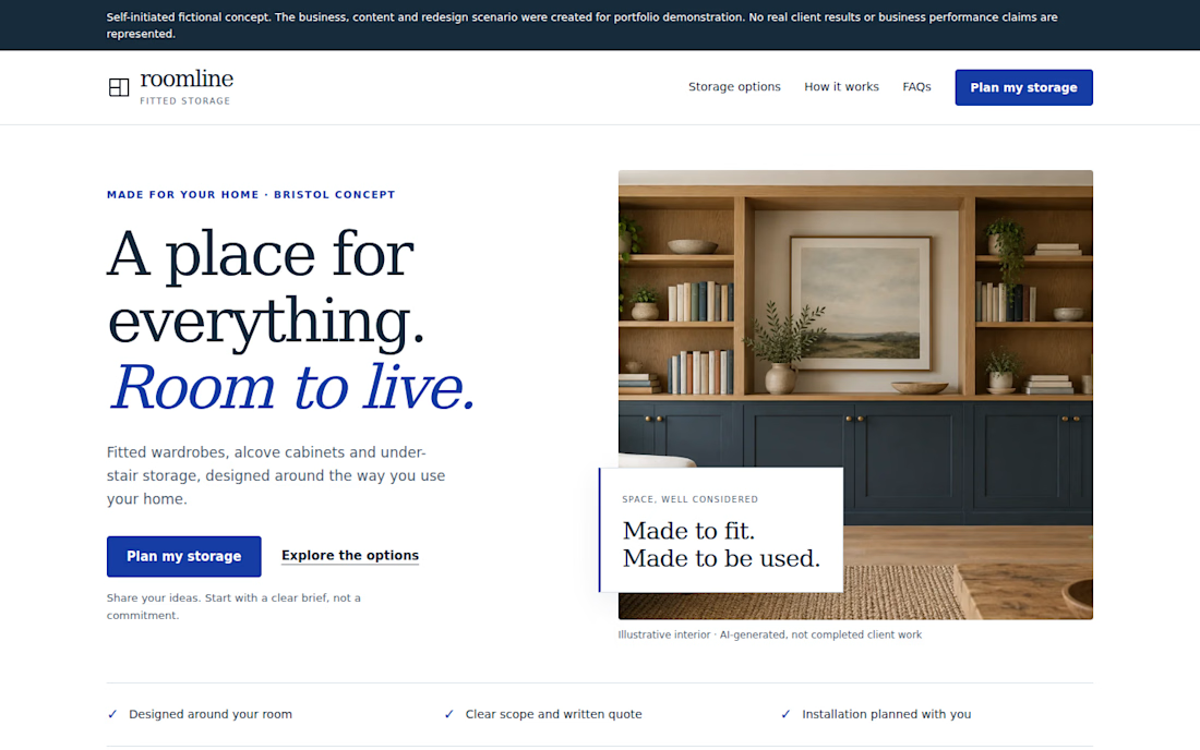
Self-initiated fictional concept. Roomline is a fictional fitted-storage business created for portfolio demonstration. No real client results or conversion data are represented.
I redesigned a fictional landing page around a simple question:
Can a visitor quickly understand the offer, see the relevant options, trust the next step, and know what to do?
The redesign focuses on:
• A clearer value proposition
• More focused service choices
• Stronger CTA hierarchy
• A simpler enquiry path
• Responsive mobile behavior
• FAQ content that addresses common questions
• A practical demonstration enquiry flow
I deliberately avoided claiming conversion improvements because this is a portfolio concept with no real traffic or A/B testing.
For landing pages, the useful work is often less about adding more sections and more about making the existing decision path easier to understand.

that first line hit hard - doesn't need more sections, needs a clearer next step. so true. the roomline concept looks super clean too

Like this
The network for creativity
Join 1.25M professional creatives like you
Connect with clients, get discovered, and run your business 100% commission-free
Creatives on Contra have earned over $150M and we are just getting started





Related posts


Another successful launch 🚀
For MindAbility, we went from Figma design to a fully built Kajabi experience – website pages, course design, offers, forms, and automations.
The result is a clean, connected platform that’s easy to manage and ready to grow into new regions.


The interaction between the typography, imagery, and spacing works really well.

I’ve always liked products that solve a very specific problem instead of trying to do everything.
So for the Lovable Challenge, I picked a simple question that event-tent rental businesses hear all the time:
“Can I book a tent for my wedding?”
The problem is… a tent can’t really be booked until you know if the whole event will work.
How many guests?
How much usable space?
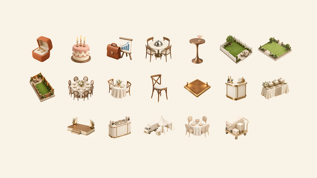
Tables? Dance floor? Bar? Stage?
Will the layout actually fit?
Can the crew set it up and pick it up on time?
Usually, the owner has to figure all of that out manually through messages, calls and calendar checking.
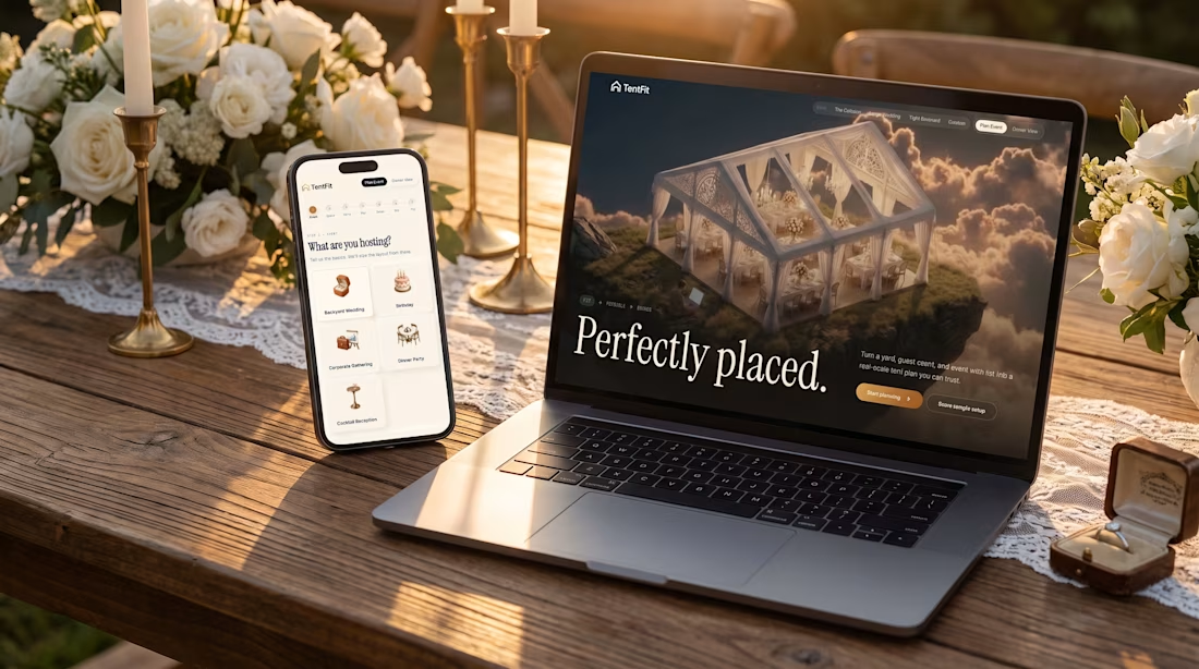
So I built TentFit — a spatial booking experience for event tent rentals.
The customer starts by planning the event, then maps out the space and everything they want inside it. TentFit checks the layout and highlights conflicts.
And instead of just saying “doesn’t fit,” it helps solve the problem:
Switch the tent. Move the layout. Remove an element.
Once everything works, TentFit checks the logistics and turns the final setup into a booking.
The goal was simple:
Make the customer’s decision easier, and make the owner’s job easier.
The flow is basically:
FIT → FEASIBLE → BOOKED
I had a lot of fun building the spatial planning part of this one.
X/Twitter post: https://x.com/brjanov/status/2105630218492731501?s=20
Built with @Lovable
#LovableChallenge #ProductDesign #UXDesign #NoCode #SaaS #WebDesign



Nice stuff!

Always get so excited about a Contra feature. 🚀
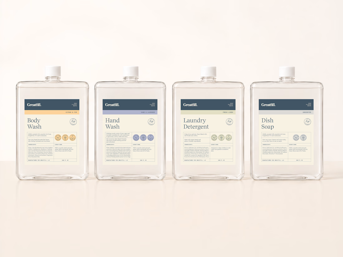
This one was about more than a visual refresh. This brand needed their labels to feel more aligned with who they are as a brand, and at the same time have a system that could grow with them without losing consistency.
Thank you Contra.

Color coding each variant with the dot rows is a clean way to scale the system. Quiet and easy to shop.