Roomline — Landing Page Redesign & Conversion-Focused Website

Batholomew Frank


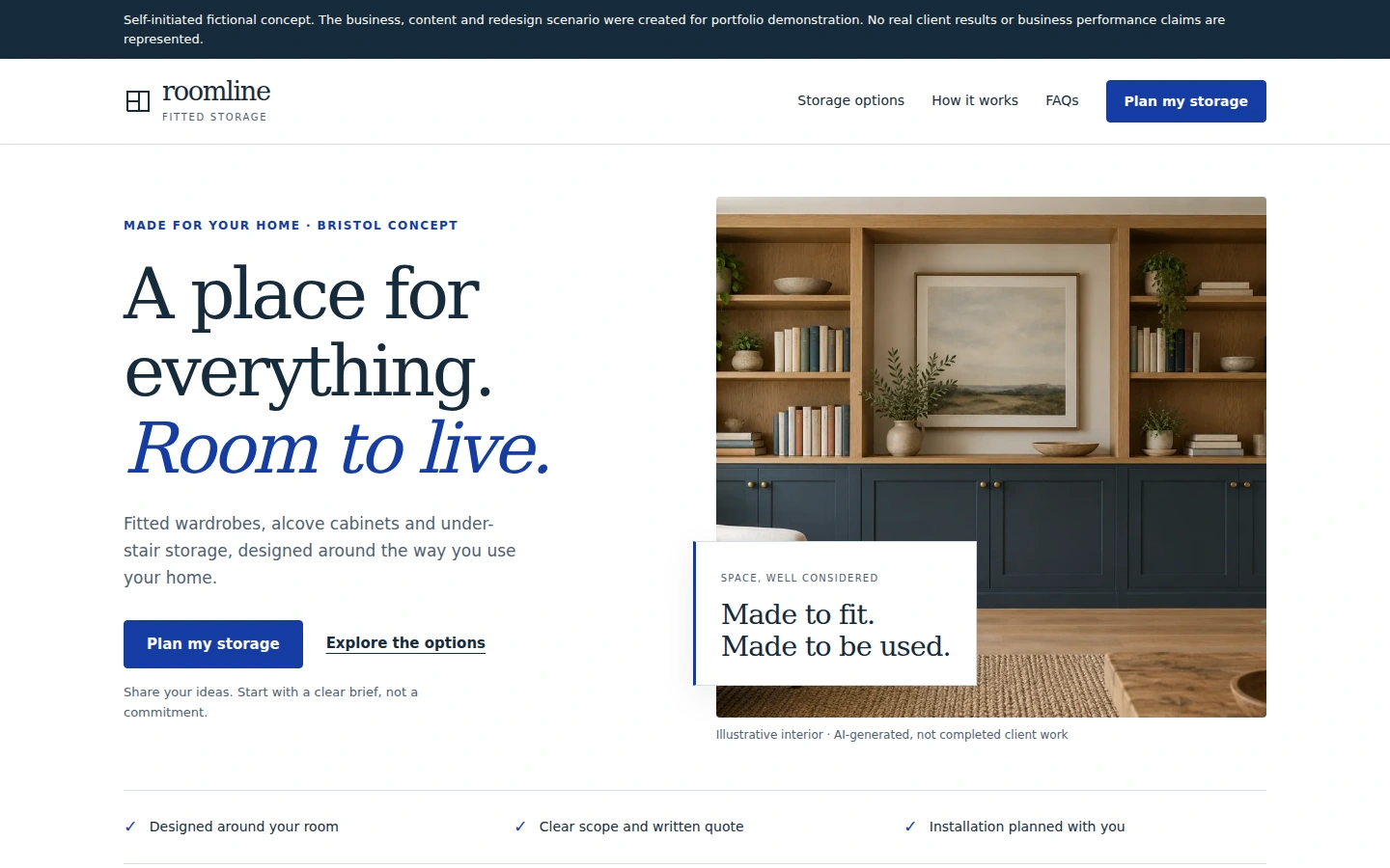
Self-initiated fictional concept. Roomline, the business, content, testimonials and redesign scenario were created for portfolio demonstration. No real client results, conversion data or business performance claims are represented.
A self-initiated landing-page redesign concept for a fictional fitted-storage business, focused on clearer messaging, service choices, CTA hierarchy, responsive UX and a practical enquiry flow.
Role: Web Designer & Frontend Developer
Tools: HTML5 · CSS3 · JavaScript · SVG
Project overview
Roomline explores a focused website improvement: turning a plausible but generic landing page into a clearer decision path for homeowners considering fitted storage. The fictional before-state and redesigned page demonstrate messaging, layout and frontend decisions within a small, one-time project scope.
Problem
The starting scenario describes “quality solutions” without identifying the offer quickly. Three equally weighted actions compete for attention, overlapping service categories leave the visitor to interpret the options, and the enquiry section gives little guidance about what to provide.
The before-state was created for this study. It is not a real client's original website.
Approach
The redesign follows the homeowner's questions: what is offered, whether it fits their space, what happens next and what they need to share. A consistent primary action leads to the enquiry, while a secondary link supports visitors who need to explore the service first.
Recognisable storage categories replace overlapping labels. A three-stage process, scope checklist and FAQs explain the proposed service without invented awards, customer logos or business metrics.
Solution
The redesigned landing page pairs a concise fitted-storage explanation with a restrained visual system and illustrative interior imagery. Service-specific links preselect the enquiry option. Responsive layouts prioritise the offer and next step before the image on mobile, then reorganise cards, process and form into a readable single-column flow.
The enquiry interaction validates sample input locally, explains that nothing has been sent and provides a reset. The testimonial is prominently labelled fictional sample content.
Features
Consistent primary CTA and secondary exploration path.
Distinct alcove, wardrobe and under-stair storage choices.
Clear process and quotation-scope expectations.
Responsive navigation with keyboard dismissal.
Native FAQ accordion.
Accessible field labels, inline validation and managed focus.
Local demonstration success/reset state.
Lightweight HTML/CSS/JavaScript implementation with no external runtime dependencies.
QA
68 automated assertions passed in headless Chromium across 360, 390, 768, 1024 and 1440px viewports. Checks covered controls, navigation, keyboard interactions, form states, images, anchors, reload, reduced motion, horizontal overflow and nine key text-contrast pairs. The 390px layout also passed a 200% text-size reflow check after an overflow fix.
Rendered desktop/tablet/mobile captures were visually reviewed. No console/runtime errors or external HTTP requests were observed during local testing. Mobile images are responsive browser captures; physical Android testing and accessibility certification are not claimed.
Limitations
This is a frontend portfolio demonstration. There is no live business, backend, email delivery, booking, CMS, analytics or production integration. The business and redesign scenario are fictional, the interior image is AI-generated illustrative content, and the testimonial represents no real customer.
“Conversion-focused” refers to the design's intention to make the offer and next step clearer. No conversion, lead, sales or revenue improvement was measured or is claimed.
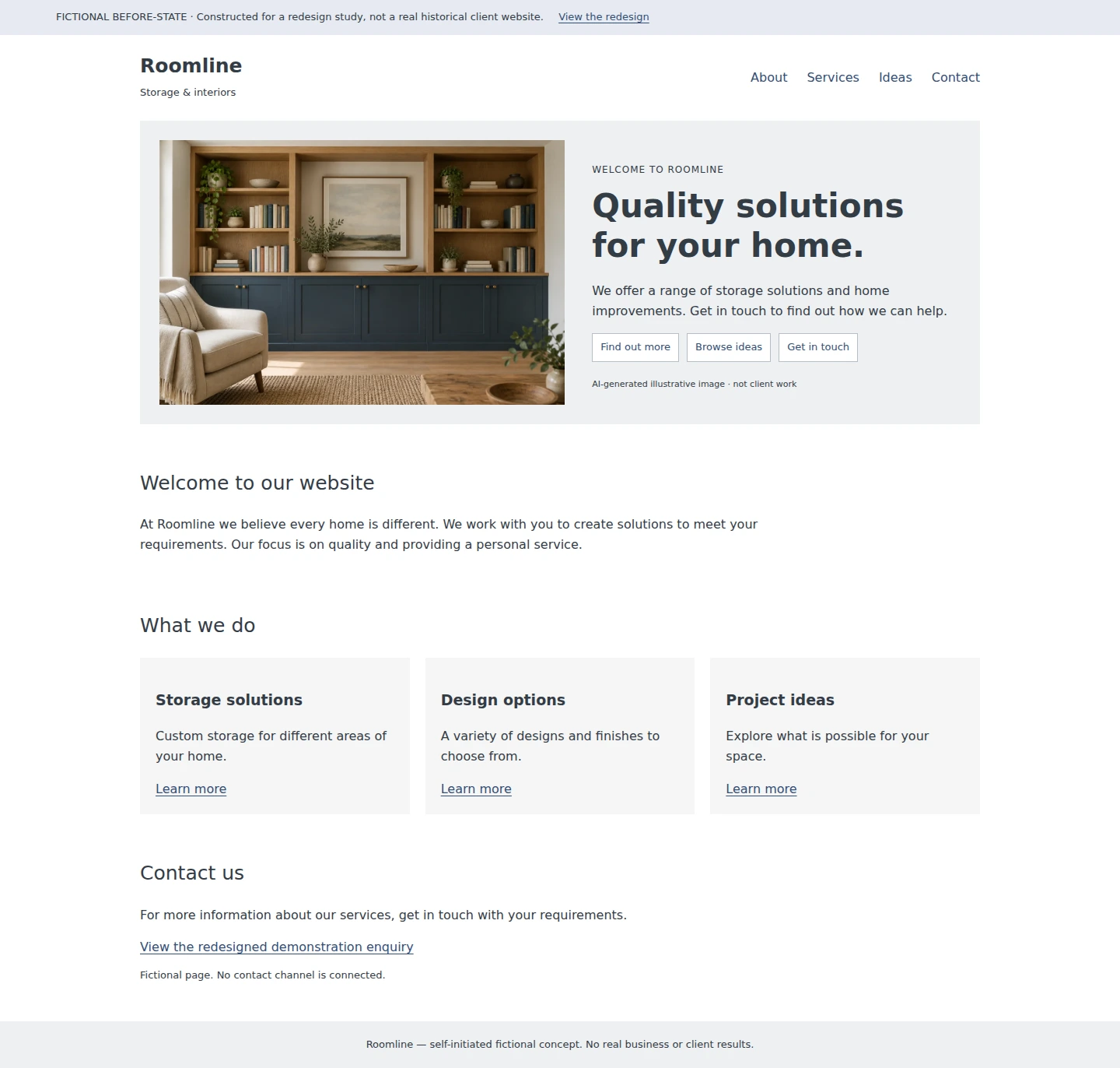
Constructed before-state: generic messaging and competing actions. Created for this redesign study, not a real historical client website.
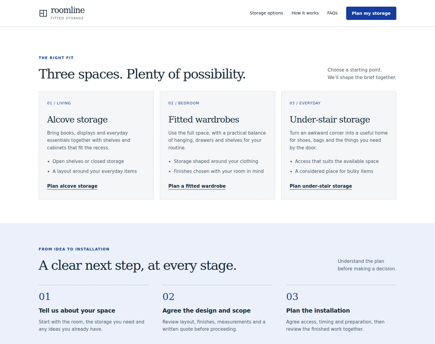
Distinct service choices and a three-stage process help explain the proposed service.
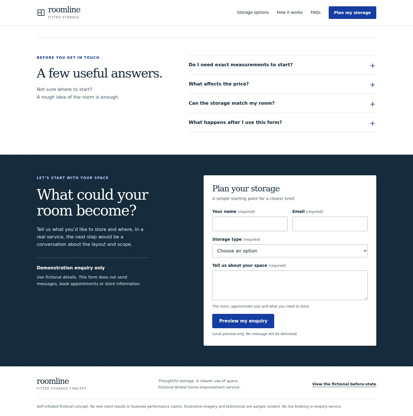
FAQs and a labelled local demonstration enquiry make the next step explicit. No message is sent.
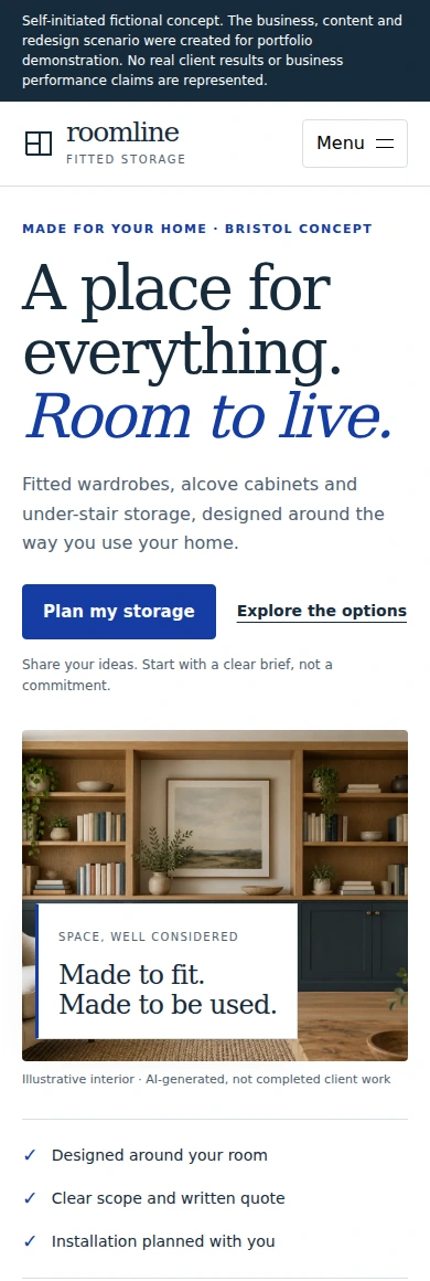
Responsive browser capture: offer and enquiry action precede illustrative imagery.
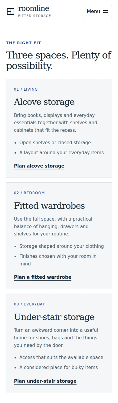
Responsive browser capture: storage options reorganise into readable cards with relevant enquiry links.
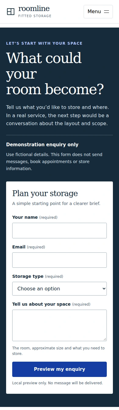
Responsive browser capture: clear demo disclosure, labelled fields and a local preview action.
Like this project
Posted Oct 7, 2026
Self-initiated fictional fitted-storage landing-page redesign focused on clearer messaging, service choices, CTA hierarchy, responsive UX and enquiry flow.