The network for creativity
Join 1.25M professional creatives like you
Connect with clients, get discovered, and run your business 100% commission-free
Creatives on Contra have earned over $150M and we are just getting started
Back to feedPost

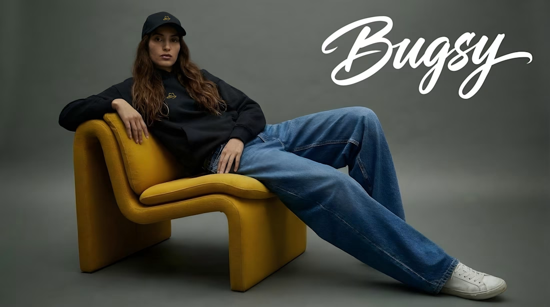
Bugsy — Urban Streetwear Brand Identity & Custom Gestural Typography
Bugsy is a dynamic urban streetwear brand requiring a bold, authentic, yet highly polished brand identity. The goal was to craft a distinctive visual signature driven by custom gestural typography and edgy, high-end streetwear art direction.
The Challenge
The urban fashion and streetwear market demands a visual brand language that feels organic, expressive, and culturally authentic, while maintaining technical precision for complex production methods—from dense apparel embroidery to high-resolution digital storefronts.
The Solution & Art Direction
As Senior Art Director, I developed a custom typography-led visual identity system:
Custom Gestural Lettering: Engineered an original, hand-crafted logotype that balances raw urban energy with refined typographic structure and visual weight.
Apparel & Textile Optimization: Created vector-perfect brand marks specially optimized for screen printing, high-density embroidery, woven labels, and custom hangtags.
Brand Language & Lookbook Direction: Established comprehensive art direction rules for visual campaigns, social media assets, and e-commerce touchpoints.


The network for creativity
Join 1.25M professional creatives like you
Connect with clients, get discovered, and run your business 100% commission-free
Creatives on Contra have earned over $150M and we are just getting started





Related posts

Jordan Reid - Sportswear Brand Identity

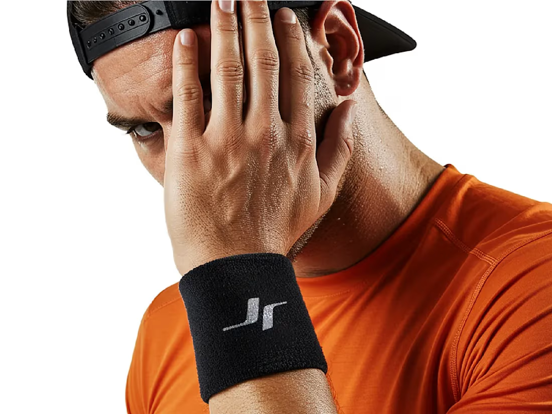




Like the logo direction

Post
Luxury Sound — Premium Headphones Landing Page 🎧✨
A premium landing page concept for a luxury audio brand, built around a bold headphone design and a refined visual experience
The design combines warm neutral tones, glowing details, oversized product visuals, and minimal typography to create a futuristic yet elegant feel
Special attention was given to:
• Product-first composition
• Premium visual direction
• Feature highlights
• Lifestyle imagery
• Clear CTA placement
• Responsive mobile experience
The result is a clean, immersive product experience that makes the headphones feel like more than tech — they become part of the lifestyle 🔥
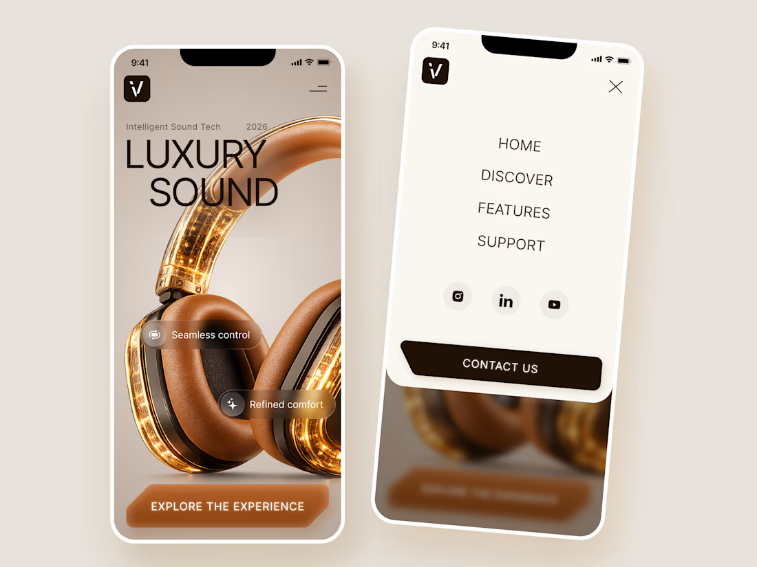
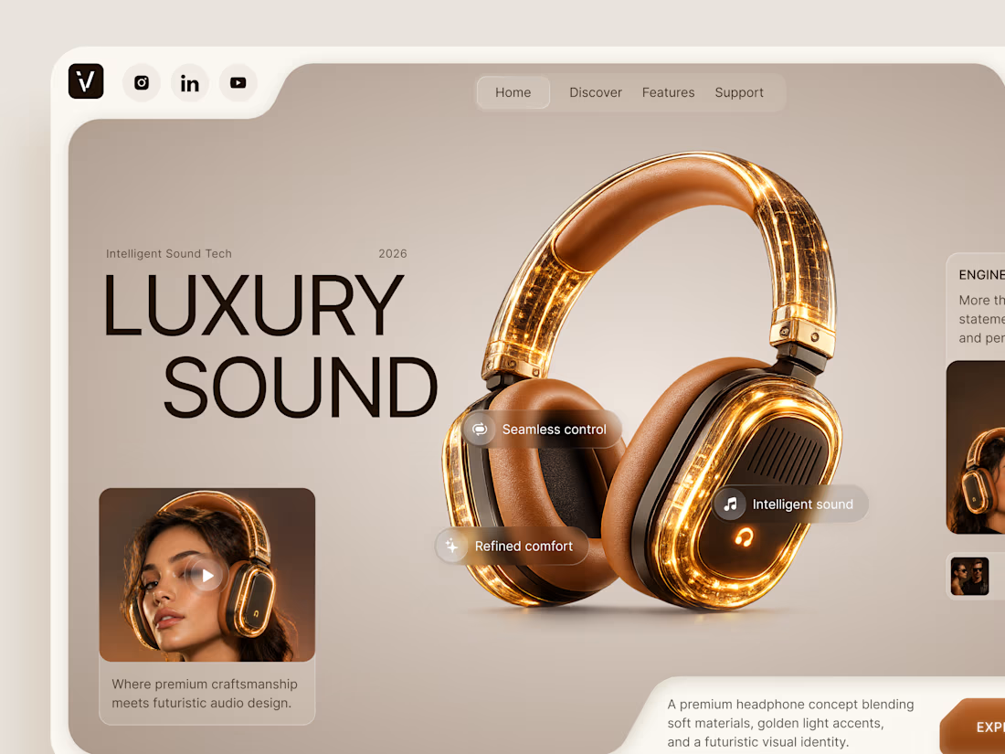
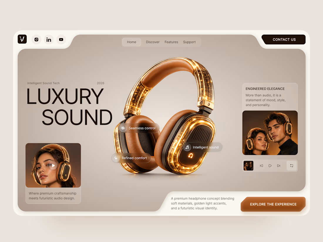

The amber glow on the headphones against that warm beige is lovely. How does the mobile menu handle the product image?


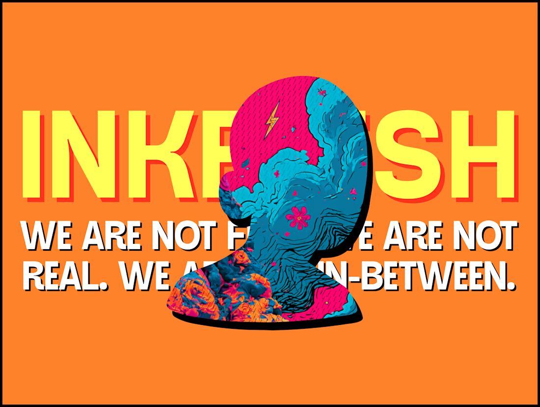
The INKFLESH mark I designed starts with an empty profile avatar. A deliberately plain shape for an identity full of strange characters.
The characters needed room to change. The identity also had to work on a woven label or an app icon, where a detailed illustrated face has very little space to do its job.
I kept the silhouette and palette constant, then let the artwork change around them. The mark can hold an illustration, appear as a solid stamp, or sit on its own at a small size. Each version still has the same shape underneath.
That was the useful constraint: decide what someone should recognise when the most expressive part of the design disappears.
If your identity depends on a detailed illustration, try its smallest application before approving the whole world around it.

Super bold and creative! Love the vibrant colors. 🔥