The network for creativity
Join 1.25M professional creatives like you
Connect with clients, get discovered, and run your business 100% commission-free
Creatives on Contra have earned over $150M and we are just getting started
Back to feedPost
While designing Slacky, I wanted to create a SaaS identity that feels fast, connected, and modern. Many SaaS brands look overly complicated or visually forgettable, so I focused on building a simple but meaningful symbol.
The logo was developed using the letter “S” combined with arrow-like motion and connected shapes. The flowing structure represents workflow movement, automation, and connected systems — which are core ideas behind modern SaaS platforms.
I kept the branding minimal and monochrome so it feels clean across websites, app icons, and digital products. The goal was to create an identity that looks smart, scalable, and instantly recognizable.
The network for creativity
Join 1.25M professional creatives like you
Connect with clients, get discovered, and run your business 100% commission-free
Creatives on Contra have earned over $150M and we are just getting started
Related posts
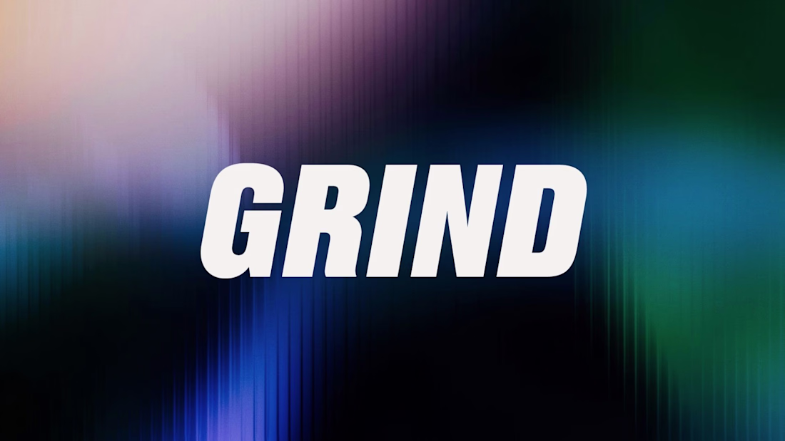
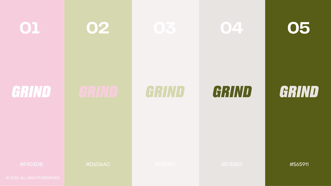
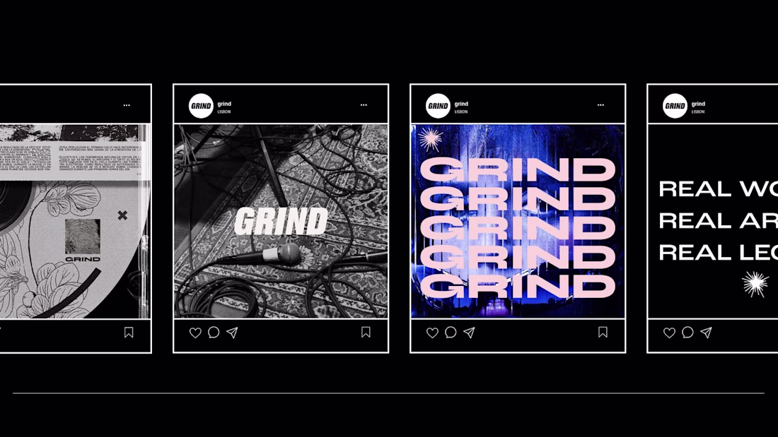
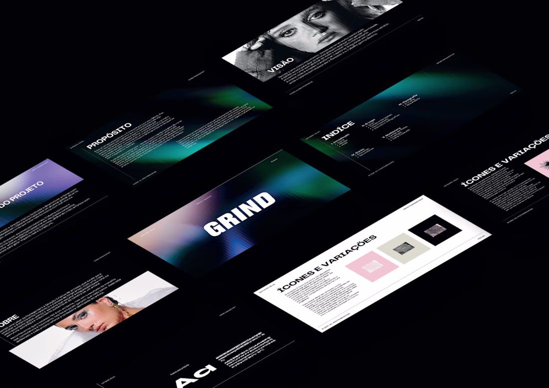
I design the full brand identity and social media system for GRIND, a Lisbon-based artist management and music label.
The scope covered logo design, icon system, color palette, typography, stationery, and a complete set of social media templates all built around a consistent visual language that works across every touchpoint.
The aesthetic sits at the intersection of street culture and industry credibility, bold type, high contrast. Built to stand out in a feed and hold weight in a boardroom.
This branding goes hard! Really like how it feels bold and expressive.
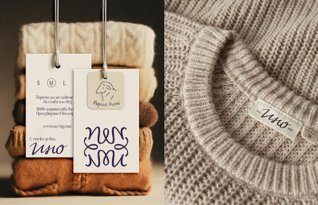
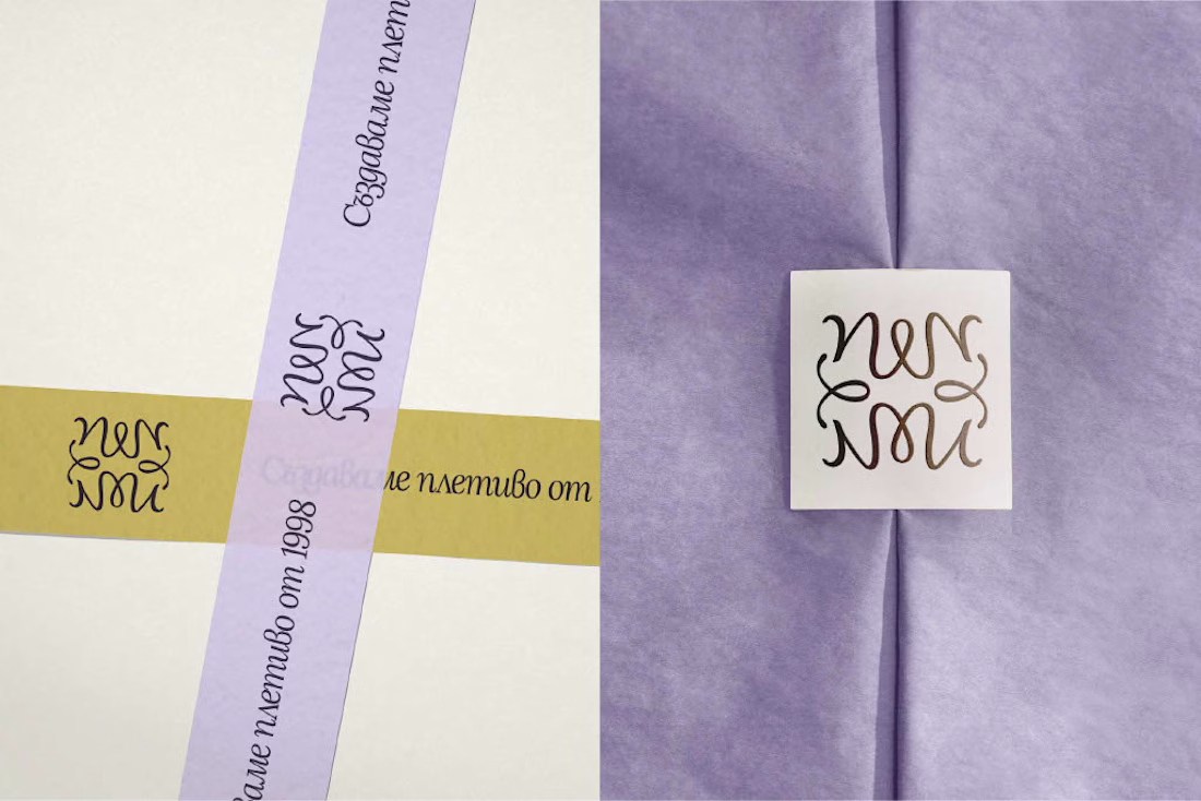
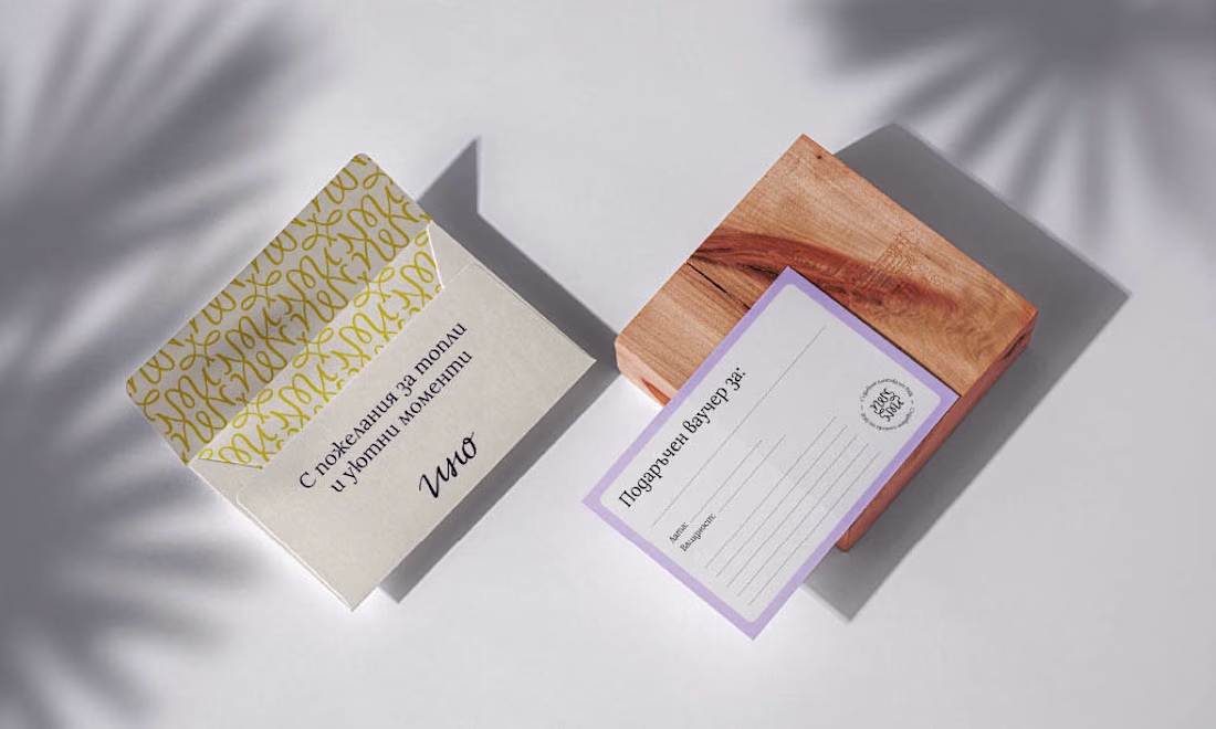
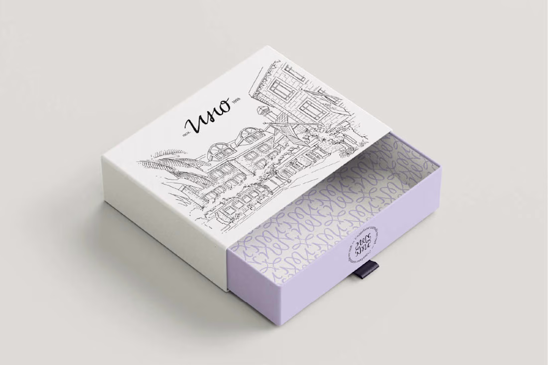
Ino is a Bulgarian family knitwear brand with 25+ years of craft behind it - but its old identity no longer reflected the warmth, quality and heritage at the heart of the brand.
For the redesign, I built the concept around family heritage and personal signature - creating a visual system that feels refined, human and timeless, while giving Ino a more recognizable presence across packaging, social media and brand touchpoints.
Good one here
Working on a new Brand Identity and Product designing for a web3 company backed by J.P. Morgan
Trending
Claude
Claude has entered the design space. How are you using Claude Design?
Contra University
Learn from expert creatives how to earn more using next-gen AI tools.
creativeaiflow
Creative AI workflows are evolving. What tools do you use, and what are their strengths and weaknesses?
portfolioreview
The best portfolios tell a story, not just show a grid. Share yours for feedback.
freelancerlife
Freelancer life is wins, pivots, and everything in between. What’s yours right now?