The network for creativity
Join 1.25M professional creatives like you
Connect with clients, get discovered, and run your business 100% commission-free
Creatives on Contra have earned over $150M and we are just getting started
Back to feedPost
Crispy Nature is a dried fruit snack company that needed packaging covering six different flavors, kiwi, blood oranges, bananas, lemons and limes, apples, and oranges, each one distinct enough to grab attention on its own, while still reading clearly as part of the same brand family when they all sit together on a shelf.
That tension is most of the actual work in packaging design. Too much consistency and every flavor looks interchangeable, nobody can tell them apart at a glance. Too little, and the brand falls apart, it stops feeling like one company.
I started with the identity itself, a clean mark built around an organic apple-and-citrus icon, paired with simple, confident typography that signals "natural" without leaning on the usual clichés of leaf icons and earthy browns. From there, the packaging system carried that mark across all six flavors, with color and fruit imagery doing the work of differentiation while the logo, layout structure, and "No Added Sugar" badge stayed identical across every pouch.
Once the identity and packaging were locked, I built a custom Shopify store to match, clean, product-forward, and built to let the packaging photography do most of the talking rather than competing with it.
#BrandIdentity #PackagingDesign #LogoDesign #Shopify #FoodBranding #ConsumerBrands #Figma #VisualIdentity
The network for creativity
Join 1.25M professional creatives like you
Connect with clients, get discovered, and run your business 100% commission-free
Creatives on Contra have earned over $150M and we are just getting started

Related posts
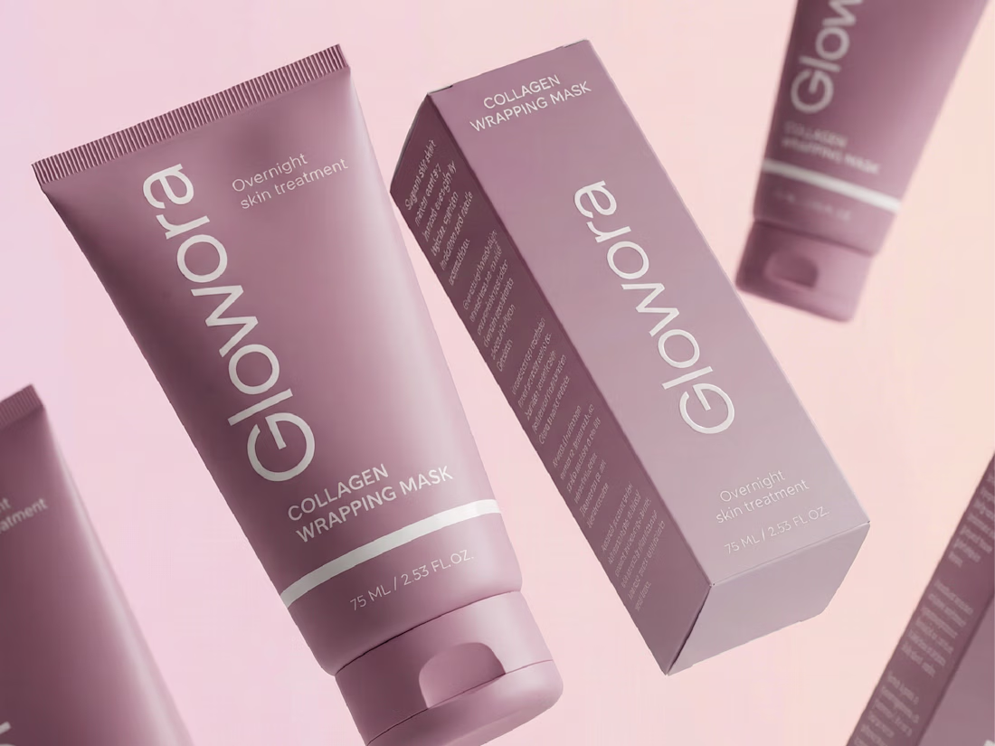
It's been a while since I last posted a project on my portfolio and today I am happy to bring this one to you!
Glowora approached me with a clear foundation already in place: a defined logo and brand identity that was not being consistently applied across their existing products. The challenge was to translate that identity into packaging and label designs that truly reflected the brand’s premium positioning.
I love your use of color and composition here.
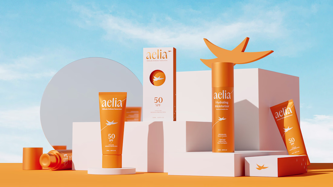
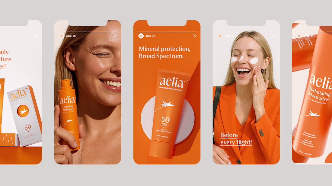
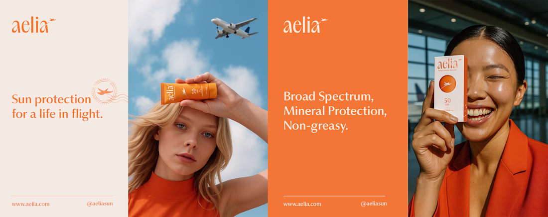
For Aelia, I was responsible for developing the brand strategy, visual identity, packaging design, and the overall creative direction of the project. My goal was to transform the founder’s unique perspective as a pilot into a distinctive brand experience, creating a clear connection between skincare, travel, and life at high altitudes.
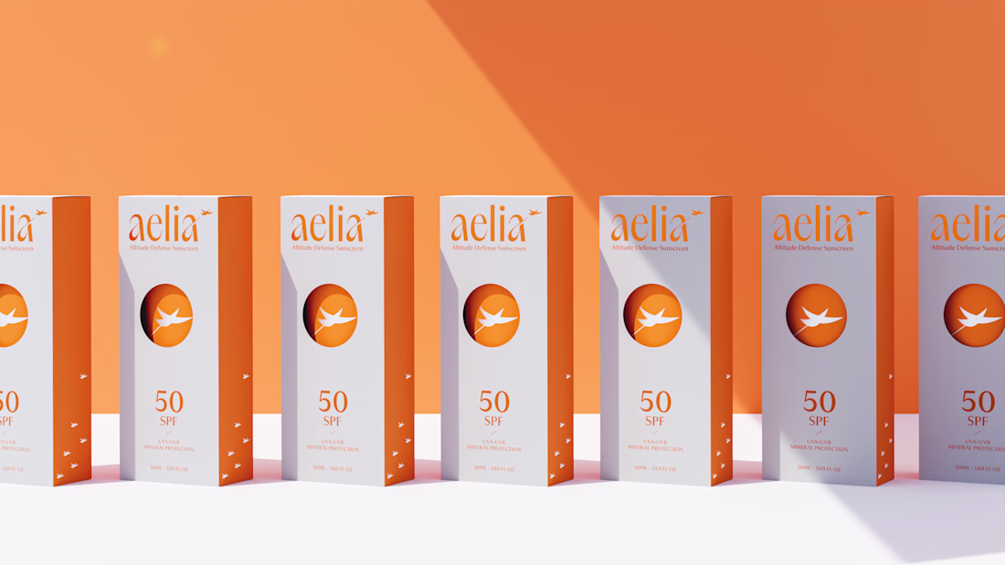
The project began with defining the brand positioning and core narrative, which guided every design decision that followed. I created a visual identity inspired by freedom, protection, and elevation, expressed through a custom symbol, a carefully crafted color system, and a modern aesthetic designed to resonate with frequent travelers and modern explorers. The packaging was designed to reinforce this story, featuring a distinctive circular cut-out that references both the sun and an airplane window, creating a memorable and meaningful brand asset.
By aligning strategy, identity, and packaging under a single concept, I helped build a cohesive brand that feels premium, functional, and emotionally connected to its audience.
I love your use of color and composition here.
Which of the two logos is better?
8 voted
62%
5 voted
38%
13 votes
Closed
Option 1
Trending
Claude
Claude has entered the design space. How are you using Claude Design?
Contra University
Learn from expert creatives how to earn more using next-gen AI tools.
MagicPath
The canvas is infinite, and exploration is becoming the workflow. How are you using MagicPath?
creativeaiflow
Creative AI workflows are evolving. What tools do you use, and what are their strengths and weaknesses?
freelancerlife
Freelancer life is wins, pivots, and everything in between. What’s yours right now?