The network for creativity
Join 1.25M professional creatives like you
Connect with clients, get discovered, and run your business 100% commission-free
Creatives on Contra have earned over $150M and we are just getting started
Back to feedPost
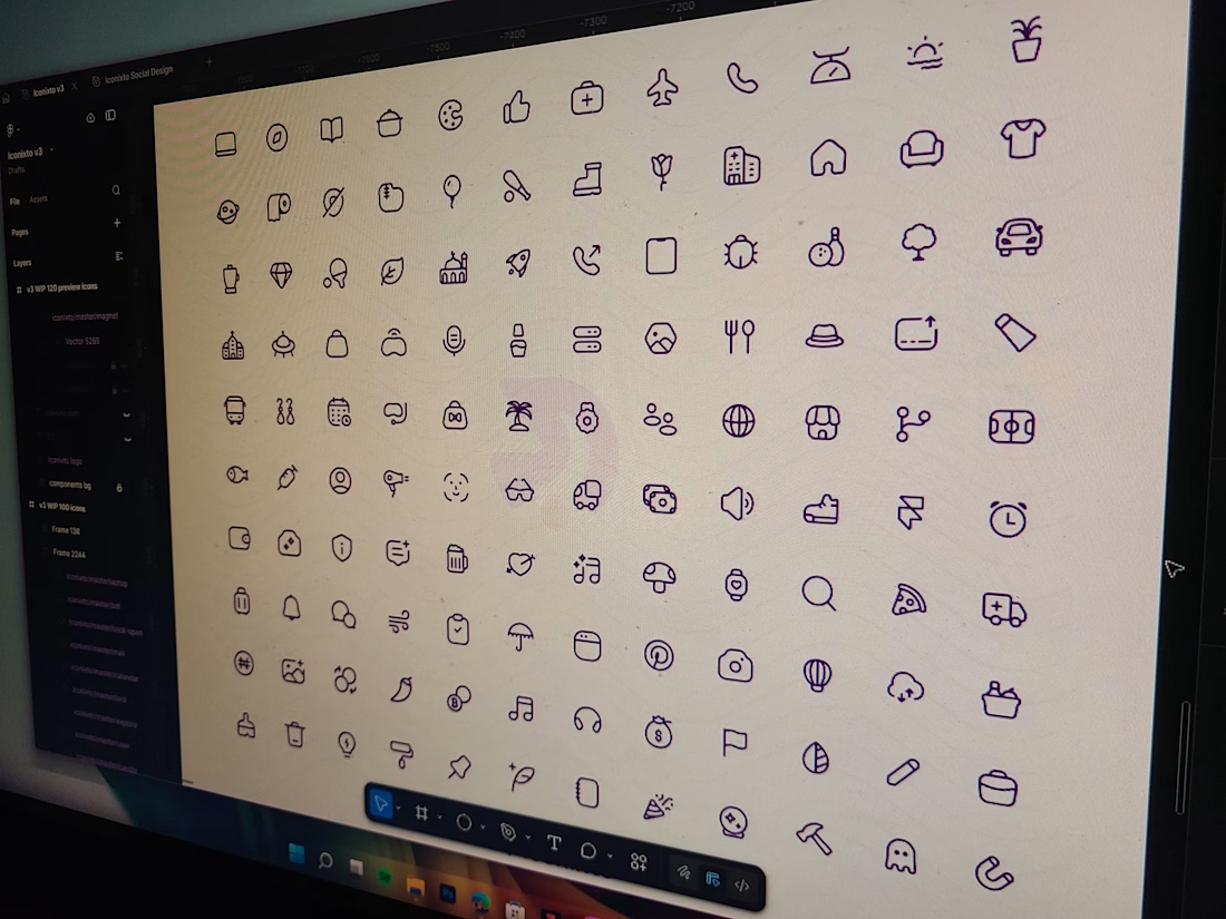
The past 2 months, I’ve been working on a redesign for Iconixto icons.
The focus has been on redefining and following clear, consistent guidelines which would improve scalability, visual cohesion, and predictability across various styles and use cases. Every decision is aimed at ensuring the icons integrate seamlessly into modern UI environments while maintaining clarity, cohesiveness and balance.
This phase is about elevating interface experiences through structure, consistency, and thoughtful detail so that teams can rely on Iconixto as a concrete foundation within their visual design systems.
Still iterating and testing out the system. More updates coming. Who else is excited to try them out?
The network for creativity
Join 1.25M professional creatives like you
Connect with clients, get discovered, and run your business 100% commission-free
Creatives on Contra have earned over $150M and we are just getting started
Related posts
Cool
Why overcomplicating your layout kills readability.
Most content-heavy sites fail because they try to show everything at once. Sidebars, badges, related articles, and tiny fonts create cognitive overload. The user gets tired after two paragraphs and leaves.
Good design is about aggressive editing. You need to manage where the eye goes first.
In this layout, the hierarchy does all the work:
• A massive headline sets the mood and context instantly
• Generous white space prevents visual fatigue
• The clean grid ensures the reader actually focuses on the text
We don't need complex decorations to make a web page look expensive. We just need perfect typography and discipline.
Are you building a product or content platform that feels too cluttered? Drop a link below, and I’ll tell you where your users are getting stuck.
Love the color theme!
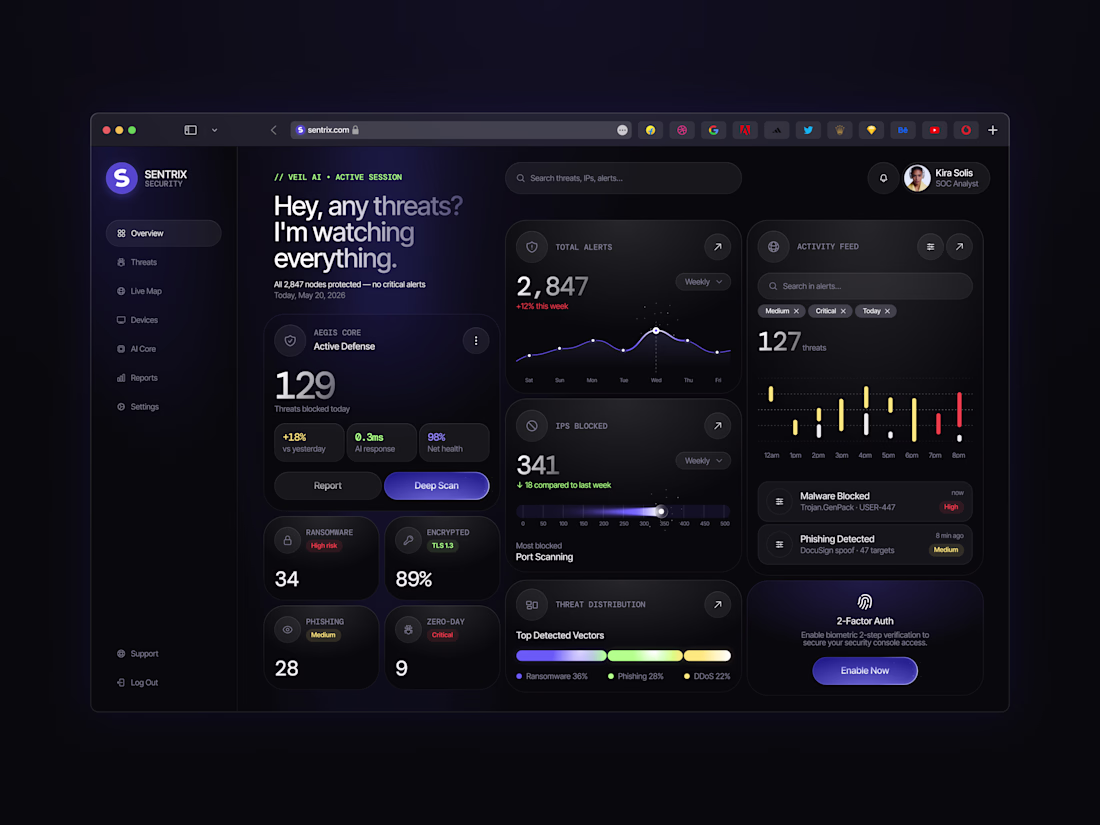
Just shared a new cybersecurity dashboard concept focused on making security insights clear and easy to act on. 🛡️
Would you use a dashboard like this? I’d love to hear your thoughts! 💙
NIce
Trending
Claude
Claude has entered the design space. How are you using Claude Design?
Contra University
Learn from expert creatives how to earn more using next-gen AI tools.
MagicPath
The canvas is infinite, and exploration is becoming the workflow. How are you using MagicPath?
creativeaiflow
Creative AI workflows are evolving. What tools do you use, and what are their strengths and weaknesses?
freelancerlife
Freelancer life is wins, pivots, and everything in between. What’s yours right now?