
Anees Adeyinka
Crafting iconography for products, brands and interfaces
- $1k+
- Earned
- 4x
- Hired
- 5.00
- Rating
- 14
- Followers
Cleanliness is next to Godliness, they say.
A sneak peek of the redesigned iconography for Iconixto (https://iconixto.com) icons coming soon 🧡
1
32
8 months in, and still refining 🏗
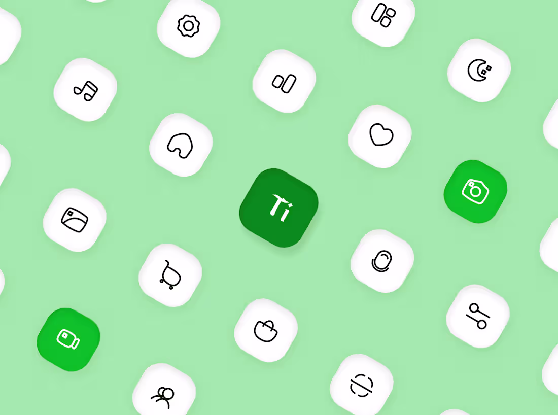
Sneak peek at the new duocolor style for Iconixto (https://iconixto.com) v3.
Every icon in the library is being redesigned from the ground up to create a more cohesive, scalable, and flexible system.
Over 3000 icons with countless iterations made, every stroke, fill, corner radius and spacing, is intentional.
Building an icon library is about designing a language that works consistently across various products.
Excited to share more as we get closer to launch.
Have a product that needs its own iconography system? Send me a DM, and let’s create icons that complement your product and elevate its user experience.
0
59
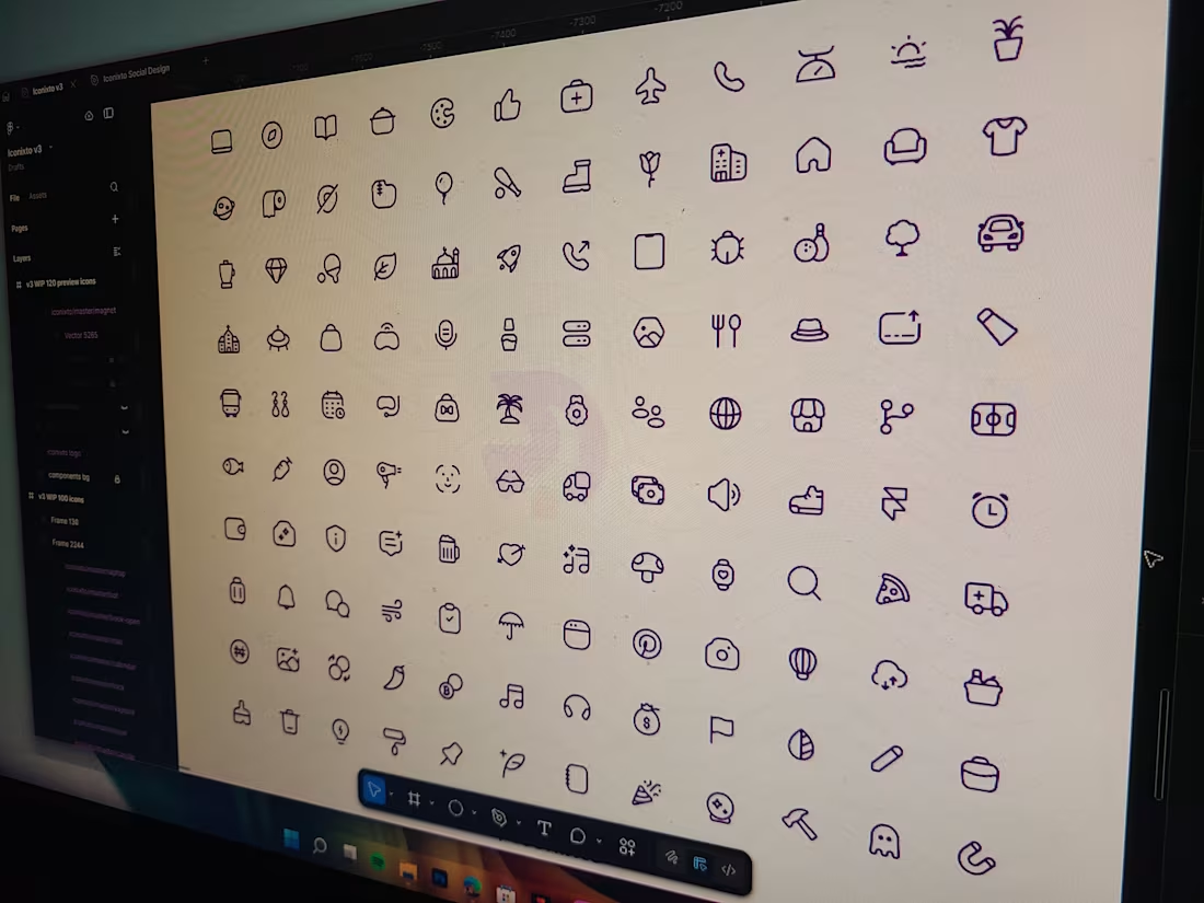
After 3 months, the base icons for the Iconixto (https://www.linkedin.com/company/iconixtohq/) icons v3 is now done.
The next phase would be to transform them into different styles and variants for various use cases.
Who else is excited for this?
3
4
262
All is fair in love and war ⚔️
My submission for Contra x Figma #figmamakeathon
I present to you, Chess of War - a reimagined version of the iconic chess game but it comes with a twist - Superpowers exists.
Power-ups includes: Teleport, Resurrect, Shield, Assassinate, Freeze, Downgrade your enemy's piece and a few more 👀
Earn XP as you play and rank higher on the leaderboard 🏆
Restore your progress on a different device by creating a PIN linked to your username
Play with a friend by creating a room code or get paired with someone online
Added support for 10 languages
What did it take to make this?
hours and 100+ prompts between Figma make and Claude and a little bit of UI design and, of course, lost hours of sleep😴
How far would your strategies take you in an all out war?
Game link:
https://lasso-broom-05837059.figma.site
3
194
Faster UI
1
25
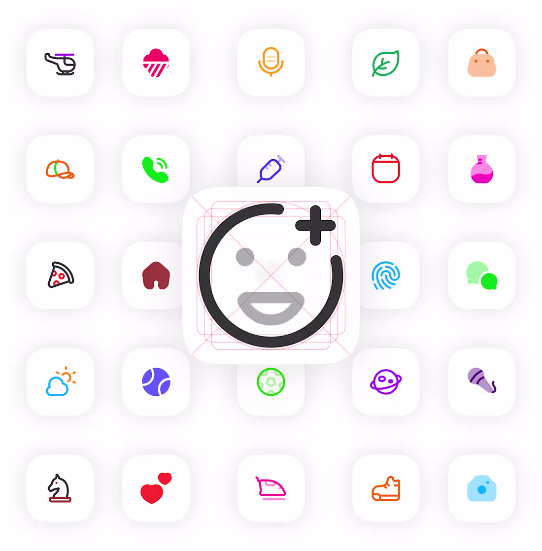
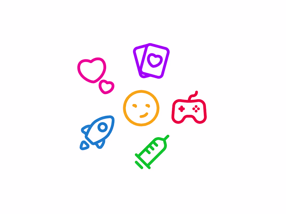
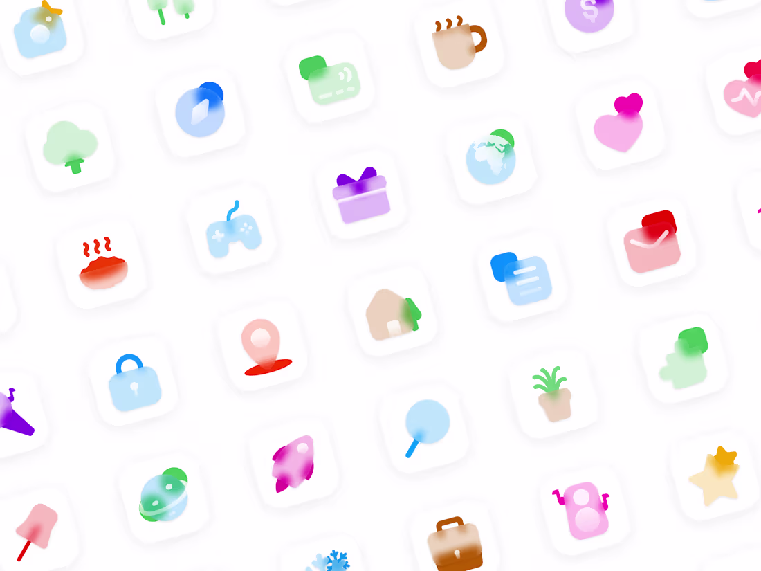
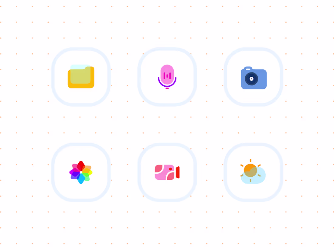
Got bored, cooked up these icons 🙃
My first for these kind of style.
1
239
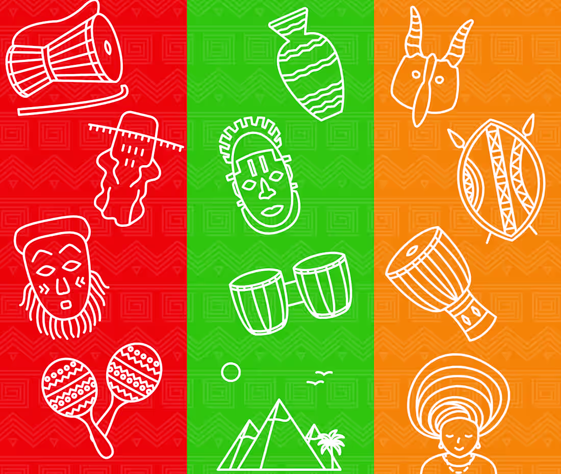
A while back, I released Afriqcons - an icon set inspired by the african heritage and culture.
0
181
Sharing my work cos contra says we should
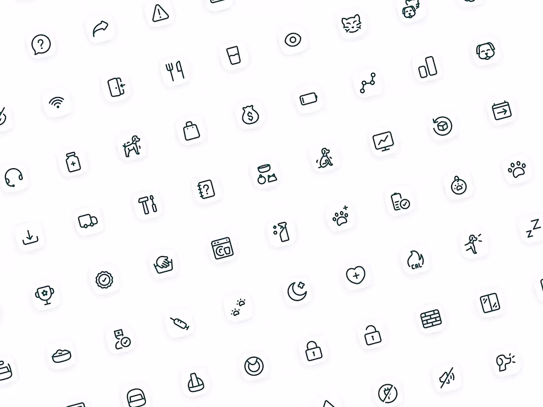
Featuring icons for a pet care app 🐶
29
312
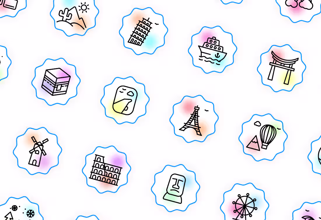
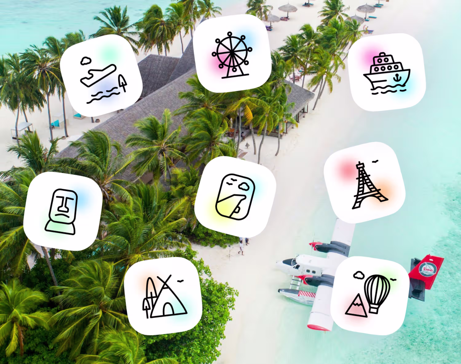
Scenery and travels icons
2
32
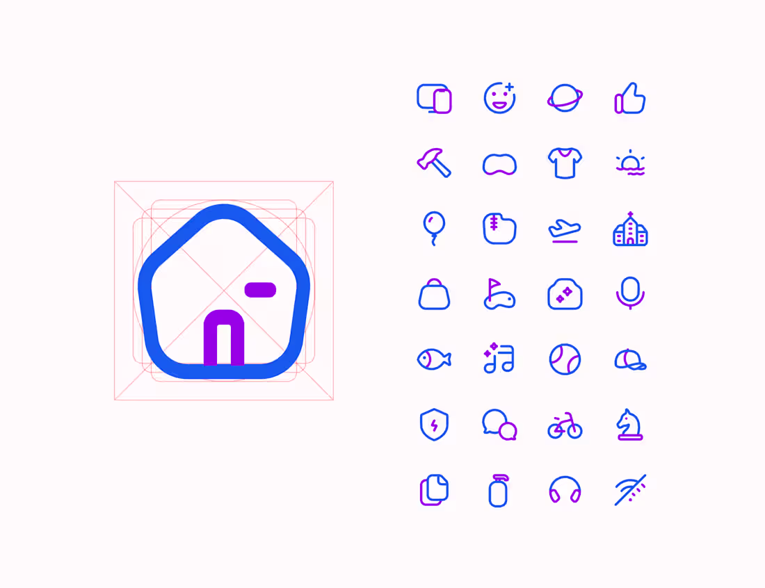
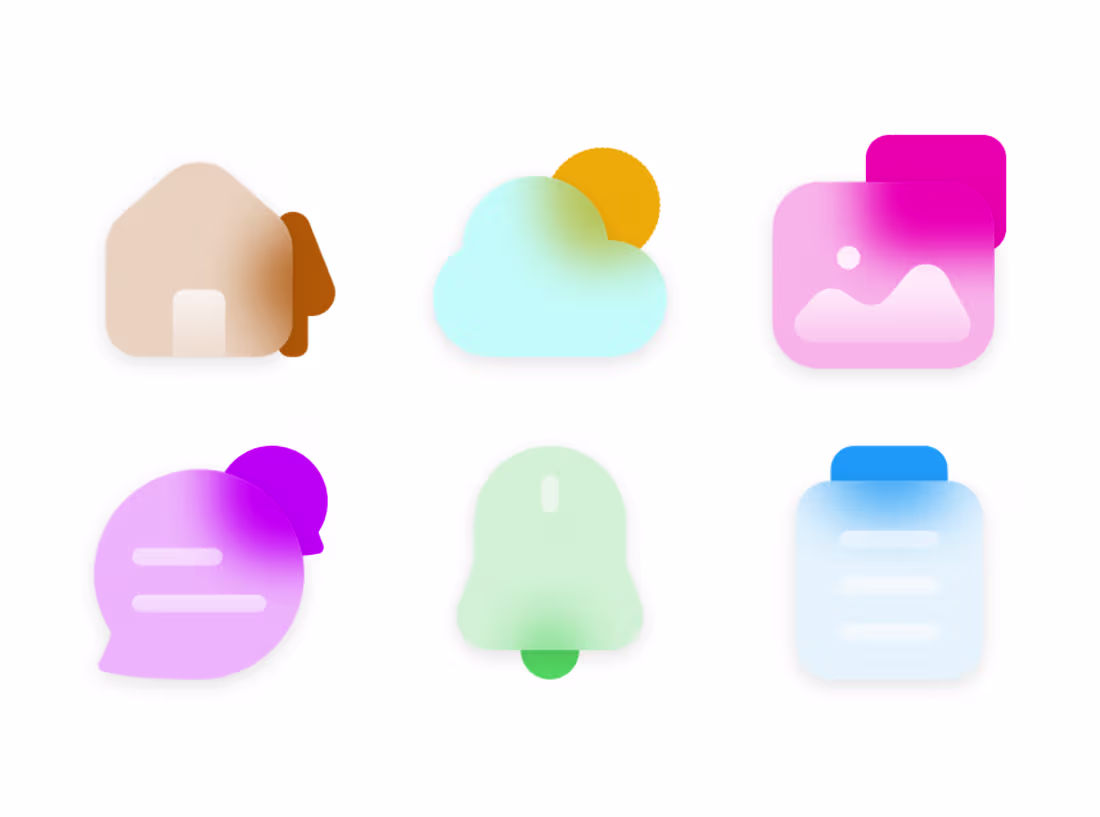
The past few days, I worked on a new set of icons, a style I haven't tried before.
Glazicons is a coloured glass style icon set embracing the frosty glass effect.
100+ icons
Designed on a 44px grid
Works in light/dark theme
Scalable to use at different sizes for various designs you can think of.
What would you be using these icons for?
Check it out here and let me know what you think 👇
https://scientisco.gumroad.com/l/glazicons (https://scientisco.gumroad.com/l/glazicons?_gl=1*gg3xh5*_ga*NzAzNDAzOTM5LjE3MzQ5ODQ3NDg.*_ga_6LJN6D94N6*czE3NjIyOTY5NjgkbzcyJGcwJHQxNzYyMjk2OTY4JGo2MCRsMCRoMA..)
4
2
178
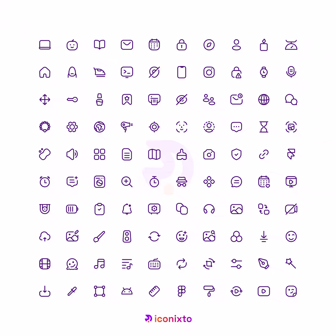
The past 2 months, I’ve been working on a redesign for Iconixto icons.
The focus has been on redefining and following clear, consistent guidelines which would improve scalability, visual cohesion, and predictability across various styles and use cases. Every decision is aimed at ensuring the icons integrate seamlessly into modern UI environments while maintaining clarity, cohesiveness and balance.
This phase is about elevating interface experiences through structure, consistency, and thoughtful detail so that teams can rely on Iconixto as a concrete foundation within their visual design systems.
Still iterating and testing out the system. More updates coming. Who else is excited to try them out?
6
195
My 2026 goal is to finish up the redesign of Iconixto icons for v3 release and expand our user base.
2
105
2025 design with me wrap 🎊
1
99
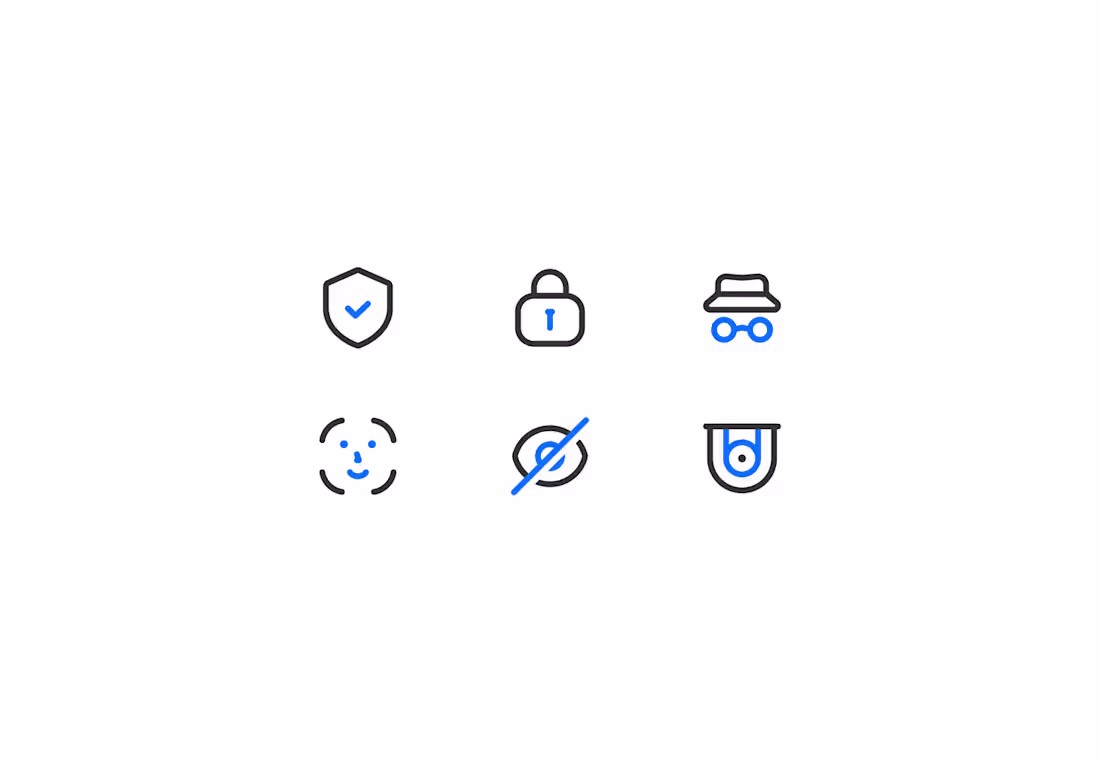
Security icons
0
99
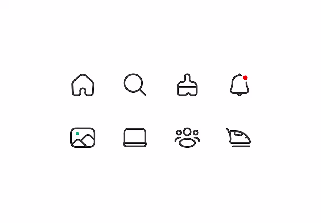
Some new icons I worked on these past few weeks.
1
103
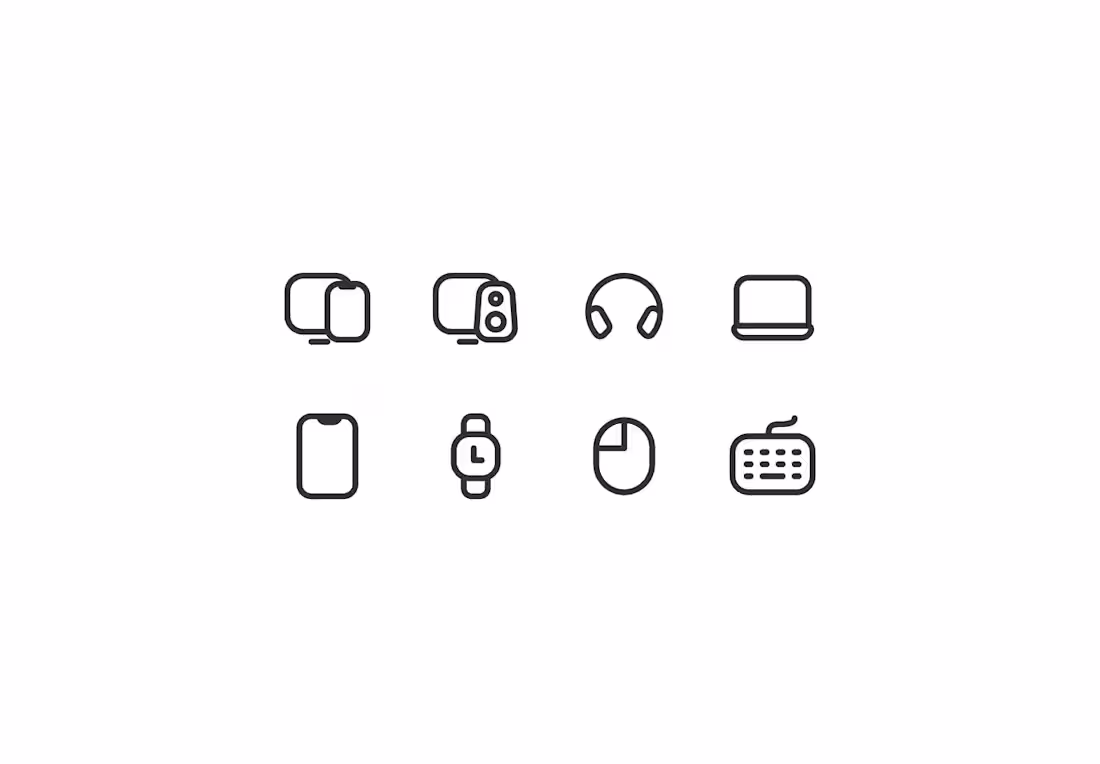
Some icons I've been working on recently 😊
0
98
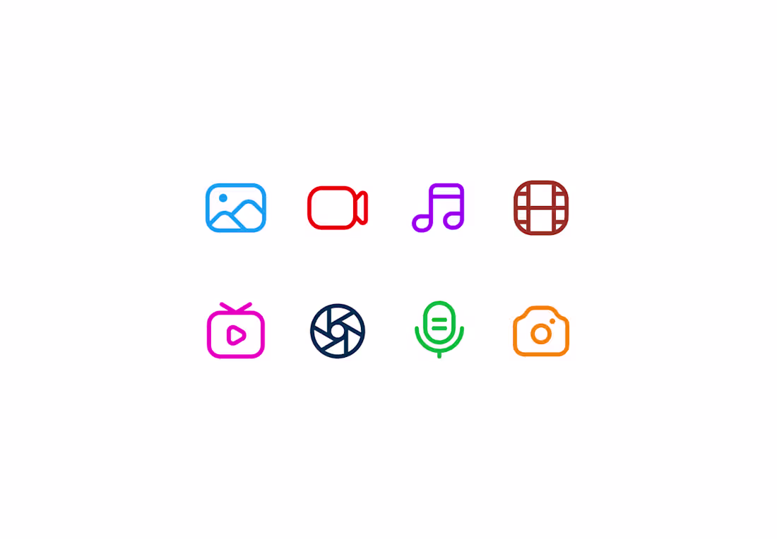
It's a new week. What are you guys up to?
Btw here are some icons I made recently. 😊
1
117
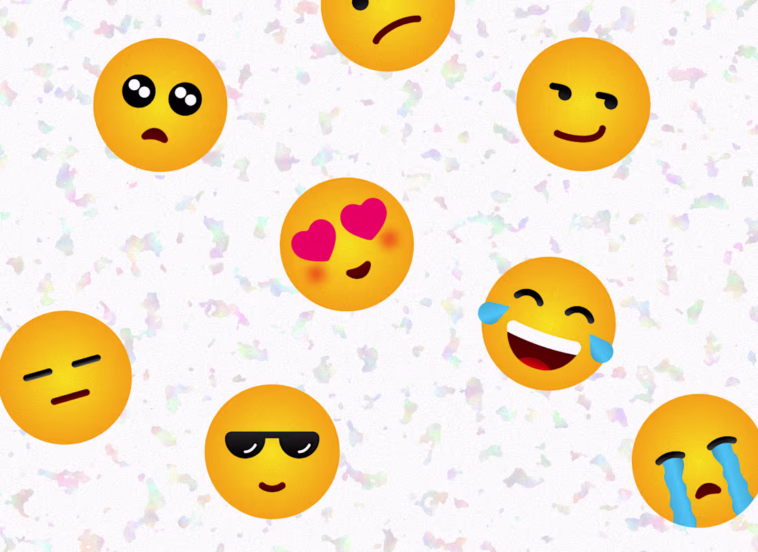
Tismojis - expressive emoji set
0
3
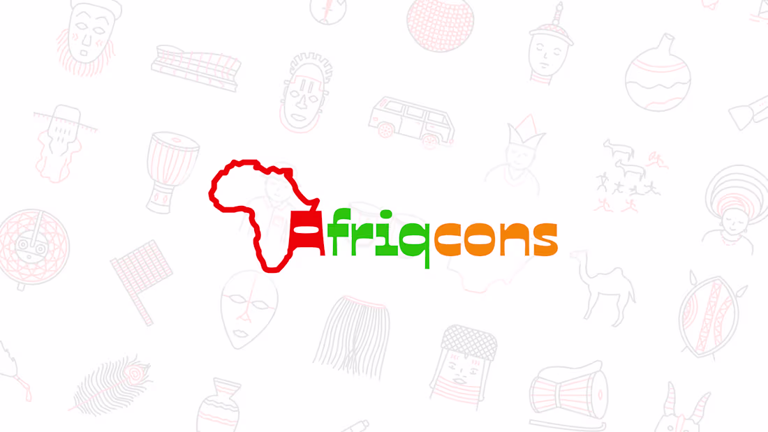
Afriqcons - African centered icon set
0
8
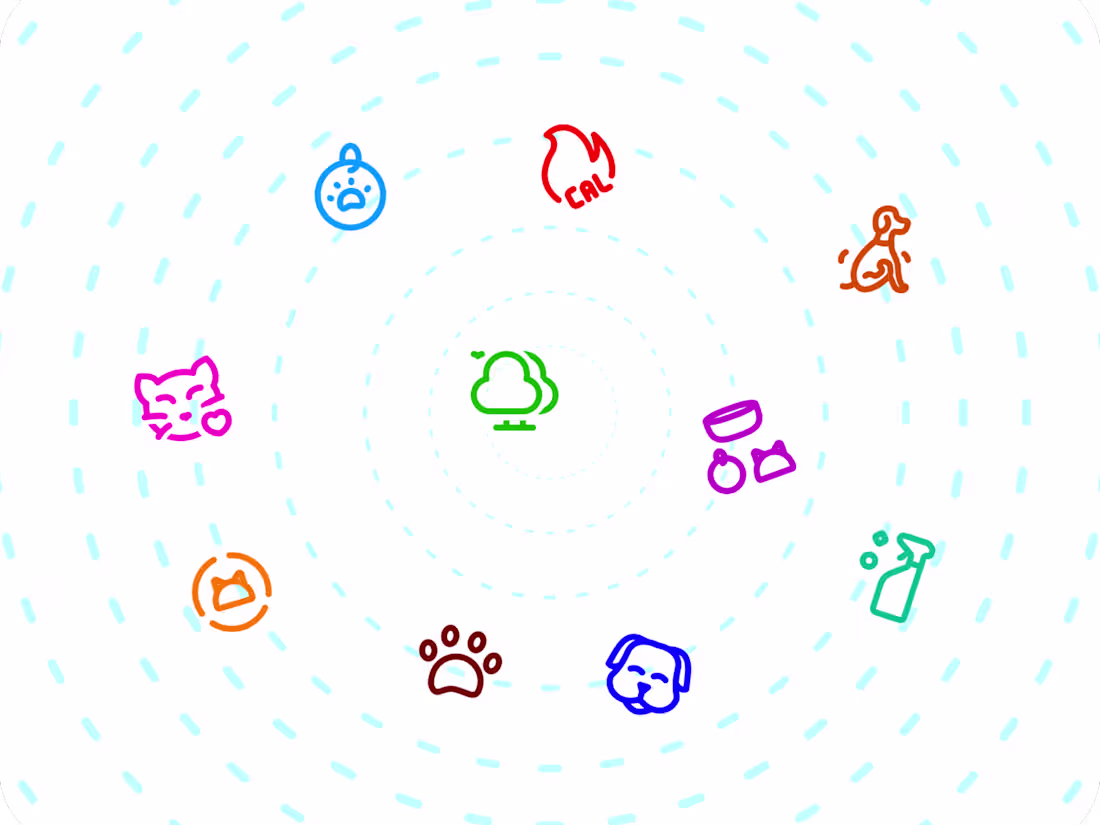
Sure Petcare Icon Design
2
22
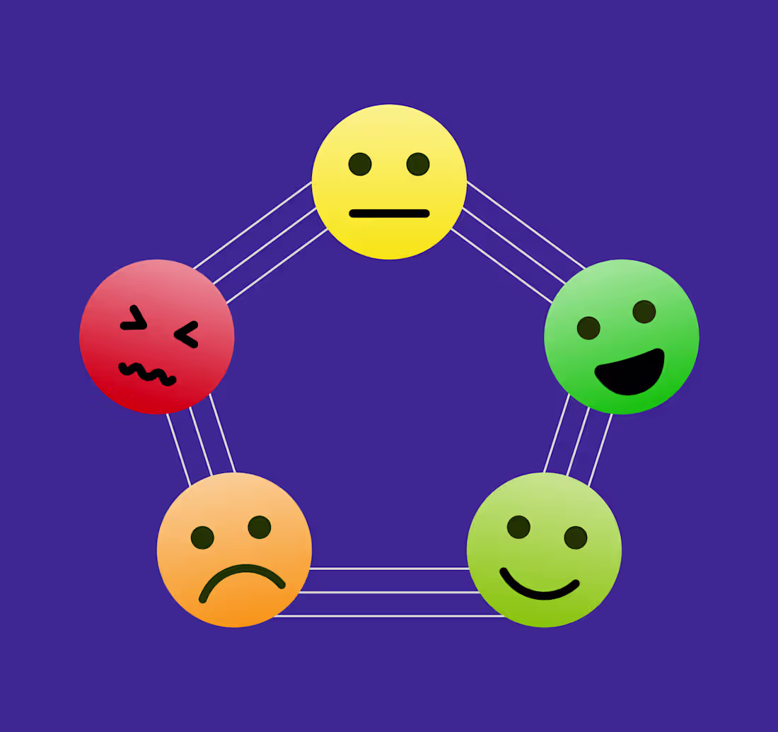
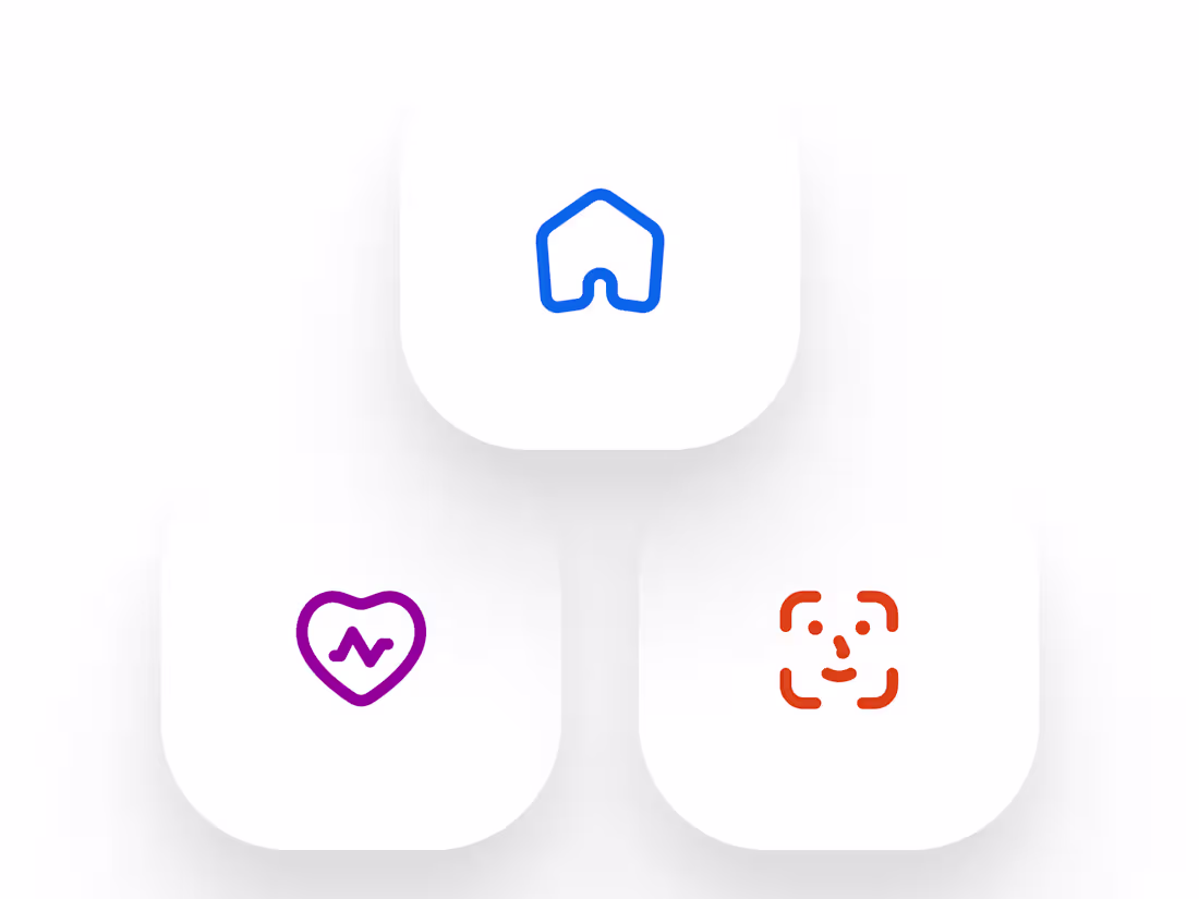
Mood Journal App Icons
0
6
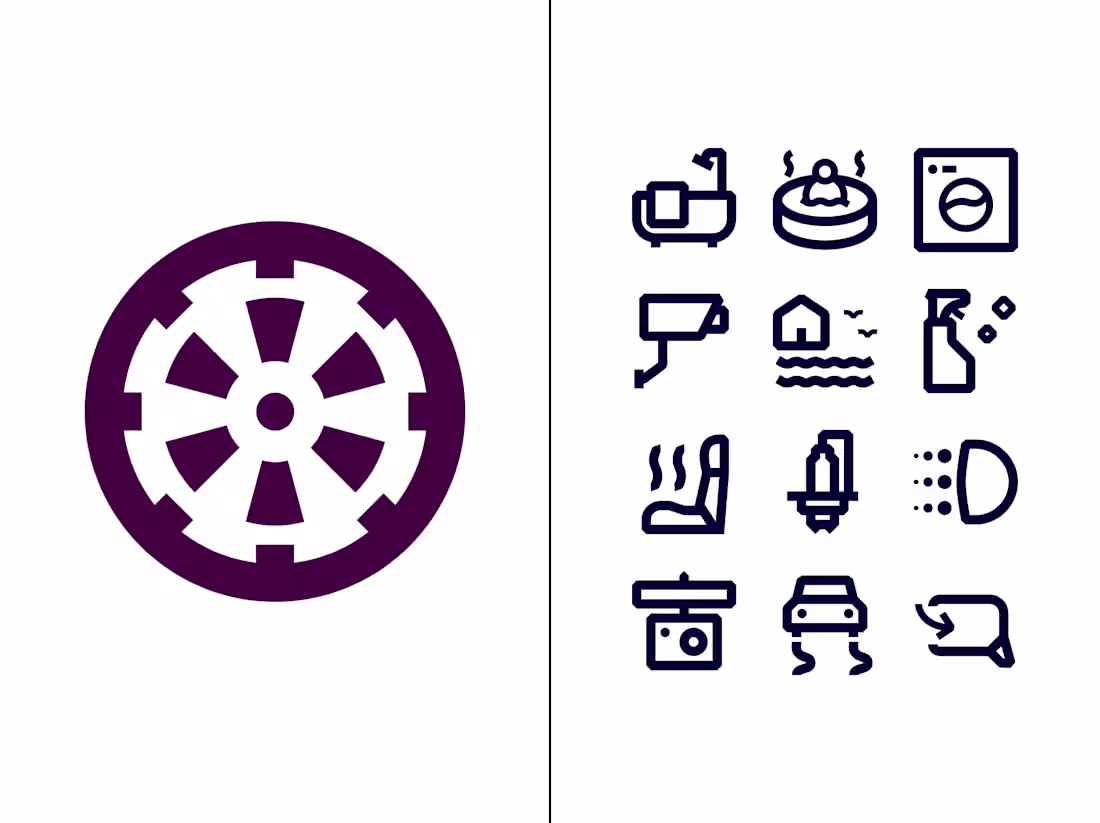
Car features and property amenities icons
0
25
Rayna UI icon library
1
46
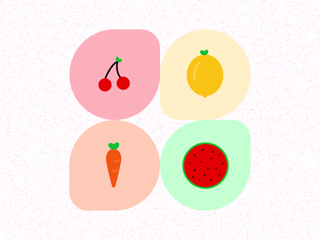
Fruit icons
0
15
Iconixto Icon Library
1
64
App icon design
1
34
Tisco Icons
0
46
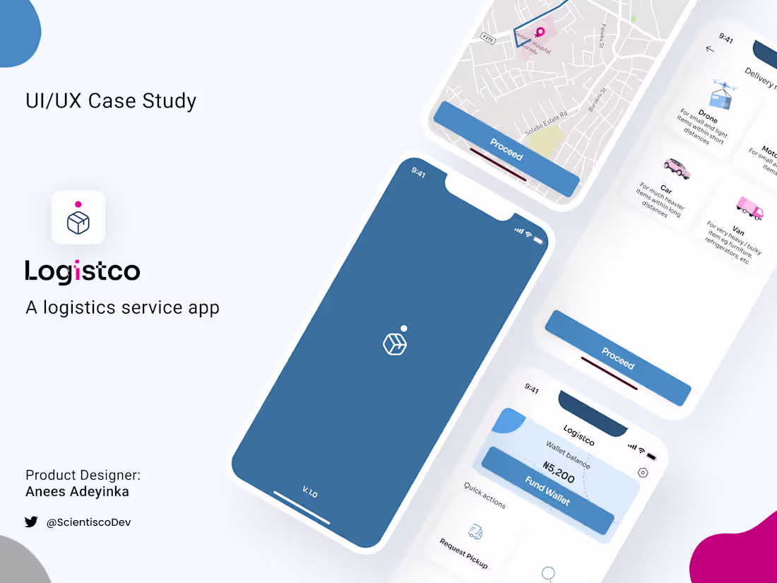
Logistco UI/UX case study
0
33
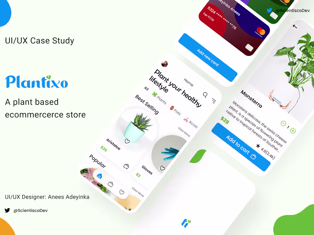
Plantixo UI/UX design case study
0
55
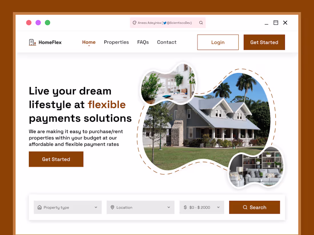
HomeFlex Web design
0
24
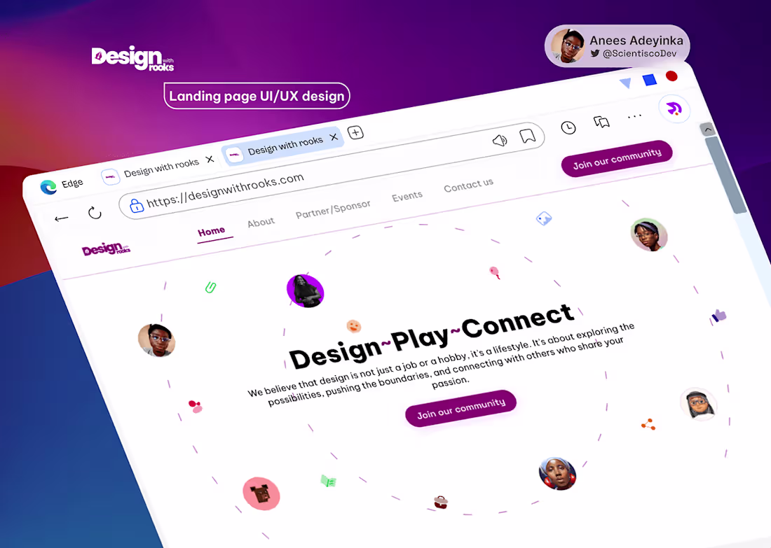
Design with rooks Website UI/UX design
0
43
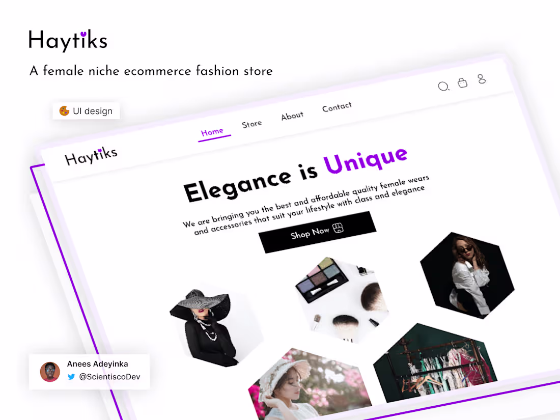
Haytiks
0
33
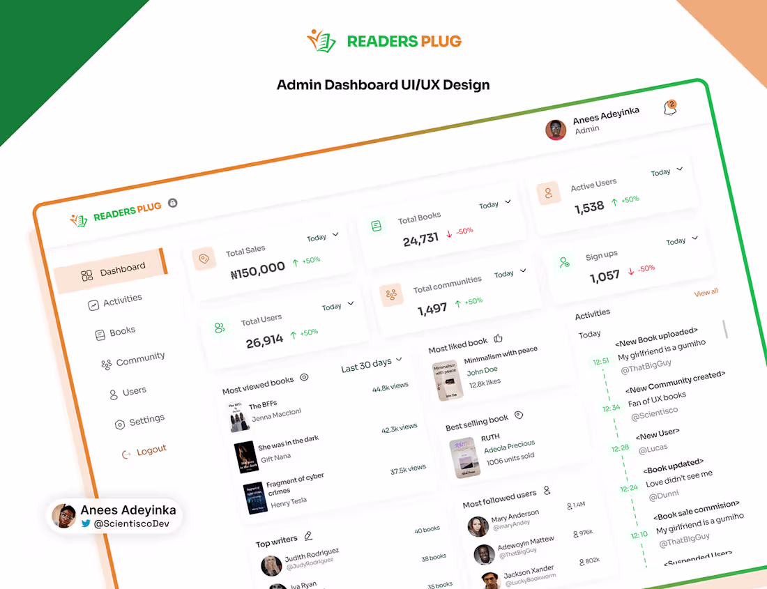
Readers Plug - Admin Dashboard UI/UX design
0
15
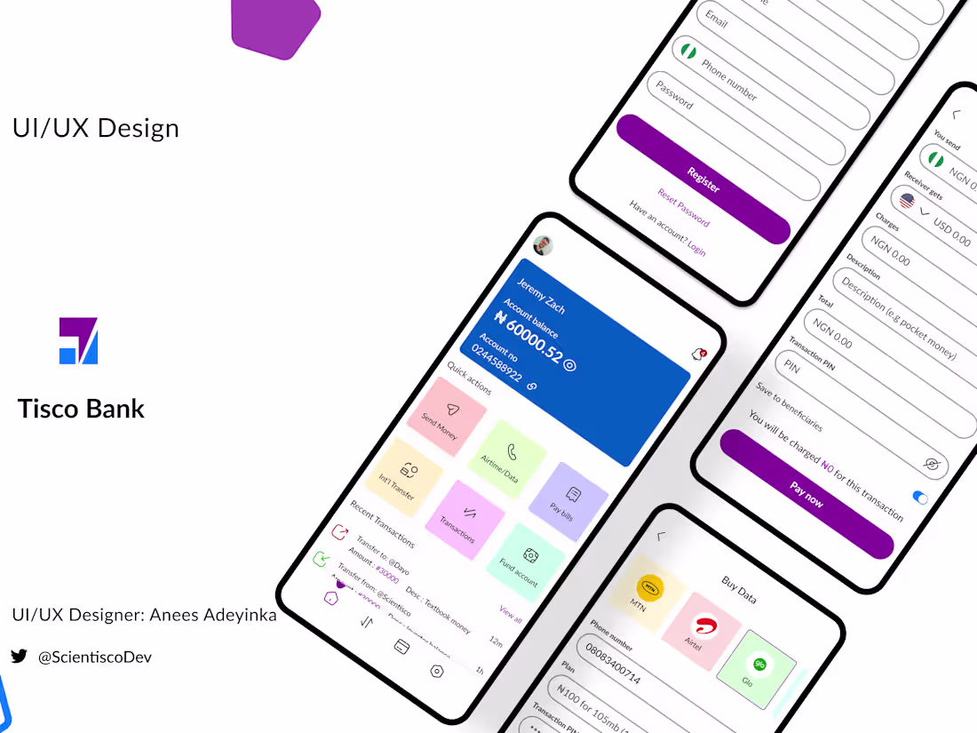
Tisco bank UI/UX design
0
36
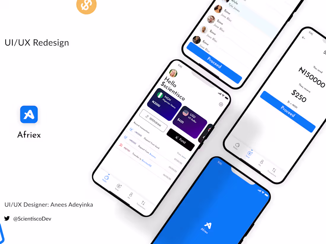
Afriex UI/UX Redesign
0
26
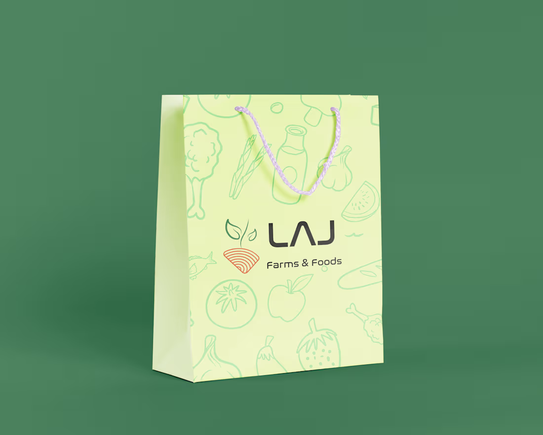
LAJ Farms and Foods Logo design
0
43
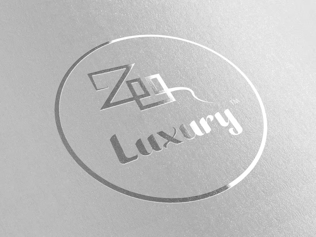
Zee luxury logo design
0
15