The network for creativity
Join 1.25M professional creatives like you
Connect with clients, get discovered, and run your business 100% commission-free
Creatives on Contra have earned over $150M and we are just getting started
Back to feedPost

I built a Shopify store auditor with Base44 to solve a problem I face almost every day as a freelancer.
As a Shopify and Full Stack Developer, I regularly inspect storefronts to identify conversion issues, UX friction, missing HTML tags, SEO problems, and opportunities to improve the shopping experience.
The problem? Doing all of this manually takes time. A lot of time.
So I thought, why not build a tool that does the heavy lifting for me?
That idea became my Base44 Challenge project.
Here’s how it works:
→ Enter your Shopify store URL
→ Choose between AI-powered and rule-based auditing
→ Get an instant report highlighting critical issues and areas for improvement
→ Discover problems across your storefront and identify what needs attention
→ Use AI-powered insights to guide your optimization process
→ Download and share your audit reports with clients, agencies, or your team
The goal is simple: make Shopify store audits faster, more accessible, and less repetitive.
Whether you're an e-commerce brand owner trying to improve conversions, an agency auditing client stores, or a freelancer managing multiple projects, this tool is built around a real problem we face in our daily work.
I built it with Base44, starting with a problem I understand firsthand as a Shopify developer.
Sometimes, the best ideas aren't complicated. They're the ones that solve problems you deal with every day.
🔗 Try it here: https://storesignal-audit-flow.base44.app/
Built for the Base44 Challenge.
I'd love to hear what you think and what you'd add next!
#Base44 #Shopify #Ecommerce #AI #WebDevelopment #SaaS #ConversionOptimization #BuildInPublic


Amazing work
The network for creativity
Join 1.25M professional creatives like you
Connect with clients, get discovered, and run your business 100% commission-free
Creatives on Contra have earned over $150M and we are just getting started











Related posts

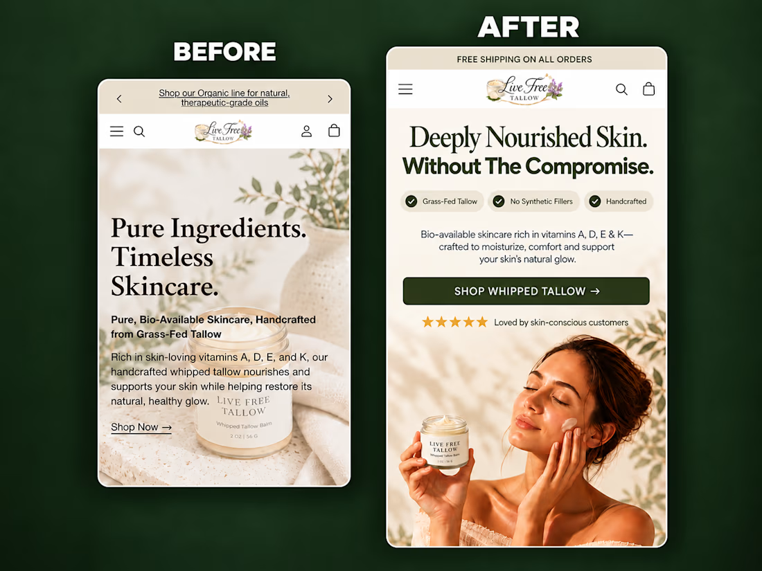
A self-initiated homepage hero redesign concept for Live Free Tallow, created to demonstrate how stronger visual hierarchy and clearer messaging can improve the mobile shopping experience.
The original hero had a compelling product, but the copy competed with the imagery, the product lacked visual prominence, and the next action wasn’t immediately clear.
For the redesign, I focused on:
• A sharper product-in-use lifestyle visual
• A clear, benefit-led headline
• Scannable product differentiators
• Improved spacing and visual hierarchy
• Social proof positioned near the CTA
• A prominent, action-focused shopping button
• Keeping the product and CTA visible above the fold
The result is a cleaner and more premium hero section that helps visitors quickly understand what the product is, why it is different, and where to go next.
I design and build conversion-focused Shopify landing pages, product pages and homepage sections for DTC brands.
Need help improving your store’s customer journey? Let’s work together.



Putting the proof next to the CTA is the right call on mobile. Did you check how much of the hero fits above the fold on a 390px-wide screen once the browser bar is counted? That's usually where the review stars get pushed out.

Designing a fragrance website with 2 sections that feels as premium as the product.
Built a fragrance experience where the product takes center stage.
I wanted the website to feel as refined as the fragrances themselves minimal layout, strong typography, immersive product visuals, and subtle interactions that make exploring each scent feel premium.
The goal wasn’t to fill the page with elements, but to give every product enough space to create its own presence.
Built with Next.js, with a focus on responsive design, smooth interactions, and a polished browsing experience.


The product imagery is doing most of the work here. Did you use art-directed mobile crops, or keep one image with a different object position? That can preserve label detail without loading the full desktop asset.

After weeks of 14–16 hour workdays, late nights and countless iterations, our new website is finally live! 🚀🌙
Built using Claude Code, Codex, Claude Design, Higgsfield and Figma.
AI is incredibly powerful when used correctly. With the right expertise, creativity and attention to detail, you can create something truly unique that doesn’t look or feel AI-generated.
AI accelerated. Expert led.
I’d love your feedback! What part of the website do you like the most? 👀:


great keep it up