The network for creativity
Join 1.25M professional creatives like you
Connect with clients, get discovered, and run your business 100% commission-free
Creatives on Contra have earned over $150M and we are just getting started
Back to feedPost
Designing a fragrance website with 2 sections that feels as premium as the product.
Built a fragrance experience where the product takes center stage.
I wanted the website to feel as refined as the fragrances themselves minimal layout, strong typography, immersive product visuals, and subtle interactions that make exploring each scent feel premium.
The goal wasn’t to fill the page with elements, but to give every product enough space to create its own presence.
Built with Next.js, with a focus on responsive design, smooth interactions, and a polished browsing experience.


This is very nice honestly 👏

Thank you !! Really appreciate it...😊

The product imagery is doing most of the work here. Did you use art-directed mobile crops, or keep one image with a different object position? That can preserve label detail without loading the full desktop asset.
Thanks a lot!! I used separate images for mobile rather than repositioning the same image.
That makes sense for fragrance packaging; a dedicated mobile crop gives you control over label scale and focal point while keeping the asset lighter.

This is inspiring! Thanks for sharing your process.
Thank you so much ! Really appreciate it..

Incredible luxury aesthetic, Rithik! The minimal layout hierarchy is spot on. Adding a subtle 3D parallax scroll effect on the bottle would elevate this luxury e-commerce experience even further.
Thank you! I think that would look really good with the bottle animations.
Separate mobile images should give you more control over the label size and framing. That’s useful for product shots where the packaging details matter.

The VELOUR GOLD presentation really does feel premium, Rithik. The oversized watermark type behind the bottle plus that warm amber palette gives each scent its own presence. Smart restraint in keeping it to two sections.
The network for creativity
Join 1.25M professional creatives like you
Connect with clients, get discovered, and run your business 100% commission-free
Creatives on Contra have earned over $150M and we are just getting started








Related posts

✨ Two Hero Concepts. One Luxury Fragrance Brand. Which one wins?
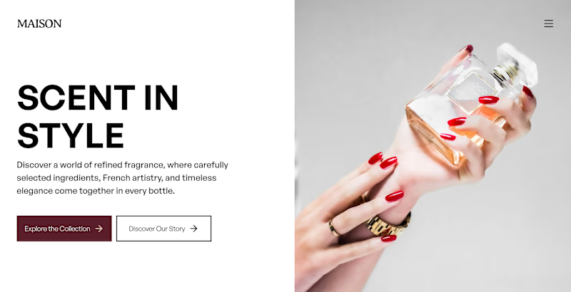
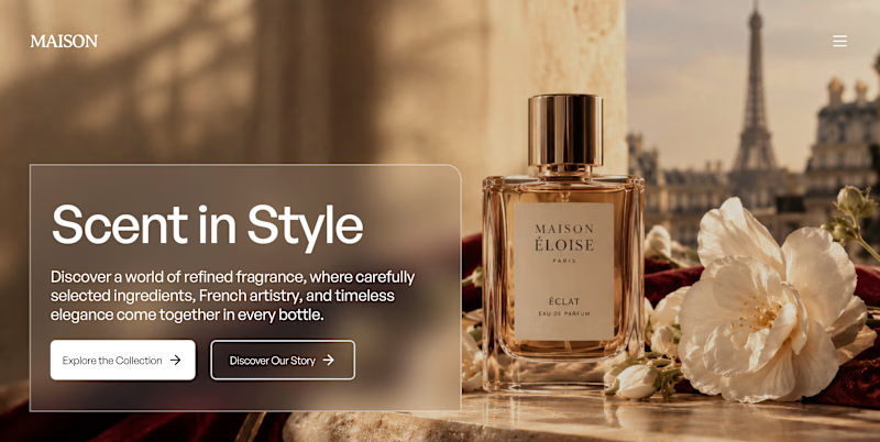
I explored two different hero section designs for Maison, a fictional luxury fragrance brand inspired by Parisian elegance, timeless scents, and premium visual storytelling. 🥂🌹
I’d love to hear what makes your choice stand out!


4 voted
50%
4 voted
50%
8 votes
Closed

Option A is unique I don't know why but it get my attention great job Orlerx🎉🎉❤️❤️

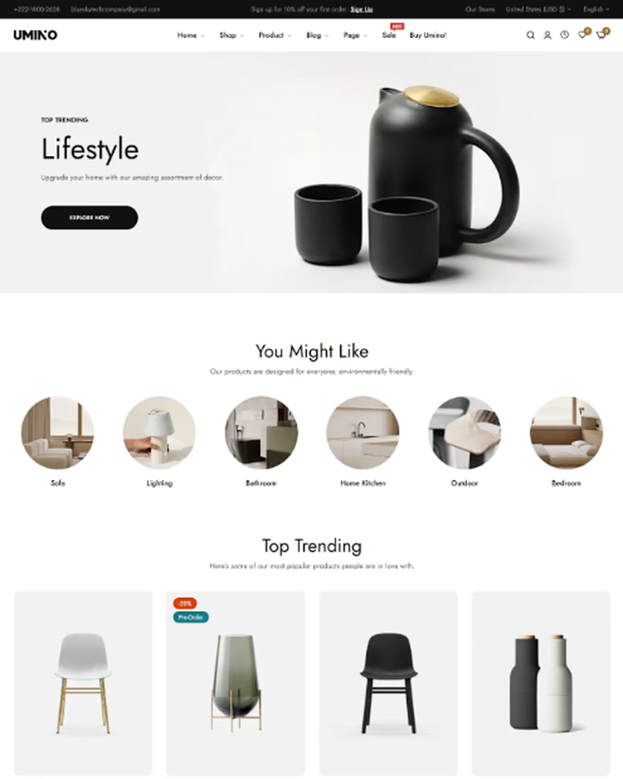
Creating a Beautiful Home Décor Shopping Experience with Shopify
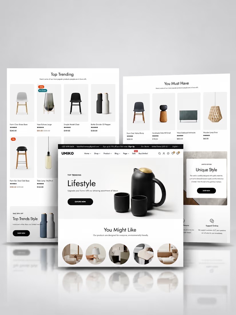
Recently, I worked on a home décor website project focused on combining elegant design with a seamless shopping experience.
✨ Key highlights:
🛋️ Clean, inviting layouts to showcase furniture, lighting, and accessories
📸 High-quality product imagery for better product discovery
🔍 SEO optimization to improve search visibility
🛒 A streamlined checkout with multiple payment options
📱 Social media and email marketing integration to drive traffic
My goal was to create an online store that not only looks beautiful but also makes shopping simple and enjoyable.
Every project is an opportunity to build better e-commerce experiences that help brands grow. 🚀
Looking to build or improve your Shopify store? Let's connect!
#ShopifyDeveloper #ShopifyDesign #HomeDecor #EcommerceWebsite #ShopifyStore #WebDesign #EcommerceDevelopment #ShopifyExpert



The layout is mind-blowing

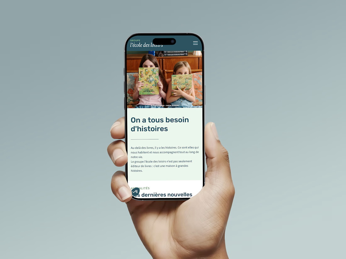
Just shipped: the group site for l’école des loisirs, one of France’s best-known children’s publishers.
14 brands, two weeks, on Webflow.
A on Website Carbon, 0.06g per visit. Lighter pages are faster pages, and faster pages rank. Eco-design pays twice.
Case study 👇


This is amazing! I just read that a website with 0.06g per visit is in the 94th/95th percentile of the cleanest website in the world. That's Superb. Great work Laura!