The network for creativity
Join 1.25M professional creatives like you
Connect with clients, get discovered, and run your business 100% commission-free
Creatives on Contra have earned over $150M and we are just getting started
Back to feedPost
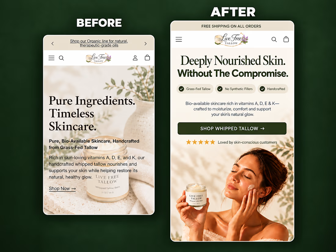
A self-initiated homepage hero redesign concept for Live Free Tallow, created to demonstrate how stronger visual hierarchy and clearer messaging can improve the mobile shopping experience.
The original hero had a compelling product, but the copy competed with the imagery, the product lacked visual prominence, and the next action wasn’t immediately clear.
For the redesign, I focused on:
• A sharper product-in-use lifestyle visual
• A clear, benefit-led headline
• Scannable product differentiators
• Improved spacing and visual hierarchy
• Social proof positioned near the CTA
• A prominent, action-focused shopping button
• Keeping the product and CTA visible above the fold
The result is a cleaner and more premium hero section that helps visitors quickly understand what the product is, why it is different, and where to go next.
I design and build conversion-focused Shopify landing pages, product pages and homepage sections for DTC brands.
Need help improving your store’s customer journey? Let’s work together.



Looks amazing

Thanks man

A very big Move.
Thanks

Fixing copy that fights the imagery is such an underrated redesign skill, Olabode. Letting the product photo do the emotional work while the words stay tight is exactly how a mobile hero should behave.
Exactly Timothy.
Thanks for Engaging.

Putting the proof next to the CTA is the right call on mobile. Did you check how much of the hero fits above the fold on a 390px-wide screen once the browser bar is counted? That's usually where the review stars get pushed out.
Good point, Maximiliano. I designed the concept at a 390px viewport in Figma, but I haven't tested it on a live page yet. You're right that accounting for the browser UI is important when evaluating what actually stays above the fold on mobile. It's definitely something I'd check during implementation.

The after version reads much clearer. Stars near the CTA was a good move.
The network for creativity
Join 1.25M professional creatives like you
Connect with clients, get discovered, and run your business 100% commission-free
Creatives on Contra have earned over $150M and we are just getting started



Related posts

Redesigned the ModaZ fashion e-commerce storefront with a clean, modern shopping experience focused on product discovery and brand presentation. The project included a refreshed homepage, curated product collections, new arrivals, best-selling sections, and responsive layouts.
I also focused on improving navigation, product visibility, and the overall shopping journey to create a more engaging online store.
Have a fashion brand that needs a storefront upgrade? Let's talk.


I love the layout. Impressive work

What if sending money felt a little more like giving a gift?
For Nova, I explored a banking app that brings payments, cards, and a bit of personality together. You can check your balance, browse recent transactions, send or request money, top up, and pay bills.
My favorite part is the digital postcard feature. Before sending a transfer, you can add a little illustrated card—a heart, a birthday greeting, or a playful character. A simple way to make birthday money or a thank-you feel more personal.
I carried that same 3D character into onboarding, pairing it with bold red gradients and large, clear payment details. There’s room for play, while the recipient and amount stay easy to check.
Would you add a postcard to a transfer? I’d love to know what occasion you’d use it for.






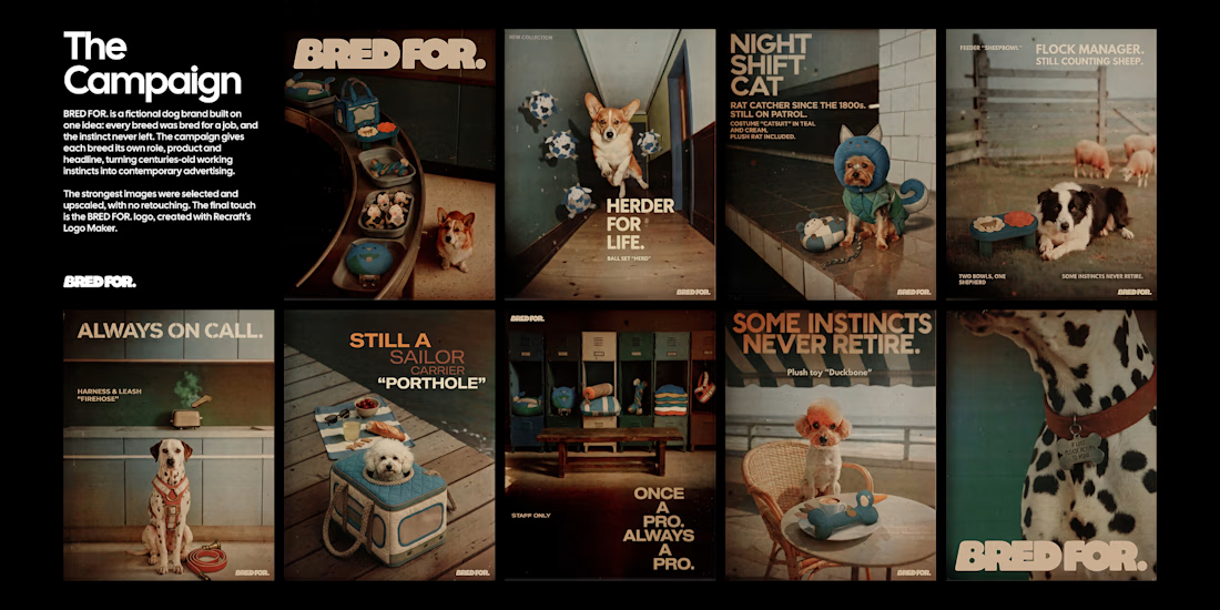
BRED FOR. is a fictional dog brand built on one idea: every breed was bred for a job, and the instinct never left. Collies herded sheep, poodles retrieved ducks, Yorkies hunted rats, Dalmatians ran beside fire carriages, so each product turns a breed's original work into an everyday object.
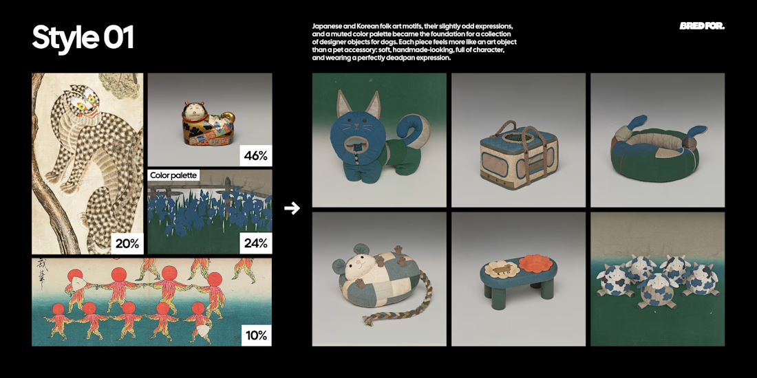
Style 01 is built from Japanese and Korean folk art found at the Cleveland Museum of Art, The Met, LACMA and the Rijksmuseum, and designs the products as soft, deadpan designer objects.
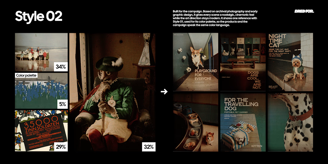
Style 02 is built from early colour autochromes and a 1914 lithographic poster from the Rijksmuseum and the Albertina, and turns every scene into a modern fashion campaign with an archival feel.
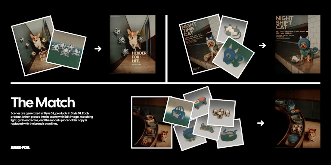
The two Styles were chained with Edit image: Style 01 products placed into Style 02 scenes, every headline rewritten in the brand's dry, deadpan voice. The strongest images were selected, upscaled and finished with a logo made in Recraft Logo Maker.
Style 01 (products): https://www.recraft.ai/styles/b8e1a6b6-ae61-49db-907d-74229530b596
Style 02 (campaign): https://www.recraft.ai/styles/7f2a89de-d69a-4fad-aa0d-ba6302c9a2f3