The network for creativity
Join 1.25M professional creatives like you
Connect with clients, get discovered, and run your business 100% commission-free
Creatives on Contra have earned over $150M and we are just getting started
Back to feedPost

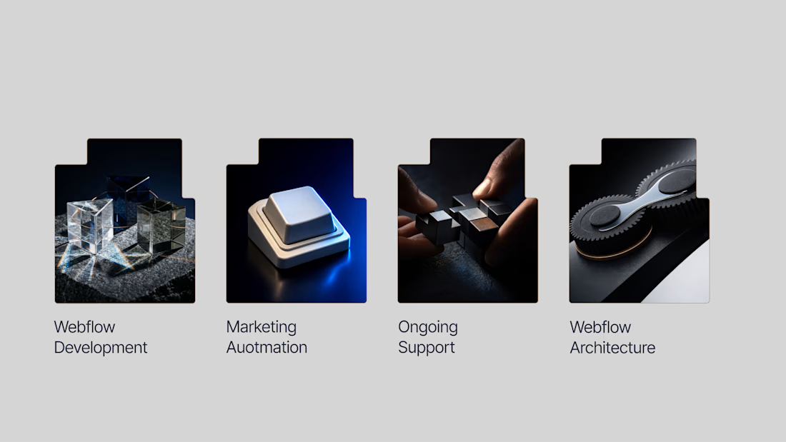
Armstrong | Brand Identity Expansion
Expanded Armstrong’s existing visual identity into a more expressive digital brand system. The work built on the established logo and website direction, creating a cohesive visual language that carries the brand confidently across key touchpoints.
You can see full project here

Amazing work

I agree
Thank you

Thank you so much Afnan! I really appreciate it 💛 Let me know if you need any designs.

Thanks!

Good presentation.
Appreciated!

Looks Classy..
Thanks

Pure identity, Love it.
Thanks a lot

Great concept🎨
Thank you

This is awesome
Thanks

you did really well with design, look premium and clean
Thanks man
Welcome man😊

Very clean work)
Thank you Myroslava

what a fantastic work
Thank you!

Welldone
Thanks!


Welldone
Thank you!
A pleasure


Love the shapes!
Thanks Marcin!

Well done on this project. The design feels polished, user-focused, and ready for production. Looking forward to seeing more of your work!
Thank you!


Amazing work
Thanks!

i like your style, amazing
Appreciated!

Great work
Thaanks!

Great work
Thanks!

Thanks!

Awesome! I love how you made it elegant and modern🔥

Nice work man

Super sleek expansion, the dark aesthetic combined with those custom 3D assets adds to the premium depth of the whole system.

Brand systems tend to fall apart the moment they hit a pitch deck, this one didn't.

Amazing work


Impressive work.


Nice seeing how the existing identity was pushed further without losing the original feel. The digital system feels really cohesive.
The network for creativity
Join 1.25M professional creatives like you
Connect with clients, get discovered, and run your business 100% commission-free
Creatives on Contra have earned over $150M and we are just getting started





Related posts

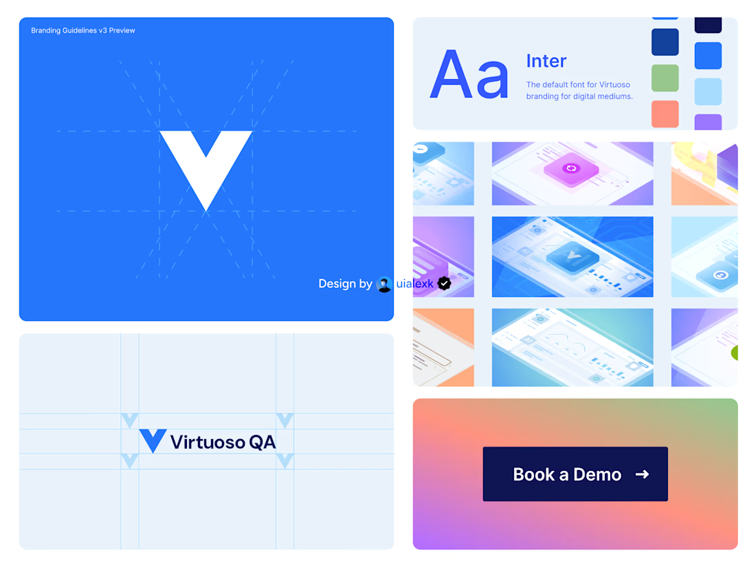
Branding v3 for Virtuoso
This design evolution, made an impact to the brand growth's by:
- Increasing website conversions
- Having consistent brand presence across digital mediums
- Increase brand awareness
See full case study here

One of the best designs I’ve seen today. Really solid work

Bringing MONETA to life through a series of brand applications that extend the identity across digital banking, business materials, and marketing touchpoints. A refined combination of typography, color, and structured layouts creates a modern and cohesive financial brand experience.
Have a project in mind?
Get in touch and let’s create something together.

Goatt!!


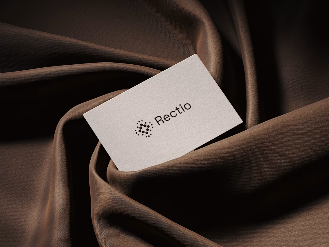
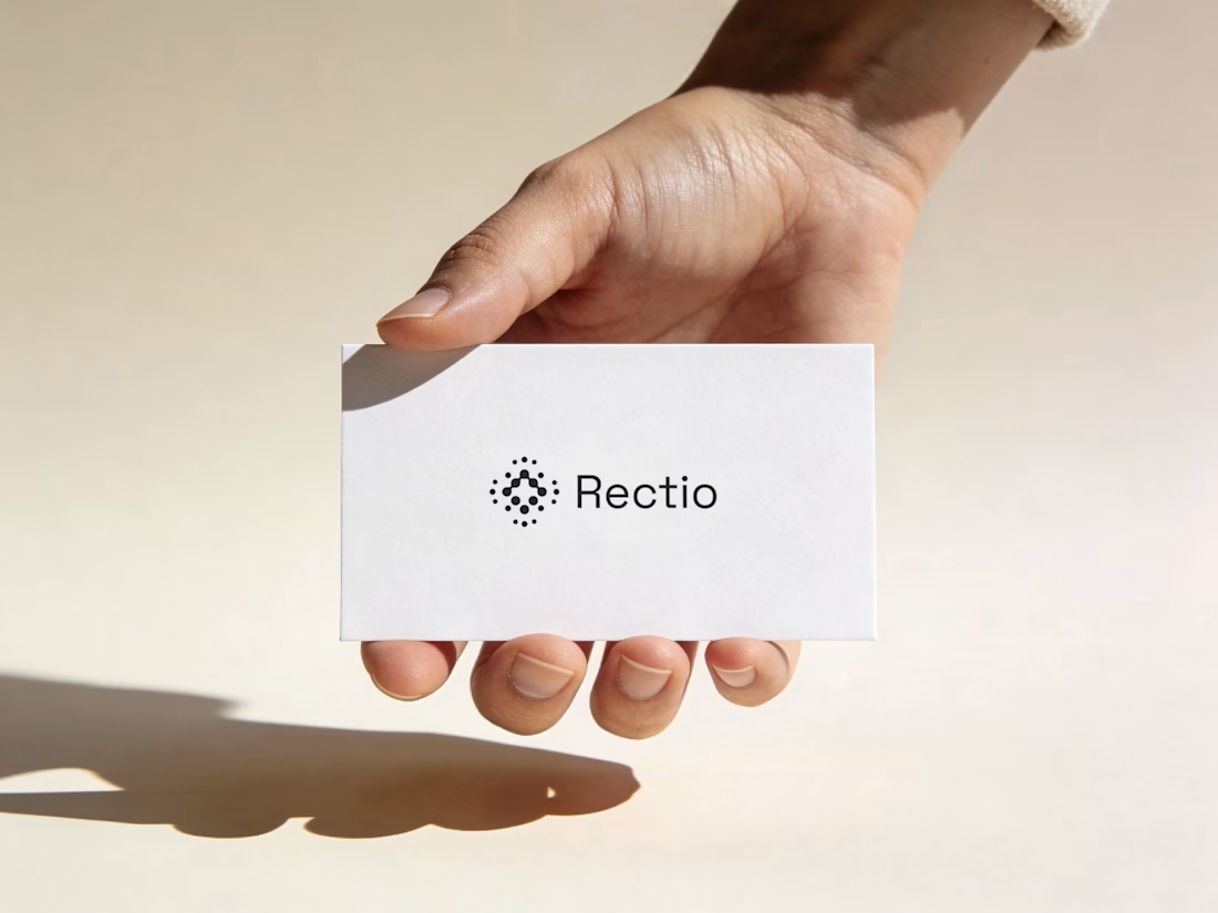
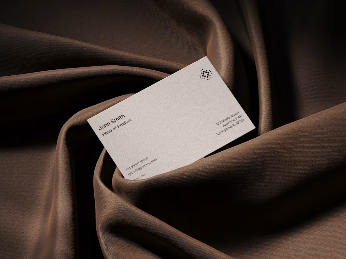
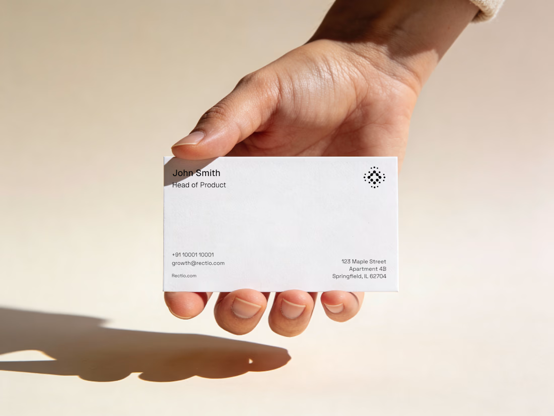
Rectio — Brand Identity
Brand Identity • Visual Direction • Business Cards • Mockups
A modern and minimal branding direction for Rectio, from visual identity to business card applications.
Created by Artonest Design Studio — artonest.design