The network for creativity
Join 1.25M professional creatives like you
Connect with clients, get discovered, and run your business 100% commission-free
Creatives on Contra have earned over $150M and we are just getting started
Back to feedPost

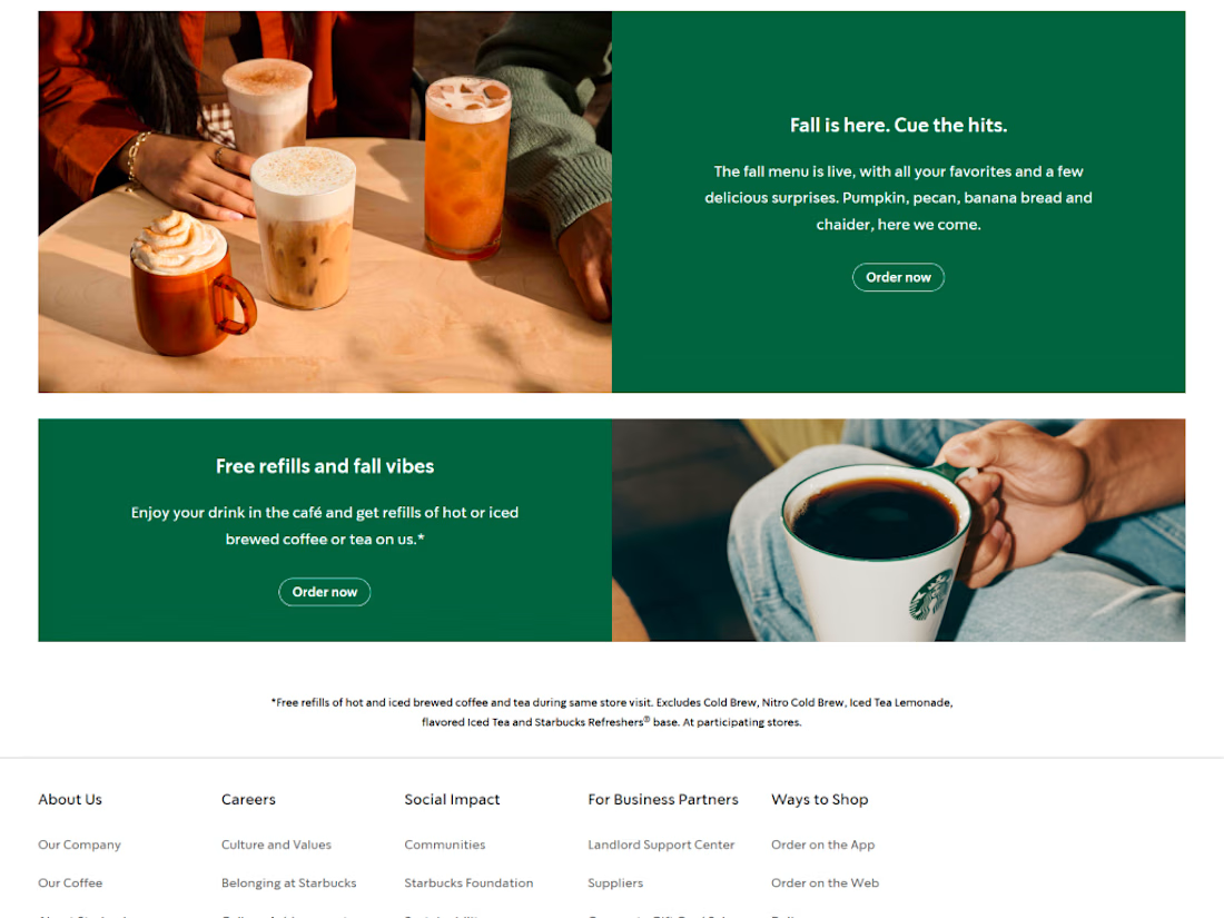
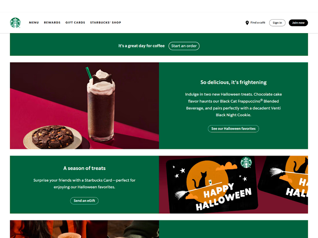
I’ve been exploring the Starbucks website, and one thing stood out: the experience is easy to navigate and easy to explore.
There’s room to improve, but the page doesn’t need elaborate animation to keep me moving through it. The content is clear, the calls to action are easy to spot, and I can find different things without having to decode the interface.
That’s a useful reminder for landing-page design: motion should support the journey, not become the journey. If an animation adds clarity or makes an interaction feel more intuitive, it has a purpose. If it only adds visual noise, simplicity may serve the user better.
Designers: what’s one animation pattern you think genuinely improves a landing page and one you’d happily remove?
The network for creativity
Join 1.25M professional creatives like you
Connect with clients, get discovered, and run your business 100% commission-free
Creatives on Contra have earned over $150M and we are just getting started



Related posts

Most SaaS landing pages lose visitors in the first 5 seconds. Not because the product is bad, but because the page doesn't explain it fast enough.
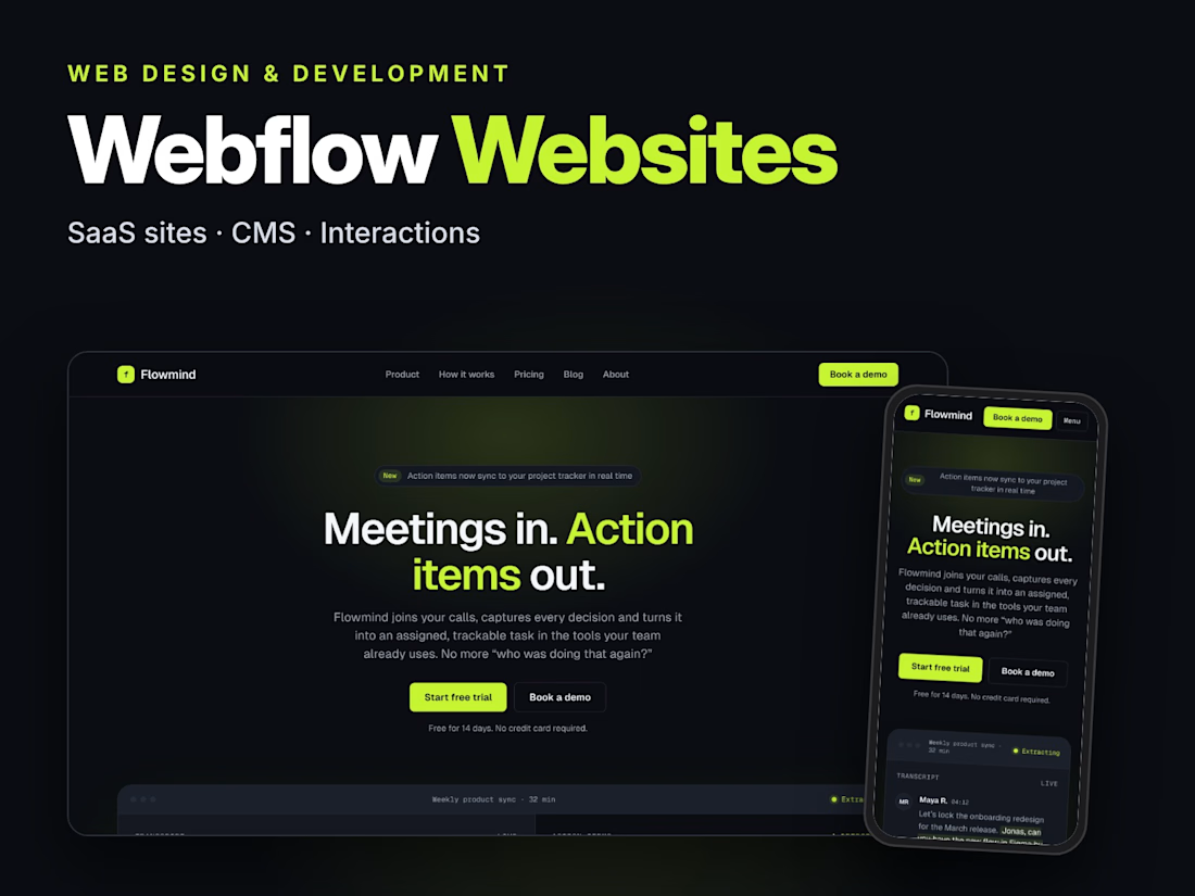
That was the challenge behind Flowmind, an AI workflow tool I designed and built in Webflow:
→ A hero that says what it does in one line
→ Product visuals instead of vague illustrations
→ Pricing and FAQs that answer objections before they become questions
→ Fully responsive, fast, and easy for the client to update through the CMS
A website isn't decoration. It's your best salesperson, working 24/7.
If your landing page isn't converting the way it should, let's talk. 👇


This is so true, most landing pages lose people not because the product is bad but because the hero takes too long to explain it. Your one line hero for Flowmind does exactly what it should, you know what it does in 2 seconds. For local businesses I see the same thing, if the...

Unpopular opinion: most redesigns don’t need a new look. They need less noise.
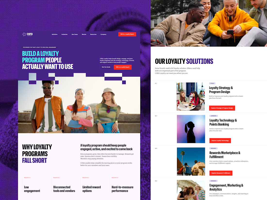
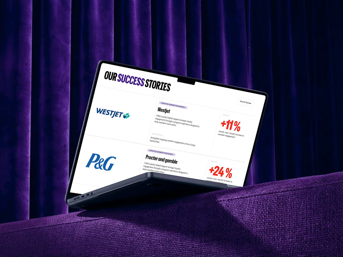
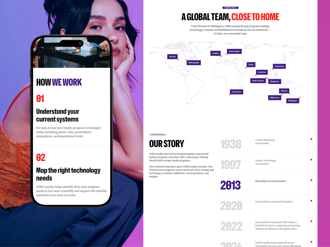
When CORA, a B2B loyalty and rewards platform, came in for a redesign, the easy move was to refresh everything. I did the opposite. I kept the brand’s colors, fonts, and rules, built a new UI system around them, and added the pages they were missing.
Wireframes first, then UI and animation. The biggest change came from what I took away: visual noise. A clear type hierarchy did the rest.
Before and after are in the case study on my profile.
So, designers: when a client asks for a “fresh look”, do you push for something new or protect what people already recognize? 👇


Love the after result and the comprehensive case study!

🚀 SaaS Explainer Video | UI Motion Design
A great explainer video starts with understanding the business behind the product.
For this SaaS commercial, I focused on understanding the company's product, identifying the challenges its customers face, and finding the most effective way to communicate how the business solves those problems.
My goal wasn't just to create beautiful animations. It was to build a compelling story that clearly presents the problem, introduces the solution, and demonstrates why the product matters.
Independent creative concept — not commissioned by the featured company.


Excellent !