The network for creativity
Join 1.25M professional creatives like you
Connect with clients, get discovered, and run your business 100% commission-free
Creatives on Contra have earned over $150M and we are just getting started
Back to feedPost
Unpopular opinion: most redesigns don’t need a new look. They need less noise.
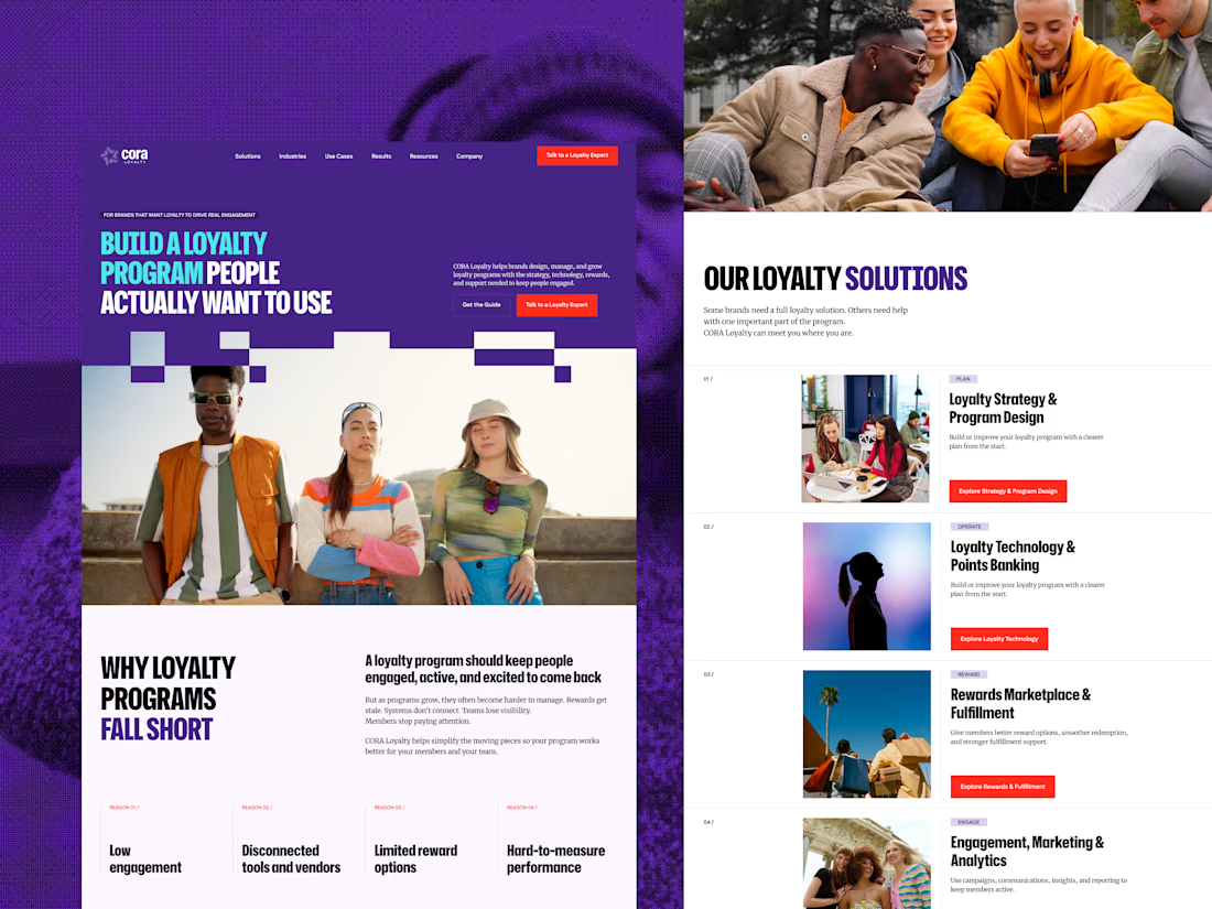
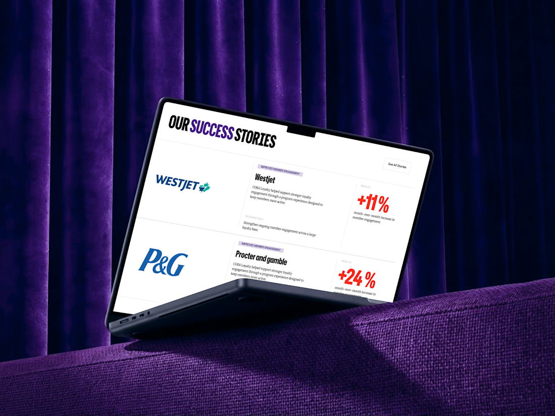
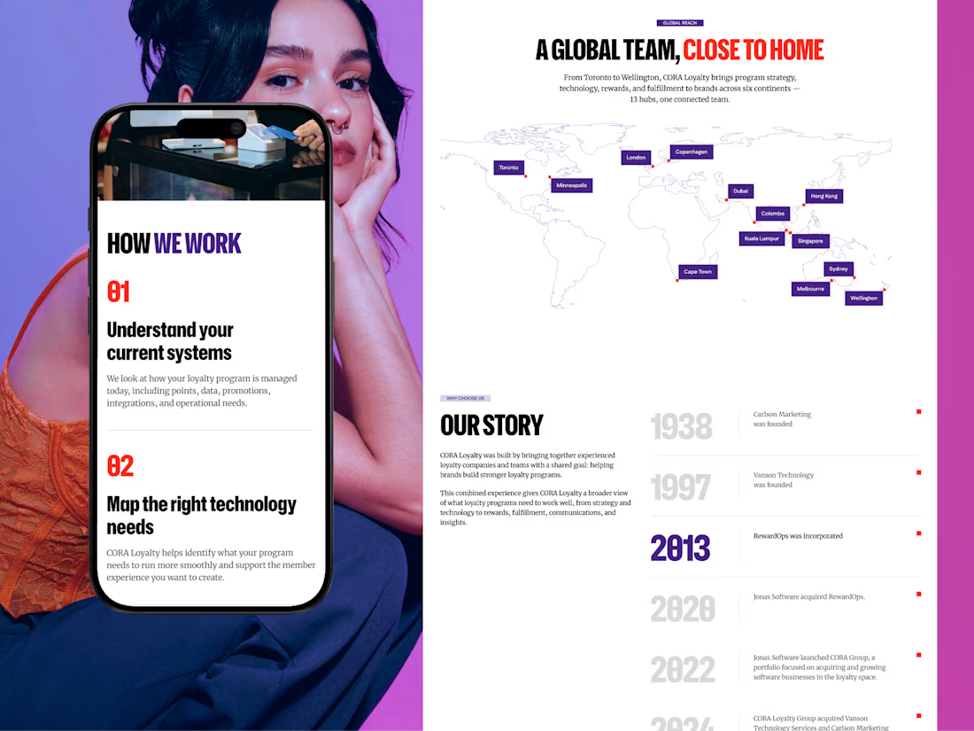
When CORA, a B2B loyalty and rewards platform, came in for a redesign, the easy move was to refresh everything. I did the opposite. I kept the brand’s colors, fonts, and rules, built a new UI system around them, and added the pages they were missing.
Wireframes first, then UI and animation. The biggest change came from what I took away: visual noise. A clear type hierarchy did the rest.
Before and after are in the case study on my profile.
So, designers: when a client asks for a “fresh look”, do you push for something new or protect what people already recognize? 👇



thanks a lot!

The simpler type hierarchy works well.
thanks!

Love the after result and the comprehensive case study!
thank you!

I almost always vote to protect brand recognition first. Clients often mistake "visual clutter" for "outdated brand" so showing them how far clean hierarchy and intentional spacing can go without tossing their identity out the window is always the smarter move.
The network for creativity
Join 1.25M professional creatives like you
Connect with clients, get discovered, and run your business 100% commission-free
Creatives on Contra have earned over $150M and we are just getting started



Related posts

New here, so I'm slowly filling in my portfolio and getting to know the place. So far I like it.
Here's an extract from Software Intelligence, a Framer site I designed and built a few months ago for an enterprise data consulting startup.
The visual idea mirrors what they do with data: compact blocks that animate, break apart and recompose, like charts taking shape. Few effects, all consistent, everything managed through the CMS.
If you have a minute, take a look at the full case study.
I'd love to know what you think, especially whether the motion supports the content or ends up overpowering it.


You're very welcome, Francesco — glad the note landed. The motion in that extract really does the heavy lifting for the content, so keep sharing your work here. Looking forward to seeing what's next from you. ✌️

Brand work for HauntChain
I'm loving building this brand and the results so far
A deFi platform with some gamification


That's cute ❤️

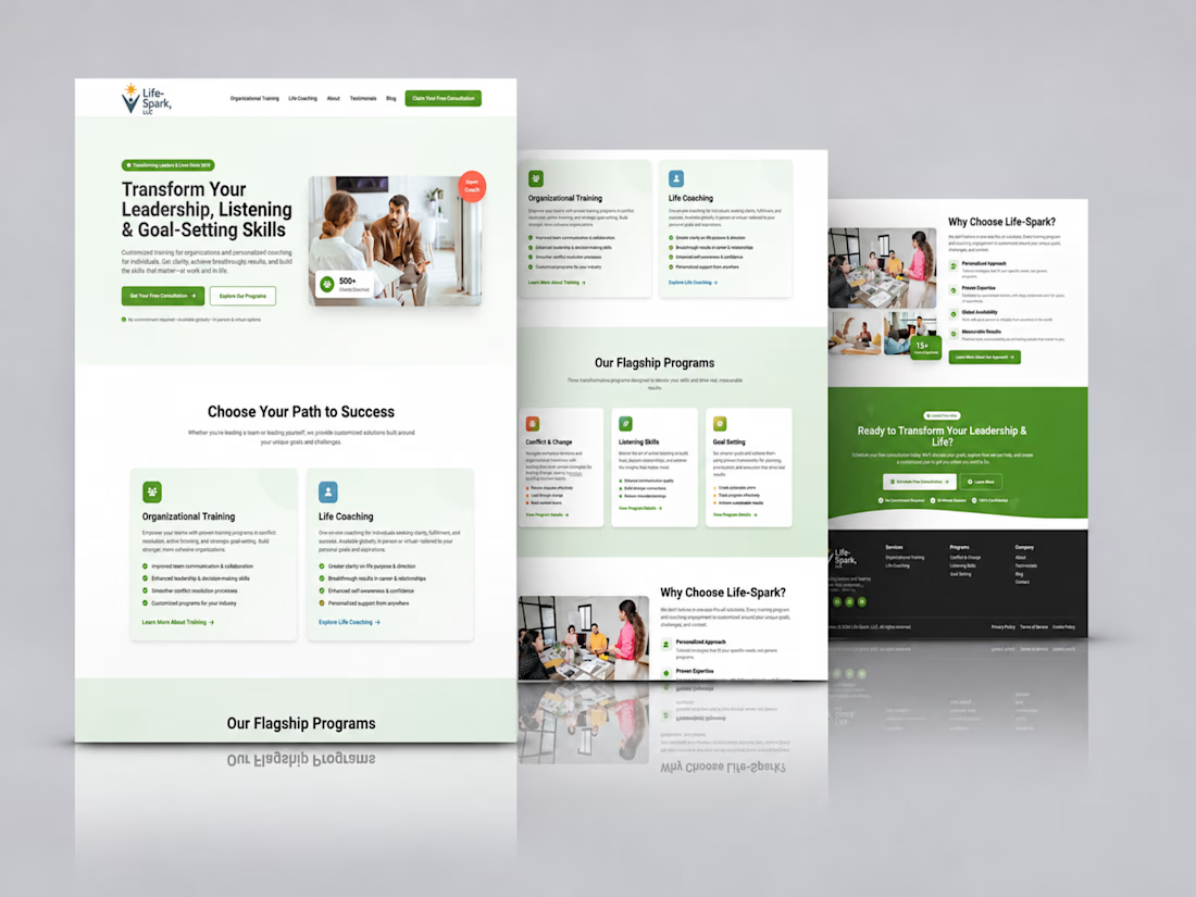
Kajabi Life Coach Website Design & Development
The client needed a professional website that would communicate their life coaching services more effectively, build trust with potential clients, and make it easier for visitors to understand their coaching approach and take the next step.
I helped bring this vision to life by designing and developing a Kajabi website with a welcoming visual direction, clear content structure, and intuitive navigation. The focus was on presenting the coaching services in a more engaging way, creating a smoother visitor experience, and making it easier for prospective clients to connect with the coach and explore available opportunities for personal growth.
#Kajabi #KajabiWebsiteDesign #KajabiExpert #LifeCoach #LifeCoaching #LifeCoachWebsite #CoachingWebsite #PersonalDevelopment #PersonalGrowth #CoachingBusiness #WebsiteDesign #WebsiteDevelopment #WebDesign #ResponsiveWebDesign #OnlineCoaching #BusinessWebsite #UXDesign #UIUXDesign


Love how clean and intentional everything feels.